
My project is a redesign of the existing food delivery service Micky Booth fresh fruit and veg to make their delivery service more accessible to the elderly population during COVID-19.
The Problem
In the wake of this pandemic and how it has affected how we live our
daily lives especially for our elderly population, who are at most risk with
the virus and have to stay at home. Because of this, some activities that
they loved to do they no longer can, creating this feeling of helplessness
and disconnect from friends and family.
Still wanting their independence is also a key goal for this population,
not wanting to burden their families during this time. But getting their
regular services and needs meet during this time is quite difficult and
daunting for this population as it is an online world that seems so
overwhelming and confusing.
Target Audience

Demographic
Age: 55+
Location: Australian Suburbs and Rural areas
Gender: Any
Income level: Low to Middle class citizens
Education level: Completed year 12 or the equivalent, higher education attended and completed
Marital or family status: Married or separated, close family relationship
Occupation: Either retired or working full-time
Ethnic background: Any
Existing Company


The existing company Micky booth has a homely feel and quite a clear layout but overall looks a little outdated and lacks a punch and is a little bland to look at and doesn’t really advertise their main points of difference, family owned, locally sourced produce.
The Deliverables
Logo Progress


First up for my deliverables is my logo variations, this was the deliverable that took the longest but I finally got a range of logos that accurately represented the company’s family roots and also was informative to the viewer about the brand.
Logo Final

Final Logos
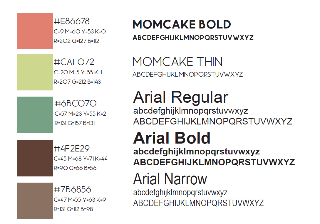
Brand Style Guide
Website Progress


Next up is my website, my aim for this deliverable was to really cater it towards my target audience and make it really simple and easy to use as especially during this time a lot of essential services have moved to the online space. So I implemented bigger buttons to make for easy navigation and also use of big, easy to read type to not overwhelm the user.
Website Final


Final Website design
Poster Progress


For my posters, I wanted to design them for a train station or community center, places were my target audience would most frequent. I wanted to really sell the “made easy” point of difference with these, as this would be a lot of customers first impression of the brand.
Poster Final


Final Posters and Mockup
Catalogue Progress


Now for the catalogue I was still deciding right up till the end whether this would be part of a customer’s order or to also have it available at your local supermarket/ newsagent as another form of advertising. I ended up using it as another form of advertising to help convince the customer to choose this brand of competitors, providing them with kind of an insight into the brand before choosing it. With this catalogue I wanted to make sure I kept the design on brand, so I kept with the clean, minimalistic design, similar to the website.
Catalogue Final


Final Catalogue and Mockup
Mail Out Flyer Progress


So with the mail-out flyer, the whole idea with this deliverable was to have these sent out to people house as to get people talking about the brand. So I once again wanted to make the focus of these the “made easy” component as to both family member of and my target audience this is something they value in a brand. I also went quite into depth about what the brand does on the back as to also properly inform the reader or everything they need to know
Mail Out Flyer Final


Mail Out flyer Final and Mockup
Thank You Note Progress
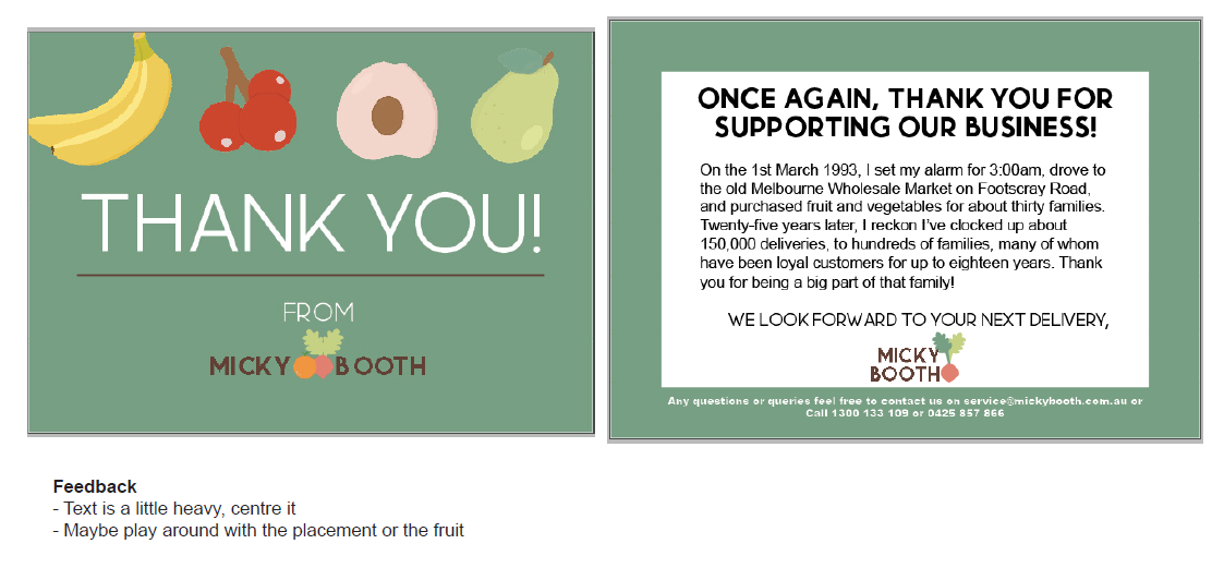
The thank you note is just included with the persons delivery just to add a little personal tough from the brand, as they are a family owned, small business.
Thank You Note Final


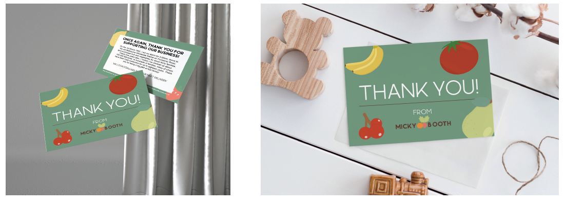
Thank you note final and mockup
News Paper Progress

First off the newspaper ad, this was a very specific deliverable catered to my target audience, as they are more likely to read their local newspaper than check their facebook. So once again, keeping it simple, instantly highlighting my point of difference and then providing information on to where to go next. As for the social media, they a less targeted to my actual target audience and more to family of my target audience to start that chain of the customer journey.
Newspaper and Social Media Final


Newspaper and social media final and mockup
Packaging Progress


Finally to packaging, I was honestly really happy with how these turned out, to quickly go through them
the box is the what the fresh produce would all be packed inside, I went with big simple artwork that makes the design look quite modern whilst not taking away from the information provided on the box.
the bands are designed to go around the likes of celery sticks and bananas to keep them together for travel, as they are quite tiny, I had to keep the design quite minimal and created a trend with my packaging to include a vector of the product the packaging is covering.
the sleeve is designed to go over meat packaging or raw food that have to packaged in a container and the sack, is a paper bag that carries the likes of potatoes, apples and pears to keep them from rolling around in the box.
Packaging Final


Packaging Finals, Printed and mockups
Evaluation
My main marker for success for this project was having my nan’s feedback throughout this project so when I showed her the final products and she said that she loved them and thought they would pull her in as a customer as well as make her life easier online, I this I take that as a successful point of catering to my target market.
One thing I learnt during this whole project was how tedious it can be, especially with logos and how many tiny tweaks there were to make to the point where you just get sick of looking at it but overall I’m pretty proud of what I’ve achieved throughout this semester. Thank you for reading.
One thing I learnt during this whole project was how tedious it can be, especially with logos and how many tiny tweaks there were to make to the point where you just get sick of looking at it but overall I’m pretty proud of what I’ve achieved throughout this semester. Thank you for reading.


