Sandra Pessoa
Pernambuco - Brasil
2020
Dra. Sandra Pessoa é uma nutricionista e coach de emagrecimento para mulheres que tem dificuldade em emagrecer e aumentar a sua autoestima. O seu objetivo é ajudar essas mulheres a se auto descobrirem, enfrentando seus bloqueios e abrindo novos caminhos para uma vida mais saudável e feliz.
A Dra. Sandra Pessoa tem uma história de superação incrível. Há cerca de 25 anos atrás, ela sofreu um acidente de carro que quase tirou a sua mobilidade. Ficou em cadeira de rodas por mais de um ano, mas quando descobriu a nutrição e viu como ela poderia contribuiu para a sua recuperação, ela se dedicou a si própria e aos estudos para recuperar e ajudar outras mulheres a superar fases difíceis que elas possam estar vivenciando.
--------
Sandra Pessoa
Pernambuco - Brazil
2020
Dr. Sandra Pessoa is a nutritionist and weight loss coach for women who have difficulty losing weight and increasing their self-esteem. Her goal is to help these women to discover themselves, facing their personal locks and opening new paths to a healthier and happier life.
Dr. Sandra Pessoa has an incredible history of overcoming. About 25 years ago, she suffered a car accident that almost took away her mobility. She was in a wheelchair for over a year, but when she discovered nutrition and saw how it could have contributed to her recovery, she devoted herself and her studies to recovering and helping other women to overcome difficult stages that they may be experiencing.

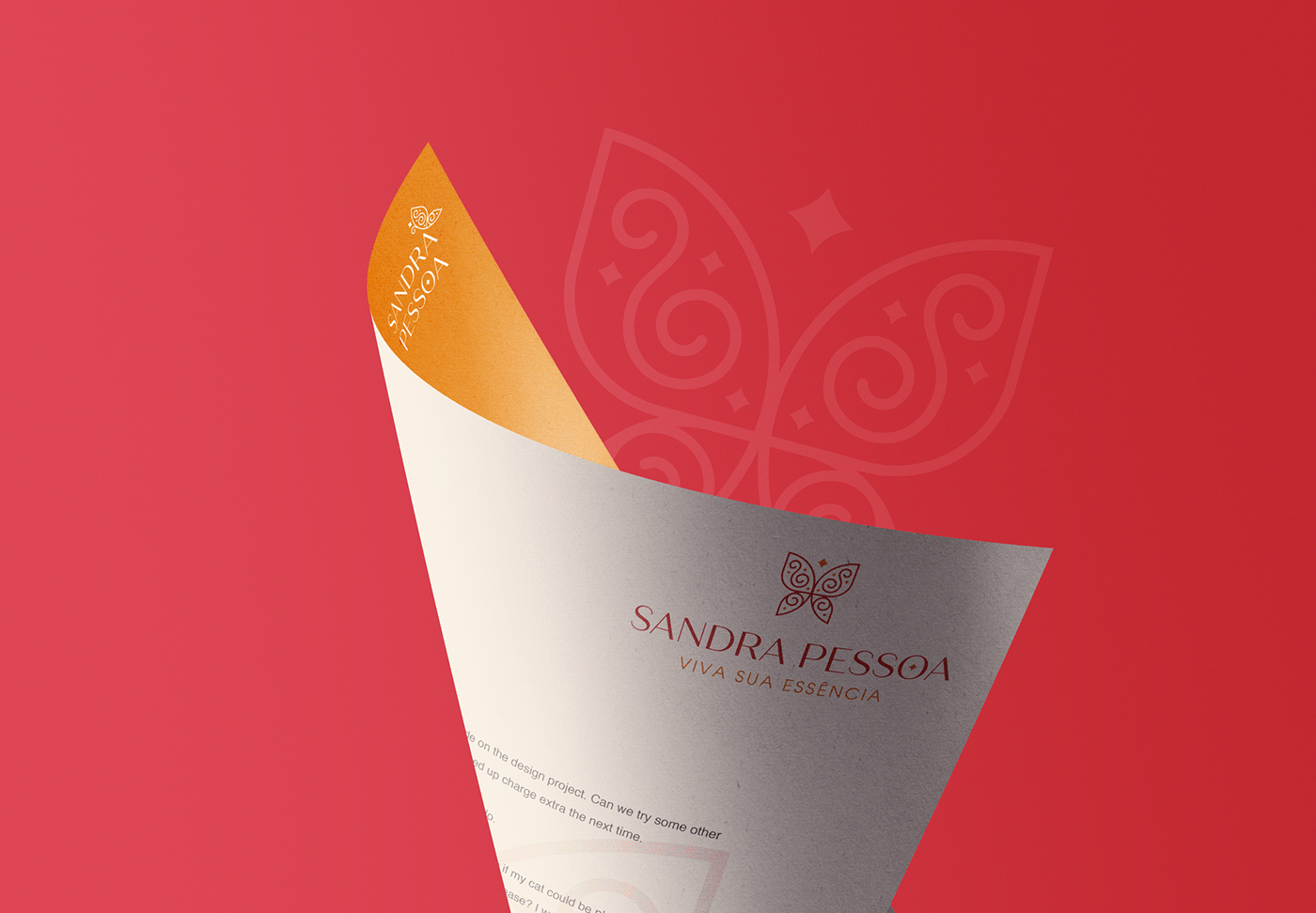
Símbolo e Conceitos
Para criar sua Identidade Visual, fizemos uma pesquisa minuciosa e um processo de autoconhecimento para identificar sua Essência e Propósito.
Para transmitir quem realmente é a Dra. Sandra em um símbolo, foram utilizados 03 conceitos:
- Borboleta: representa a sua transformação própria e de suas pacientes, que passando por um longo e difícil processo, evoluíram e se tornaram mulheres mais fortes e confiantes;
- Letra S: o nome Sandra tem um significado próprio que é Defensora da Humanidade, e não poderia ser mais correto, porque é exatamente isso que a Dra. Sandra é. Para representar esse lado humano e defensor dela, a letra S foi usada no símbolo principal.
- Brilho / Estrelas: para representar o seu espírito radiante e energético, foram adicionadas estrelas ao logotipo, um toque do brilho e da luz que a Dra. Sandra dá às suass pacientes.
O símbolo foi criado simetricamente para transmitir harmonia e equilíbrio.
------
Symbol and Concepts
To create her Visual Identity, we did a thorough research and a process of self-knowledge to identify her Essence and Purpose.
To convey who Dr. Sandra really is in a symbol, 03 concepts were used:
- Butterfly: it represents their own transformation and that of their patients, who, going through a long and difficult process, have evolved and become stronger and more confident women;
- Letter S: the name Sandra has a meaning of its own that is Defender of Humanity, and I couldn't be more sure, because that is exactly what Dr. Sandra is. To represent this human and defending side of you, the letter S was used in the main symbol.
- Brightness / Stars: to represent your radiant and energetic spirit, stars were added to the logo, reminiscent of the brightness and light that Dr. Sandra gives to her patients.
The symbol was created symmetrically to convey harmony and balance.

Cores e Tipografia
O vermelho é a sua cor preferida, porque ela a vê como uma cor poderosa, muito forte e energética. Para complementar o vermelho, foi escolhida uma cor complementar, o amarelo, para trazer o lado alegre e divertido da marca.
Para a tipografia foi escolhida uma fonte sem serifa muito elegante e simples, para transmitir simplicidade e um toque amigável à marca.
----
Colors and Typography
Red is her favorite color, because she sees it as an empower color, very strong and energetic. To complement the red, was chosen a complementary color, the yellow, to bring the bright and playful side of the brand.
For the typography was chosen a very elegant and simple san serif font, to transmite simplicity and a warm feel to the brand.