


Tiff & Erika Brief
Sisters, moms, and self-made businesswomen of the Vancouver food industry, Tiffany and Erika are street-smart, hilarious, and passionate about honest healthy food. They need a signature-inspired logo for use in conjunction with their various health & lifestyle projects.
Process
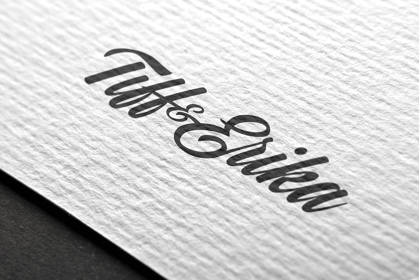
Research—A discovery session with Tiffany and Erika. Understanding what their values are, what their professional vision looks like, and what makes them unique. Moodboards—An exploration of tone and feel with special attention paid to script typography and handwritten logos. Idea generation—Concept—Created just for them, the Tiff & Erika mark is feminine and personal; it sits nicely under logos, and functions as a branded signature. Typography—Investigation of script fonts. Personal calligraphy experimentation. Logo Design—Manipulation of Kaleidos Smooth to achieve the desired result. The ampersand echoes the shape of the E and the presence of both ascenders and descenders gives the logo design a pleasing balance. A signature that Tiffany and Erika can take with them on all future ventures.


Fitness Foods Brief
Sisters and ‘Mompreneurs,’ Tiffany and Erika co-own Fitness Foods, a farm-to-table meal delivery service. They’re happy with their current logo and website, but they need defined brand guidelines and a few other design items.
Process
Research—To understand the client as a business and service, research is done on the meal delivery industry, competitors, the farm-to-table social movement, and the history and brand values of Fitness Foods. Discovery reveals the target audience of busy, young, community-minded people who go to the gym, buy nutritional supplements, and are food-conscious. Moodboards—Working with the pre-existing logo design, the focus is on creating the look and feel for Fitness Foods. Idea generation—Concept—Evoking the open, airy, and natural feeling of the farmhouse-style aesthetic. Typography that speaks with an earnest and friendly voice. Showcasing yummy food to capture viewer attention. Using crisp lines and edges to signify the reliability of the delivery service and to echo the logo design. Typography identification and exploration—Clarification of the colour palette—Logo recreation—Visual exploration—Refinement—


Fuel Up Brief
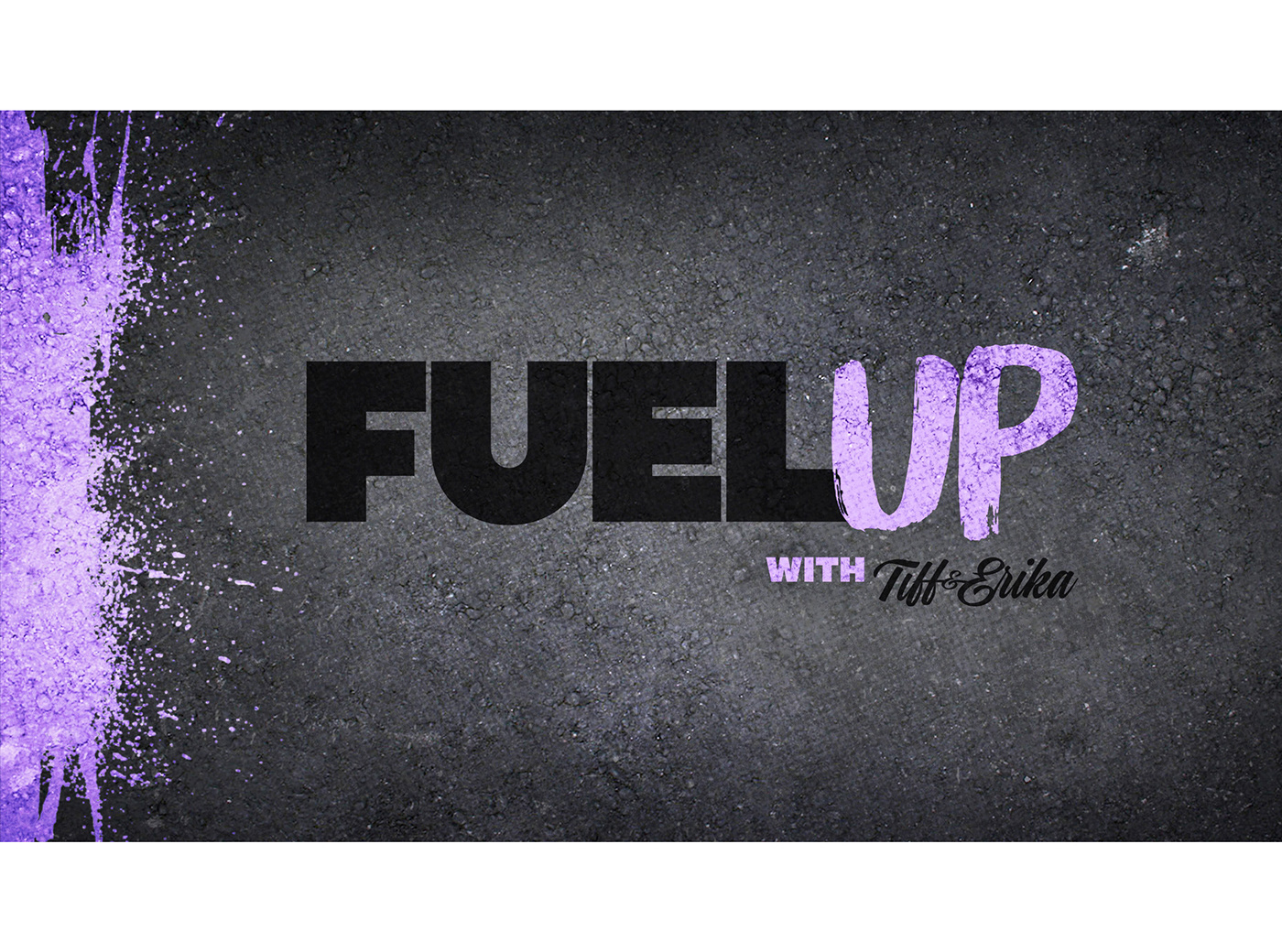
To better connect with their audience and to tell their personal story, Tiffany and Erika are creating a web series called Fuel Up. It aims to help career-driven people live a healthy lifestyle while juggling family, work, and fun. The sisters want new branding for Fuel Up, and they want to maintain a link to Fitness Foods, their primary business.
Process
Research—Personal discovery sessions with Tiffany and Erika. Researching similar short web series’ and online food and lifestyle brands. Defining the target audience which is similar to Fitness Foods, but more specifically targeting women and mothers. Moodboards— Exploration of tone and feel, brand voice, and design. Idea generation—Concept—The branding for Fuel Up is inspired directly by the personalities of its owners. The tone is unique, feminine, and rebellious—a combination of hard and soft. Colour palette—Hard black and white paired with soft lavender (the grown-up pink)—further reinforcing the concept. Typography—Inspired by bold, extended auto-industry type; a nod to the word ‘fuel’ in the brand name. This type style is typically considered ‘masculine,’ so using it in a feminine brand plays to the rebellious tone of Fuel Up. Design—Gritty textures and paint splatter feature as design elements. As a contrast to Fitness Foods, photography is rough and dark. Logo design—The logo is inspired from the typography, and carries the paint element throughout.


Digital
Website—Website design for Fuel Up is in keeping with the overall brand aesthetic. The responsive site plays the newest episode of Tiff & Erika's web series, tells their story, and links users to the Fitness Foods site with a tempting coupon code for a free meal. Web series—Consulting with the writers and production team for the Fuel Up web series. Creation of branded assets and various digital deliverables.


Work for Tiff & Erika—Branding / Logo Design / Motion Graphics Design
Work for Fitness Foods—Branding / Design / Art Direction
Work for Fuel Up—Branding / Design / Art Direction
Credits
Original Fitness Foods Logo Design: Unknown / Motion Graphics Design: Fredy Mendoza / Junior Designer: Olivia DiLiberto / Front End Developer: Eric Chau / Back End Developer: Emett Speer / Brand Strategy: Sarah Brinson & J. Alex Brinson / Social Media Design: Nailia Minnebaeva / Photography: J. Alex Brinson / Fuel Up Web Series Production: GB Brand Management
Created with GB Brand Management
© Tiff and Erika 2017 All Rights Reserved


