


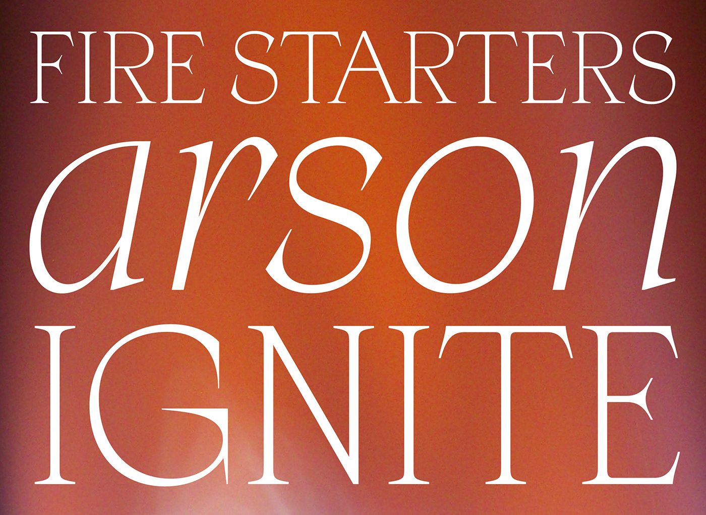
Apoc(alypse), type family.
Apoc, the battle between Light and Dark.
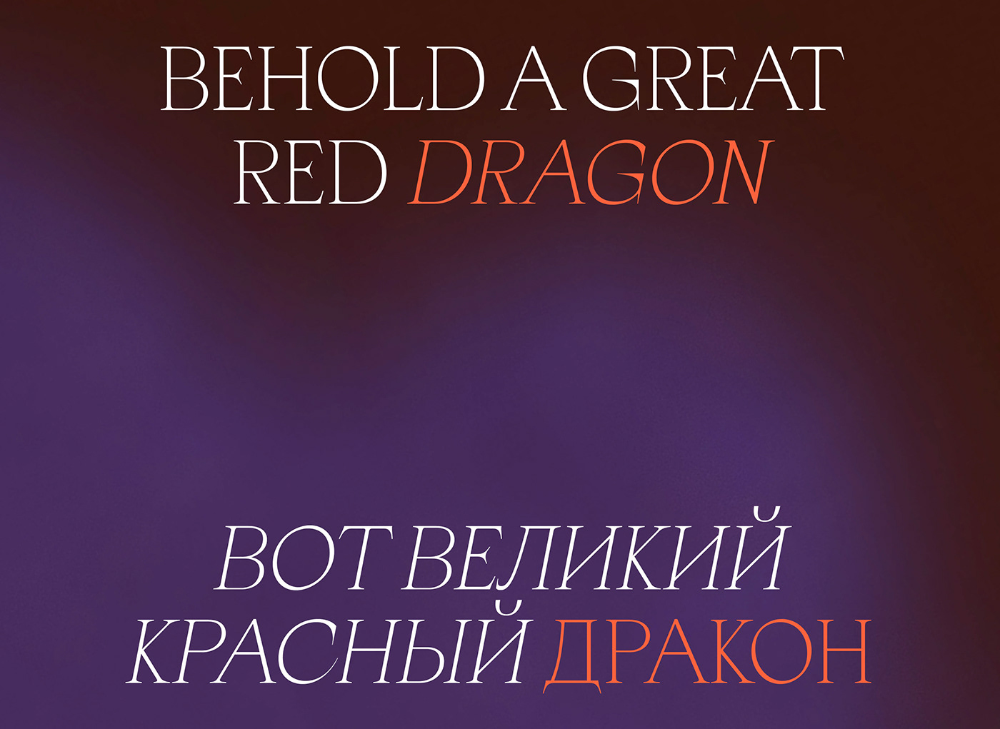
“As I stood upon the sand of the sea…”
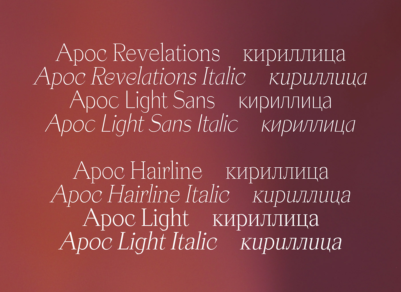
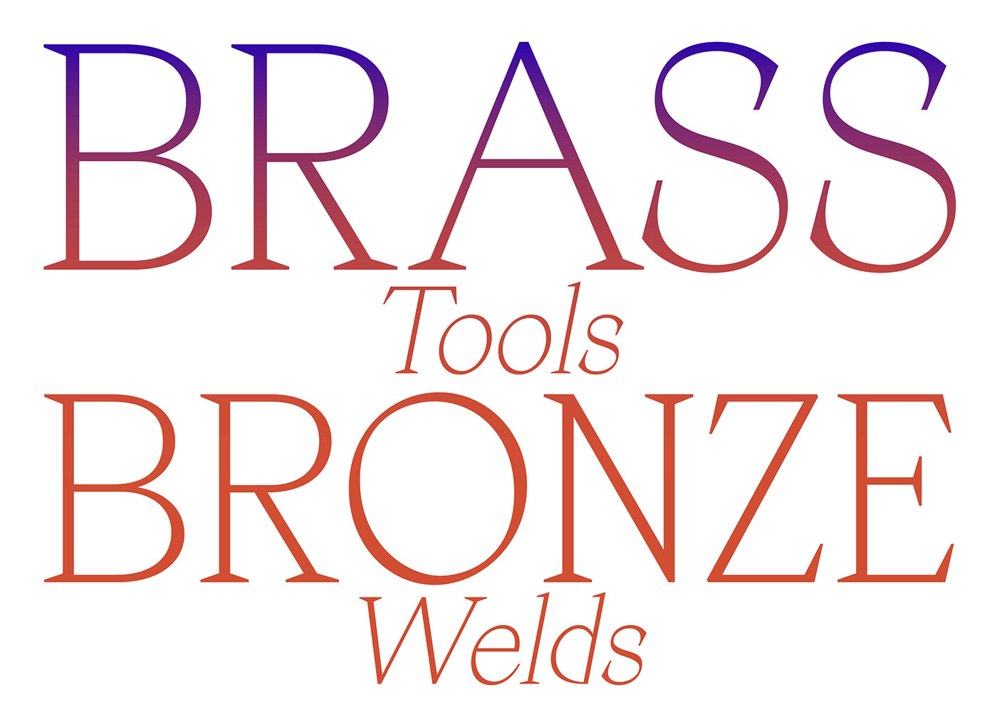
Apoc is a typeface family revolving around 16 fonts + Variable:
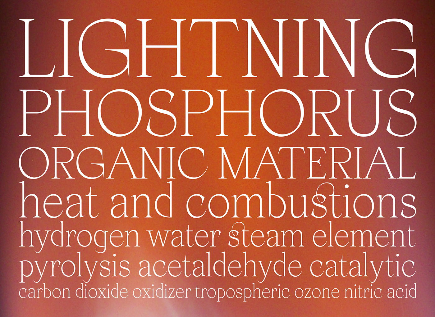
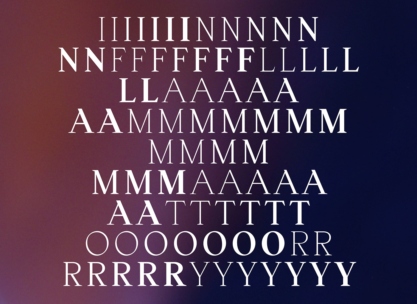
The design process started with the finding of a lettrage made for a book cover about the book of Revelations. It had clear historic links to Humanistic letter shape and proportions but somehow there was something refreshingly new in the way the counter-forms seem to be displayed. We build from there. Meant first as a custom-experimental project, it soon became a full-time commitment as we grew more and more fascinated by the kind of shapes we could design based on the few characters we had originally (“APOCALYPSE”, uppercases only).
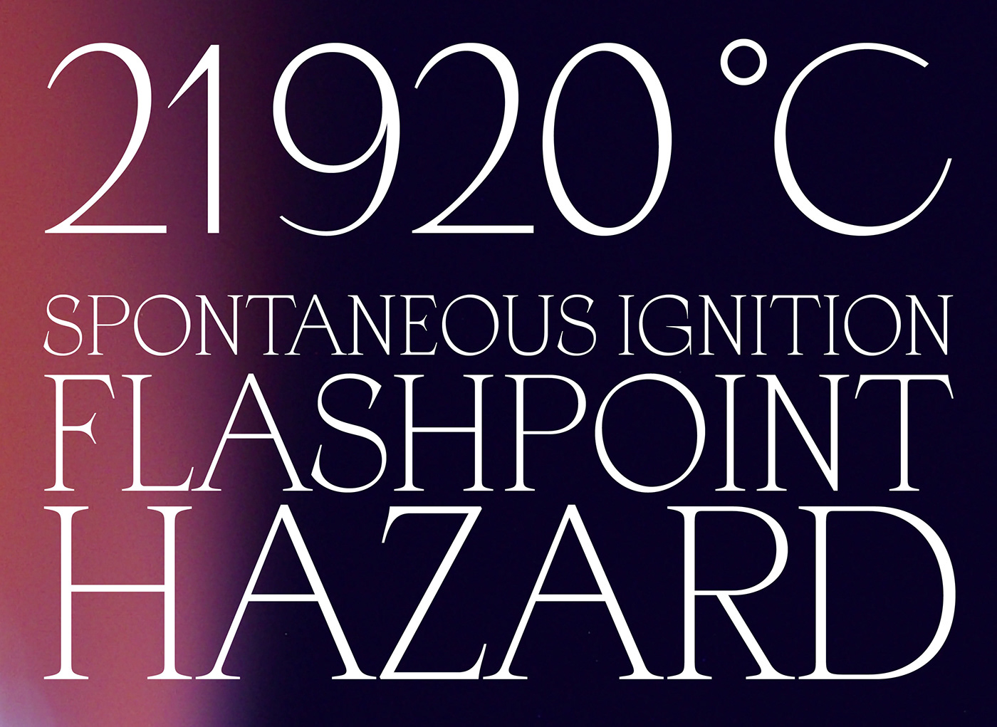
16 fonts available
Available in .OTF .EOT .WOFF .WOFF2
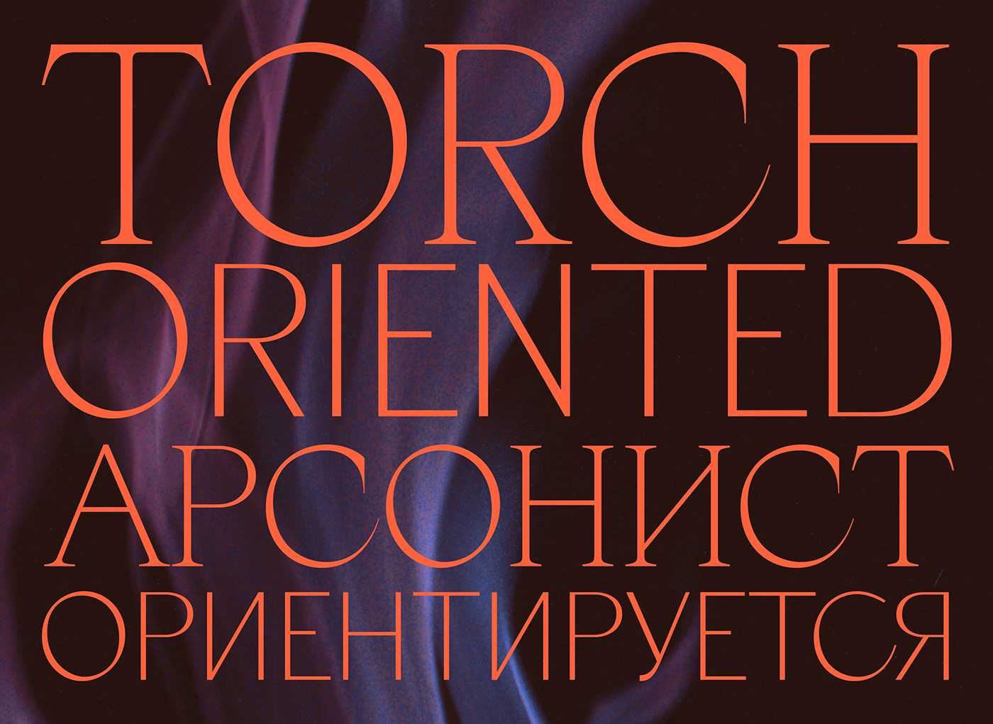
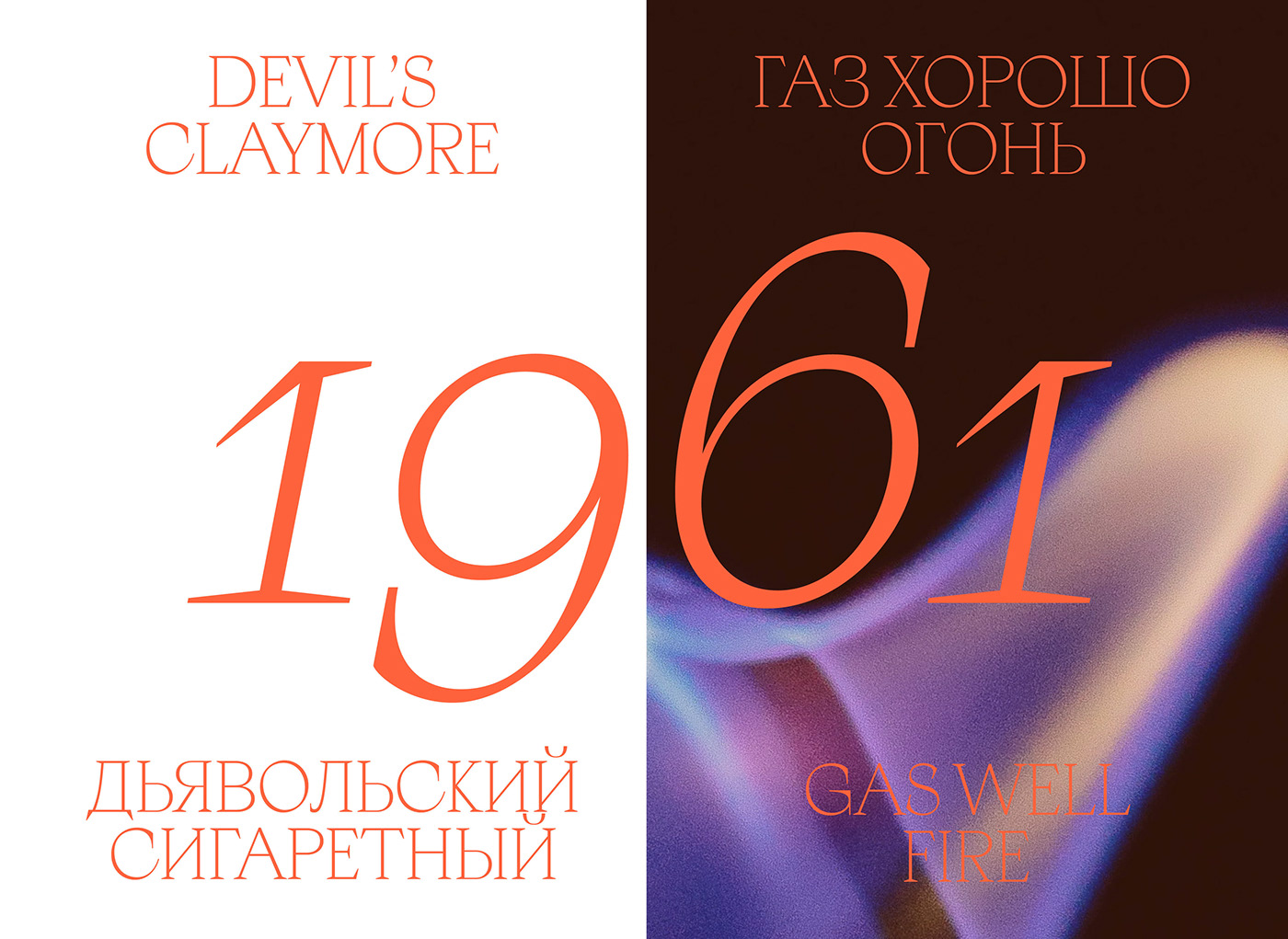
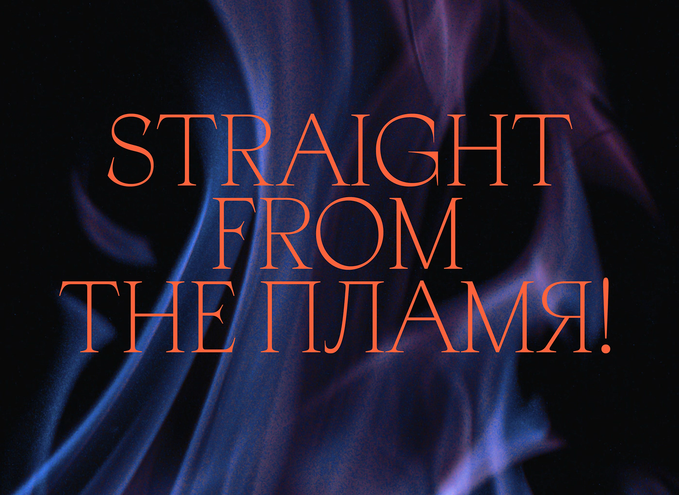
Developed for Latin European Languages
“As I stood upon the sand of the sea…”
Apoc is a typeface family revolving around 16 fonts + Variable:
The design process started with the finding of a lettrage made for a book cover about the book of Revelations. It had clear historic links to Humanistic letter shape and proportions but somehow there was something refreshingly new in the way the counter-forms seem to be displayed. We build from there. Meant first as a custom-experimental project, it soon became a full-time commitment as we grew more and more fascinated by the kind of shapes we could design based on the few characters we had originally (“APOCALYPSE”, uppercases only).
16 fonts available
Available in .OTF .EOT .WOFF .WOFF2
Developed for Latin European Languages
Variable Fonts available


Apoc(alypse), type family.
Apoc, the battle between Light and Dark.
“As I stood upon the sand of the sea…”
Apoc is a typeface family revolving around 16 fonts + Variable:
The design process started with the finding of a lettrage made for a book cover about the book of Revelations. It had clear historic links to Humanistic letter shape and proportions but somehow there was something refreshingly new in the way the counter-forms seem to be displayed. We build from there. Meant first as a custom-experimental project, it soon became a full-time commitment as we grew more and more fascinated by the kind of shapes we could design based on the few characters we had originally (“APOCALYPSE”, uppercases only).
16 fonts available
Available in .OTF .EOT .WOFF .WOFF2
Developed for Latin European Languages
Variable Fonts available


