


Logo Drinkenburg Speech therapy and dyslexia center.
The letter 'd' for Drinkburg en Dyslexie is made of the more legible typeface Open Dyslexis.
The letter 'd' for Drinkburg en Dyslexie is made of the more legible typeface Open Dyslexis.
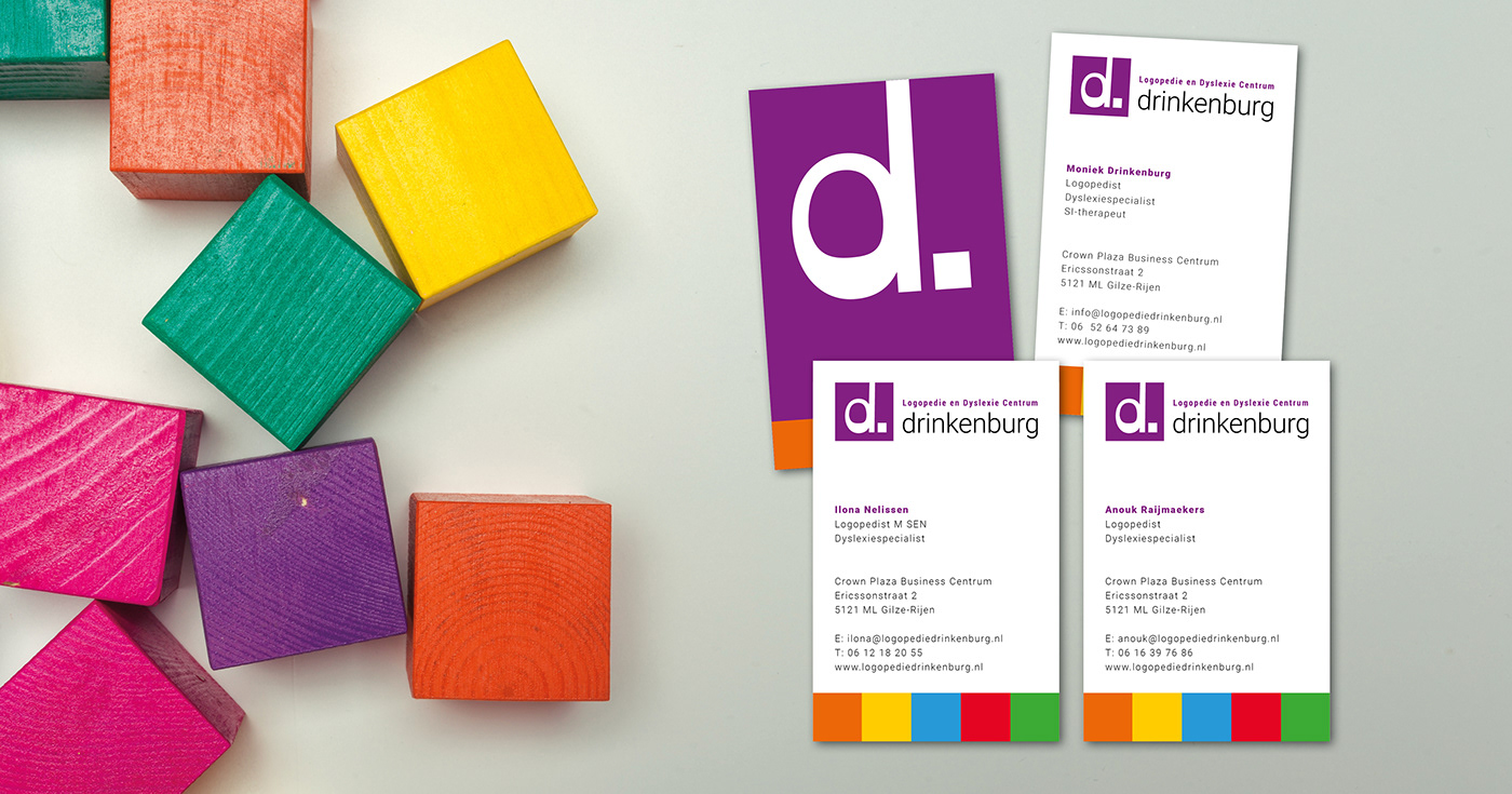
Business cards all four colleagues.
Design with colored blocks is based on the F&L method.
The F&L method® is a cognitive, linguistic method for reading and spelling. Reading and Games are provided in an integrated system. Reading teaching methods support spelling and vice versa.
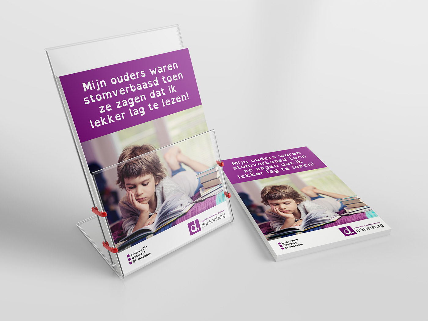
Flyer A5 The headline is set in the more legible typeface Open Dyslexis (concept).
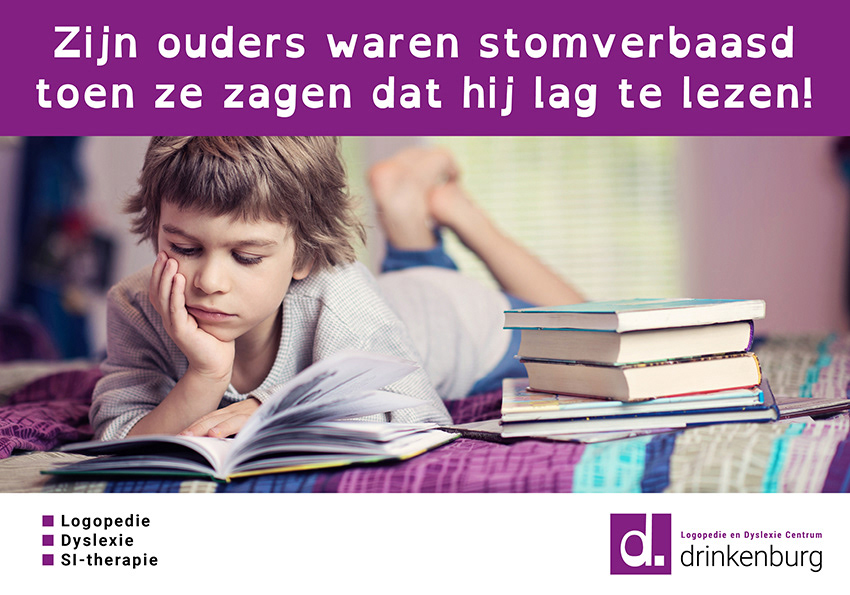
Poster headline: His parents were amazed to see that he was reading (concept)
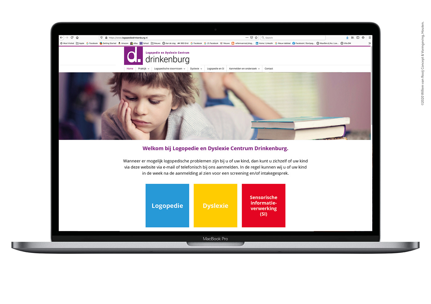
Website Drinkenburg (concept)


