Urbano | Audiovisual
A Urbano é uma empresa do segmento audiovisual que cuida de todas as etapas da produção, desde roteirização até a finalização. Fundada em 2020 com a proposta de "pensar e agir fora da caixinha", sendo assim, o manifesto principal gira em torno da liberdade criativa e do interesse em empreender.
-
Urbano is a company in the audiovisual segment that takes care of all stages of production, from scripting to completion. Founded in 2020 with the proposal to "think and act outside the box", therefore, the main manifesto revolves around creative freedom and interest in entrepreneurship.
A Urbano A Urbano tem a proposta de se diferenciar de tudo o que está no mercado hoje, na praça do Rio de Janeiro. Assim, realizamos o processo de naming com a intenção de chegar a um nome que descrevesse a dupla criativa por trás desse projeto: Nicolas e Luis. Audaciosos, compenetrados, descontraídos e 100% modernos. Atributos que foram decisivos para o nome Urbano, que representa além disso tudo, um senso de responsabilidade profissional de tornar real o sonho do cliente.
-
Urbano proposes to differentiate itself from everything on the market today, in the square of Rio de Janeiro. Thus, we carried out the naming process with the intention of coming up with a name that described the creative duo behind this project: Nicolas and Luis. Audacious, focused, relaxed and 100% modern. Attributes that were decisive for the name Urbano, which also represents a sense of professional responsibility to make the client's dream come true.

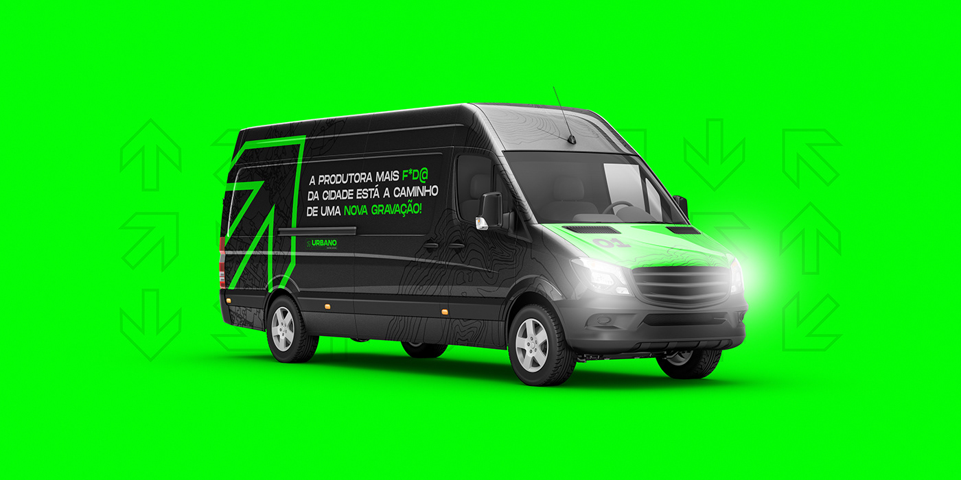
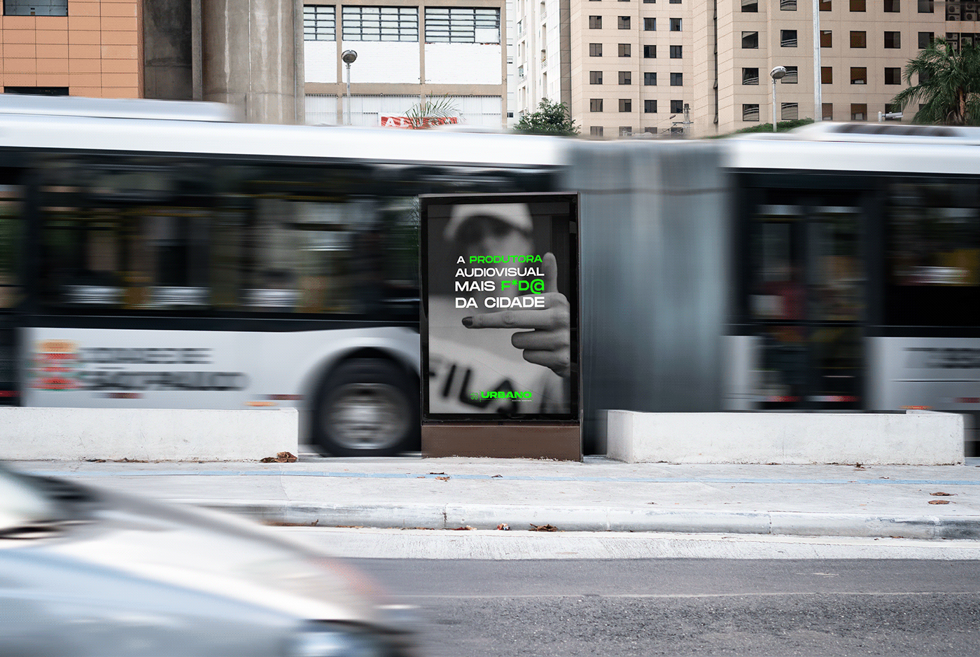
Dentro dos espaços que encontramos no mercado, identificamos algumas cores que fazem sentido para a marca, tendo em vista que ela é uma marca disruptiva e ousada. O Green Venom, o querido "verdão", foi extraído de um conceito que olha para as grandes metrópoles e observa que nelas são encontradas sinalizações de trânsito no tom verde. Dentro dessa perspectiva, o verde simboliza o caminho certo, a rebeldia e a ousadia.
-
Within the spaces that we find in the market, we have identified some colors that make sense for the brand, considering that it is a disruptive and daring brand. Green Venom, the beloved "verdão", was extracted from a concept that looks at large metropolises and notes that traffic signs in green are found in them. Within this perspective, green symbolizes the right path, rebellion and boldness.

O nome escolhido para a marca justifica-se pelas suas características mas também pela sua forma de atuação. Buscando ser algo atual e presente, o nome Urbano veio para ressignificar empresas do setor audiovisual no Rio de Janeiro.
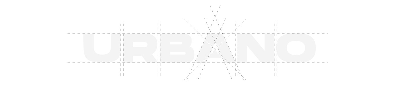
Diante do nome escolhido, buscamos um elemento que estivesse presente nas grandes metrópoles brasileiras e que fosse facilmente identificado. Procurando sinais nós encontramos, tanto no trânsito quanto nas placas de "saída", que continham o mesmo elemento, a seta. Ela é a responsável por apontar o caminho certo, por direcionar o leitor, é através das setas que podemos chegar ao objetivo final
-
The name chosen for the brand is justified by its characteristics but also by its way of acting. Seeking to be something current and present, the name Urbano came to reframe companies in the audiovisual sector in Rio de Janeiro.
Given the chosen name, we looked for an element that was present in the great Brazilian metropolises and that was easily identified. Looking for signs we found, both in traffic and on the "exit" signs, which contained the same element, the arrow. She is responsible for pointing the right path, for directing the reader, it is through the arrows that we can reach the final goal