


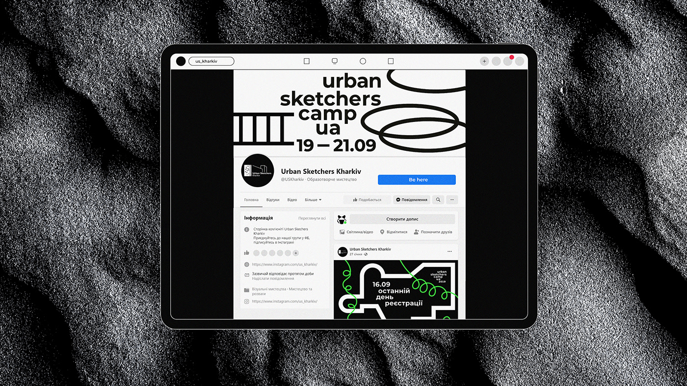
Identity for the Urban Sketchers Camp.
The Urban Sketchers Camp opens the forbidden territories for creative people. It provides an opportunity
to explore industrial zones which are usually closed for regular people. During one week participants were
able to visit 5 Kharkiv factories (Ukraine).
It is important to know, that Kharkiv was an industrial giant — more than 270 plants and factories during 1950-1980 years. Factories were the main job for many citizens. But now the factory is something unknown and romantic for millennials. So the main idea of the USC was to understand industrial spaces with the help of art.
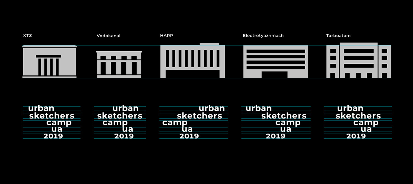
It's no great surprise that all factories are similar in shape (like a rectangle).
So, the logo is just structured in the factory space.
So, the logo is just structured in the factory space.
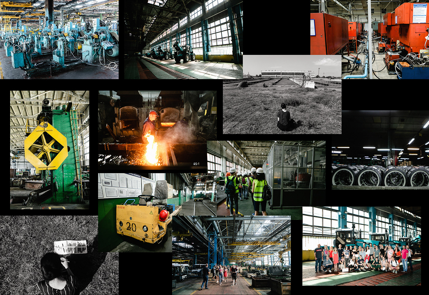
Photo by Pavel Dorogoy.

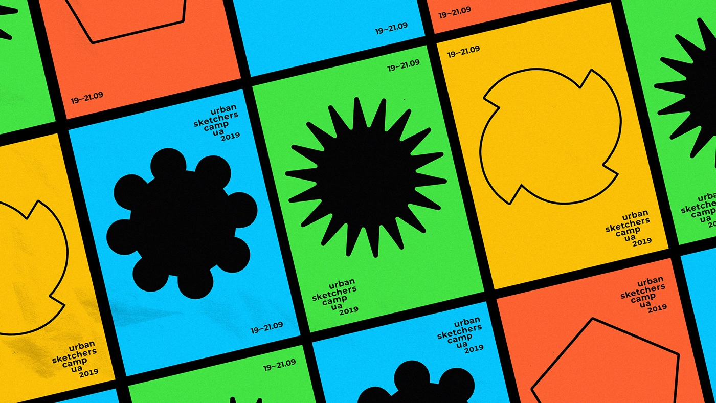
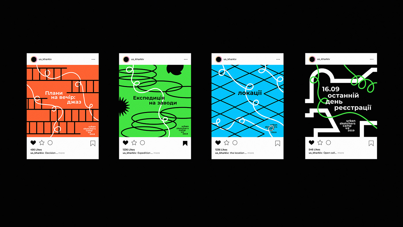
For ease of use, each factory received the icon. Actually, factories are colorful inside. They are full of bright yellow, green, blue, orange. Vibrant colors are necessary for worker safety.
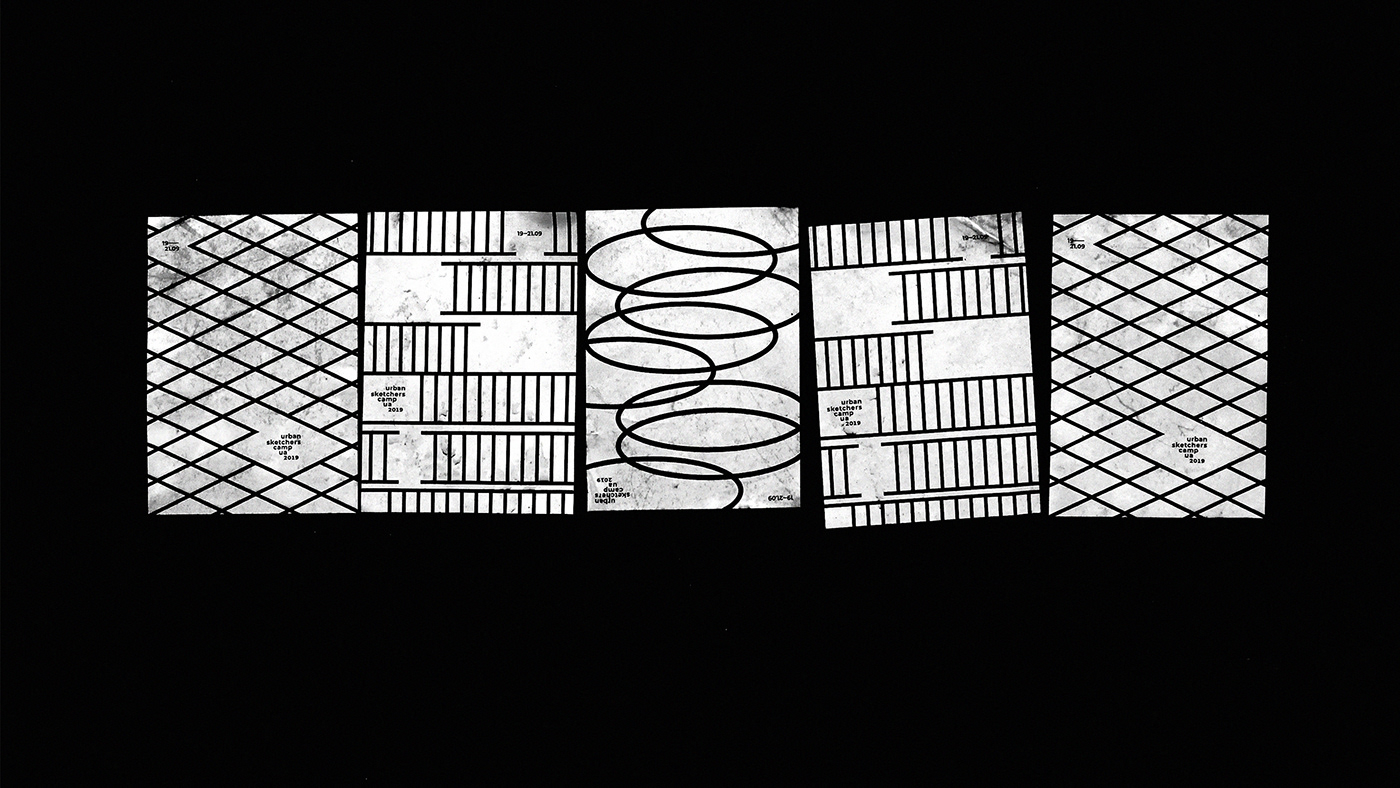
The zig-zag pattern fence which is used for protected areas has become an element of design identity.


Factories turn you on!


