Clean, crisp, rational, familiar, modern… serifed. Positype Scotch reaches back to history just enough to produce something warm and easy on the eyes. No corners were cut, no quick tricks… this type suite was drawn for specificity: Text, Display, and Deck… ALL in 3 widths that now include Condensed and Compressed. Each unique, each inter-connected, each part of the whole.
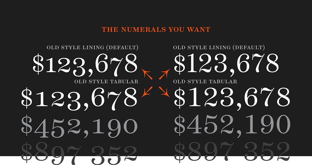
Scotch Text is offered in 6 weights with matching true italics. Drawn for economy and an easy read, the family is a workhorse for long-passage text settings. 4 sets of numerals, well-proportioned small caps, and a plethora of extras round out each font.
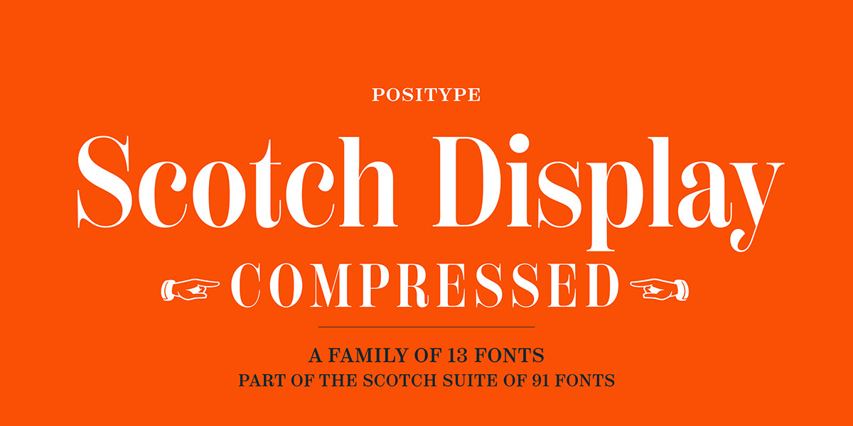
Scotch Display is not just a thinner version of Scotch Text wrapped in a higher contrast. Display sports shorter ascenders and descenders, a unique footprint, great contrast, and a more folded, calligraphic italics. Display subtly oozes sophistication and provides an attractive, exuberant companion to Scotch Text.
Scotch Deck rounds out the offering by choosing to be specific to its offering. Deck utilizes traits and proportions shared between Text and Display, but alters its overall mass to balance out the needs for settings that require sub headlines, callouts and other similar uses. Essentially, something not so high-contrast and not so stress dense that works great for middle-sizes.
GET SCOTCH DECK HERE!!!
GET SCOTCH TEXT HERE!!!
GET SCOTCH DISPLAY HERE!!!
GET SCOTCH DECK HERE!!!
GET SCOTCH TEXT HERE!!!
GET SCOTCH DISPLAY HERE!!!