White Leaf
The task with this project was to rebrand a well-established brand, which specializes in Corporate Responsibility. We needed a new logo, but also a brand identity which would fit all of the services.
The name of the brand already gave us an idea, however there was also a need for comprehensive visual identity system, which would use not only a graphic design theme, but also illustrations for the website and blog.


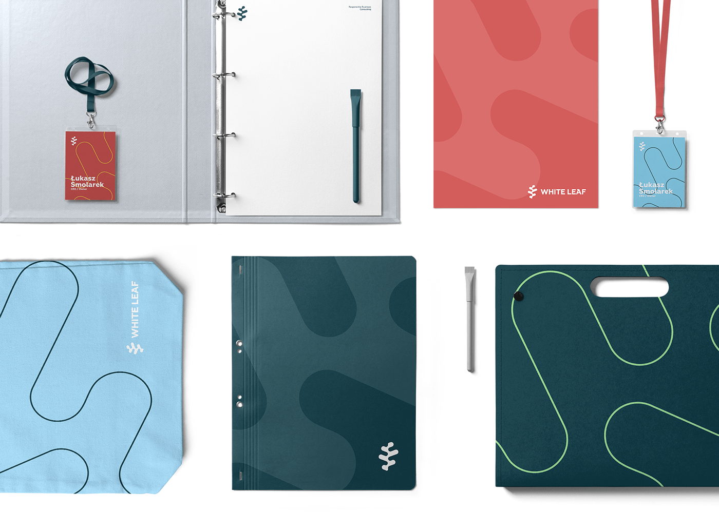
The main graphic theme is based on the logo and comes in two basic versions: full-color and line.
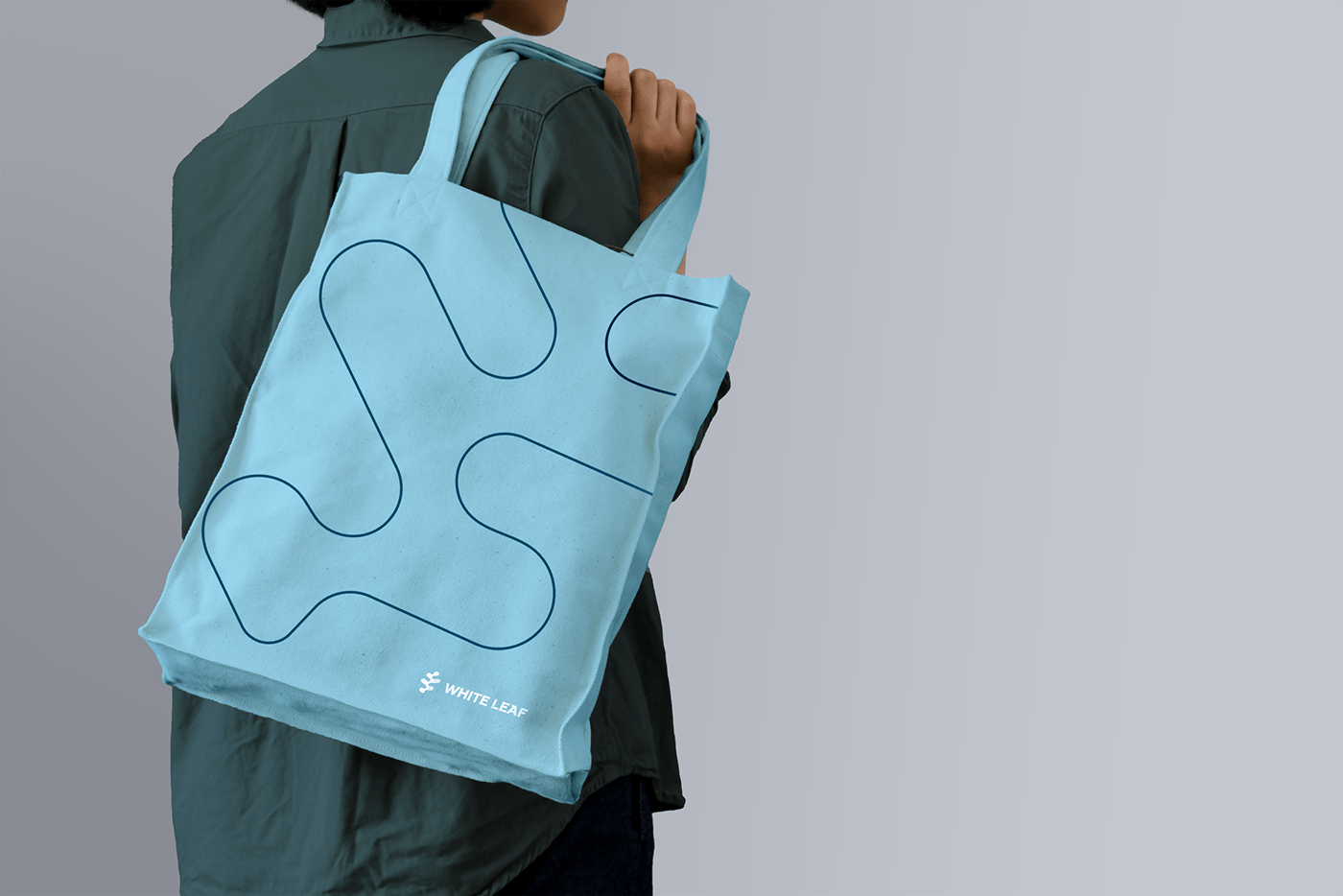
These two themes give the brand the right tools to create varied content. They can also be used in illustrations and illustrations combined with photos.

Brand identity theme


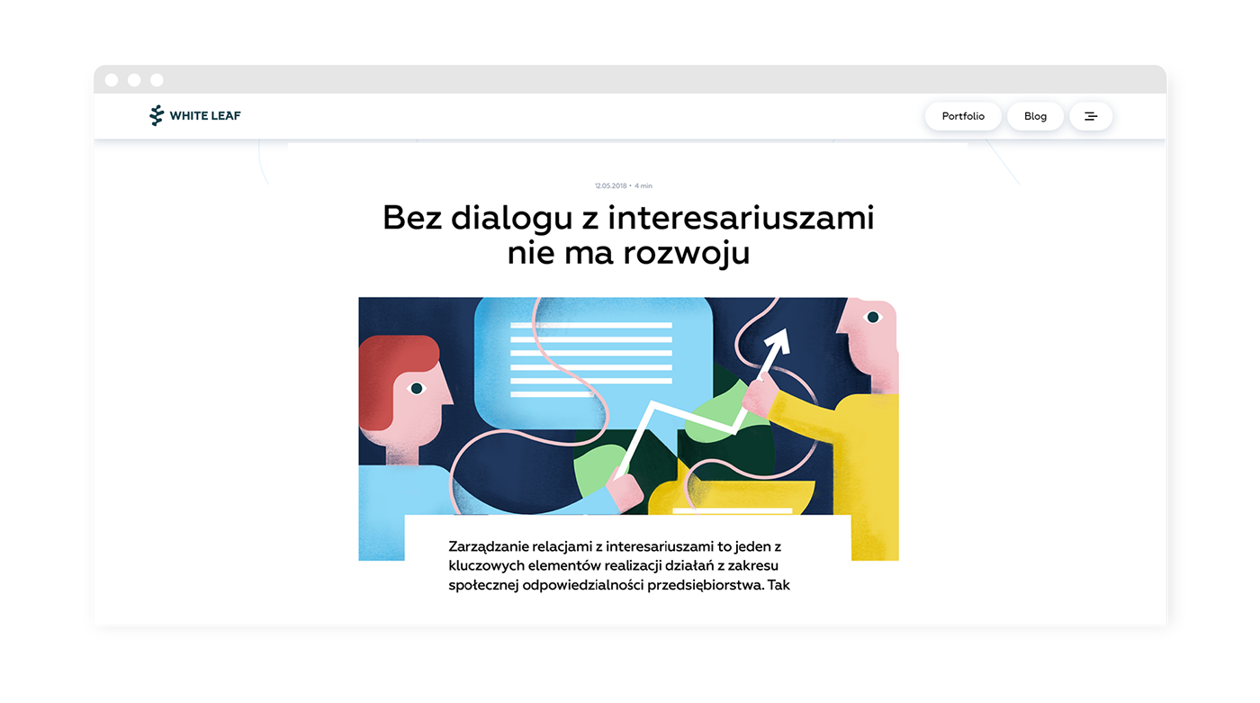
White Leaf's brand identity uses the graphic theme within illustrations which come in two forms: simpler ones which are used to illustrate the offer and process and more complex ones for the blog.
The brand identity system also establishes a system for the illustrations. The main concept here is that they use both, the full-color and the line graphic theme. Illustrations are also applied to photos and can be used this way throughout the brand identity.

Process Illustration: Human


Photos can be combined with the graphic theme to create additional illustrated content for the website.


Illustrations for the blog use brand colors and elements of the graphic theme. They are more complex to illustrate the theme of each blog post in a more direct way.