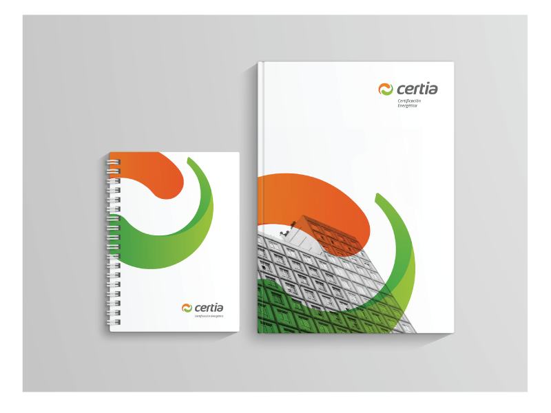
We have designed the identity of Certia with the intention of presenting a new image that transmits the values that clients expect and are willing to experience.
The logotype was designed by using a lower case typography with no finish with the intention of making the technical value and confidence more powerful.
The symbol is made up of curved shapes inspired by the shape of the letter “C” of Certia , an energetic cycle, the distinctive ranges of the energetic certifications from the A tag to the G, or the symbol of the ying-yang representing the equilibrium.
All in all, we tried to make the image professional, rigorous, technical, modern and familiar.
~
Hemos diseñado la identidad de Certia con la intención de presentar una nueva imagen que transmita los valores del cliente de la manera mas adecuada.
El logotipo se ha diseñado utilizando una tipografía en minúsculas y sin remates con la intención de potenciar el valor técnico y la confianza.
El símbolo son unas formas curvas inspiradas tanto por la forma de la letra “C” de “Certia”, un ciclo energético, los distintos rangos de las certificaciones energéticas (desde la etiqueta A a la G) o el símbolo del ying-yang, que representa el equilibrio.
Todas estas curvas tratan de proyectar una imagen profesional, de rigurosidad, de confianza, técnica y moderna.