


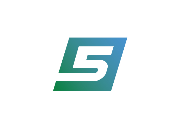
У хабаровского Завода Железобетонных Изделий был старомодный знак и небыло логотипа и фирменного стиля.
«Логохауз» поискал идею и нарисовал новый знак, логотип и определил небольшой фирменный стиль компании. Основная идея крутится вокруг Пятёрки как высшей отметки качества, массивности и веса железобетонных конструкций и цветов территории.
_
Khabarovsk ferro-concrete products factory was an old-fashioned sign and hasn't logo and corporate identity.
"Logohauz" searched the idea and create a new sign, logo and small company's corporate identity. The basic idea revolves around the Five as the highest level of quality, the massiveness and weight of ferro-concrete products and colors of territory.
"Logohauz" searched the idea and create a new sign, logo and small company's corporate identity. The basic idea revolves around the Five as the highest level of quality, the massiveness and weight of ferro-concrete products and colors of territory.

Вдохновляемся / Inspiration

Ищем знак / Find sign
Отрисовываем знак / Vektorize sign

Рисуем логотип / Logo draw

Делаем монохромные версии / Create monochromatic versions

Создаем микроверсию / Create microversion
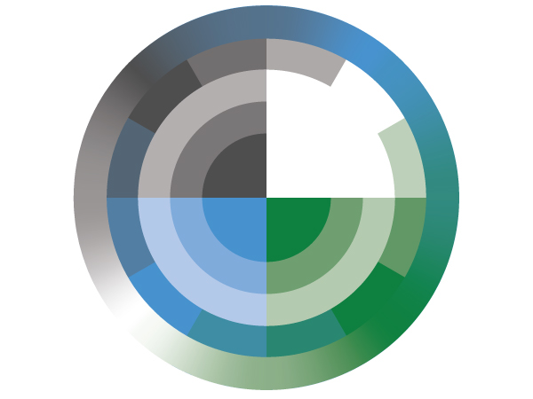
Создаем цветовую схему / Create color scheme

Подбираем шрифт / Select fonts

Генерируем орнамент / Generate pattern

Орнамент в работе / Test pattern

Создаем макеты фирменной полиграфии / Create printing layouts

Создаем макеты фирменной полиграфии / Create printing layouts

Создаем макеты фирменной полиграфии / Create printing layouts

Бетон на пятёрочку! / Best of concrete!


