


A global re-brand of the iconic and renowned post production company MPC. Short for Moving Picture Company, MPC wanted to re-brand their core business from the ground up, updating their visual identity to reflect a new and competitive global offering.
Steeped in heritage, this re-brand took over two years to complete, and draws a loop back to the origination of MPC over twenty years ago.

Moved by...
The whole identity is based on the ‘movement’ within Moving Picture Company. A studio that brings things to life, moving images and moving you, the audience. This concept has been instilled in the tagline, which is always changing.


A Moving Brand Icon
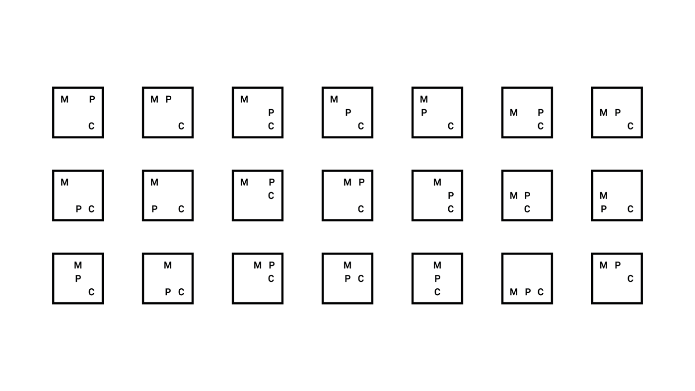
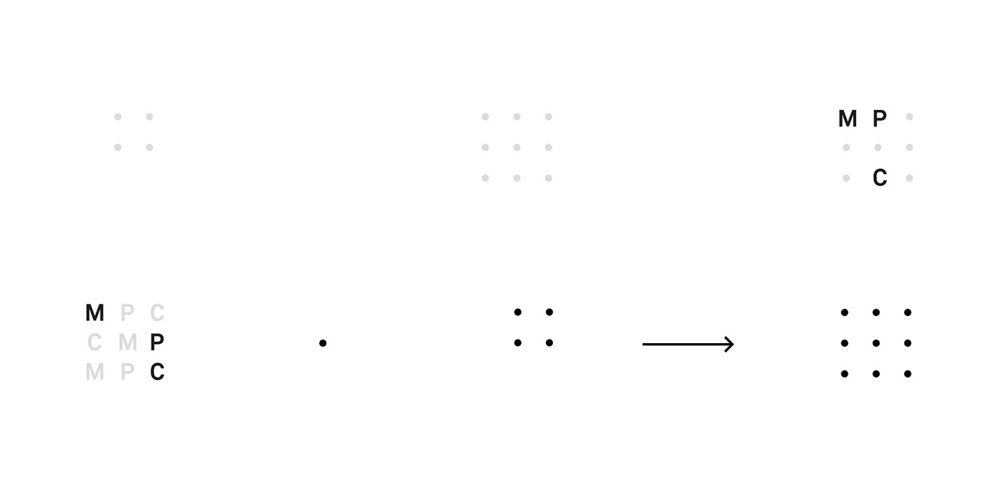
As the Moving Picture Company is always moving forward, do does it’s identity. Based on a grid of nine different positions for each letter, there are thousands of possible logo permutations.


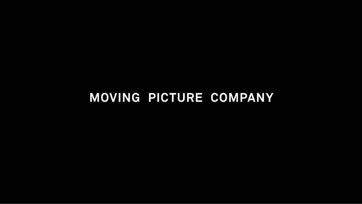
Long-form & short-form.
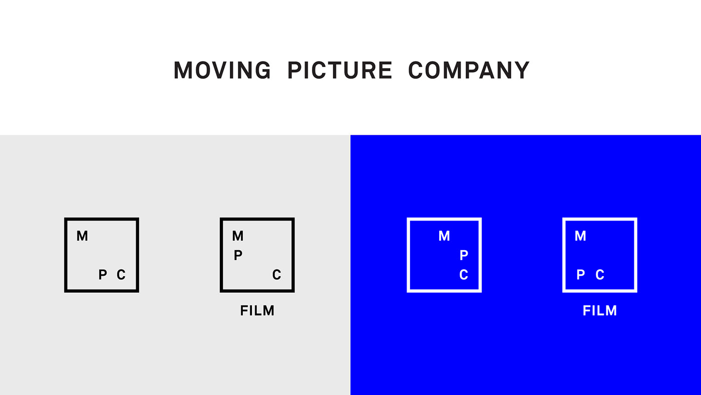
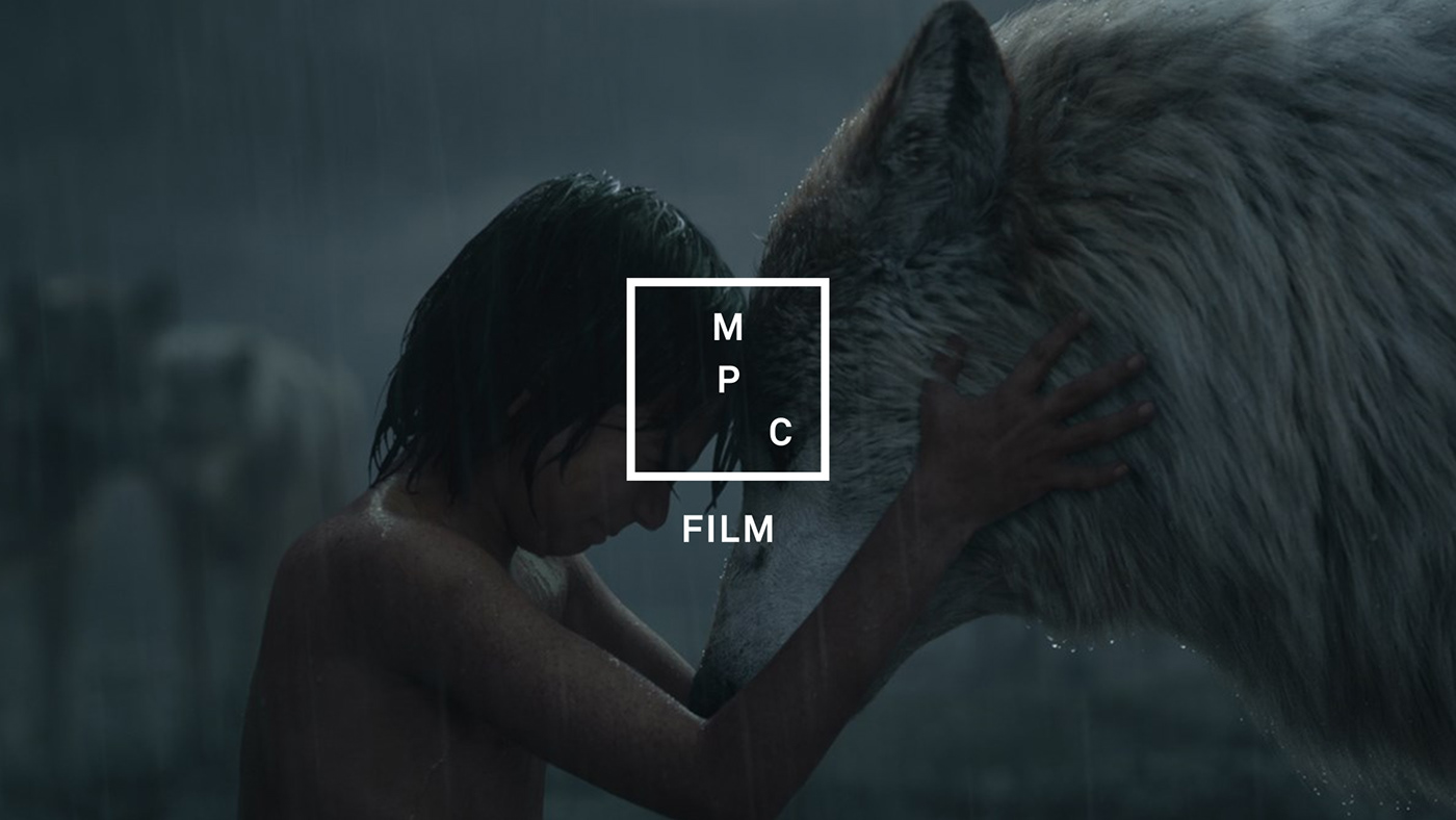
MPC or Moving Picture Company? Rather than hide behind an acronym, this re-brand celebrates the heritage behind the name. Two logo-marks were developed for different use cases, allowing formal and informal brand communication.


Colour
The brand doesn’t have one accent colour, rather it has them all. A monochromatic brand identity was developed, to work with a huge library of colourful work. Where necessary, an iridescent colour approach is adopted.


Iridescent foil blocking
Continuing this theme of transitional colour, the stationery was decorated with special foil blocking printing techniques that showcases a different spectrum depending on available light and angle of viewing.


Further credits
Creative Director – Antar Walker
Design – Antar Walker & Manuel Sepulveda
Client – MPC
Printers – Calverts


