Rockwell Razors
Brand Identity | Package Design
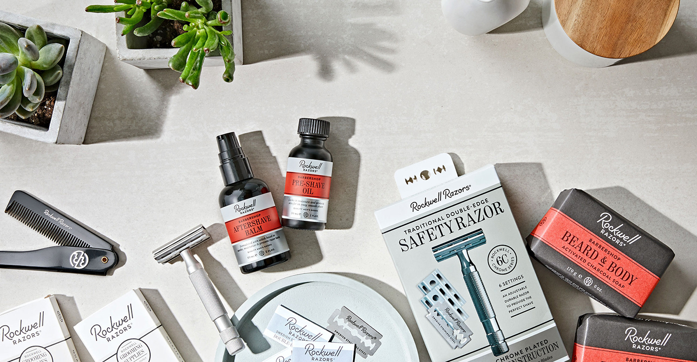
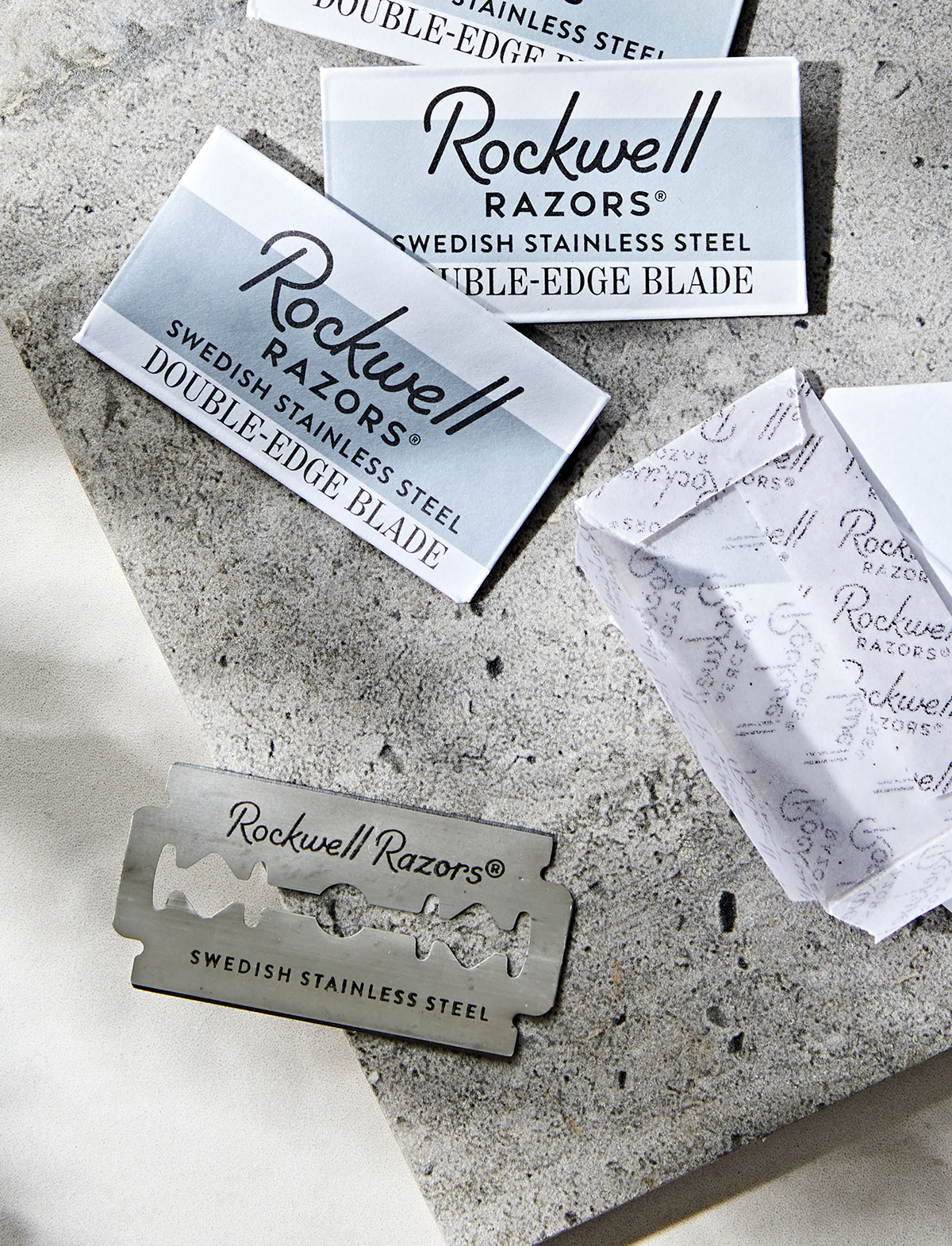
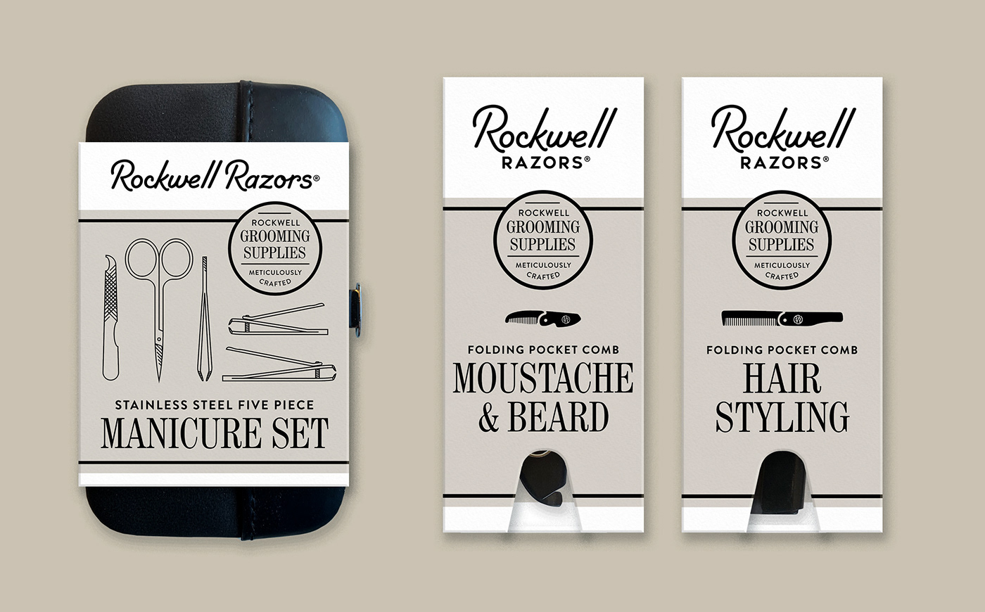
Rockwell Razors started as a men’s grooming company that came up with a smart solution to costly cartridge razors and the unappealing trap of gimmicky shave clubs. They re-engineered the classic double-edged razor to provide adjustability and use affordable disposable blades, fulfilling the shaving needs of the modern gentleman.
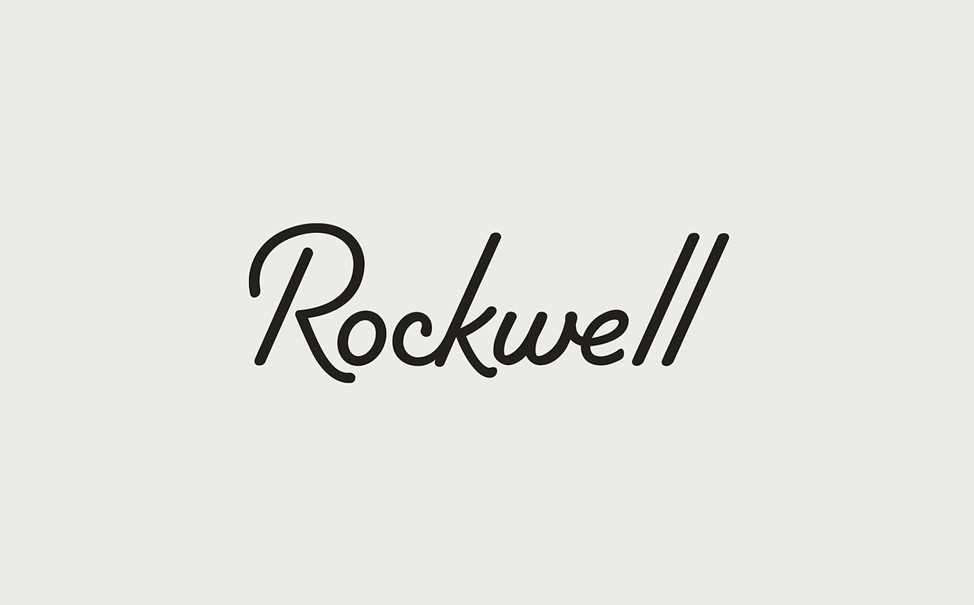
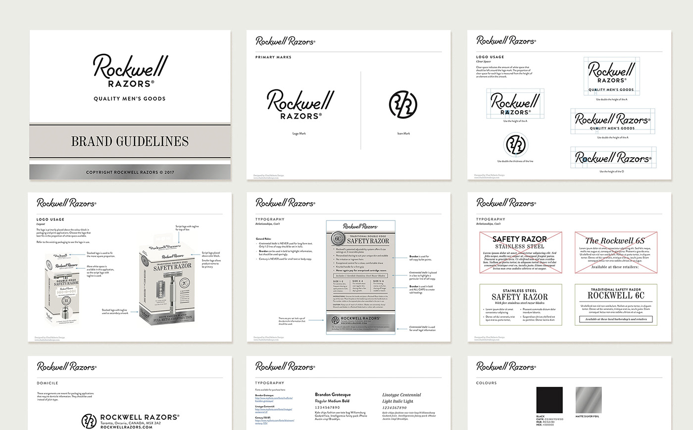
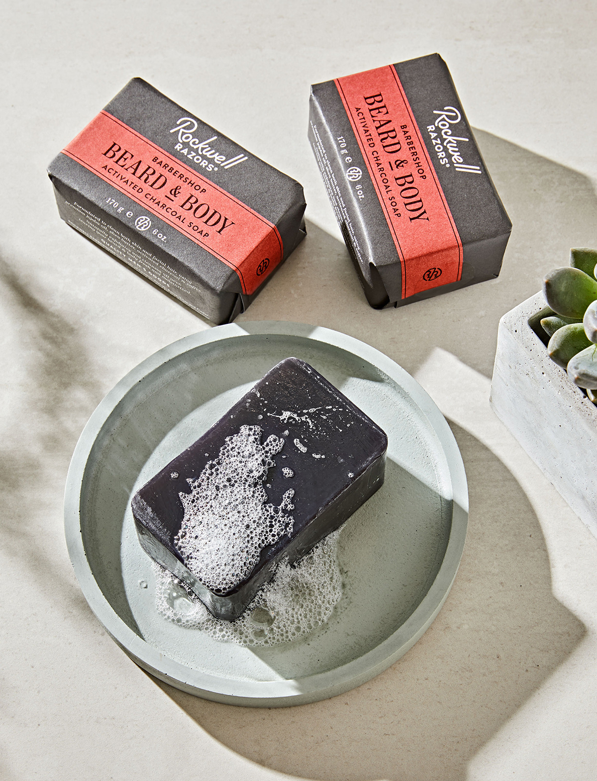
Rockwell Razors products were growing fast from startup to established business when the studio was asked to help bring a cohesive visual identity to its brand. The monoline, script-inflected wordmark and the monogram pay tribute to midcentury craftsmanship, as do the soft colour tones.
Rockwell Razors, Toronto ON Canada
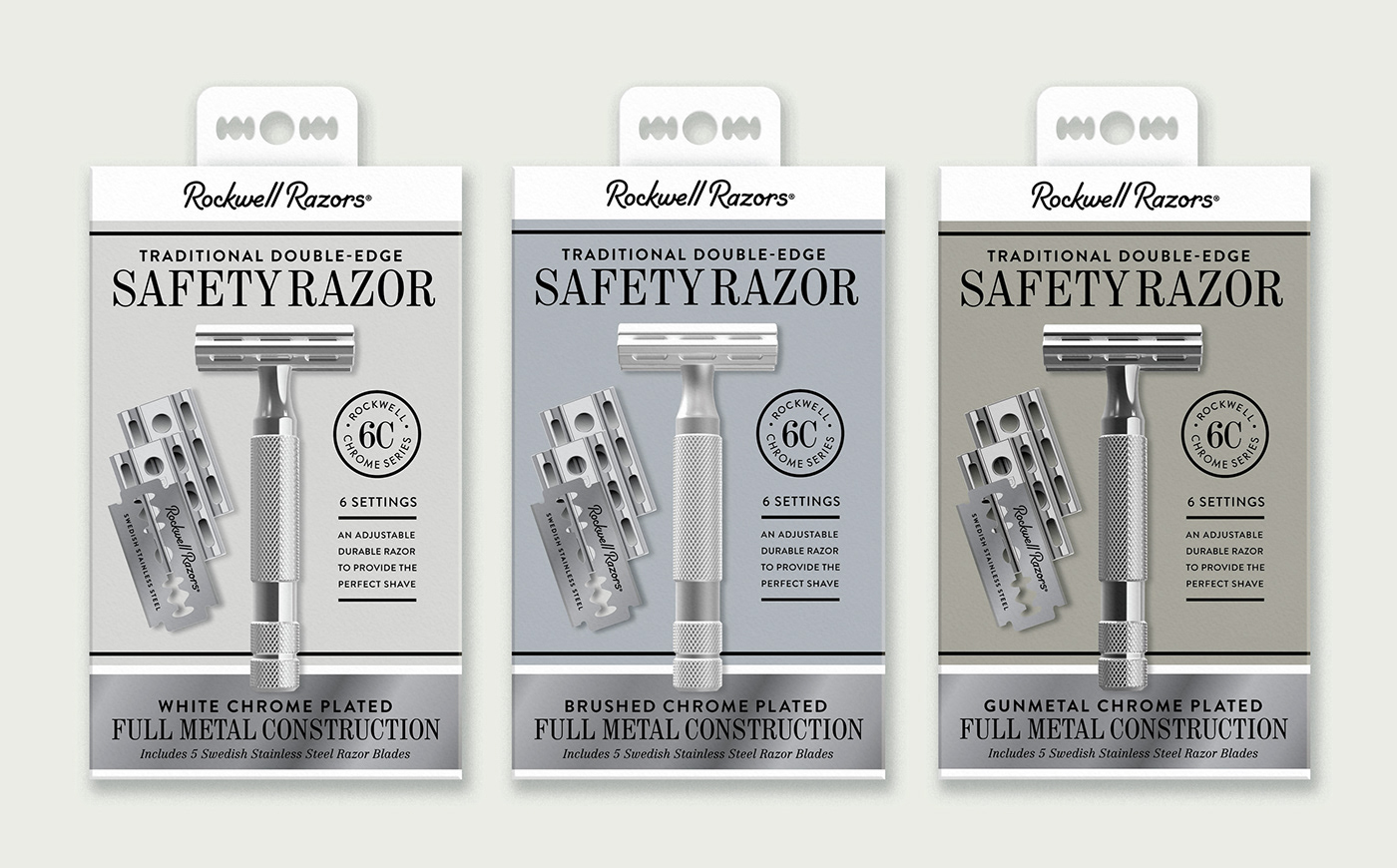
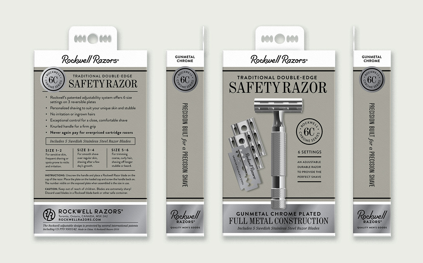
The system we devised for the package design considers the logical structure of information hierarchy, allowing room for product descriptions and messaging. Bands of metallic colour reference the premium steel finishes of the razors and the industrial strength of the brand.


View more work at ChadRobertsDesign.ca


