
Good Pantry
Naming | Brand Identity | Copywriting | Package Design | Art Direction
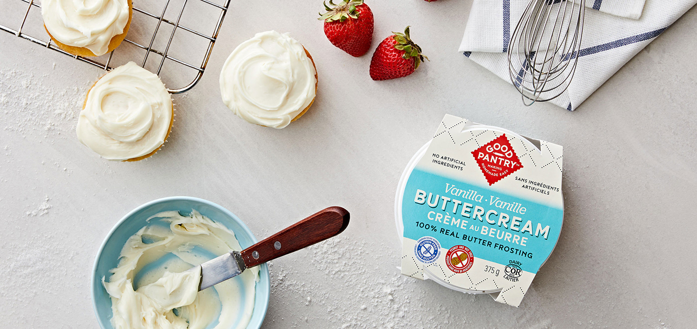
Good Pantry makes a true buttercream that’s ideal for people who want to bake at home, but don’t have the extra time to make their own frosting.
Originally called Real Layers, the clients wanted a new name so that they weren’t limited to the connection to frosting. They wanted their brand to work for a broader line of baking products. After identifying their core values and primary target market, the name Good Pantry was chosen to capture a pantry stocked with only real ingredients and the wholesome lifestyle that most parents aspire to provide to their families. We also came up with the tagline ‘Making Homemade Easy’, to concisely express the brand objective.
Real Layers Baking Inc., Toronto ON Canada


The old packaging was confusing to the consumer and didn’t clearly reflect quality, convenience, or the product itself. A competitive analysis guided us on restructuring the hierarchy of the packaging sleeve, better communicating that it was buttercream frosting made with 100% real butter. We put only the most important information on the top panel, conveying flavour through larger type and better colour blocking.


The use of custom lettering and pattern, as well as improved type and colour, intelligibly position the new brand identity and packaging in the world of homemade, quality baked goods.


View more work at ChadRobertsDesign.ca


