

Improving the Mr. Pickle's Sandwich Shop app experience — a UX case study
Heuristic evaluation and unsolicited redesign
Overview
Founded by Frank Fagundes, Mr. Pickle's Sandwich Shop aims to deliver quick service and quality ingredients to customers like me. However, after downloading the app, I discovered it was frustrating and difficult to navigate. I read a few reviews on the app store detailing the same frustrations and decided to conduct an individual heuristic evaluation utilizing Jakob Nielsen's 10 heuristics and rating scale. After my evaluation, I designed user-friendly solutions I validated through usability testing. Furthermore, I pursued this redesign to challenge myself and improve the overall experience.
Disclaimer: I am not affiliated with Mr. Pickle's Sandwich Shop.
Role: UX Designer, UX Researcher
Time: Sept 2020 - Nov 2020
Tools: Figma, Lookback, Miro, WebAIM, Stylify Me, Adobe Illustrator
Project Challenge
I realized I had a big project on my hands after observing an overwhelming number of usability problems. Nonetheless, my objectives remained the same: conduct a heuristic evaluation and design a more relevant app with enhanced UI and user-friendly interfaces.
Research and Analysis
In the beginning phases of my project, I explored the ins and outs of the existing app and even placed a few orders (yum!) throughout my design process to get a full understanding of the online ordering experience. Throughout my analysis, I referred to Jakob Nielsen's 10 Usability Heuristics for User Interface Design and Severity Ratings for Usability Problems, to help me categorize each and every usability violation. Ultimately, I discovered the app violated 9/10 of the following usability heuristics:
1: Visibility of system status
2: Match between system and the real world
3: User control and freedom
4: Consistency and standards
5: Error prevention
6: Recognition rather than recall
7: Flexibility and efficiency of use
8: Aesthetic and minimalist design
10: Help and documentation
2: Match between system and the real world
3: User control and freedom
4: Consistency and standards
5: Error prevention
6: Recognition rather than recall
7: Flexibility and efficiency of use
8: Aesthetic and minimalist design
10: Help and documentation
Low Fidelity Prototypes and Usability Testing
After evaluating the current usability violations, I brainstormed and sketched a few different ideas until I reached the following design solution. I then tested two task flows and iterated my design based on feedback from Task 1.
In Miro, I created a customer journey map to display where the user experienced frustration for Task 1.
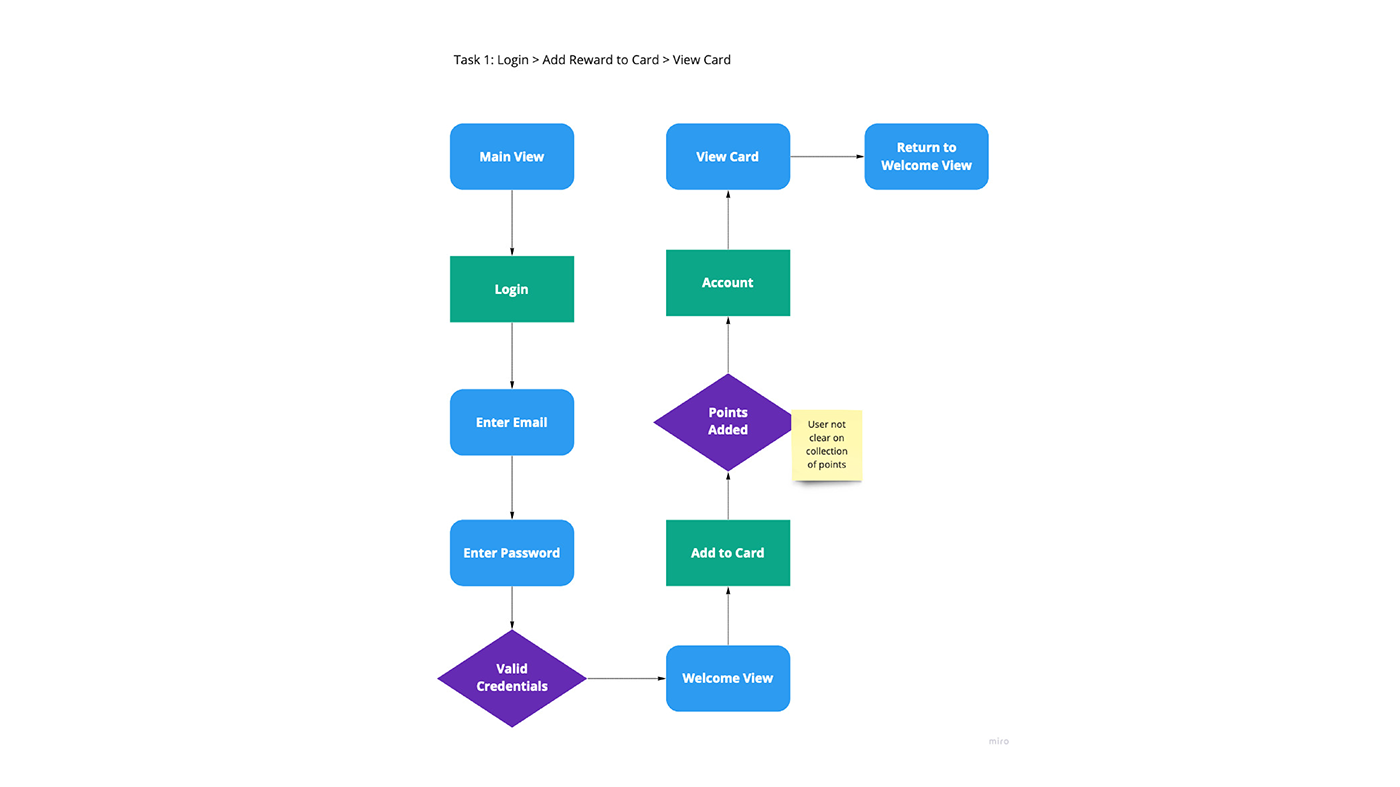
Based on the user's feedback, I iterated my design to clarify the Points Added portion of the user flow.
Heuristic Evaluation and Redesigned Experiences
Now on to the final design solutions.
For the experiences with the most severe usability violations, I provided annotated screens and severity rating scales, in addition to categorized descriptions of each violation. Then, I provided annotated screens and explanations of my redesign. Finally, I made sure to incorporate the existing colors, graphics and typography from the current Mr. Pickle's style guide.
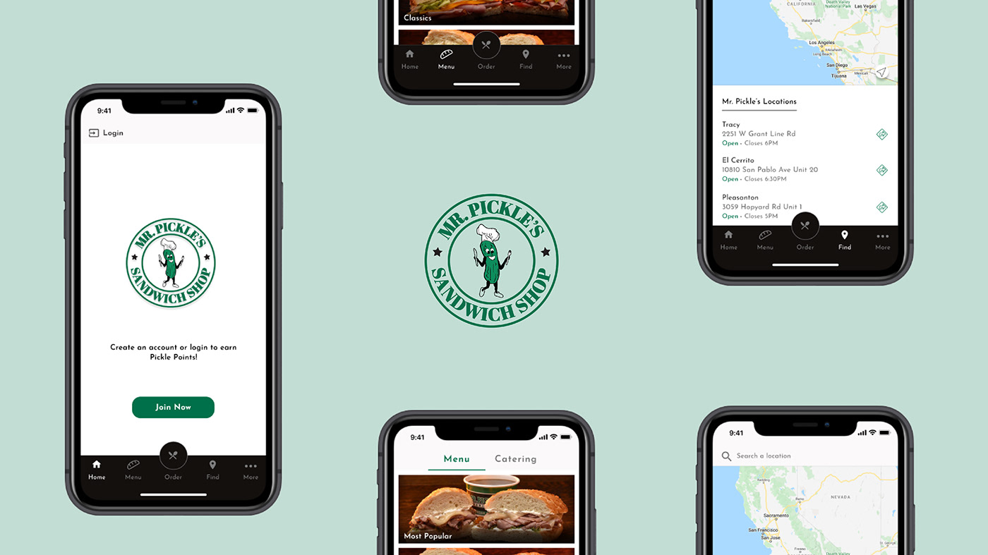
Experience #1: Home Page
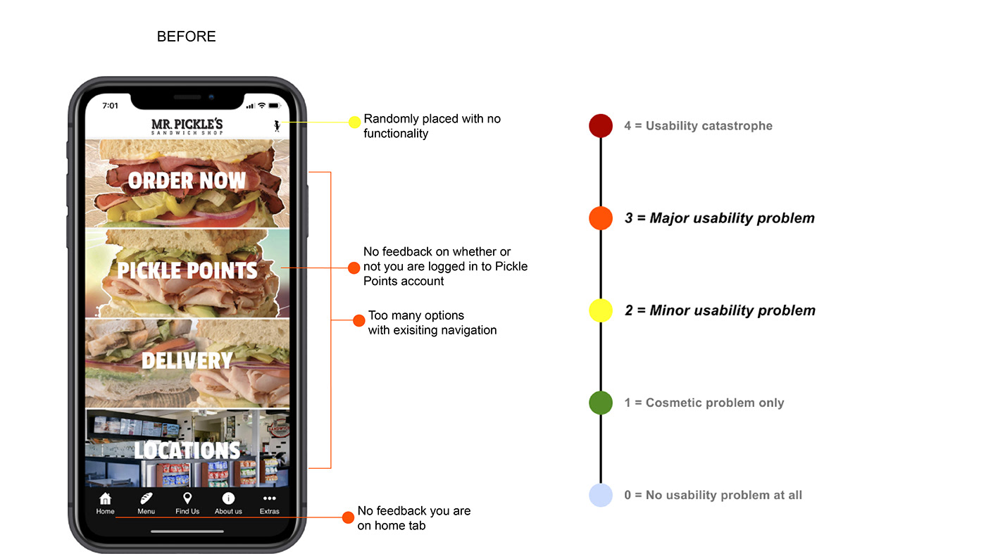
Currently, the Mr. Pickle's home screen violates the following 3/10 usability heuristics: #1: visibility of system status, #8: aesthetic and minimalist design, and #10: help and documentation.
Currently, the Mr. Pickle's home screen violates the following 3/10 usability heuristics: #1: visibility of system status, #8: aesthetic and minimalist design, and #10: help and documentation.
Visibility of system status
The navigation tab does not indicate you are on the home screen, since all of the tabs are the same color. Furthermore, the home screen does not update to inform the status of new or logged in Pickle Points accounts.
The navigation tab does not indicate you are on the home screen, since all of the tabs are the same color. Furthermore, the home screen does not update to inform the status of new or logged in Pickle Points accounts.
Aesthetic and minimalist design
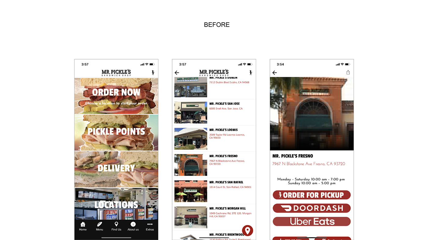
The existing options on the home screen are a bit overwhelming; "Locations", "Delivery", "Order Now" and "Find Us" link you to the same exact screen. Additionally, the Mr. Pickle's image in the right-hand corner of the screen is useless and oddly placed.
The existing options on the home screen are a bit overwhelming; "Locations", "Delivery", "Order Now" and "Find Us" link you to the same exact screen. Additionally, the Mr. Pickle's image in the right-hand corner of the screen is useless and oddly placed.
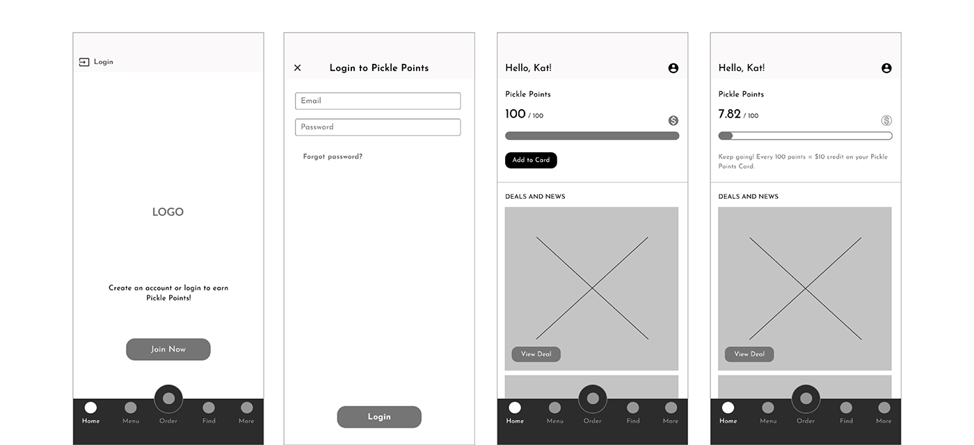
Help and documentation
Mr. Pickle's Sandwich Shop has a loyalty program called Pickle Points where you can earn points and rewards for ordering. The home screen shows the Pickle Points option, but there is no information to help you login or get started.
Mr. Pickle's Sandwich Shop has a loyalty program called Pickle Points where you can earn points and rewards for ordering. The home screen shows the Pickle Points option, but there is no information to help you login or get started.
Redesigned Experience
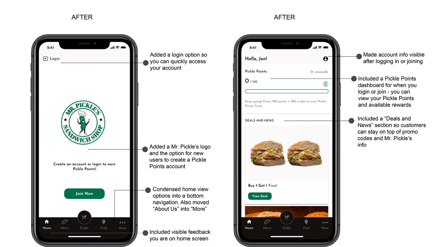
As you can see below, I fixed the usability errors and redesigned the home screen to accommodate new and existing users. Additionally, since there is no definitive Mr. Pickle's logo, I created a simple one in Adobe Illustrator; I placed the Mr. Pickle's icon in the center of the logo, then placed the logo in the center on the home screen. I also created a Pickle Points on-boarding experience by adding the login/join options on the home screen. Once you login or join, your account is visible and you can access your Pickle Points information via the profile icon. Next, I included feedback to differentiate the active vs inactive tabs on the bottom navigation, so you can easily switch from screen to screen. Finally, I cleaned up the home screen options and condensed them into a single bottom navigation. I also made the "Order" tab stand out to ensure a quick and easy ordering process.
As you can see below, I fixed the usability errors and redesigned the home screen to accommodate new and existing users. Additionally, since there is no definitive Mr. Pickle's logo, I created a simple one in Adobe Illustrator; I placed the Mr. Pickle's icon in the center of the logo, then placed the logo in the center on the home screen. I also created a Pickle Points on-boarding experience by adding the login/join options on the home screen. Once you login or join, your account is visible and you can access your Pickle Points information via the profile icon. Next, I included feedback to differentiate the active vs inactive tabs on the bottom navigation, so you can easily switch from screen to screen. Finally, I cleaned up the home screen options and condensed them into a single bottom navigation. I also made the "Order" tab stand out to ensure a quick and easy ordering process.
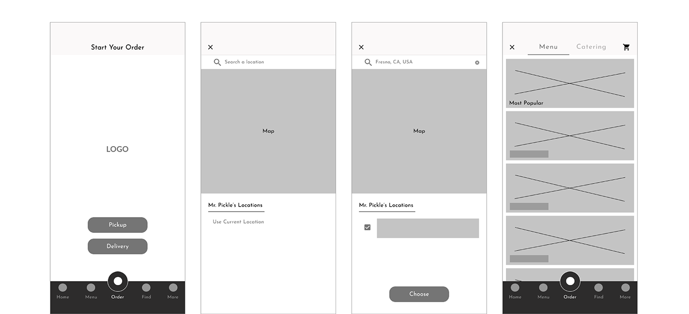
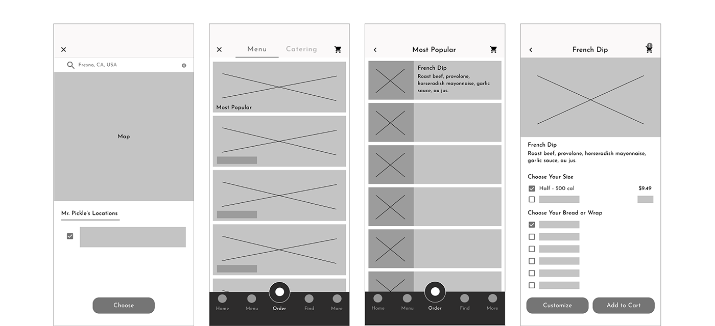
Experience #2: Order for Pickup
The existing order flow violates the following 6/10 usability heuristics: #1: visibility of system status, #3: user control and freedom, #4: consistency and standards, #5: error prevention, #7: flexibility and efficiency of use and #8: aesthetic and minimalist design.
The existing order flow violates the following 6/10 usability heuristics: #1: visibility of system status, #3: user control and freedom, #4: consistency and standards, #5: error prevention, #7: flexibility and efficiency of use and #8: aesthetic and minimalist design.
Visibility of system status
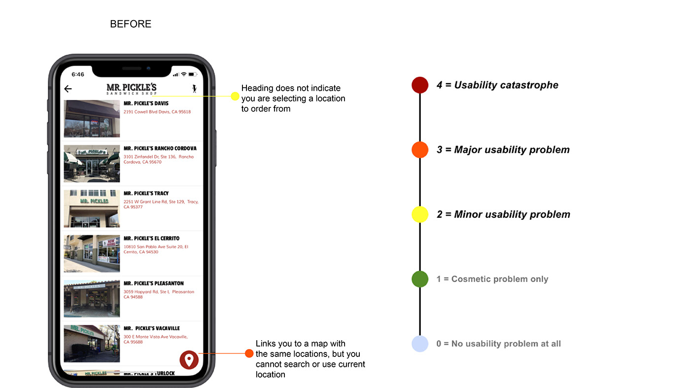
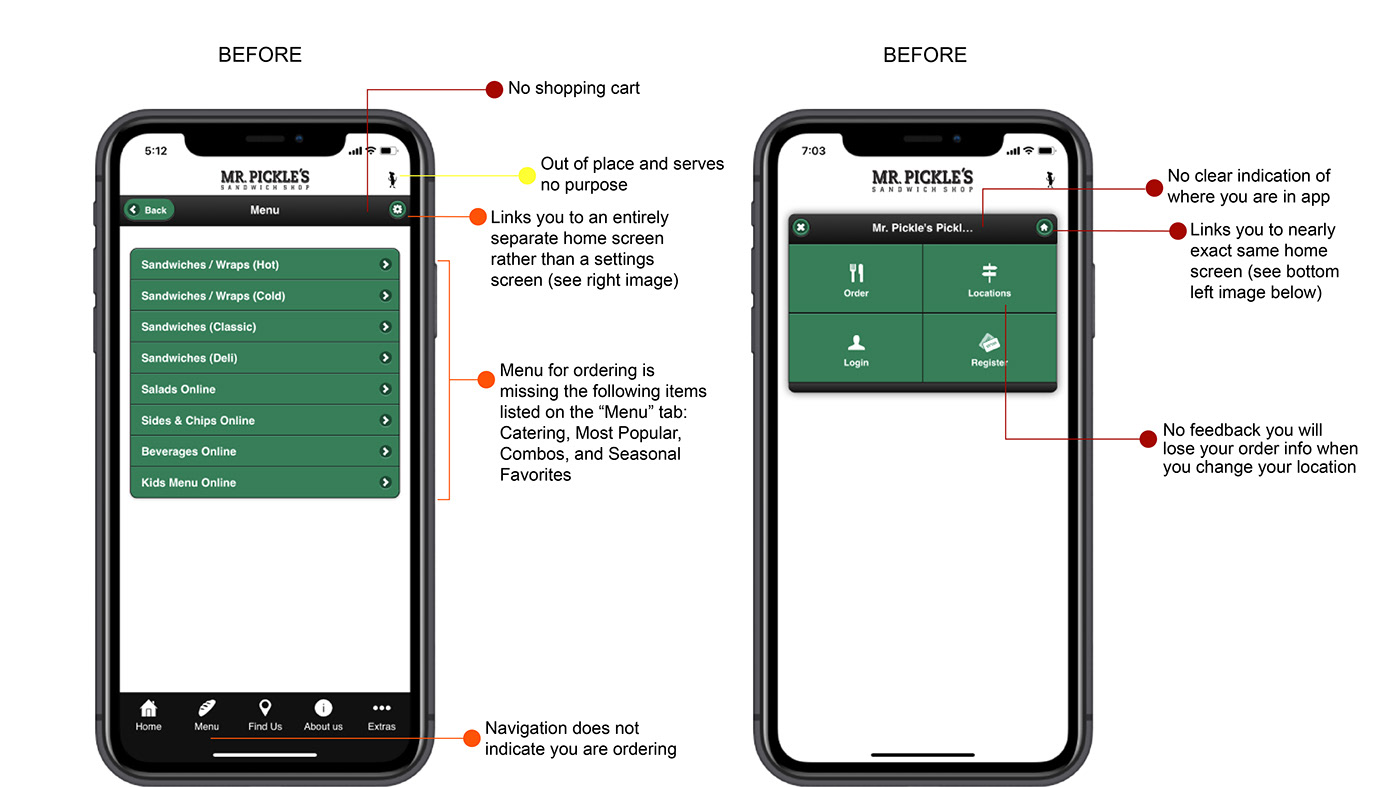
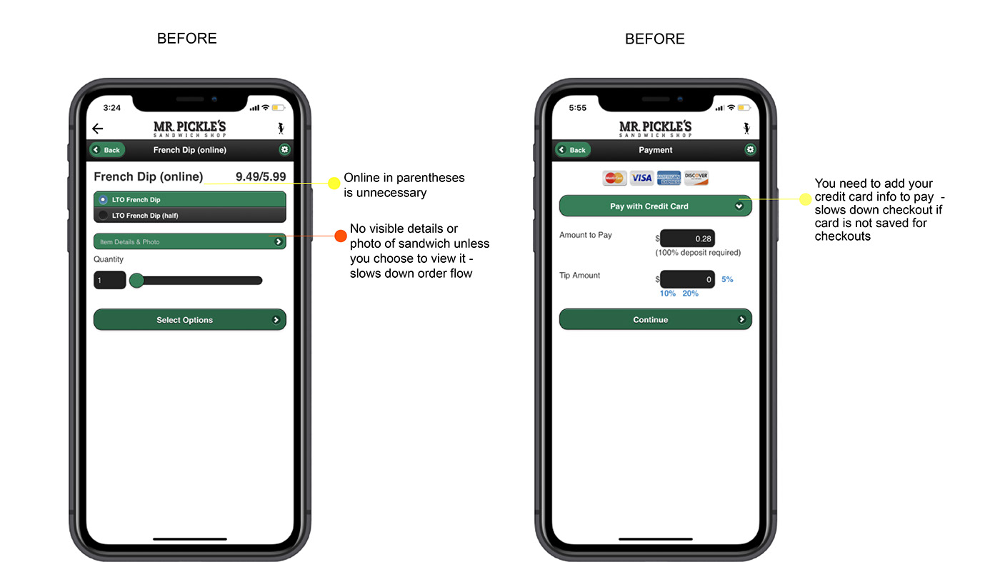
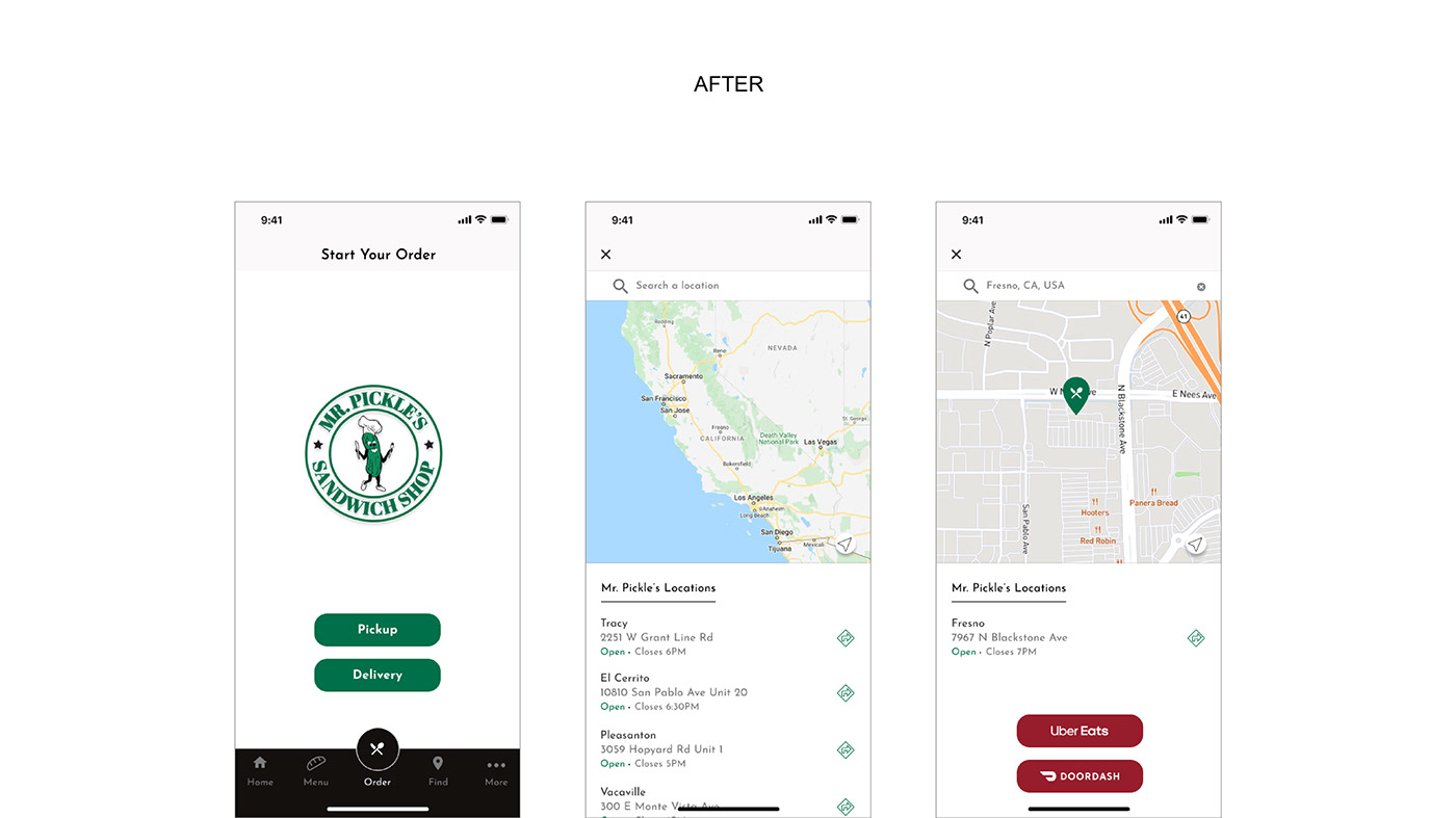
After clicking "Order Now" on the home screen, you are provided with a list of locations, however there is no feedback that shows you are ordering or selecting a location. Additionally, after you select a location for pickup and browse the menu, there is no visible shopping cart to display your order items. Finally, the menu does not list the name of the category you are ordering from, and it does not provide you with visible descriptions of the food items.
After clicking "Order Now" on the home screen, you are provided with a list of locations, however there is no feedback that shows you are ordering or selecting a location. Additionally, after you select a location for pickup and browse the menu, there is no visible shopping cart to display your order items. Finally, the menu does not list the name of the category you are ordering from, and it does not provide you with visible descriptions of the food items.
User control and freedom
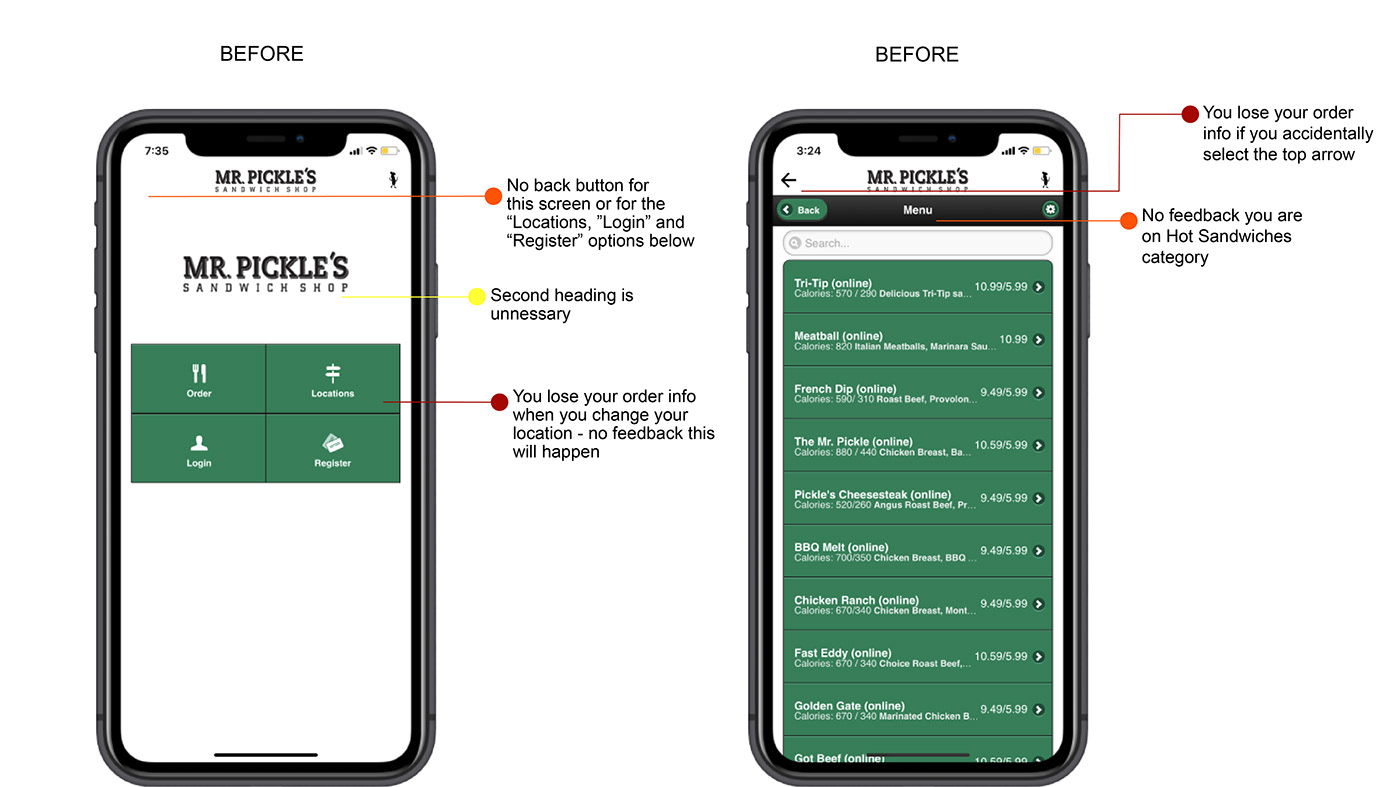
A settings button located in the top right of the menu navigation links you to a screen with a grid containing the following items: Order, Locations, Login and Register. At the top navigation of this screen, there is a home button that links you to the same exact screen but without any buttons or back arrows. You are then left to continue using the settings button as a back button when you select any of the four items (Order, Locations, Login and Register). Nonetheless, you are left confused and frustrated as you attempt to navigate this dialogue.
A settings button located in the top right of the menu navigation links you to a screen with a grid containing the following items: Order, Locations, Login and Register. At the top navigation of this screen, there is a home button that links you to the same exact screen but without any buttons or back arrows. You are then left to continue using the settings button as a back button when you select any of the four items (Order, Locations, Login and Register). Nonetheless, you are left confused and frustrated as you attempt to navigate this dialogue.
Consistency and standards
The next heuristic violation concerns the good old settings button I was just talking about, you know, the one located in the menu's top navigation. Anyways, the settings button does not link you to a conventional settings page. In fact, the settings button links you to what appears to be a home page with a home button that links you to another page with the same exact layout but without buttons or back arrows. You are yet again left frustrated by the inconsistent and confusing navigation.
The next heuristic violation concerns the good old settings button I was just talking about, you know, the one located in the menu's top navigation. Anyways, the settings button does not link you to a conventional settings page. In fact, the settings button links you to what appears to be a home page with a home button that links you to another page with the same exact layout but without buttons or back arrows. You are yet again left frustrated by the inconsistent and confusing navigation.
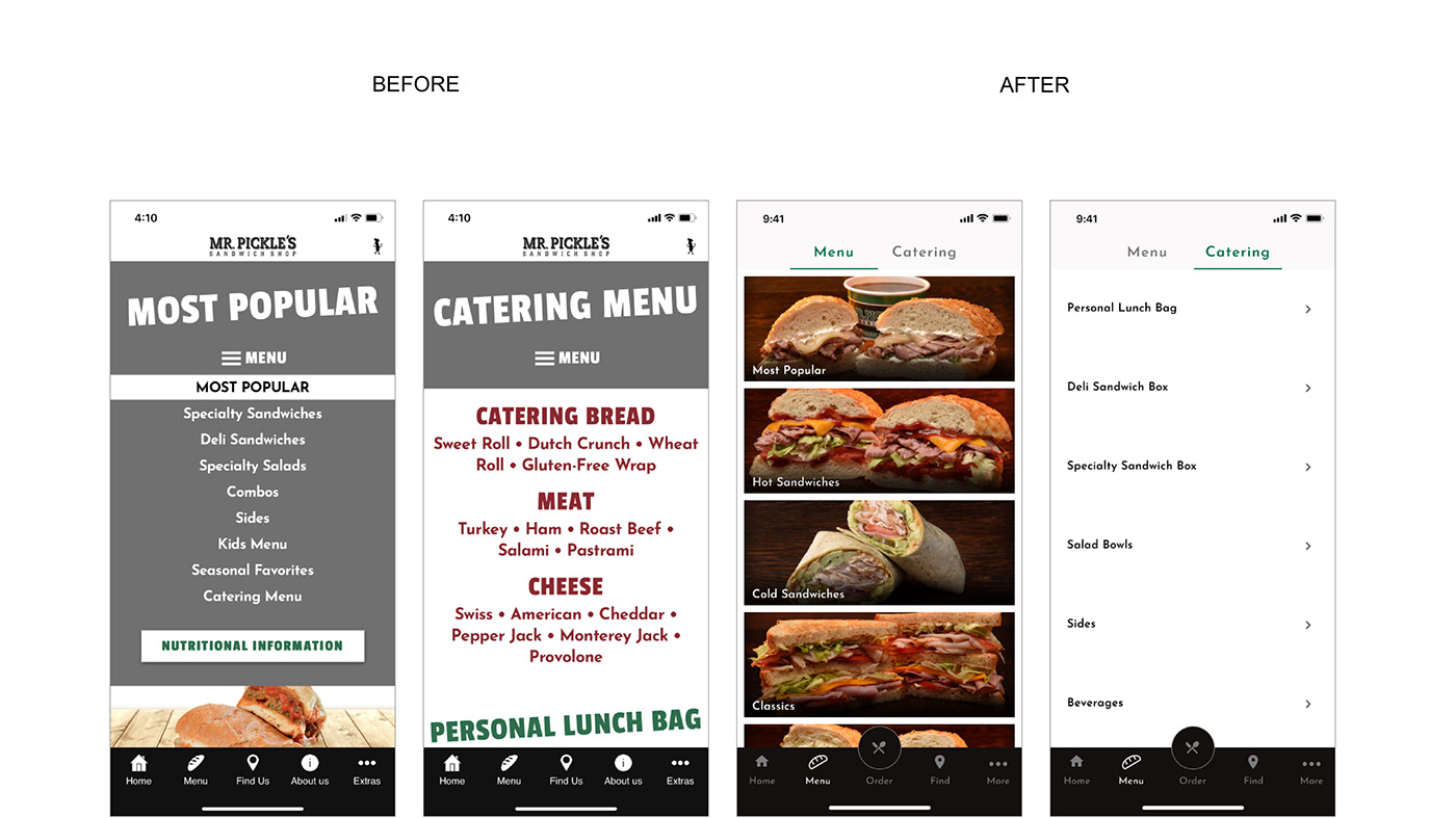
Another inconsistency concerns the items listed on the "Menu" tab vs. the items listed on the menu for ordering. Whereas the "Menu" tab consists of images and descriptions, the menu given for ordering does not. Additionally, the "Menu" tab also includes "Catering", "Most Popular", "Combos" and "Seasonal Favorites", whereas the menu for ordering does not.
Finally, the last inconsistency involves finding a location, since you cannot search a location through "Order Now." In order to search a location, you need to switch to the "Extras" tab and select "Online Ordering," or go through the beloved settings button on the ordering menu. This process requires you to dig through the entire app, which is inconvenient and extra work.
Error prevention
Two of the screens in the images below have two back arrows placed very close together, and both arrows are linked to two different locations. When you select the top arrow, however, you lose your order information without warning. Furthermore, if you were to select another location during your order, you would lose your order information without warning.
Two of the screens in the images below have two back arrows placed very close together, and both arrows are linked to two different locations. When you select the top arrow, however, you lose your order information without warning. Furthermore, if you were to select another location during your order, you would lose your order information without warning.
Flexibility and efficiency of use
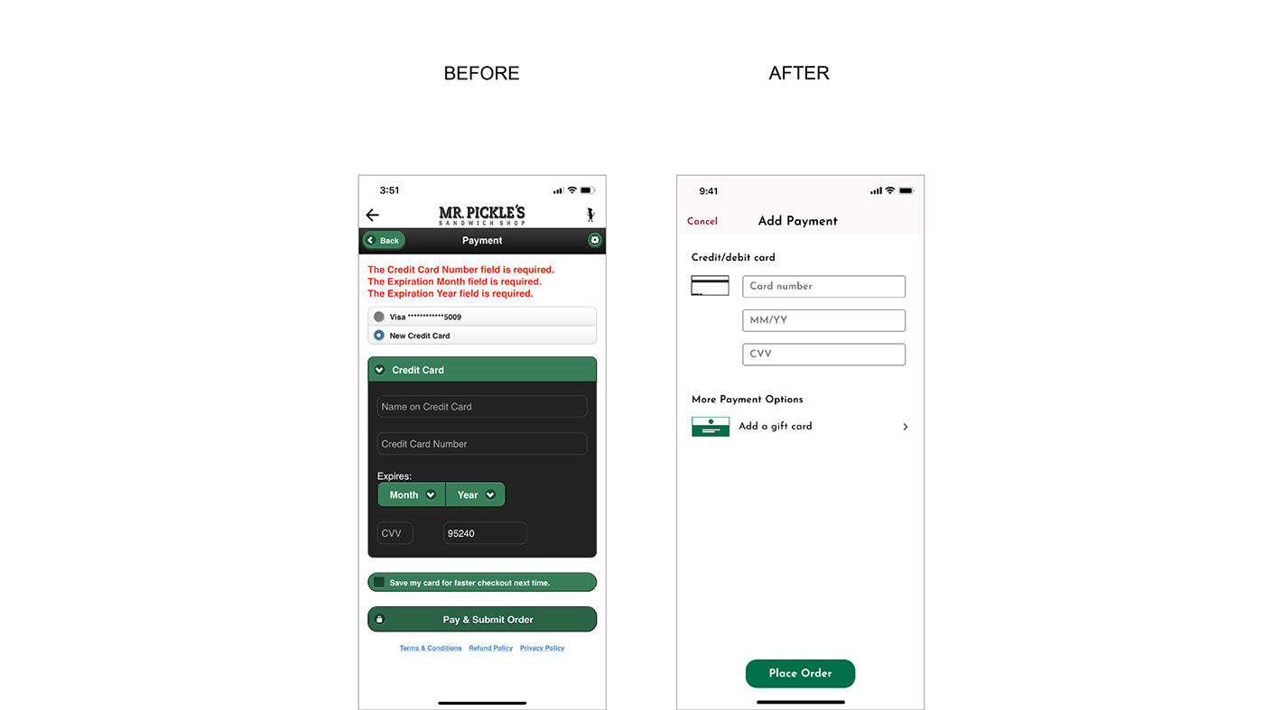
After you have ordered and are ready to pay, you must enter your credit card info if your card is not already saved for future orders. This slows down the order flow for users with Apple Pay.
After you have ordered and are ready to pay, you must enter your credit card info if your card is not already saved for future orders. This slows down the order flow for users with Apple Pay.
Aesthetic and minimalist design
The fourth screen on the left has two Mr. Pickle's headings, which is unnecessary. Additionally, the Mr. Pickle's image is oddly placed and distracting.
The fourth screen on the left has two Mr. Pickle's headings, which is unnecessary. Additionally, the Mr. Pickle's image is oddly placed and distracting.
Redesigned Experience
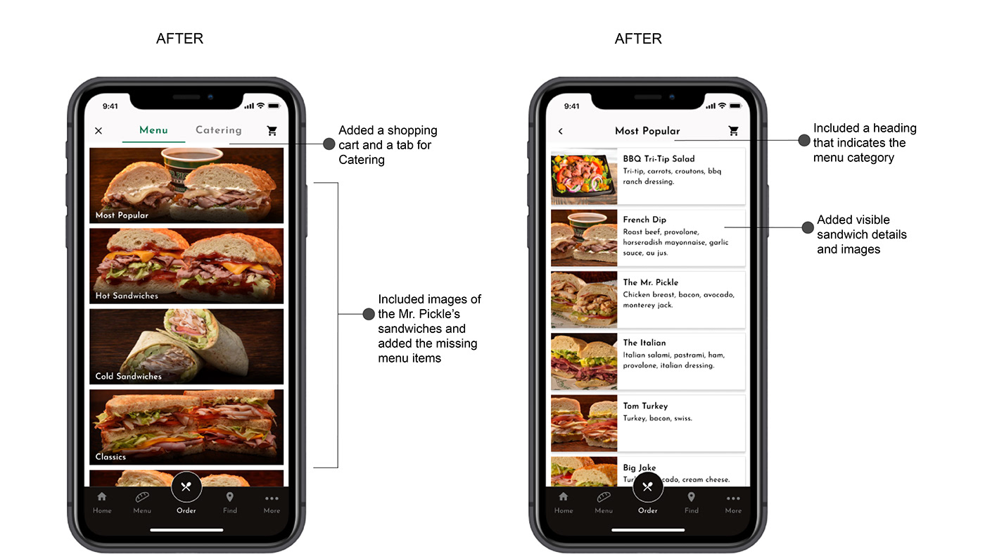
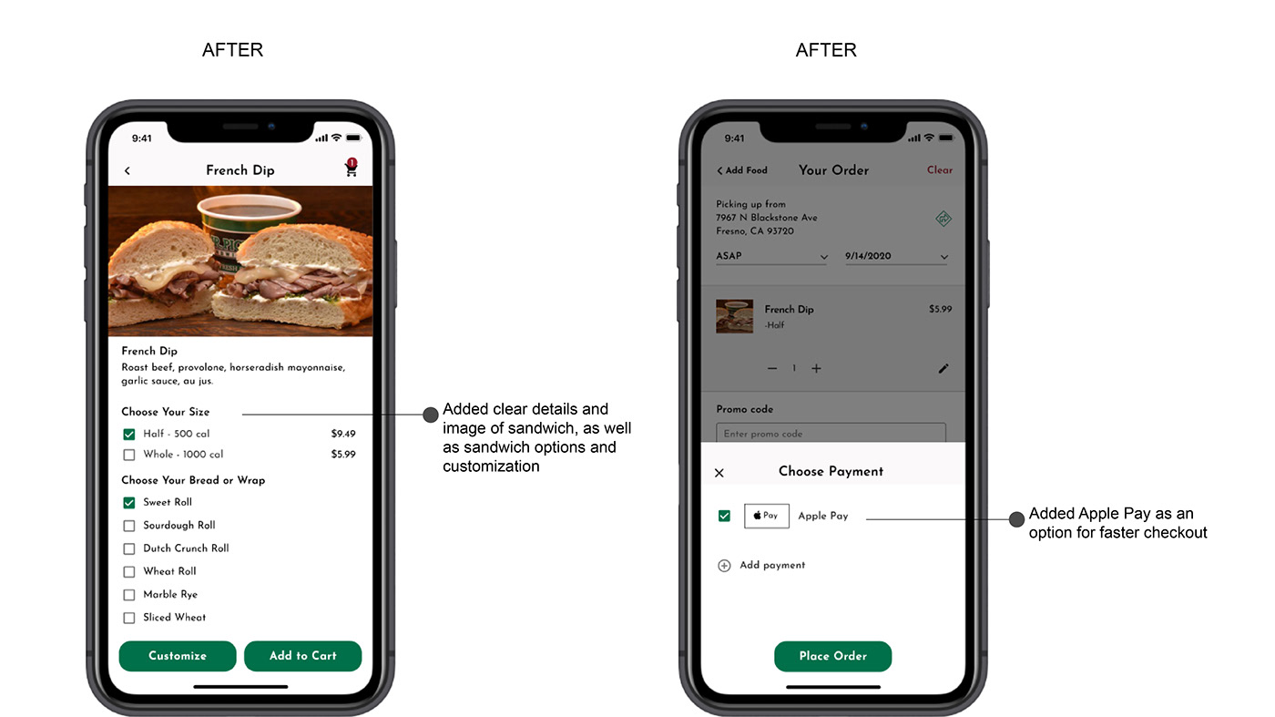
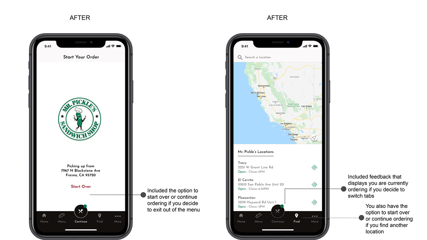
In the following screens, I redesigned the order flow and fixed the usability errors. I placed the pickup and delivery options on the "Order" tab to ensure a simple and easy ordering process. Next, I included the option to search, use, or select a location when you choose "Pickup" or "Delivery". I also included images, descriptions and appropriate headings for the menu categories and items, and added a shopping cart for feedback. To maintain internal consistency, I created a menu that includes the missing items ("Most Popular", "Combos", "Seasonal Favorites" and "Catering") from the original "Menu" tab. Furthermore, I added the customization and option selections on the same page as the description and image of the selected menu item. I also added Apple Pay to accelerate checkout for users, and omitted the settings button. Subsequently, I replaced the intended function of the old settings button with the option to "Start Over" or "Continue" your order when you click out of the menu. Finally, I made sure to include the bottom navigation to provide feedback that shows you are ordering.
In the following screens, I redesigned the order flow and fixed the usability errors. I placed the pickup and delivery options on the "Order" tab to ensure a simple and easy ordering process. Next, I included the option to search, use, or select a location when you choose "Pickup" or "Delivery". I also included images, descriptions and appropriate headings for the menu categories and items, and added a shopping cart for feedback. To maintain internal consistency, I created a menu that includes the missing items ("Most Popular", "Combos", "Seasonal Favorites" and "Catering") from the original "Menu" tab. Furthermore, I added the customization and option selections on the same page as the description and image of the selected menu item. I also added Apple Pay to accelerate checkout for users, and omitted the settings button. Subsequently, I replaced the intended function of the old settings button with the option to "Start Over" or "Continue" your order when you click out of the menu. Finally, I made sure to include the bottom navigation to provide feedback that shows you are ordering.

Experience #3: Pickle Points and Checkout
Currently, the Pickle Points aspect of the app violates the following 5/10 usability heuristics: #1: visibility of system status, #2: match between system and the real world, #4: consistency and standards, #5: error prevention, and #10: help and documentation.
Currently, the Pickle Points aspect of the app violates the following 5/10 usability heuristics: #1: visibility of system status, #2: match between system and the real world, #4: consistency and standards, #5: error prevention, and #10: help and documentation.
Visibility of system status
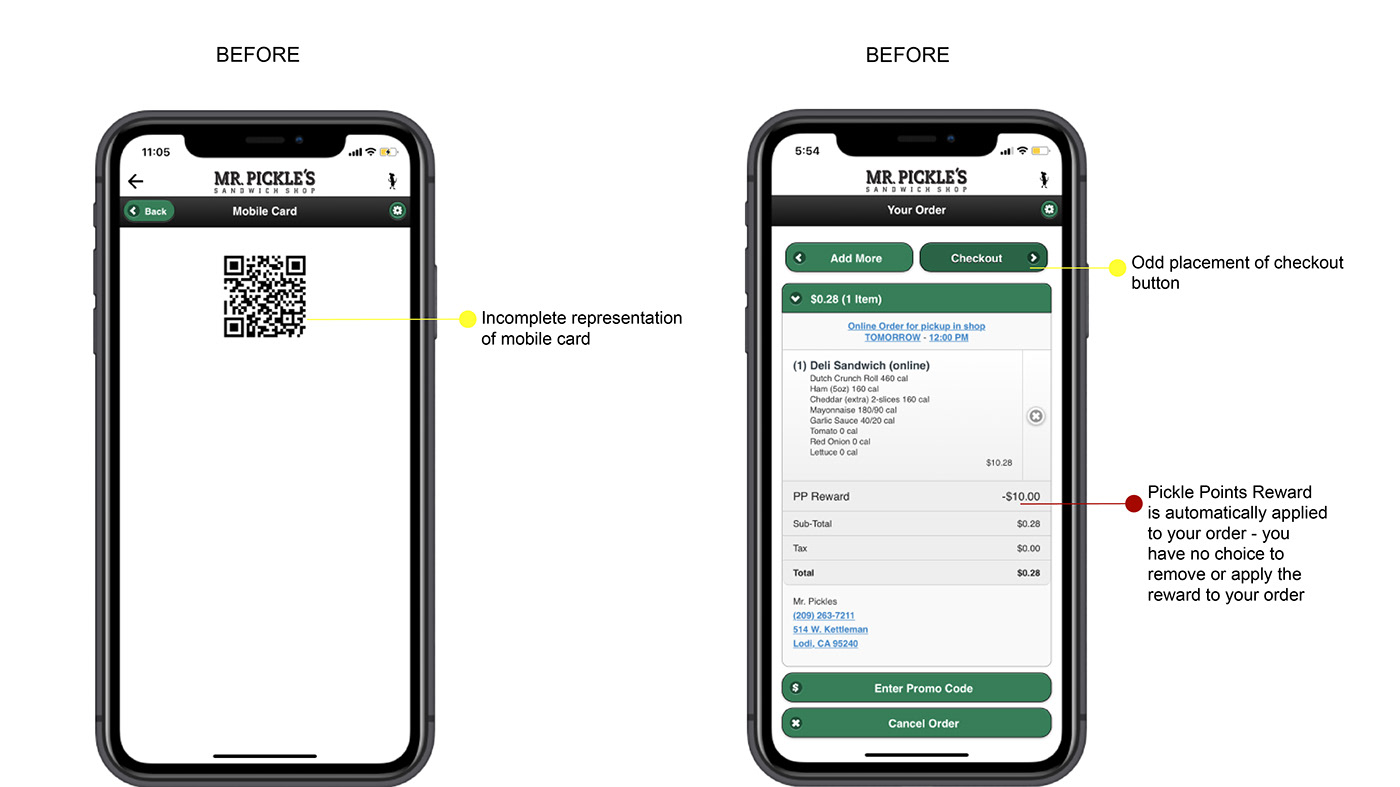
After selecting "Pickle Points" on the home screen or through the "Extras" tab, you land on a page with your account information or a login/register screen. However, there is no feedback that shows if you are on the "Extras" tab or home screen. Additionally, there is no feedback on the amount of cash available for users with a Pickle Points account.
After selecting "Pickle Points" on the home screen or through the "Extras" tab, you land on a page with your account information or a login/register screen. However, there is no feedback that shows if you are on the "Extras" tab or home screen. Additionally, there is no feedback on the amount of cash available for users with a Pickle Points account.
Match between system and the real world
The mobile card available for users with a Pickle Points account is a QR code rather than a card.
The mobile card available for users with a Pickle Points account is a QR code rather than a card.
Consistency and standards
The checkout button is placed at the top of the screen, whereas most checkout buttons are placed at the bottom of a screen. The placement of a checkout button at the bottom of a screen is better structured to fit most users' mental model.
The checkout button is placed at the top of the screen, whereas most checkout buttons are placed at the bottom of a screen. The placement of a checkout button at the bottom of a screen is better structured to fit most users' mental model.
Error prevention
The logout button on "My Account" blends in with the rest of the options, and when you click on it there is no confirmation message to double check your action. Additionally, the Pickle Points website notes you are not required to use any of your rewards on an order. The current app, however, does not give you the freedom to choose whether or not you want to use your $10 reward; the reward is automatically applied to your order and you cannot remove it.
The logout button on "My Account" blends in with the rest of the options, and when you click on it there is no confirmation message to double check your action. Additionally, the Pickle Points website notes you are not required to use any of your rewards on an order. The current app, however, does not give you the freedom to choose whether or not you want to use your $10 reward; the reward is automatically applied to your order and you cannot remove it.
Help and documentation
The Pickle Points Program information is available on the Pickle Points website, however the current app does not provide users with any information regarding the program and how it works.
The Pickle Points Program information is available on the Pickle Points website, however the current app does not provide users with any information regarding the program and how it works.

Redesigned Experience
In the following screens, I redesigned the way the Pickle Points Program is structured in the app by adhering to the information provided on the Mr. Pickle's website. I also fixed the usability errors and created a user-friendly experience.
In the following screens, I redesigned the way the Pickle Points Program is structured in the app by adhering to the information provided on the Mr. Pickle's website. I also fixed the usability errors and created a user-friendly experience.
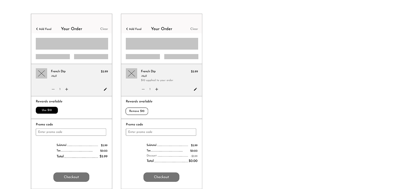
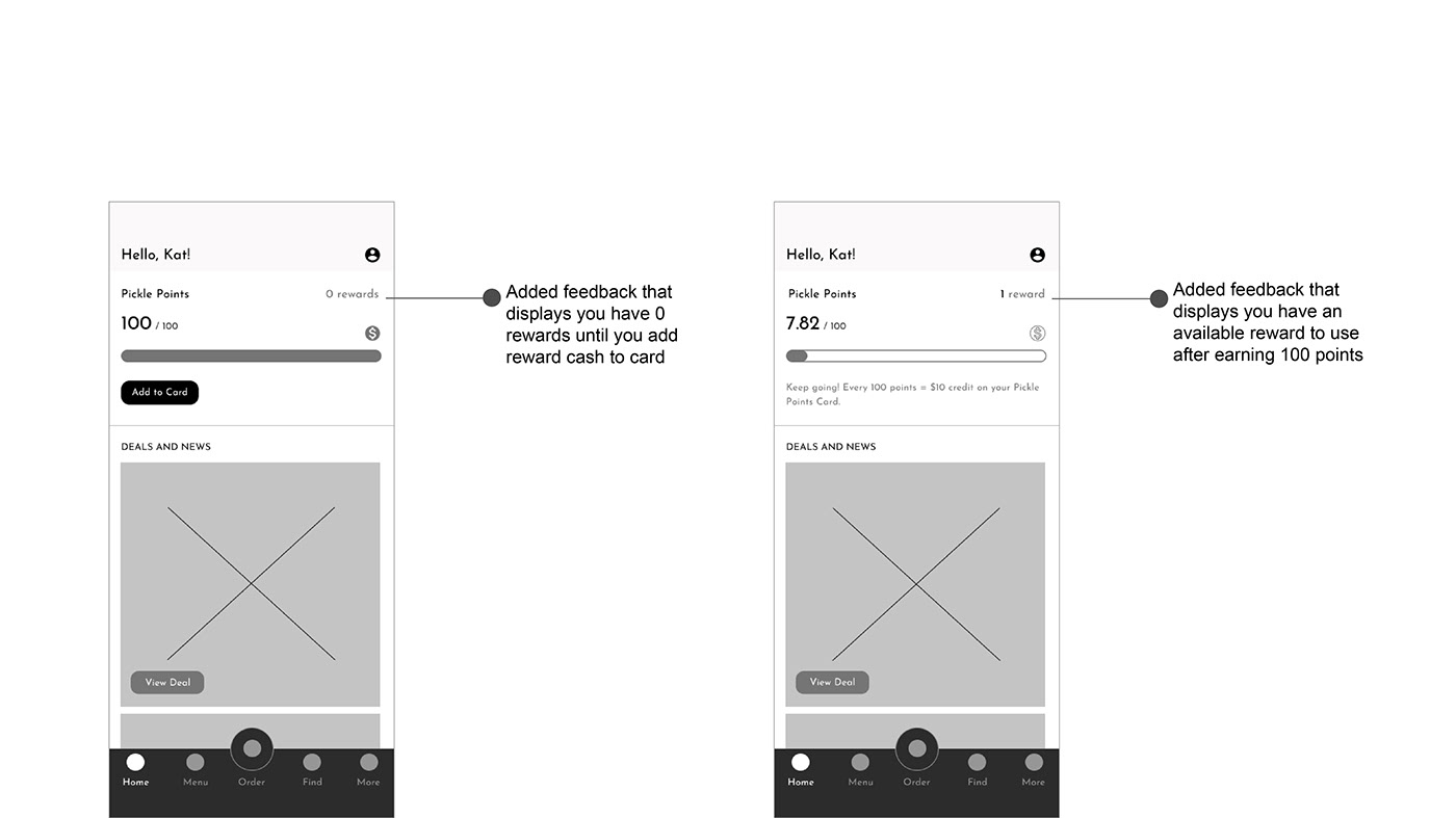
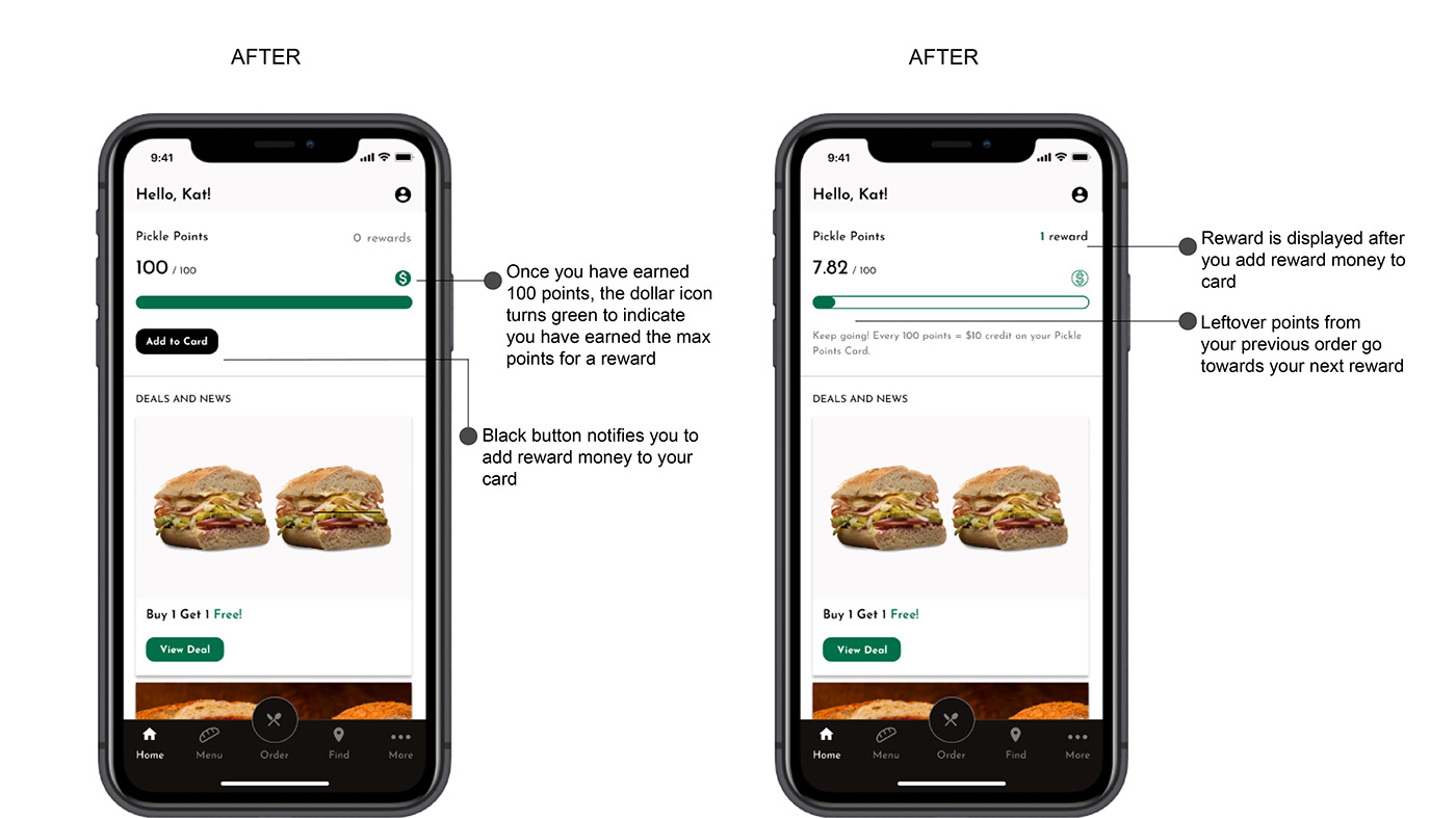
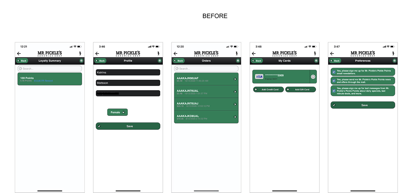
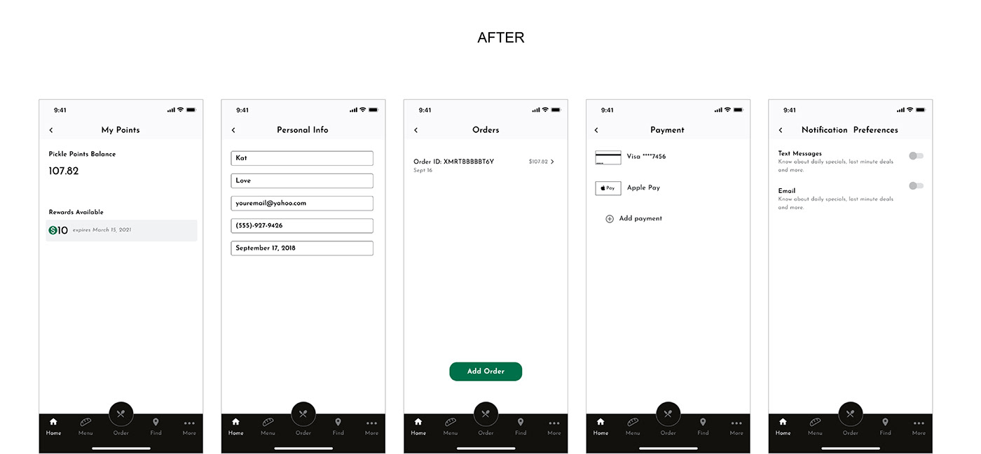
Since the current app does not have a home screen for users with a Pickle Points account, I included one with a Pickle Points dashboard so users can keep track of their points and rewards. In short, the Pickle Points program goes as follows: $10 is rewarded for every 100 points earned, and every $1 spent is equal to 1 point. Therefore, as you can see in the redesigned screens below, I included a points bar with a dollar icon that turns green when the maximum points (100) have been earned for a $10 reward. After you collect the reward money, any leftover points from your previous order are added to the next round, and you are provided feedback in the upper right-hand corner that displays you have reward money available.
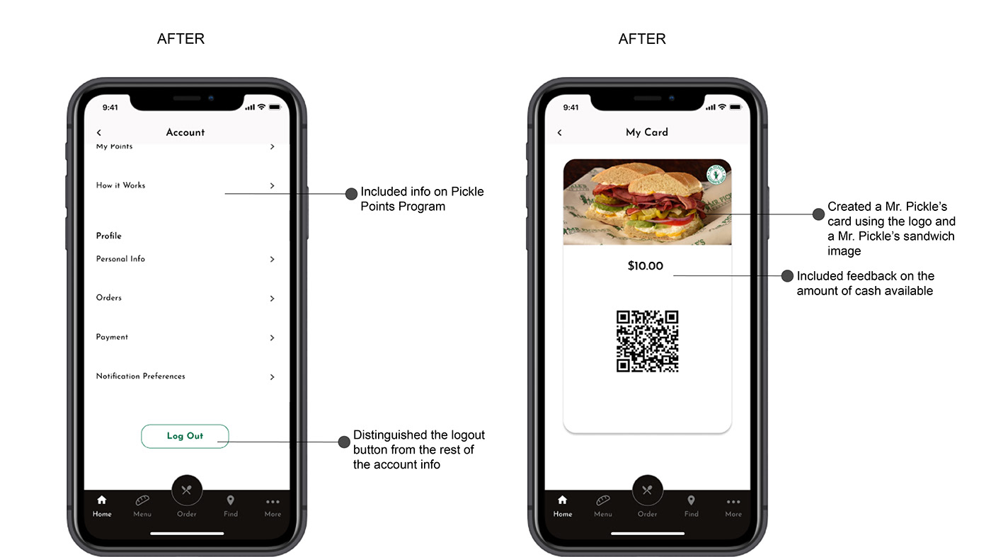
In addition to the information provided on the home screen dashboard, I included a section with information on the Pickle Points program on the "Account" page; I also created a distinct logout button with a confirmation message, and created a mobile card that resembles a real world-card.
In addition to creating a mobile card, I also added feedback on the available cash and included the option to use your cash on orders. On "Your Order," there is a black button that represents your available reward money; once you apply a reward, you also have the option to remove it. And lastly, I placed the checkout button at the bottom of the screen to match users' mental model, and included a distinct field for entering promo codes.

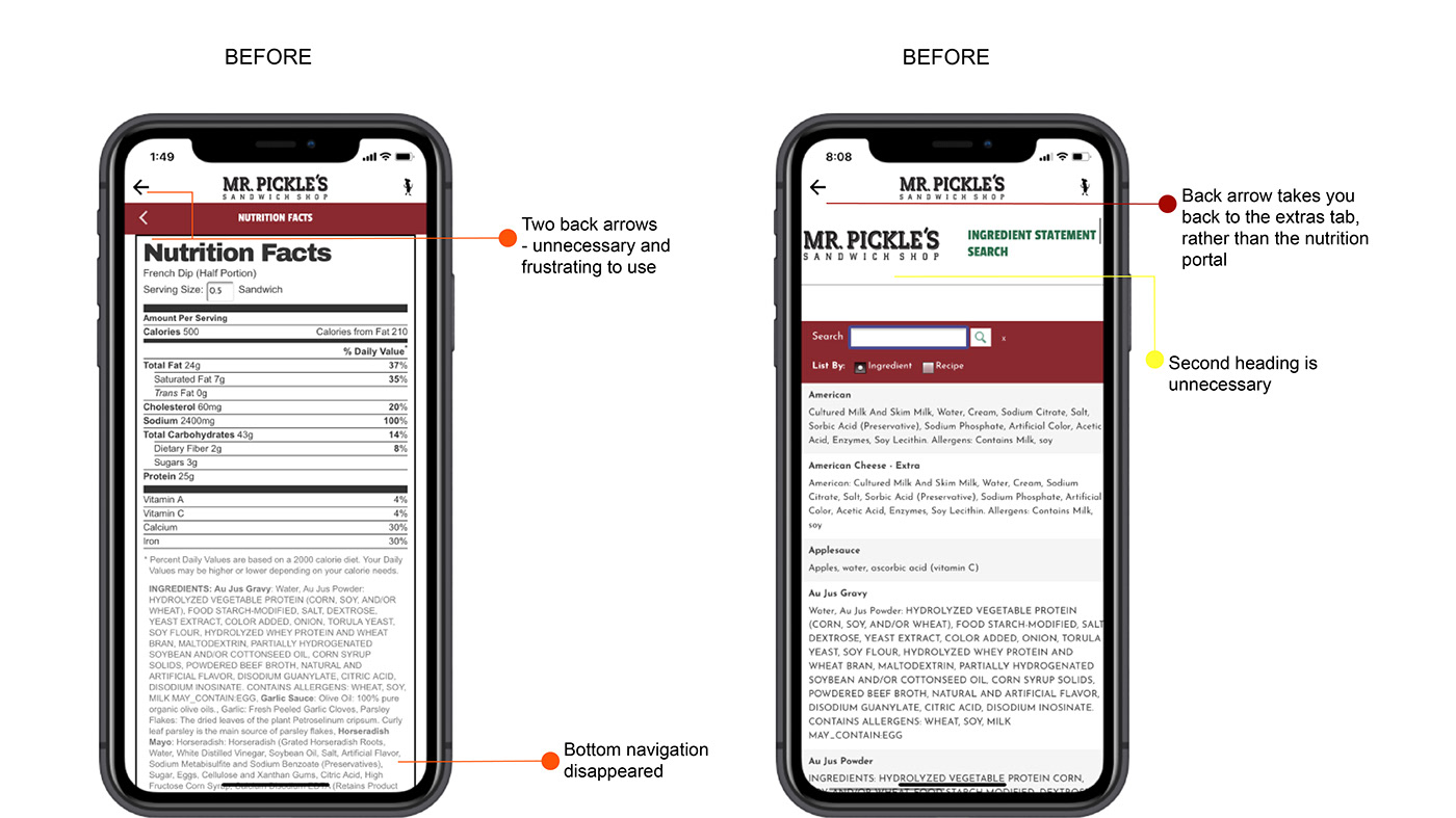
Experience #4: Nutrition Portal
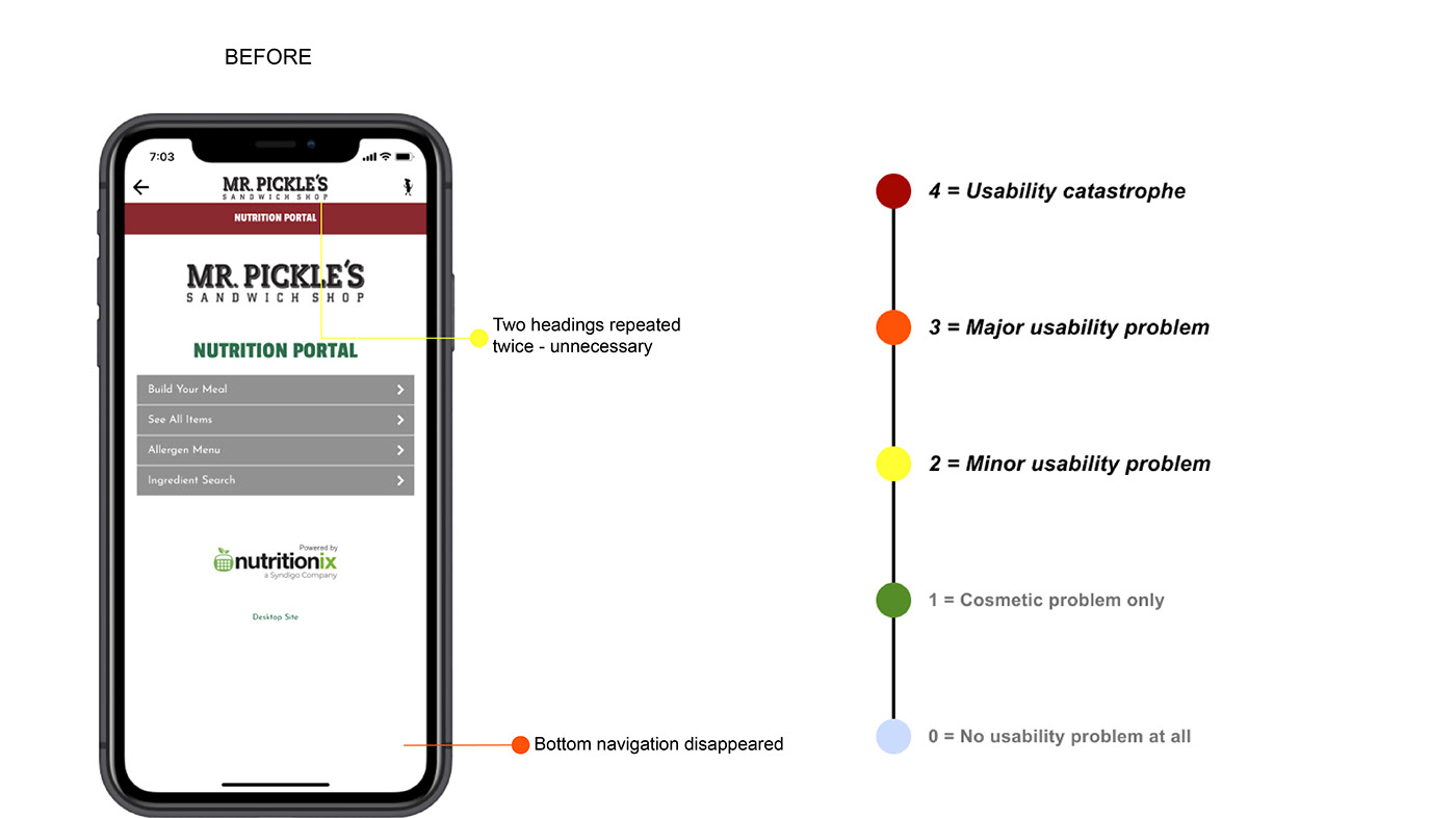
Currently, the nutrition portal violates the following 4/10 usability heuristics: #1: visibility of system status, #3: user control and freedom, #5: error prevention, and #8: aesthetic and minimalist design.
Visibility of system status
The nutrition portal is found on the "Extras" tab, yet there is no feedback to inform this.
User control and freedom
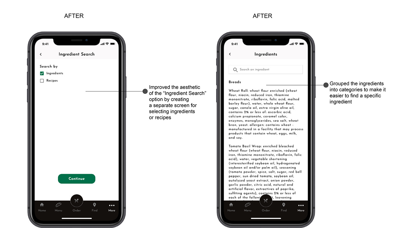
The "Ingredient Search" section contains a single back arrow that take you back to the "Extras" tab, forcing you to re-select "Nutrition Information."
Error prevention
All of the sections except "Ingredient Search" contain two back arrows, and selecting the top arrow causes you to lose your saved information.
Aesthetic and minimalist design
All of the sections in the Nutrition Portal contain two Mr. Pickle's Sandwich Shop headings, all of which take up space and add irrelevant information to the screen.
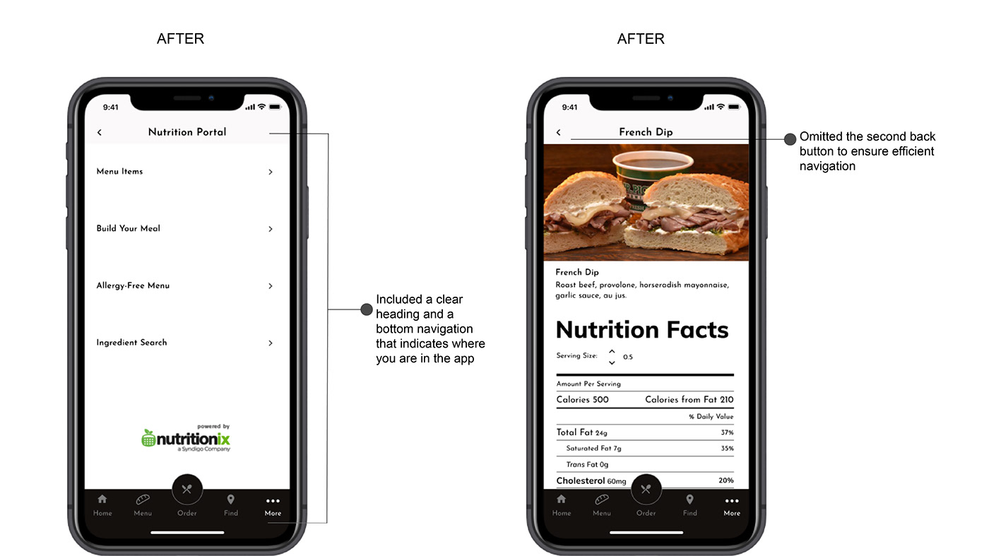
Redesigned Experience
In the following screens, I redesigned the Nutrition Portal and fixed the usability errors. I included the bottom navigation and clear headings to keep users informed on their location in the app. I also omitted the second back arrows on each screen to simplify the navigation, and grouped the ingredients into categories to speed up the search process.
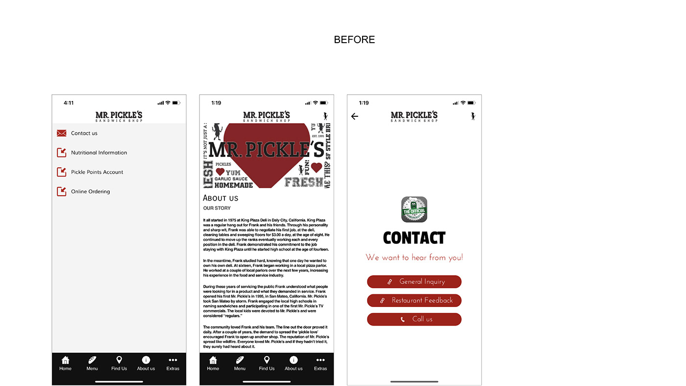
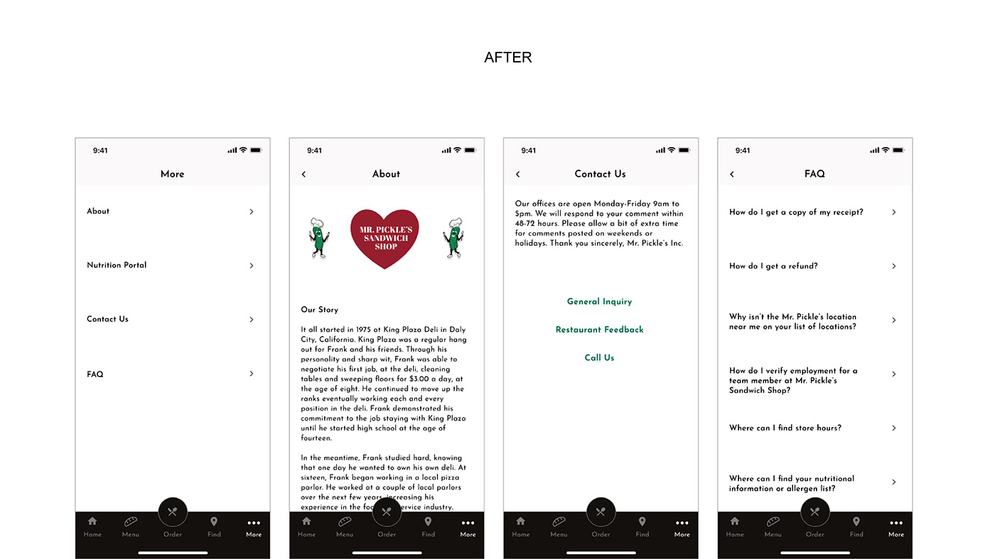
Experience #5: More
In my redesign, I included the FAQ page from the Mr. Pickle's website and added it onto the "More" tab. I also removed the "About Us" tab from the existing app, and placed it on the "More" tab to make room for the "Order" tab.
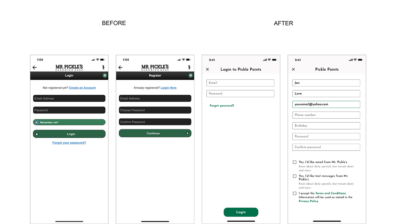
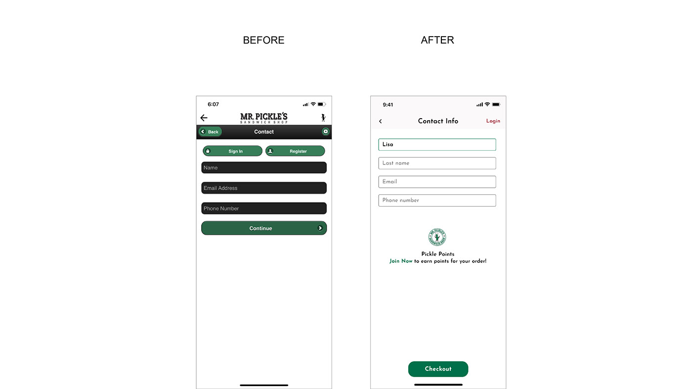
Experience #6: Login and Register
The current register flow asks you for your phone number, birthday and gender after you input your email and choose a password. In my redesign, I added all the requirements for registering on the same page.
Experience #7: Account Information
Experience #8: Add Payment
Experience #9: Delivery
Experience #10: Guest Checkout
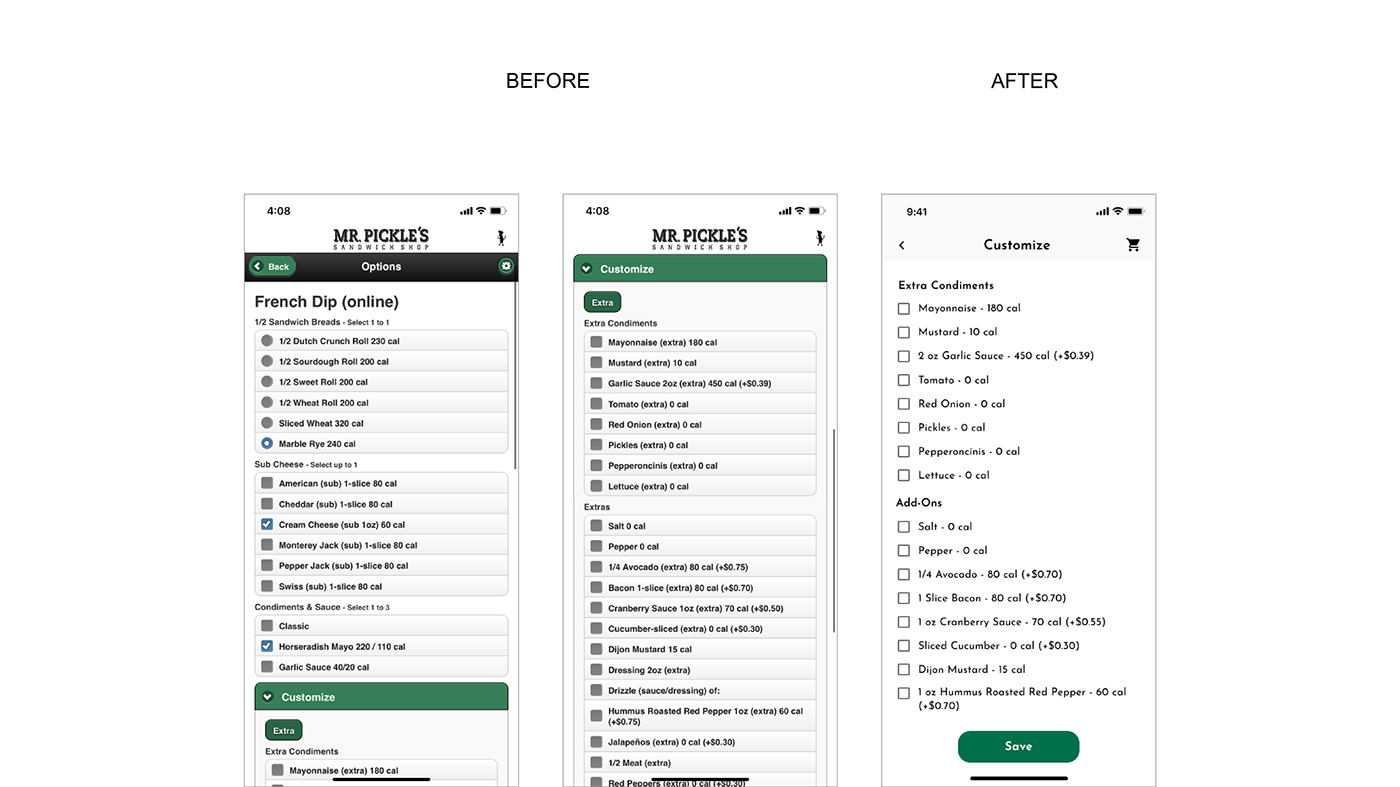
Experience #11: Customize
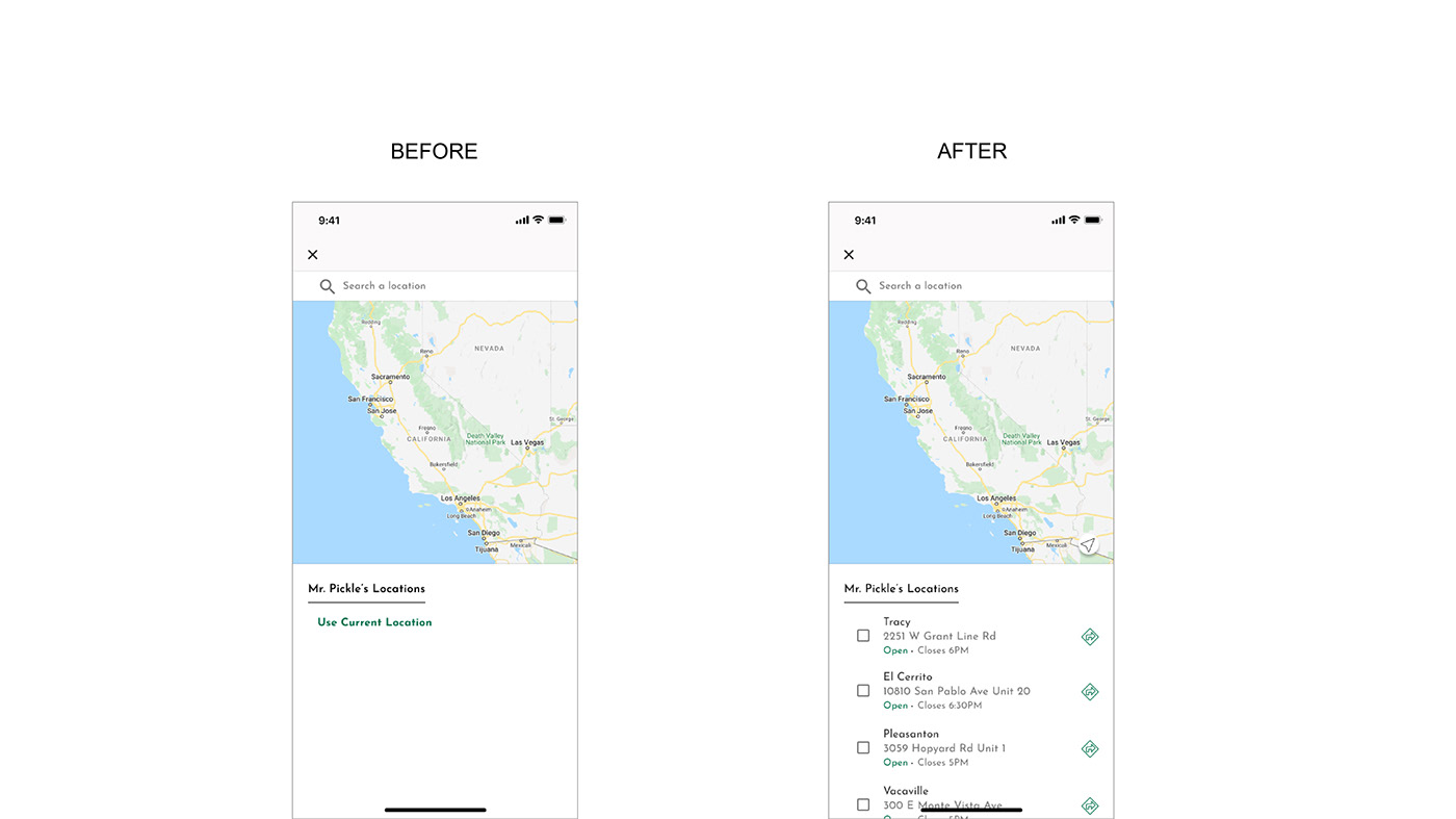
Experience #12: Choose Location
In the existing app, you can order through the "Extras" tab or the home screen. Through the "Extras" tab, you can select a location after entering a zip code, whereas through the home screen you must scroll through the list of locations to select one (*see Experience #1: Home Page). In my redesign, however, I maintained internal consistency; every time you select a location to order from, the map zooms in on the restaurant location.

Experience #13: Menu and Catering
Design Iterations and Usability Testing
Prior to my final design decisions, I conducted a remote usability session in Lookback and tested the following tasks:
TASK 1
1. Log in to your account.
1. Log in to your account.
2. Collect your reward.
TASK 2
1. Go to the Nutrition Portal.
TASK 2
1. Go to the Nutrition Portal.
2. Check the nutrition facts for the French Dip sandwich located under "Most Popular".
TASK 3
1. Order for pickup and search a location to pickup from.
2. Select the French Dip sandwich located under Most Popular and choose the half size and sweet roll.
TASK 3
1. Order for pickup and search a location to pickup from.
2. Select the French Dip sandwich located under Most Popular and choose the half size and sweet roll.
3. Add the sandwich to your cart.
TASK 4
1. Use your $10 reward on your order
TASK 4
1. Use your $10 reward on your order
2. Use your Visa to checkout.
2. Log out of your account.
2. Log out of your account.
The remote usability session revealed that users completed 4/4 tasks with 100% success rate. Task 3, however, revealed that 90% of users clicked "Use My Location" before clicking the search bar. I hypothesized that the bold green color of the "Use My Location" dominated the visual cues on the screen, and decreased the visibility of the search bar. Therefore, I omitted the bold green text and replaced it with a location sharing feature on the map. I also added the list of locations under "Mr. Pickle's Locations" to maintain internal consistency, since my redesign includes the same list on the "Find" tab.
Solution and Impact Overview
After encountering the Mr. Pickle's Sandwich Shop app, I discovered it was a gold mine for usability errors, so I intended to redesign it.
In the research phase of my project, I concluded the app violated 9/10 usability heuristics. After my redesign, however, users navigated through the app with ease.
Overall, redesigning the Mr. Pickle's app was a perfect opportunity to exercise my user-centered design skills. I enjoyed the intricacies of the design process and tasty Mr. Pickle's sandwiches along the way!
Feel free to explore the prototype here.


