centro di salute psicofisica
–branding
Client: Centro di Salute Psicofisica
Year: 2010
Location: Turin, Italy
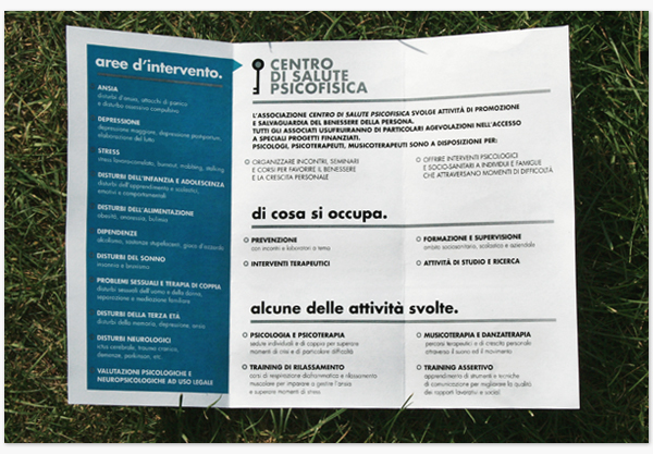
Centro di Salute Psicofisica (Centre for Psychophysical Wellness) is an association born in 2010 in which psychologists, psychotherapists and other kind of professionals cooperate in helping people with their mental wellness; their activities vary from assistance to mentally ill people to courses for fighting everyday psychological weaknesses, from supporting families with diseased patients to the use of music and dance as long as more traditional methods to achieve their results.
Logo construction
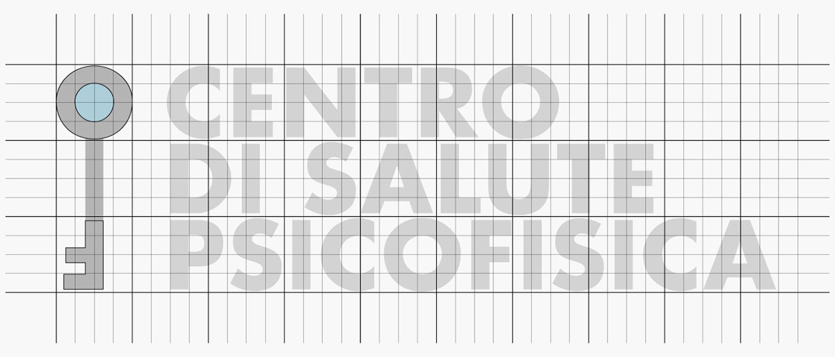
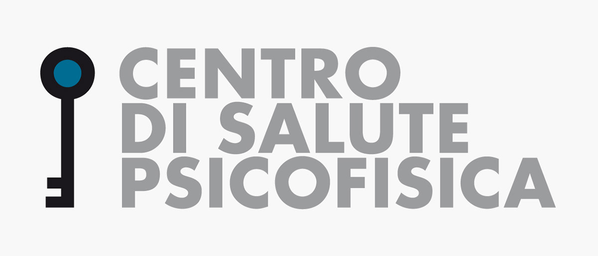
The brief for the creation of the newly born centre identity brought the request of using a key as a symbol of the aim of the association to let the patients find themselves (and consequently hold) the tool to open their minds and win their desease.
The iconic key logo, constructed using glyphs from the institutional font, can either be seen as a stylized antropomorphic figure, being the person the object of the association cares, with a color focus on the most important part: the head.
The iconic key logo, constructed using glyphs from the institutional font, can either be seen as a stylized antropomorphic figure, being the person the object of the association cares, with a color focus on the most important part: the head.
Typography
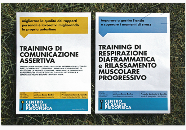
To facilitate the use of the identity by the association members, and on the other hand for the centre's need to become easily recognizable, the whole identity is based on few distinctive elements.
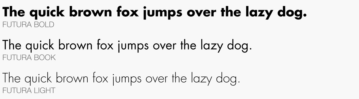
First of them all is the typography: it is used just one font family, Futura, chosen for its strong presence while being highly readable, versatile and sober, too.
Color palette
Also the basic color palette, used in institutional communications, is quite simple, in order to make the printing process, largely done in-house, easy (and inexpensive). For the same reason, the black and white version of the logo is used as often as the blue-colored one, according to the needs.
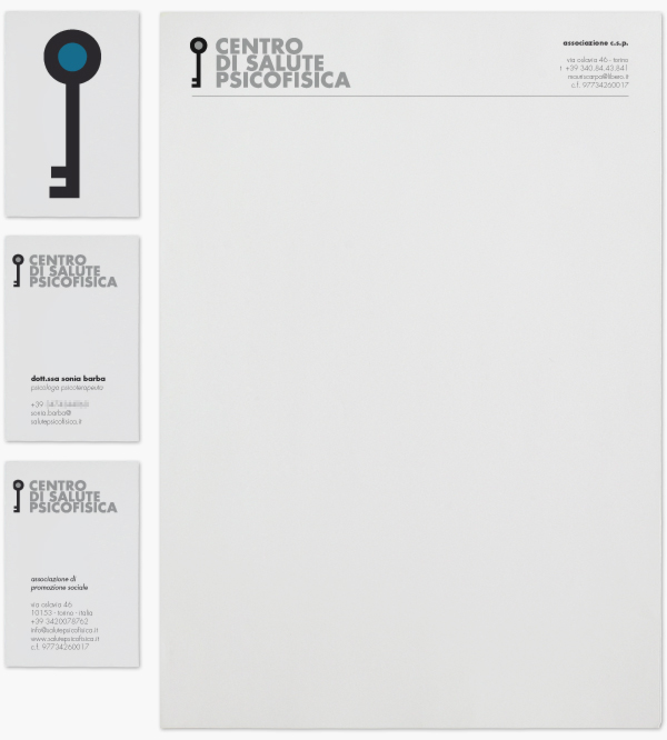
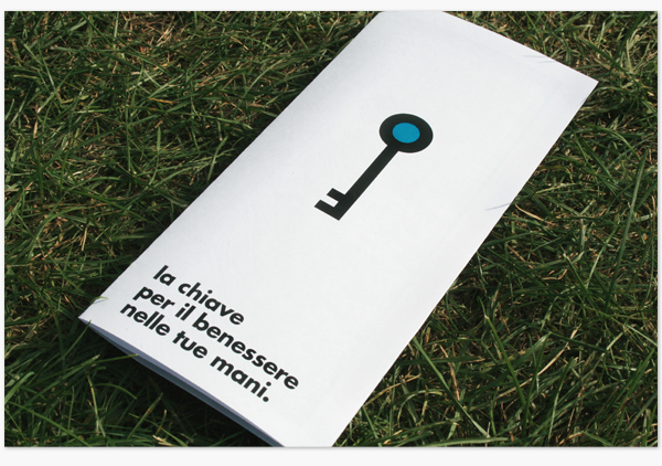

While the basic colors are mainly blue, black (or grey) and white, the logo colored "head" and the overall chromatic appearence in certain cases could be in other colors, randomly chosen, in order to create a visual differentiation and variability in the promotional material, adapting to the multidisciplinary offer.
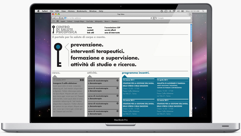
The website design proposal shown below –not realised– mainly consisted of a single scrolling page with overlapping sheets providing all the contents, maintaining the same visual features of the identity.