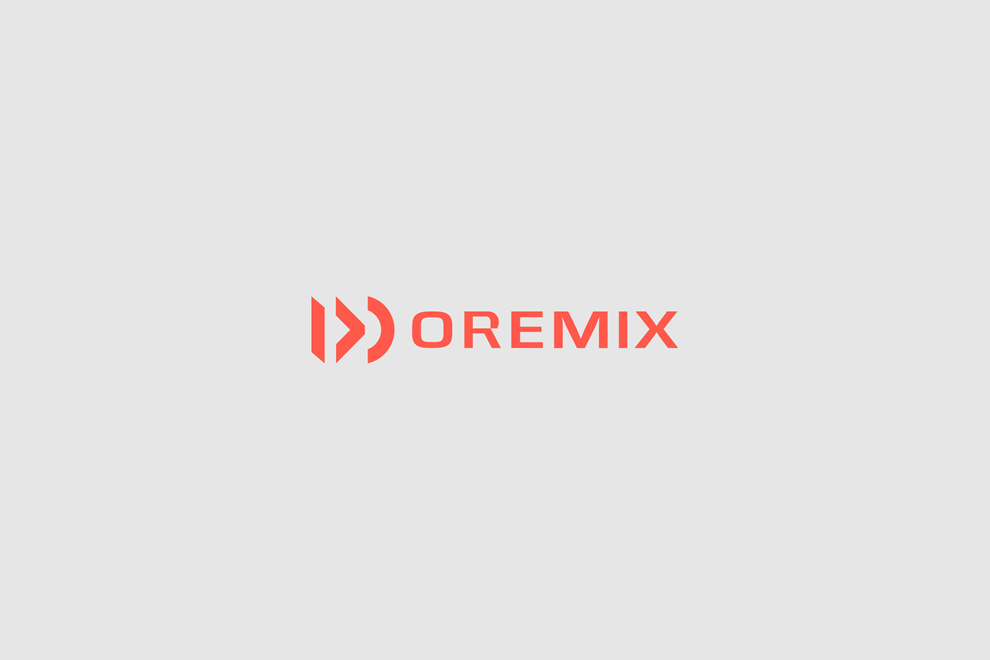
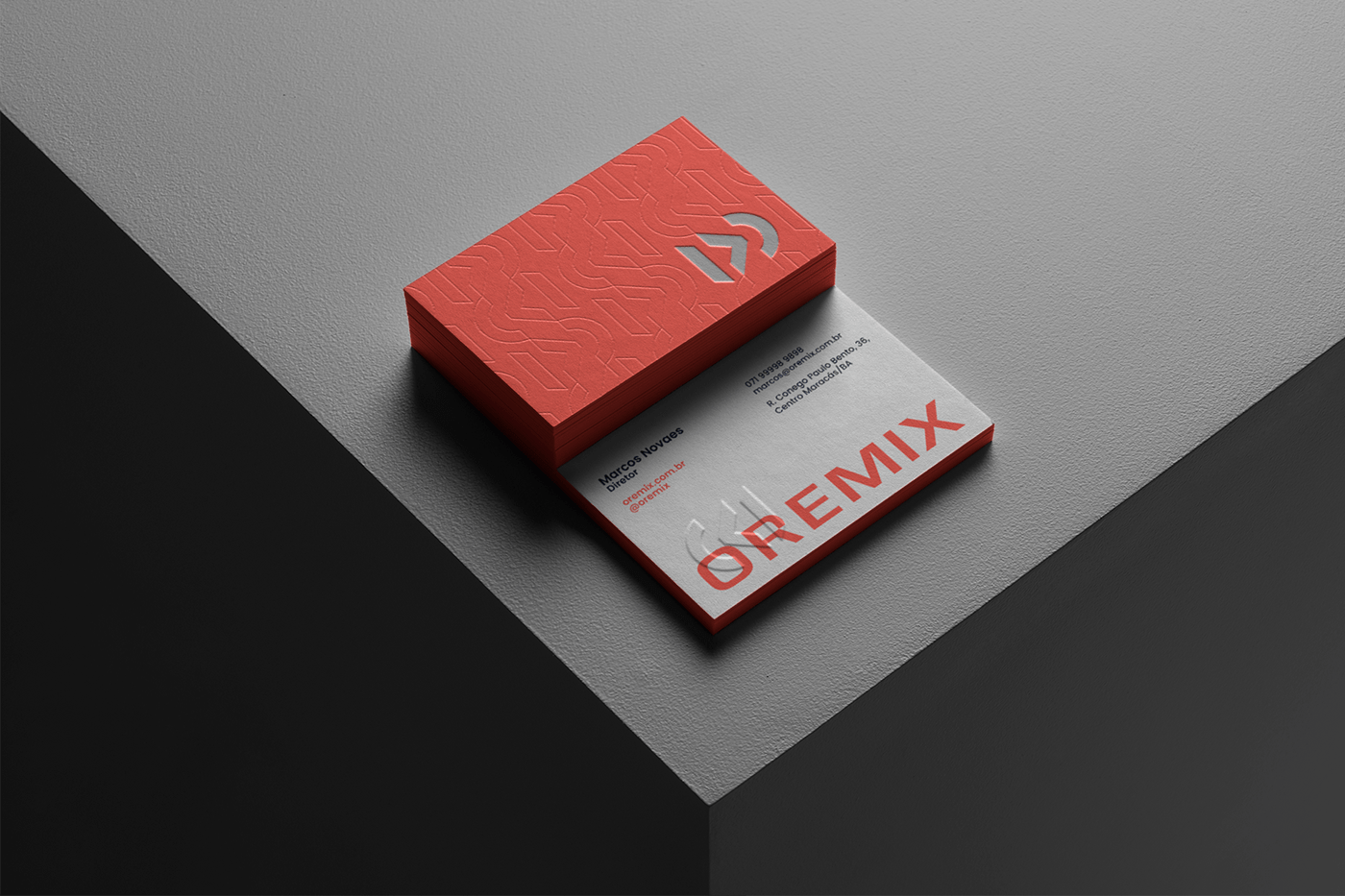
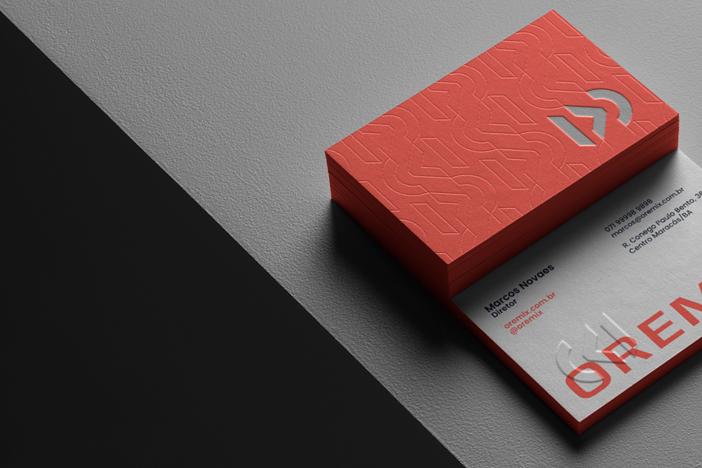
Oremix
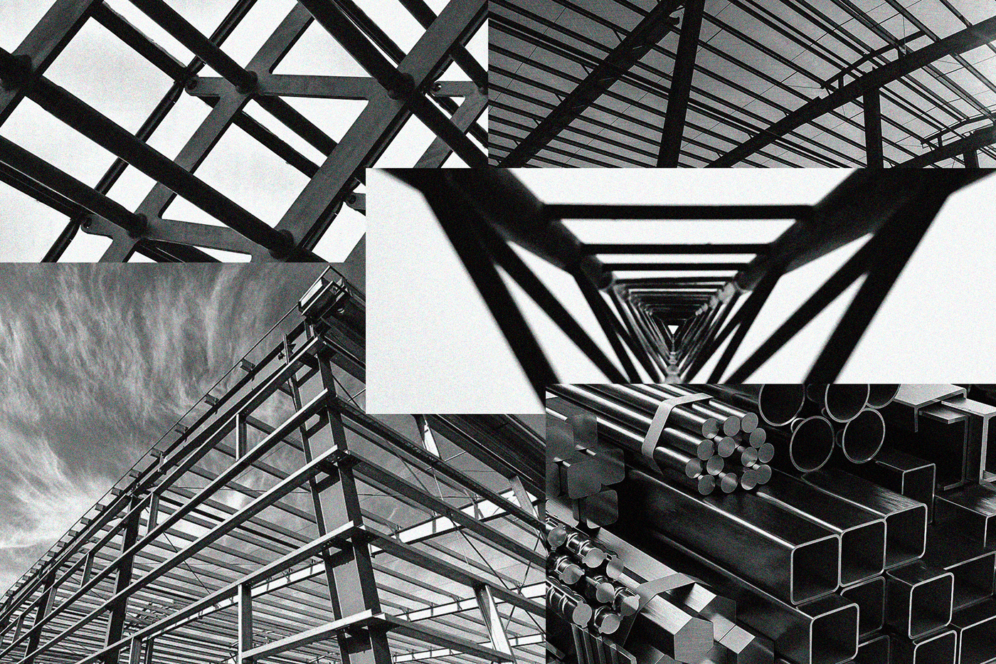
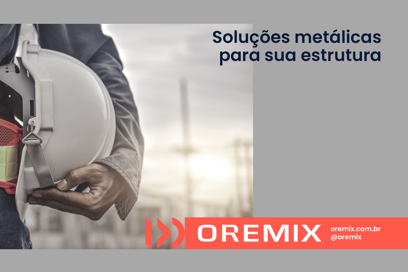
Oremix is a company that operates in the area of metal structures, providing a range of solutions to its customers and to several different sectors.
The name of the company has a very interesting concept, and the basis of the brand concept started from that. The company's raw material is iron, which is extracted from nature in the form of iron ore, hence the ORE. For the iron transformation process there is a mixture of ores, from that mixture comes another part of the name, MIX.
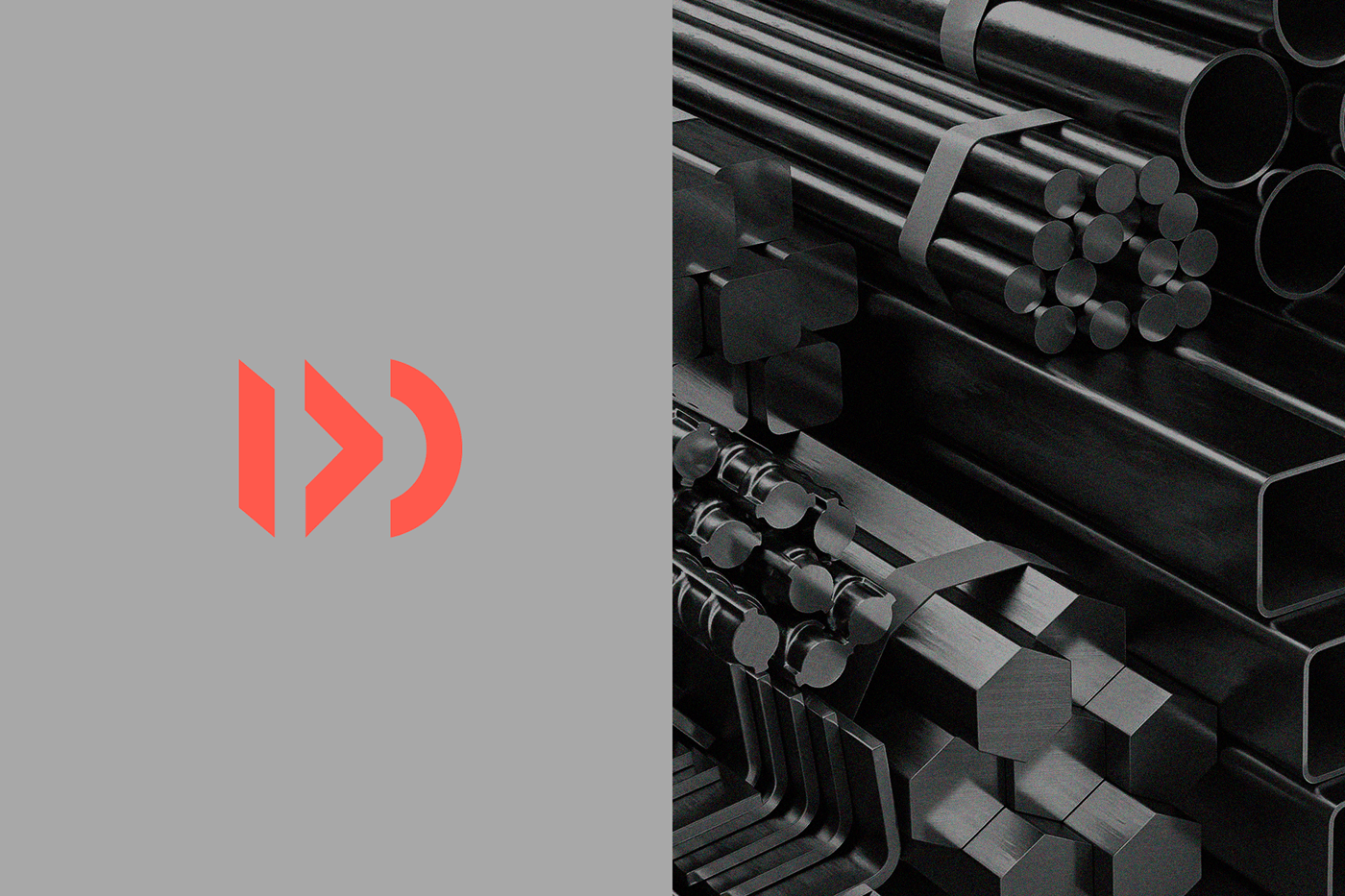
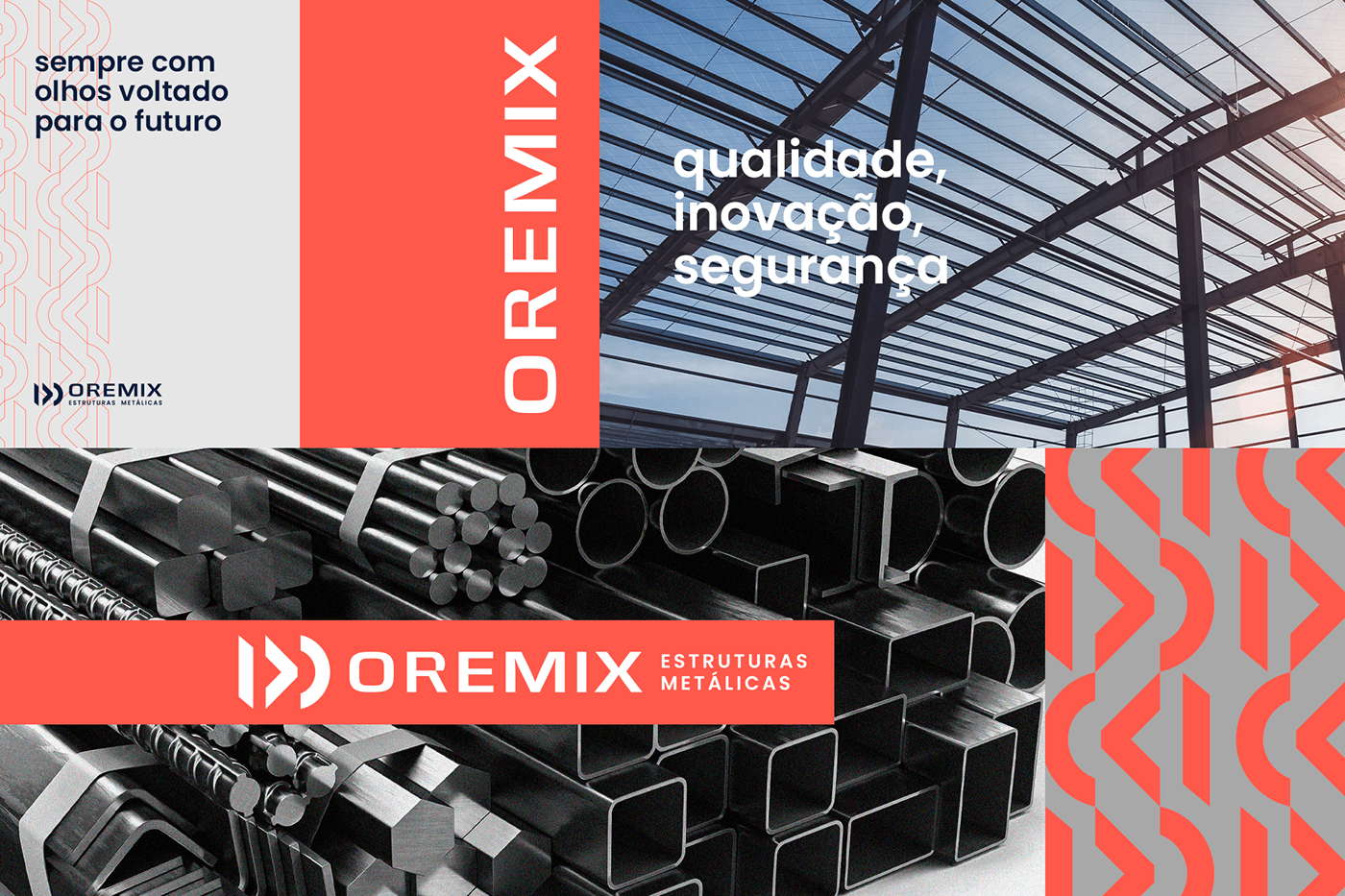
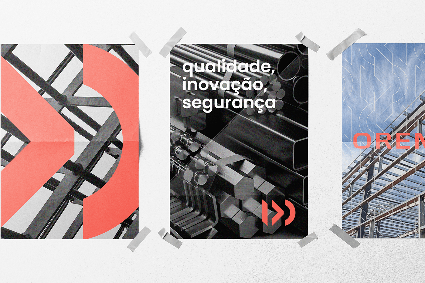
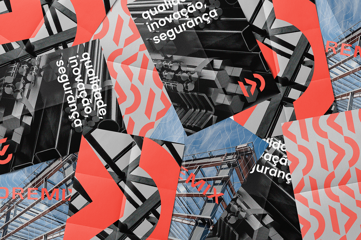
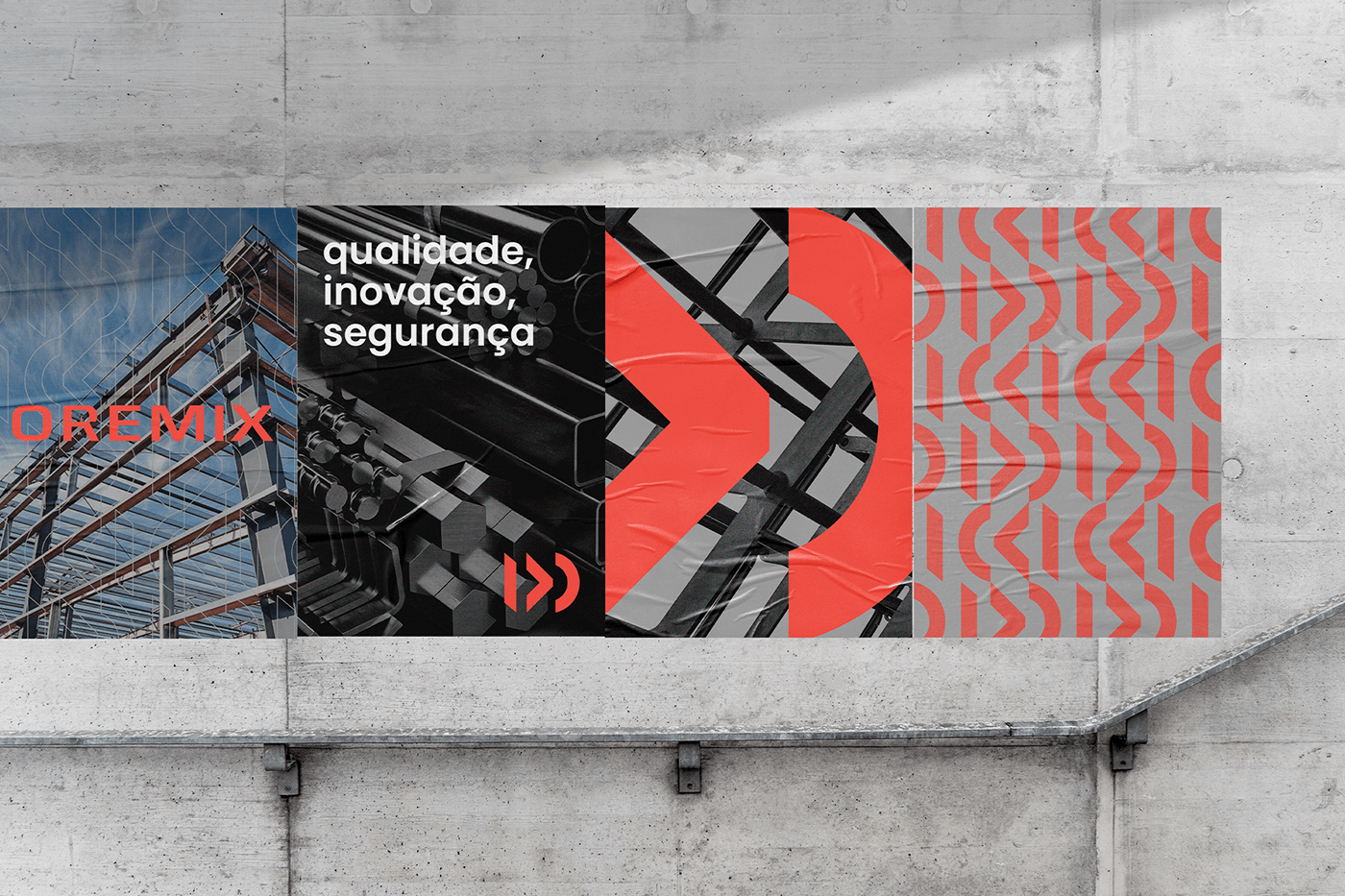
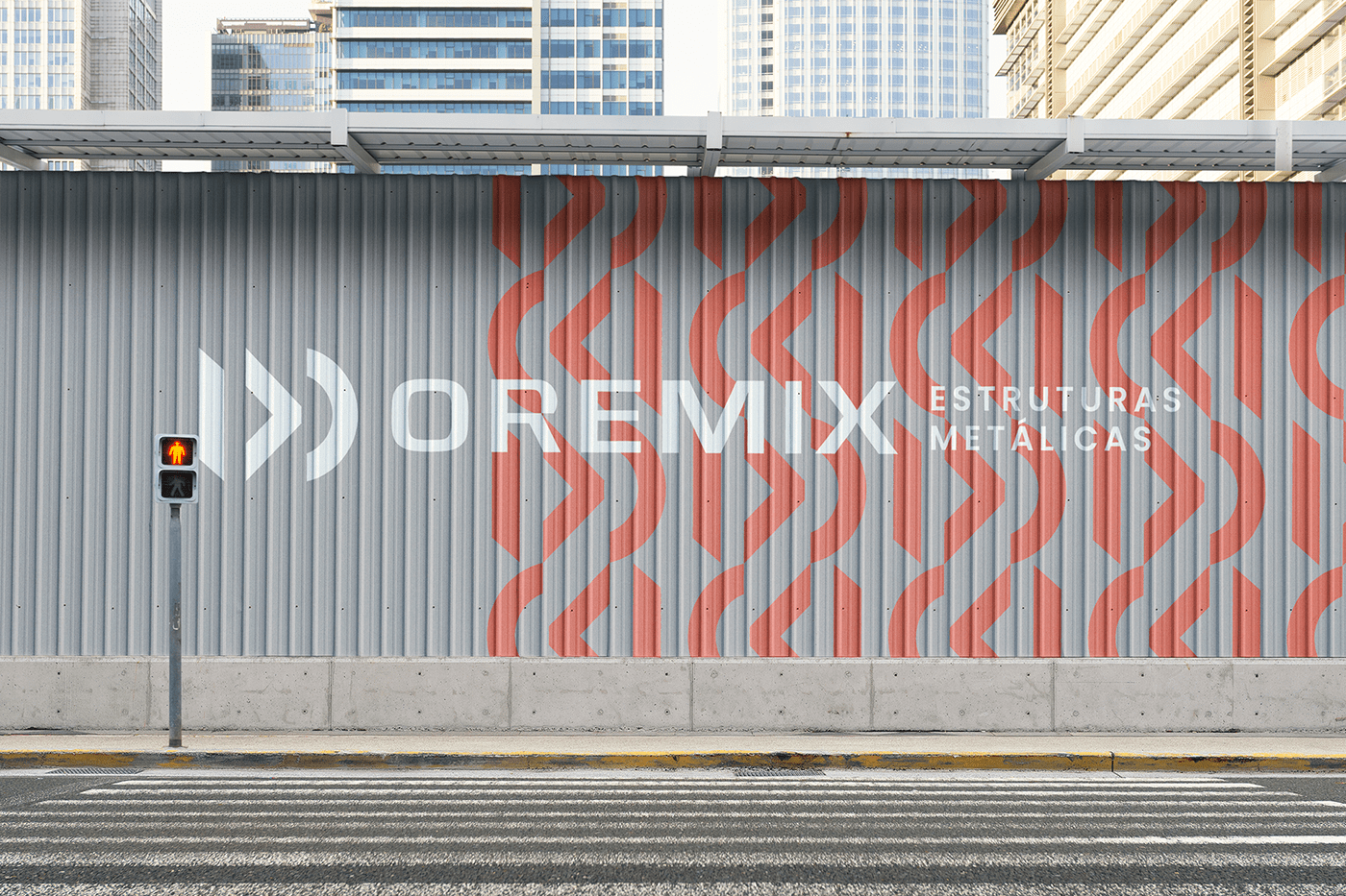
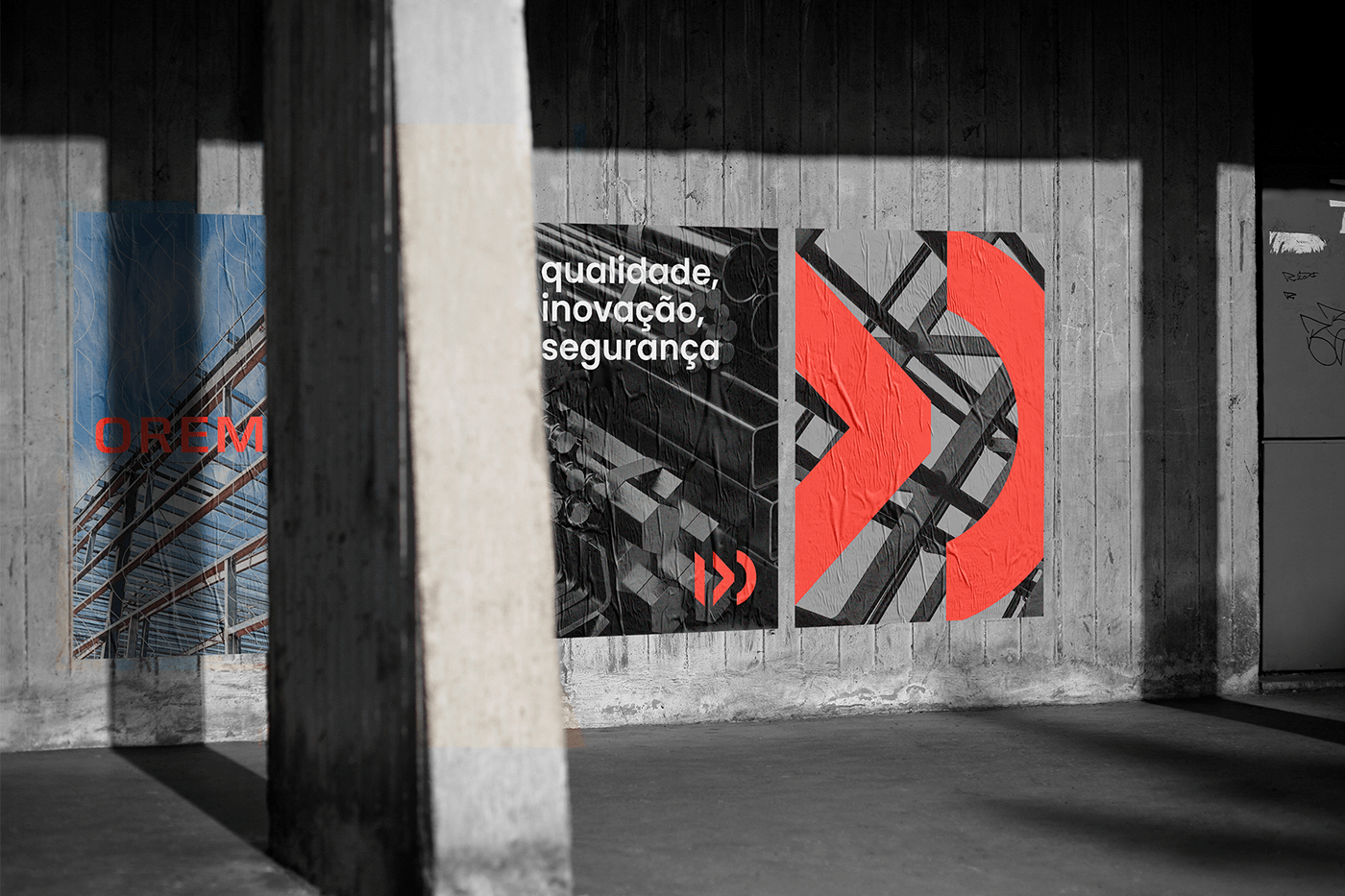
For the conceptualization of the brand, it was thinking about the materials used by the company and their formats, iron bars, angles, plates, tubes ... and so on, these different formats are represented by the shapes of the brand. In addition, the company's strengths are metal roofs, and these also have different shapes, round, triagular and straight, again, represented by the shapes of the brand.
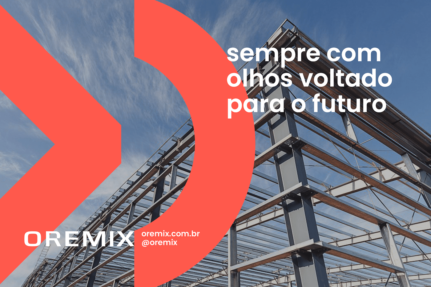
Oremix is a company that thinks ahead, is always looking for new solutions and better results for its customers, and the brand conveys this idea, something that is in motion, growing, advancing.
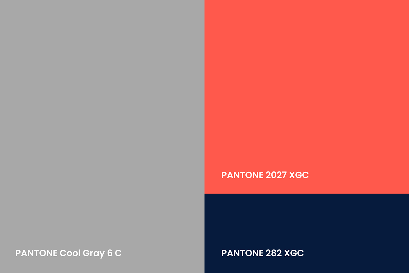
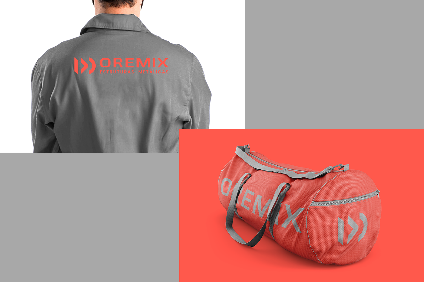
In the colors we use gray, the characteristic color of iron, and red, which comes to give strength and energy.