

Residential condominium Florenza Ilha
Florenza Ilha is a high standard residential condominium that prioritizes the tranquility of the residents and the experience of contact with nature that is located in Rio de Janeiro, on Guaratiba Island.
O Florenza Ilha é um condomínio residencial de alto padrão que prioriza a tranquilidade dos moradores e a experiência através do contato com a natureza que está localizado no Rio de Janeiro na Ilha de Guaratiba.
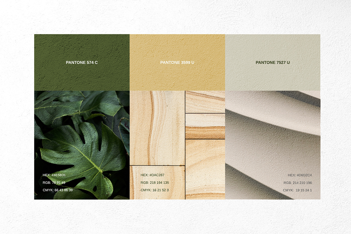
The island of Guaratiba is a region rich in nature, surrounded by the Atlantic forest and because it is a more important place in the great bustling center of Rio de Janeiro, we decided to bring the regional essence into the brand project. The symbol was made inspired by a common wild plant in the region called "Monstera Adonsonii".
O Florenza Ilha é um condomínio residencial de alto padrão que prioriza a tranquilidade dos moradores e a experiência através do contato com a natureza que está localizado no Rio de Janeiro na Ilha de Guaratiba.
The island of Guaratiba is a region rich in nature, surrounded by the Atlantic forest and because it is a more important place in the great bustling center of Rio de Janeiro, we decided to bring the regional essence into the brand project. The symbol was made inspired by a common wild plant in the region called "Monstera Adonsonii".
A ilha de Guaratiba é uma região rica em natureza, rodeada pela mata atlântica e por ser um local mais afastado do grande centro movimentado do Rio de Janeiro, decidimos trazer a essência regional para dentro do projeto de marca. O símbolo foi feito inspirado em uma planta silvestre comum da região a "Monstera Adonsonii".
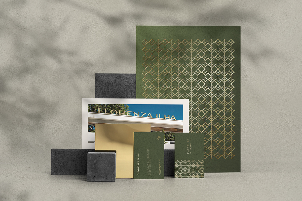
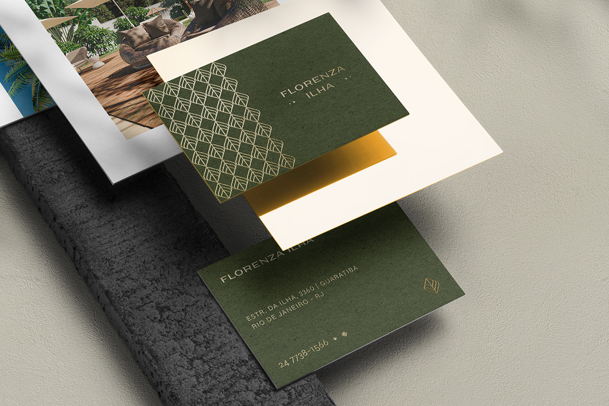
The Florenza Ilha brand typography should refer to something sophisticated because it is a high-end residential, but it should also have characteristics related to nature and convey an organic essence. We also represent these concepts through the colors and textures of the visual identity.
A tipografia da marca Florenza Ilha deveria remeter a algo sofisticado por se tratar de um residencial de alto padrão, mas também deveria ter características relacionadas a natureza e transmitir uma essência orgânica. Representamos esses conceitos também através das cores e texturas da identidade visual
TAGS: Residential Condominium, Plant, Nature, Monstera, Florest, Leaf, Minimalism, Green


Arquiteto: https://www.behance.net/LAUNE/
© ALL RIGHTS RESERVED |AVINCER STUDIO
© ALL RIGHTS RESERVED |AVINCER STUDIO


