
Lozenets District
Visual Identity
–
We were invited to do a brand refresh of Lozenets District, one of the most important and central districts in the Sofia Municipality (Bulgaria).
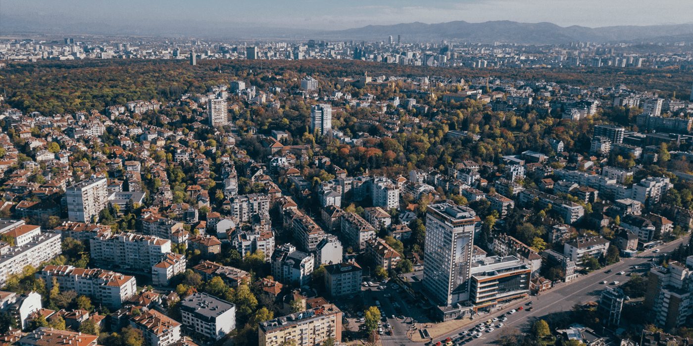
Lozenets is a district located in the heart of Sofia. The affluent neighborhood is surrounded by public parks and a significant part of its territory is occupied by low-rise residential buildings with small and charming gardens. The district is a cross point between nature, cultural heritage and residential environment.
Lozenets is a district located in the heart of Sofia. The affluent neighborhood is surrounded by public parks and a significant part of its territory is occupied by low-rise residential buildings with small and charming gardens. The district is a cross point between nature, cultural heritage and residential environment.
Symbol and Logotype
-
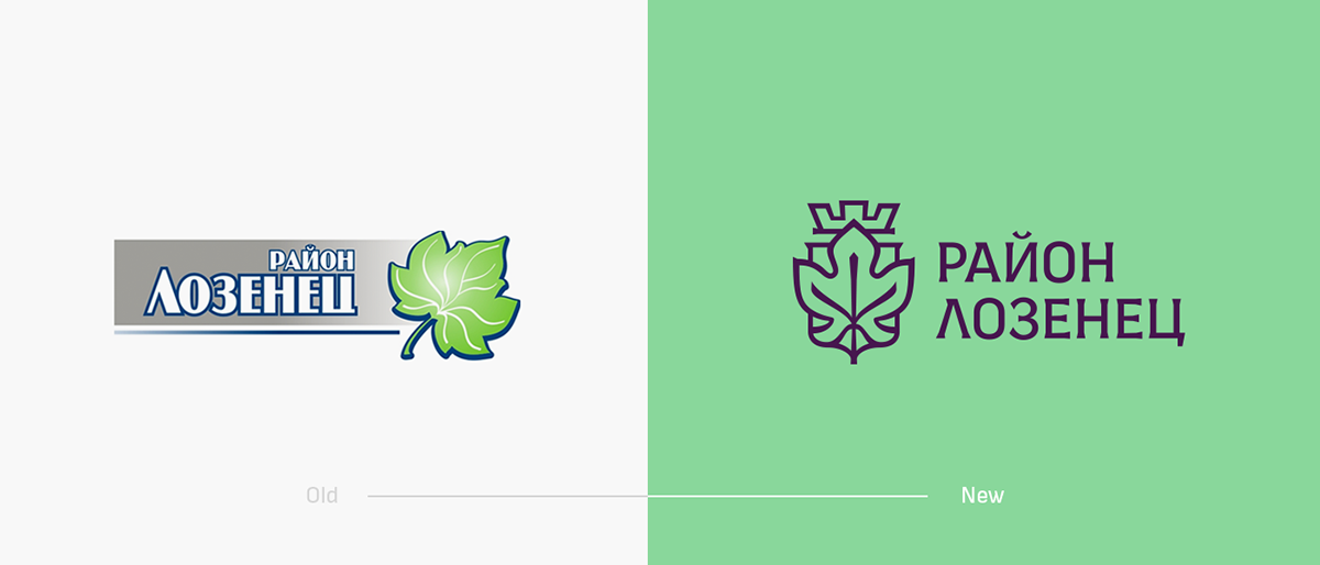
The name "Lozenets" comes from the Bulgarian word for vine – "лоза". The vine leaf, as a symbol, reflected the spirit of the entire district – quaint residential areas with flourishing greenery. An interesting fact is that a lot of the houses in the neighbourhood have vines covering their facades.
The symbol of the vine leaf had to be portrayed in a graphic style which indicated that Lozenets District is still an administrative institution and part of the Sofia Municipality.
The final result was a modern interpretation of heraldic symbolism.
The final result was a modern interpretation of heraldic symbolism.
The logotype is based on the Sofia Sans typeface. A modern condensed sans serif font with a natural feel. In order to create the perfect balance between the graphic style of the symbol and the logotype we modified the font by adding small and delicate serifs.


Colors
-
In the past, the district name was "Korubaglar" (which means "vineyards in the woods"). The current name "Lozenets" is constructed from the Bulgarian word for vine – "лоза".
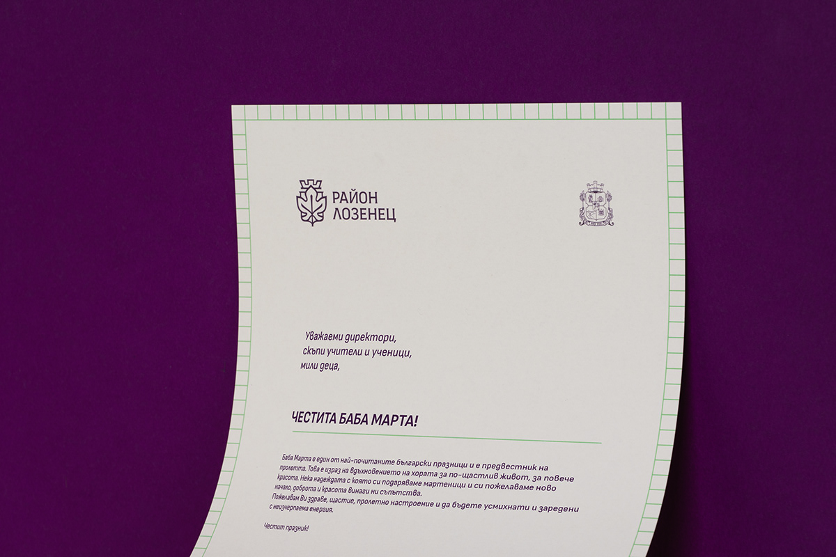
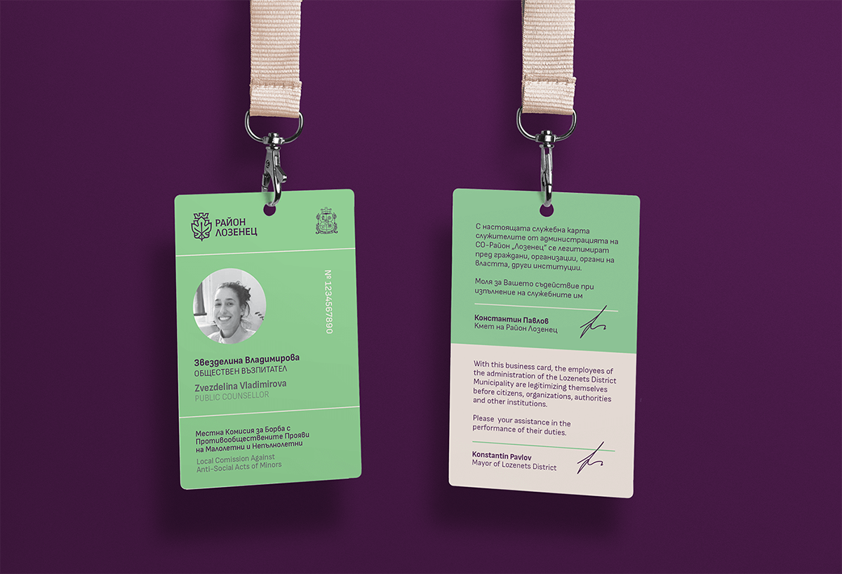
By depicting the etymological history of the district we've created a contemporary palette inspired by the green and purple colors of the local grape sort Vitis vinifera.
By depicting the etymological history of the district we've created a contemporary palette inspired by the green and purple colors of the local grape sort Vitis vinifera.


Typography
-
Since the administrative information is bilingual, we had two main criteria for the typeface selection. Firstly, we needed a more condensed typeface family, in order to fit larger chunks of texts. Secondly, it had to support Bulgarian Cyrillic. The typeface that we've chosen is Sofia Sans – a sans serif variable font family, created by Lettersoup for a wayfinding signage project for Sofia Municipality. The font was inspired from early-twentieth-century so-called technical sans serifs – typefaces with confident letterforms, a pronounced vertical impetus, and tense curves. With its narrow proportions and a generous x-height, the font works well in very diverse environments: from large to small, for display and immersive reading, on-screen and in print.


Environmental graphics
-
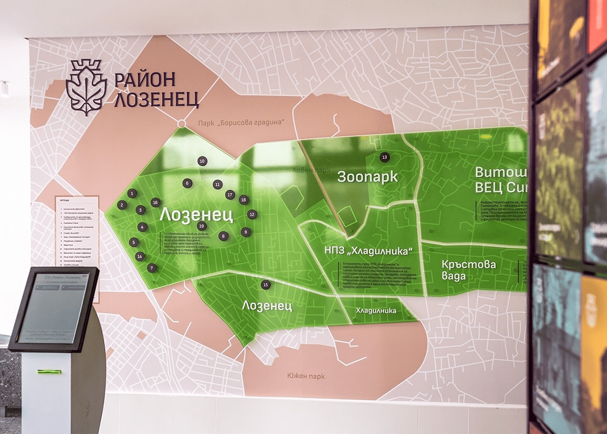
Another component of our rebranding was to create two environmental graphics located in the lobby of the District's main building. The lobby is a key area, where many people end up spending time, waiting for meetings, to pay their taxes, or to get authorizations for documents. Our goal was to create graphics on the walls that revealed interesting facts and landmarks in the district, so while people waited they could learn more about their neighborhood.
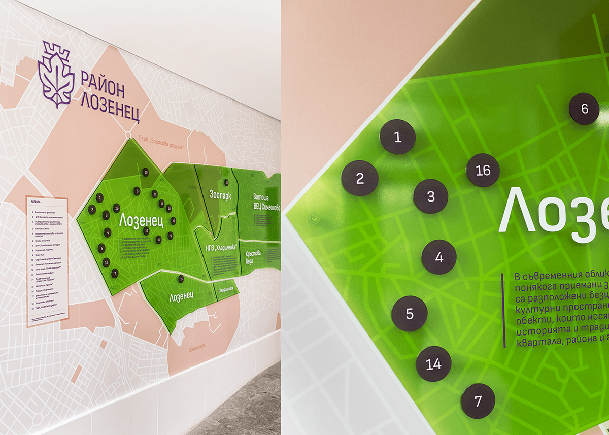
Lozenets District
Environmental graphic 01
-
Our first environmental graphic highlighted the entire district in green and broke down the district into sections of each of the neighborhoods. Then, in these sections, we were able to pinpoint most of the famous landmarks and things worth seeing.


Explore Lozenets
Environmental graphic 02
-
The second environmental graphic is an interactive modular installation, that showcases interesting facts about the district. The facts were divided in four color-coded sections – Nature (green), Community (red), Heritage (yellow) and Education (blue). We designed a customised icon for each section, based on the symbol of the district.


Credits
-
Creative Direction - Ivaylo Nedkov
Graphic Design - Atanas Giew, Tsvetislava Koleva
Client Service - Vera Schwartz, Dessi Doytcheva
Drone Photography - Alex Zhelyazkov
Photography - FourPlus Studio
Interior Design & Architecture - 7561architects
Font by Lettersoup
Creative Direction - Ivaylo Nedkov
Graphic Design - Atanas Giew, Tsvetislava Koleva
Client Service - Vera Schwartz, Dessi Doytcheva
Drone Photography - Alex Zhelyazkov
Photography - FourPlus Studio
Interior Design & Architecture - 7561architects
Font by Lettersoup