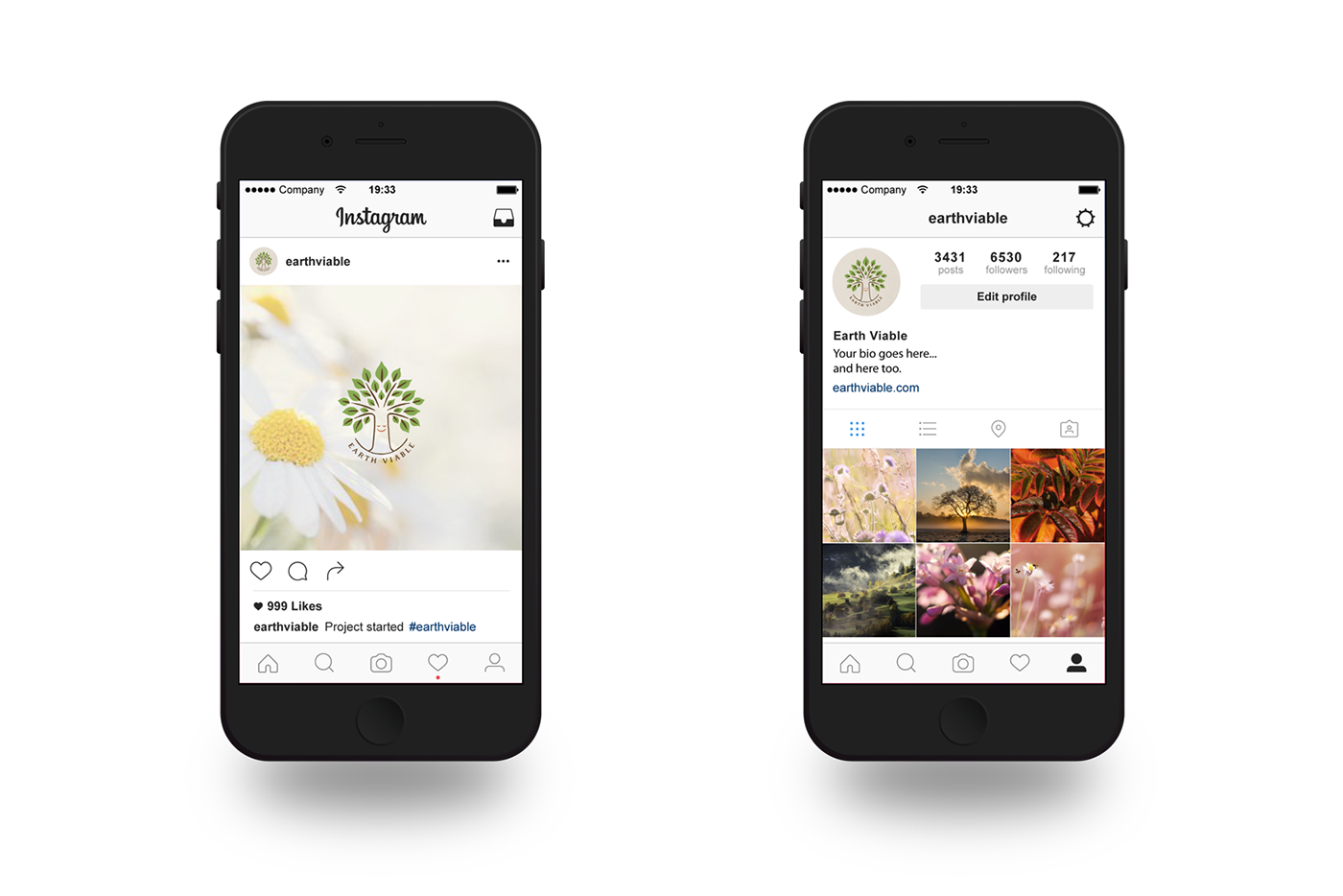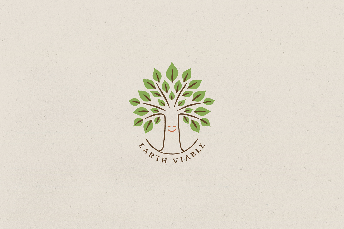
Earth Viable is new advertising platforms designed for the niche market of brands and products that are demonstrably environmentally caring, enables them to communicate a checklist of their sustainable undertakings. These advertisements will appear on the internet, social media and possibly television.
As global warming continues, sustainability and minimal climate impact is increasingly becoming a mandated corporate undertaking. I created a logo for the brand.
Earth Viableは、環境に配慮したブランドや製品などのニッチ市場向けに設計された、新しい広告プラットフォームです。様々なブランド間で、自らの事業が環境に与える影響の正しい知識を交換し、持続可能性の啓発を行うことを目的としています。これらの広告はインターネット、ソーシャルメディア、将来的にはテレビにおいても配信される予定です。
地球温暖化が進行する中で、企業の事業に対する持続可能性の確保と、気候への影響を最小限に抑える配慮は、ますます必須事項となりつつあります。今回、私はロゴのデザインを担当しました。
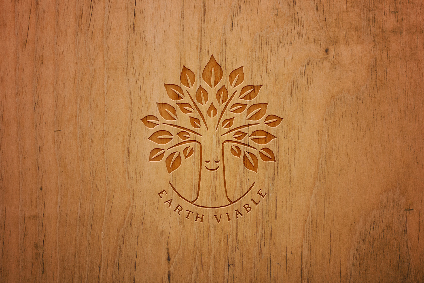
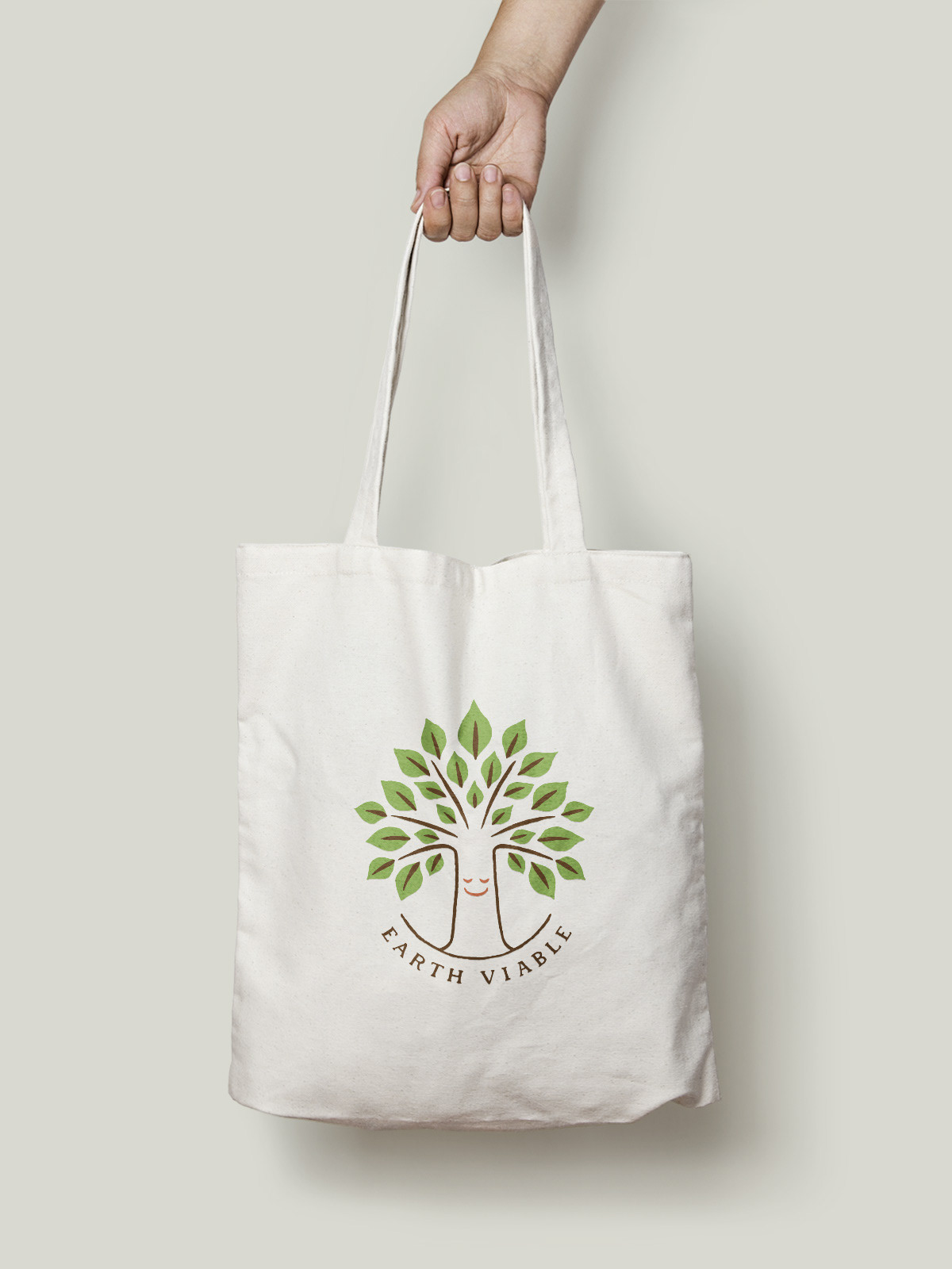
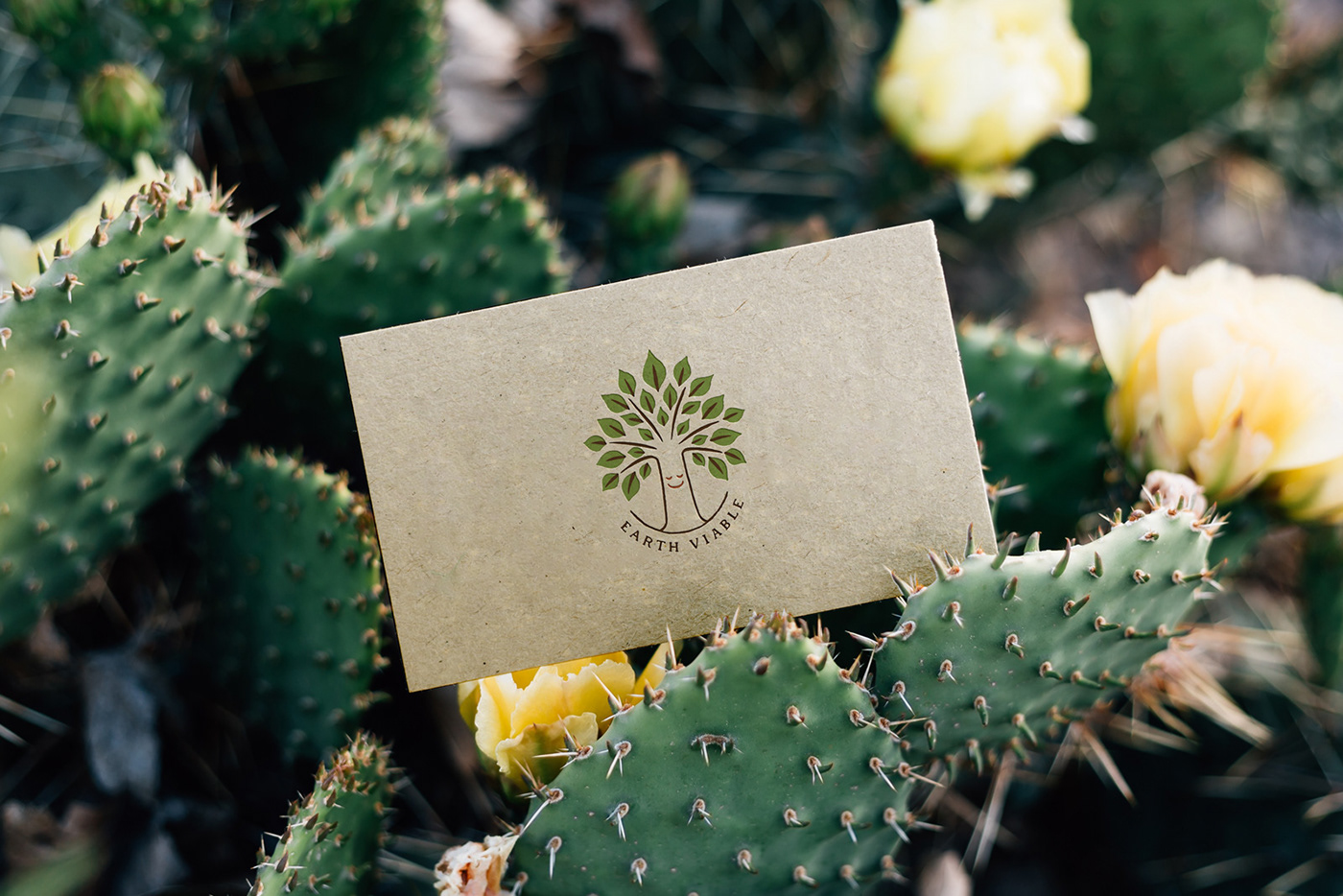
An initial brief from the client was to create 'the wisdom tree' with a simple, yet pleasing smiley face within the trunk as the logo symbol which represents warmth, compassion and friendliness.
クライアントから提示された初期イメージは、微笑みをたたえた巨大な幹をロゴシンボルとし、暖かさ、思いやり、そして親しみやすさを表現する、というものでした。
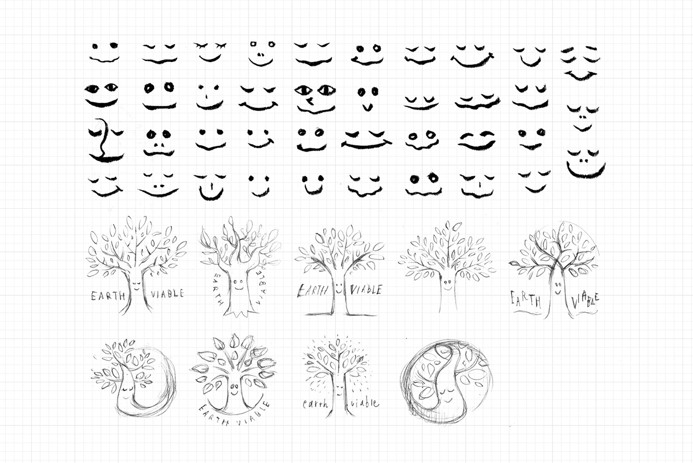
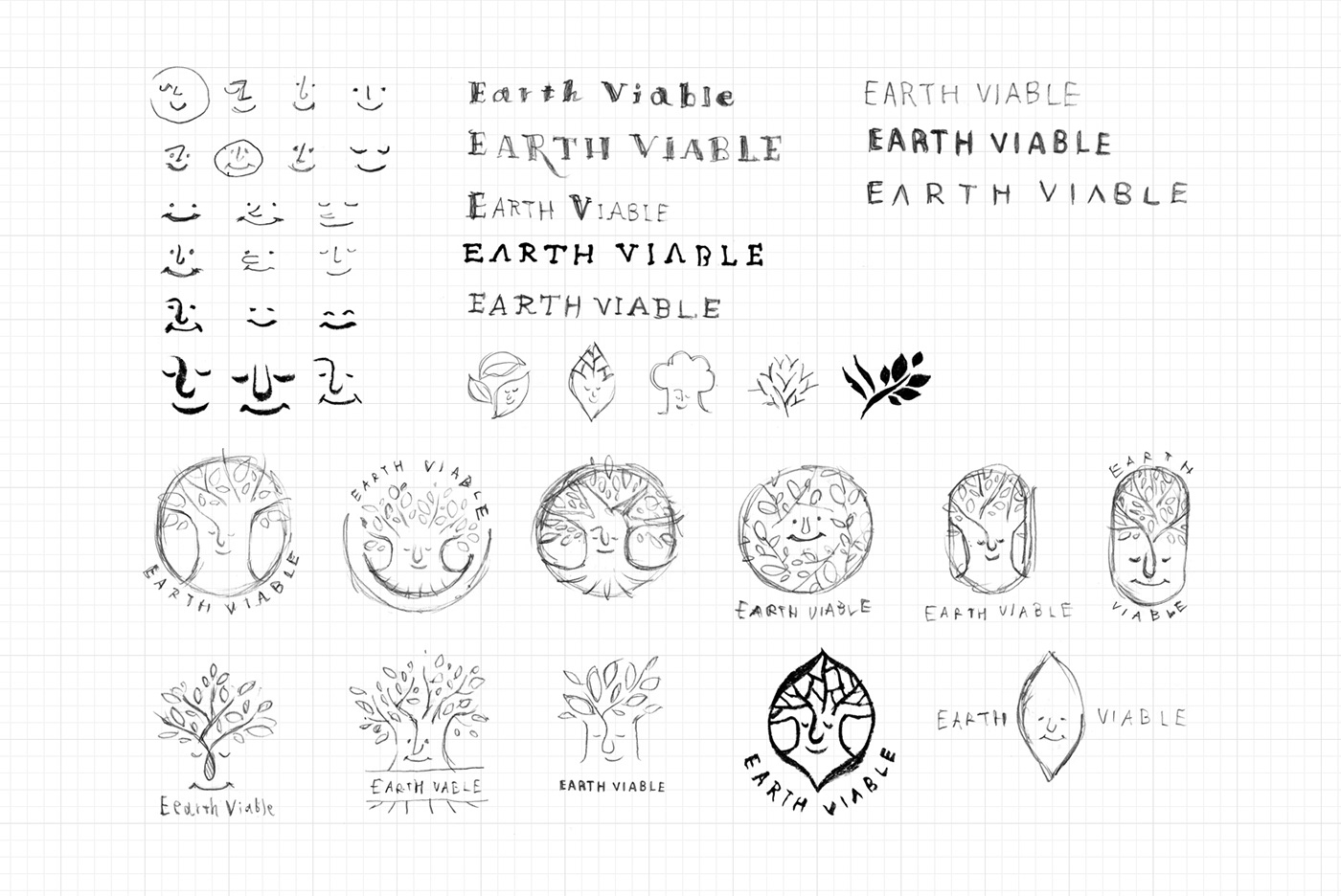
I developed the concept into some variations of the trunk, branches, leaves, smiles and logo shapes. In the result, we reached the to point of the tall and slim trunk with sporting out branches and calm smile with closed eyes.
スケッチの段階では、幹の幅、木々の伸びる方向、葉っぱの大きさ、微笑みの種類、ロゴの形など、様々なアイデアを練って検証を重ねました。結果、全方向に長く伸びた枝を備えた長く伸びた幹が、瞳を閉じながら微笑みをたたえている、というシンボルに落ち着きました。
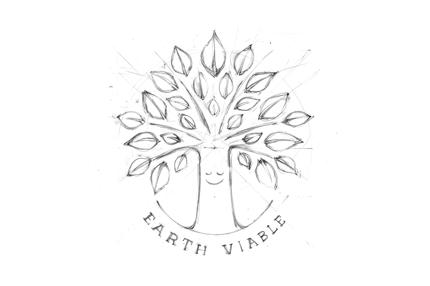


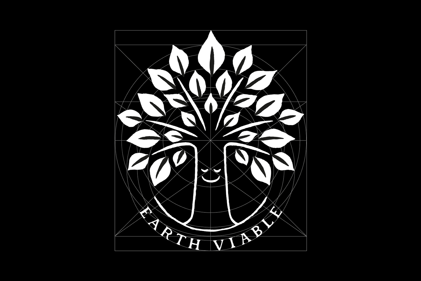
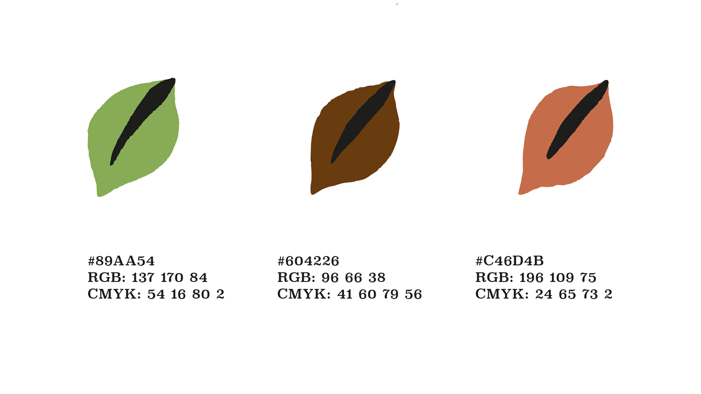
I choose a serif-based hand-drawn font for the logotype, and picked up three basic colours represents earth, environment and warmth. Throughout the pencil sketch to the final vectorisation, I kept organic hand-drawn lines that contain warmth and friendliness.
フォントはセリフベースとし、カラーは大地、環境、そして暖かさを表現する3色を設定しました。下書きからペン入れまで、有機的な手書きの感覚を保ったままベクターデータ化し、心に安らぎをもたらすような、暖かなロゴシンボルに仕上げました。