

CIC Tokyo - Signage & Identity
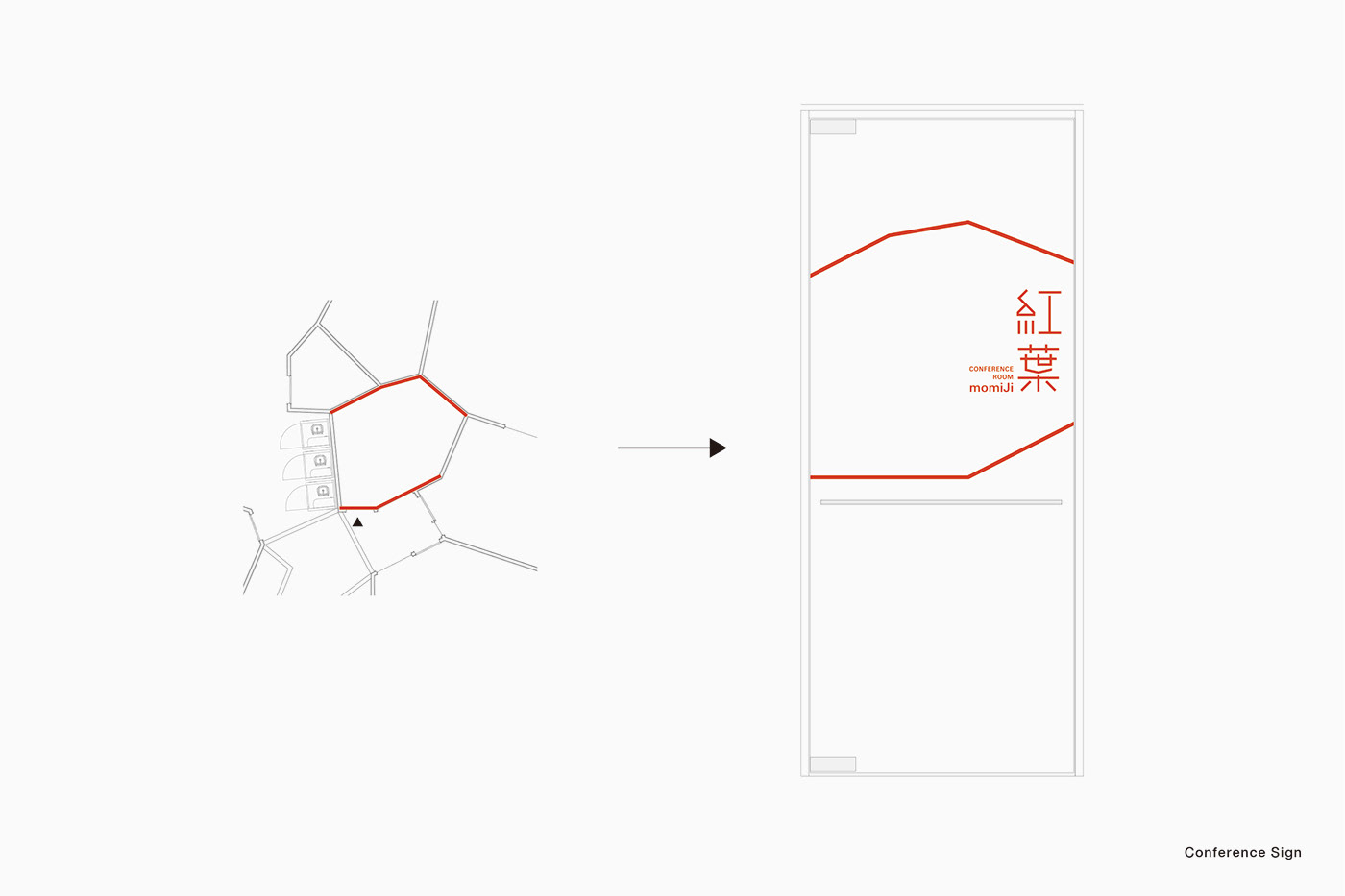
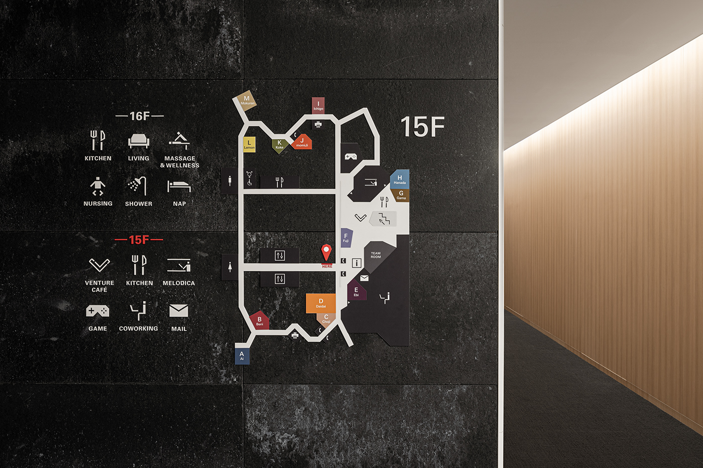
CIC(Cambridge Innovation Center)is a provider of shared office space for startups at the locations around the world. CIC Tokyo, the first CIC location in Asia, offers various office spaces based on the floor plan formed by Voronoi tessellation. In our signage scheme, each door of the conference rooms dispersed throughout the floor is turned into a wayfinding marker by adding a Kanji (Chinese characters) logotype representing a Japanese color in the very color.
The Kanji logotypes incorporate polygon shapes inspired by the plan view of each room. The names of the traditional colors represent the Japanese sensibility that captures the subtle and delicate difference of colors.

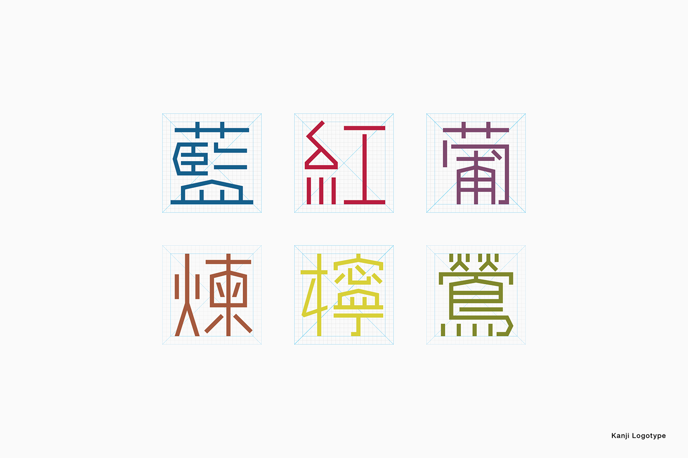


The lines above and below each logotype, derived from the plan view of each room, highlight the unevenness of the space.


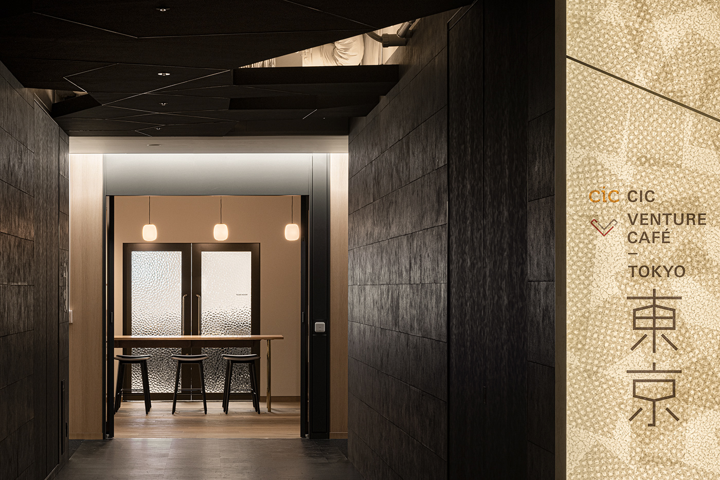
Kanji logotype is also applied to the facility name signage to symbolize CIC Tokyo.
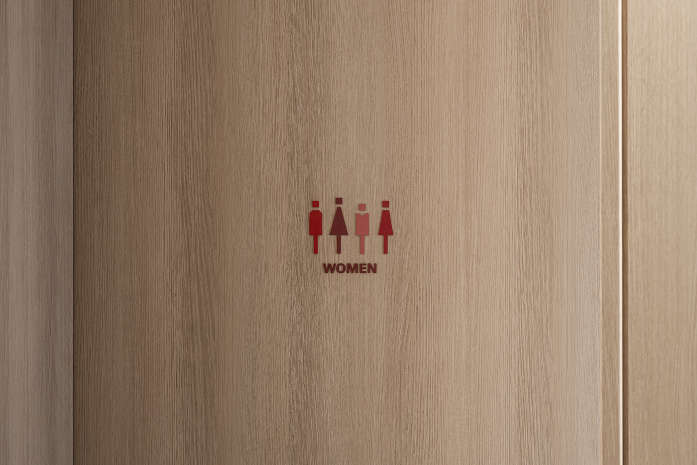
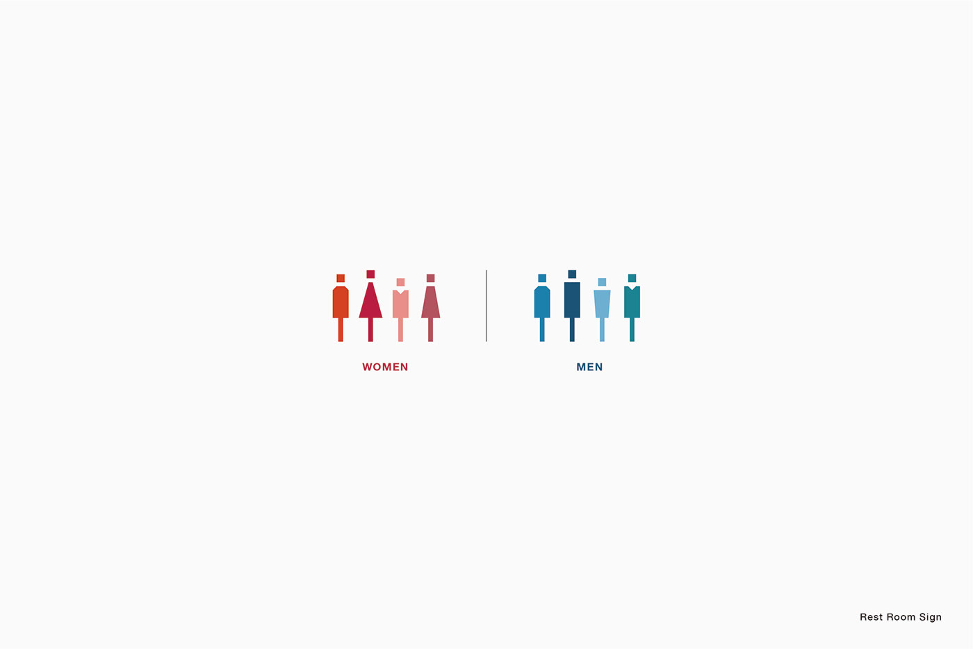
The restroom signage is composed of four pictograms in different shapes and colors, signifying diversity.

Architect : Tetsuo Kobori Architects, CIC Design Studio
Furniture : inter office
Signage + Identity : Arata Takemoto Design
Photo : Tomooki Kengaku


