


Av Bistro Menu
The task was to develop a new convenient structure, design and layout of the AV Bistro menu.
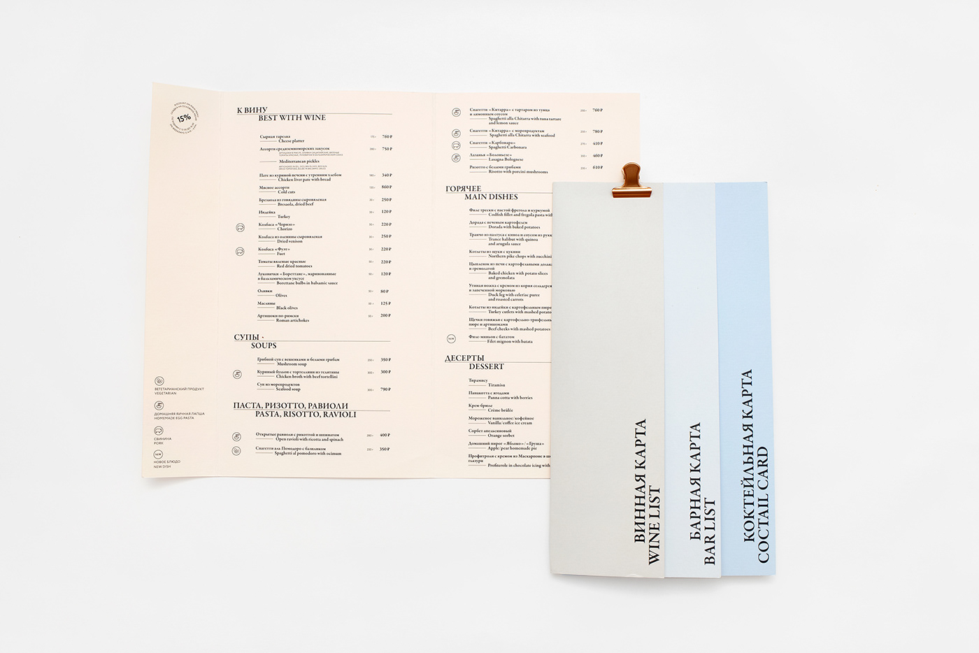
The main difficulty was the large volume of both sections and positions, as well as the need to use two languages. In addition, it was necessary to provide for the ability to use each tab or several tabs separately, for example, only a wine list or only drinks.After the prototyping stage, a convenient design was found that made it possible to fit all the sections, but at the same time the tabs-sections themselves remained mobile, some have one addition, some have two, depending on the number of positions in a particular section.The stepped layout of the menu with shifts allows the eye not to get bored, and the air pauses make the composition more poetic and light. For the menu, we chose tinted design paper "Colorplan" and printing in 1 ink, so the menu has a pleasant texture and even fill with color, a constant shade.The color scheme is selected in neutral tones, the shades of the tab sections are harmoniously combined, leaving the main accent for the menu text.
The main difficulty was the large volume of both sections and positions, as well as the need to use two languages. In addition, it was necessary to provide for the ability to use each tab or several tabs separately, for example, only a wine list or only drinks.After the prototyping stage, a convenient design was found that made it possible to fit all the sections, but at the same time the tabs-sections themselves remained mobile, some have one addition, some have two, depending on the number of positions in a particular section.The stepped layout of the menu with shifts allows the eye not to get bored, and the air pauses make the composition more poetic and light. For the menu, we chose tinted design paper "Colorplan" and printing in 1 ink, so the menu has a pleasant texture and even fill with color, a constant shade.The color scheme is selected in neutral tones, the shades of the tab sections are harmoniously combined, leaving the main accent for the menu text.
Стояла задача разработать новую удобную конструкцию, дизайн и вёрстку меню «АВ Бистро». Основная сложность заключалась в большом объёме как разделов, так и позиций, а также необходимости использовать два языка. Кроме того, нужно было предусмотреть возможность использовать каждую вкладку или несколько вкладок отдельно, например, только винную карту или только напитки. После этапа прототипирования была найдена удобная конструкция, которая позволила уместить все разделы, но при этом сами вкладки-разделы остались мобильными, некоторые имеют одно сложение, некоторые — два, в зависимости от количества позиций в конкретном разделе. Ступенчатая вёрстка меню со сдвижками позволяет взгляду не заскучать, а воздушные паузы делают композицию более поэтичной и лёгкой. Для меню выбрана тонированная дизайнерская бумага «Колорплан» и печать в 1 краску, поэтому меню имеет приятную текстуру и ровную заливку цветом, постоянный оттенок. Цветовая гамма подобрана в нейтральных тонах, оттенки разделов-вкладок гармонично сочетаются, оставляя основной акцент тексту меню.
Art director Alexandra Loginevskaya
Design & layout Ksenia Ippolitova, Daria Kwon
Text & translation Ira Ivanova
Photography Daria Kwon


