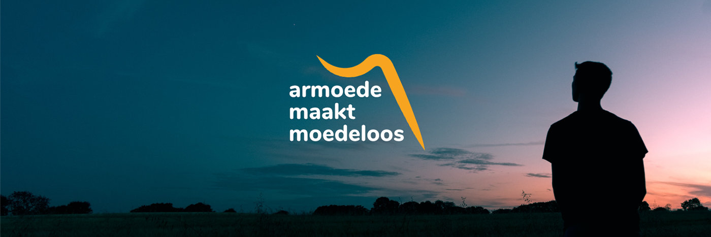
Image from Unsplash by Benjamin Davies
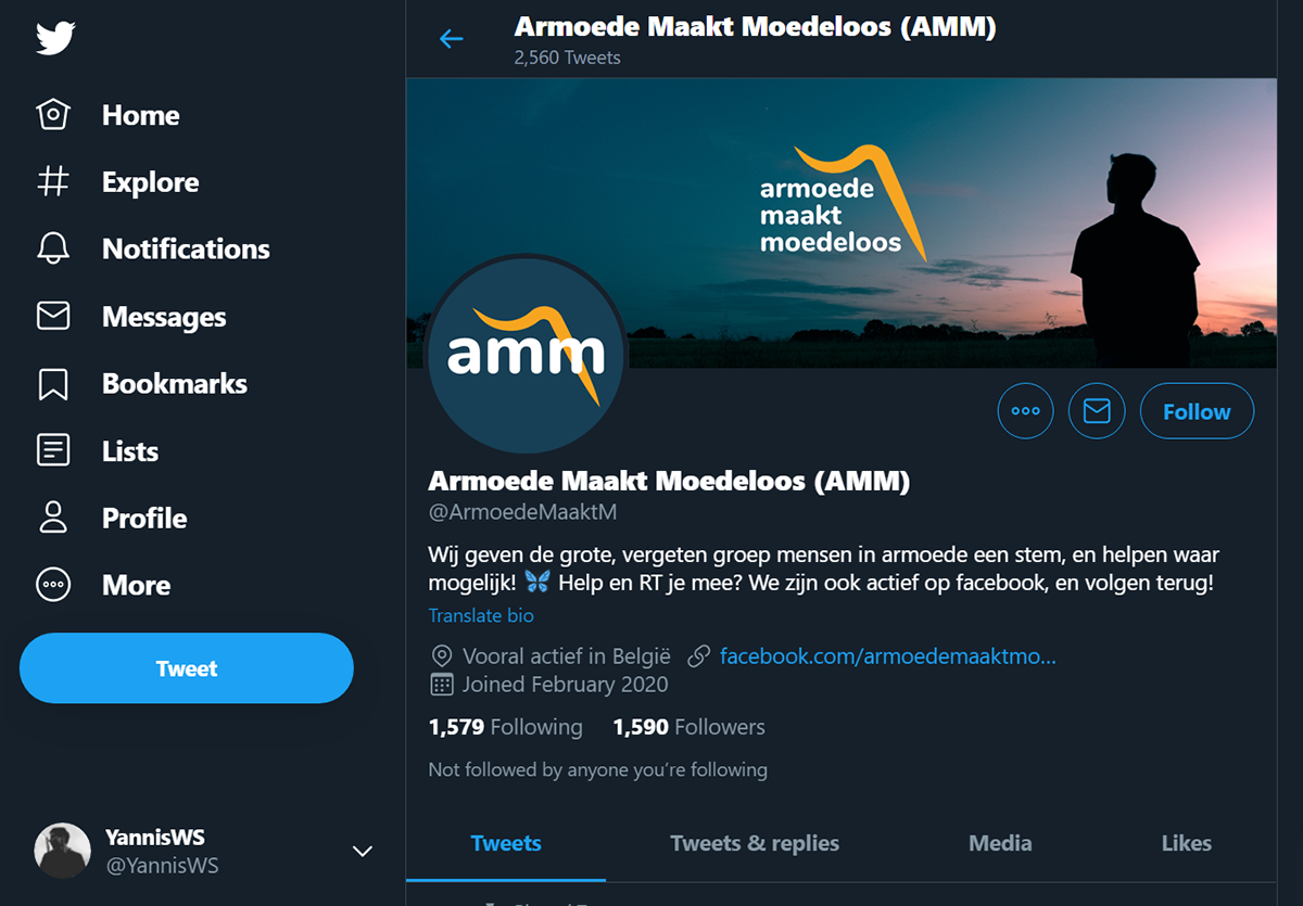
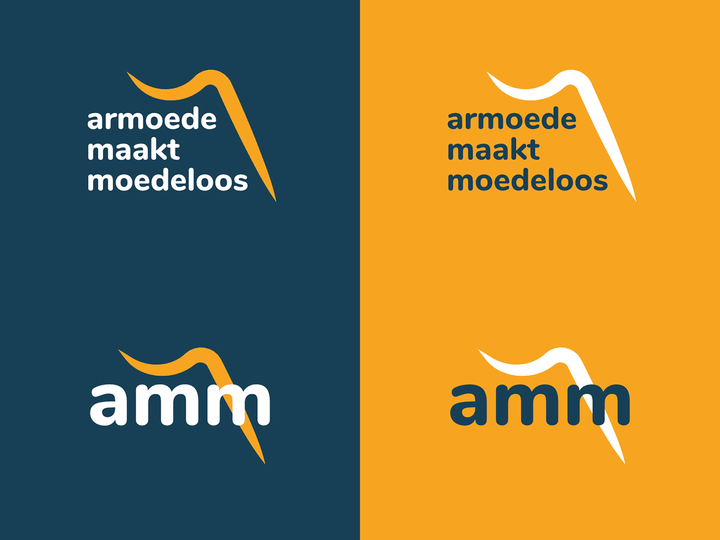
This is my proposed logo for 'Armoede Maakt Moedeloos', an organization that tries to help their community and raise awareness about the difficulties of living in poverty and social isolation.
They preferred to keep the light-blue color from their original logo, but after some iterations I decided to step away from it. Reason is that the light blue feels cold and distant, while the organization stands for the exact opposite. Therefore I used a darker shade of blue and brought in a warm orange as accent.
For the shape I took inspiration from many online resources around poverty and despondency. It can be associated with a person's hand reaching for help and a forced smile which falls down and disappears.
Although I'm not 100% statisfied, it gave me the opportunity to gain experience with Affinity Designer and logo-design in general :) Please let me know what you think!


