Kacang Bawang or Garlic Crunchy Nut in English, is one of Bali’s most well-known traditional snacks. Though very popular among both locals and tourists alike, the product is rarely seen as a delicacy for many of its suppliers’ outdated presentation. The project is to create a luxurious packaging with a touch of Bali’s traditional look to leverage the product value.
The typography consists of three typefaces – traditional Balinese aksara, San Serif, and Decorative that resembles the Balinese aksara and serves as the bridge between the first two. Illustration of the product (garlic and nuts) is used as the main vocal point to give the traditional look, further enhanced by the the Balinese patra (carving ornaments) as the background art. The colour chosen is analogues of maroon, orange and yellow – the iconic colour of Bali’s sunset.


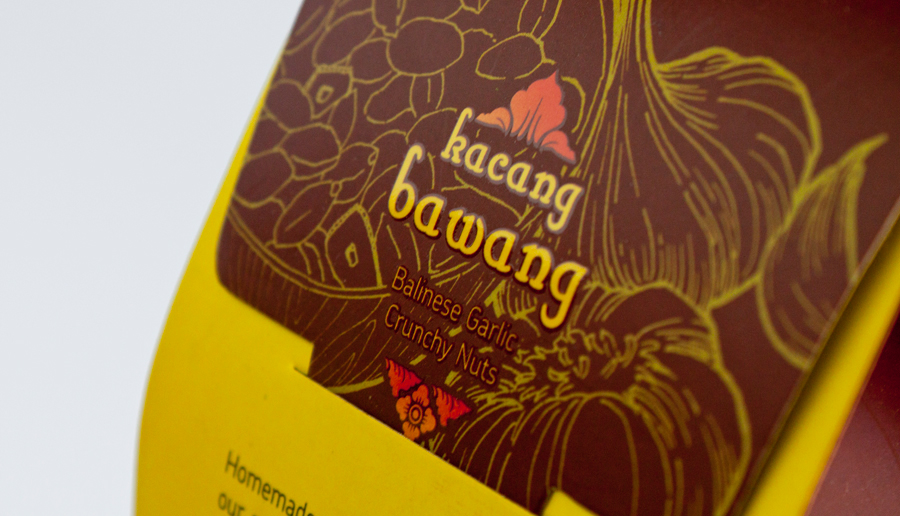
Detail view of the Kacang Bawang logo

Logo and Illustration use UV Spot to make it more aesthetic and attractive.

There are both Balinese (using Balinese aksara) and English translation on the back of the packaging.


