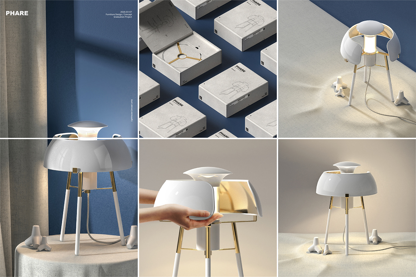
Phare
2020. 03 - 07
Furniture Design / Concept
Graduation Project
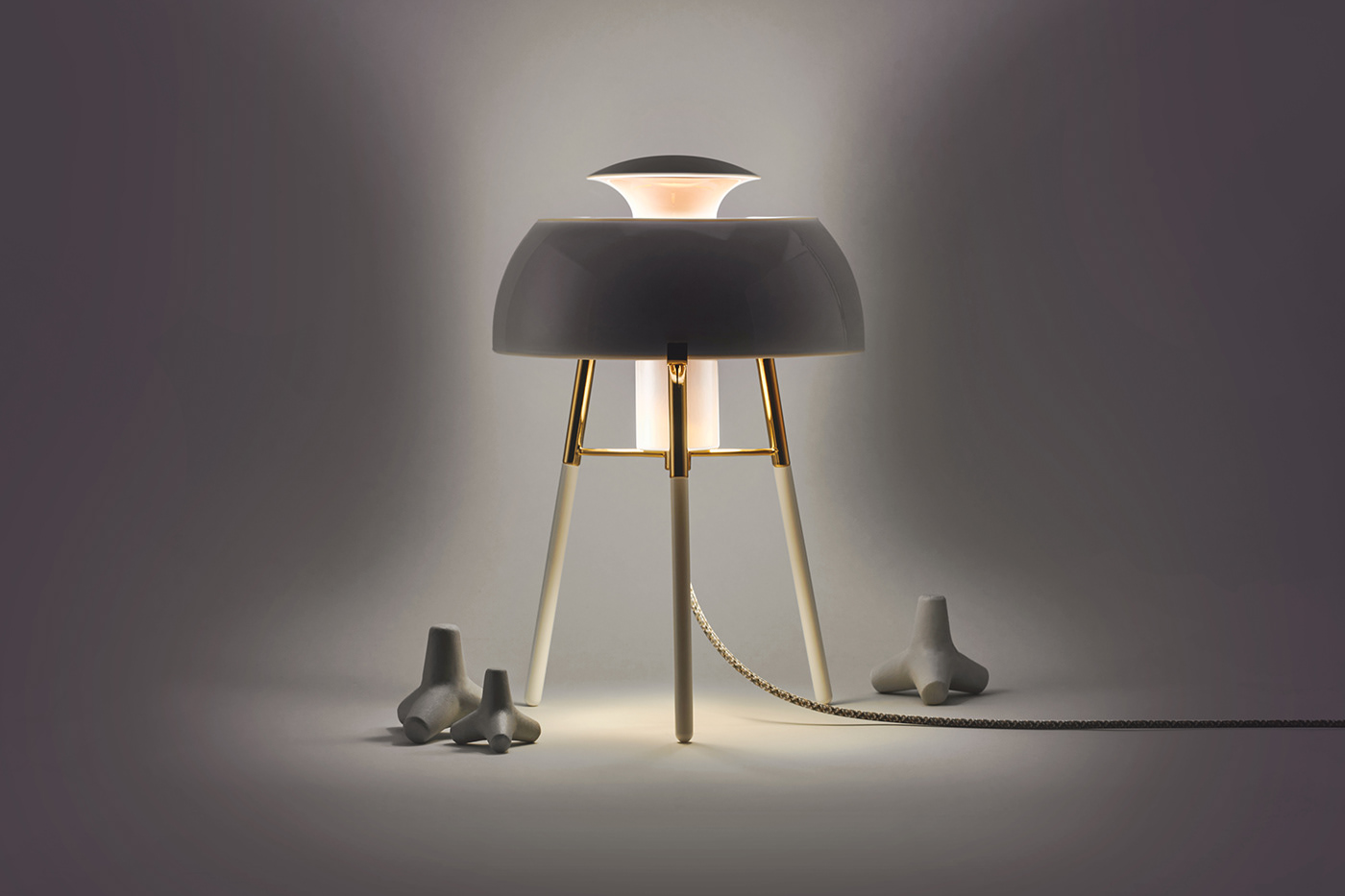
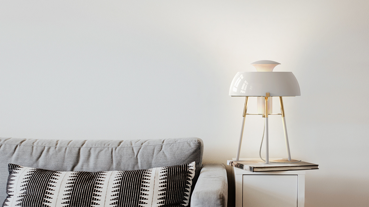
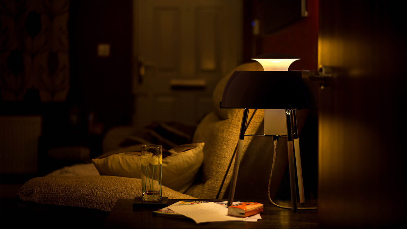
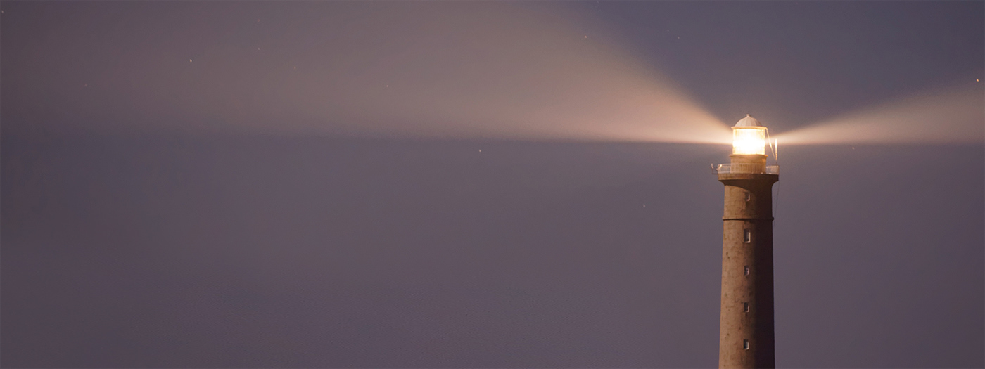
Lighting, which is often called ‘the flower of interior decoration’, is a critical factor that determines the atmosphere of a space. A coastal lighthouse is a vertical structure built on a horizontal coastline that sometimes becomes a landmark, and also plays the role of guiding the night sailing of ships with radiant light.
Phare expresses this image of a lighthouse brightening up the night journey through the shape expressing the directionality of the lighthouse’s beam and the internal processing that reflects the radiant light.
Design Inspiration
그 끝을 알 수 없는 광활한 바다에서 길잡이 역할 해주는 등대. 사람들은 등대의 빛을 보고 방향을 인지하거나, 위험으로부터 피하기도 한다. 등대의 불빛이 주는 "안정감"과 "찬란함"을 우리 생활 공간 안에 하나의 오브제로써 표현하고자 하였다.
A lighthouse that serves as a guide in the vast ocean where the end is unknown. People can see the light of the lighthouse and recognize its direction, or avoid danger. We wanted to express the "stability" and "radiance" of the light of the lighthouse as an object in our living space.


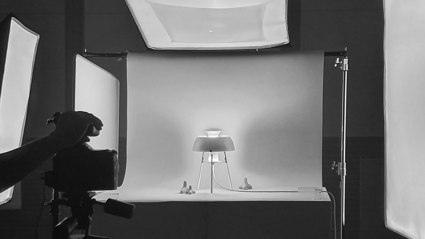
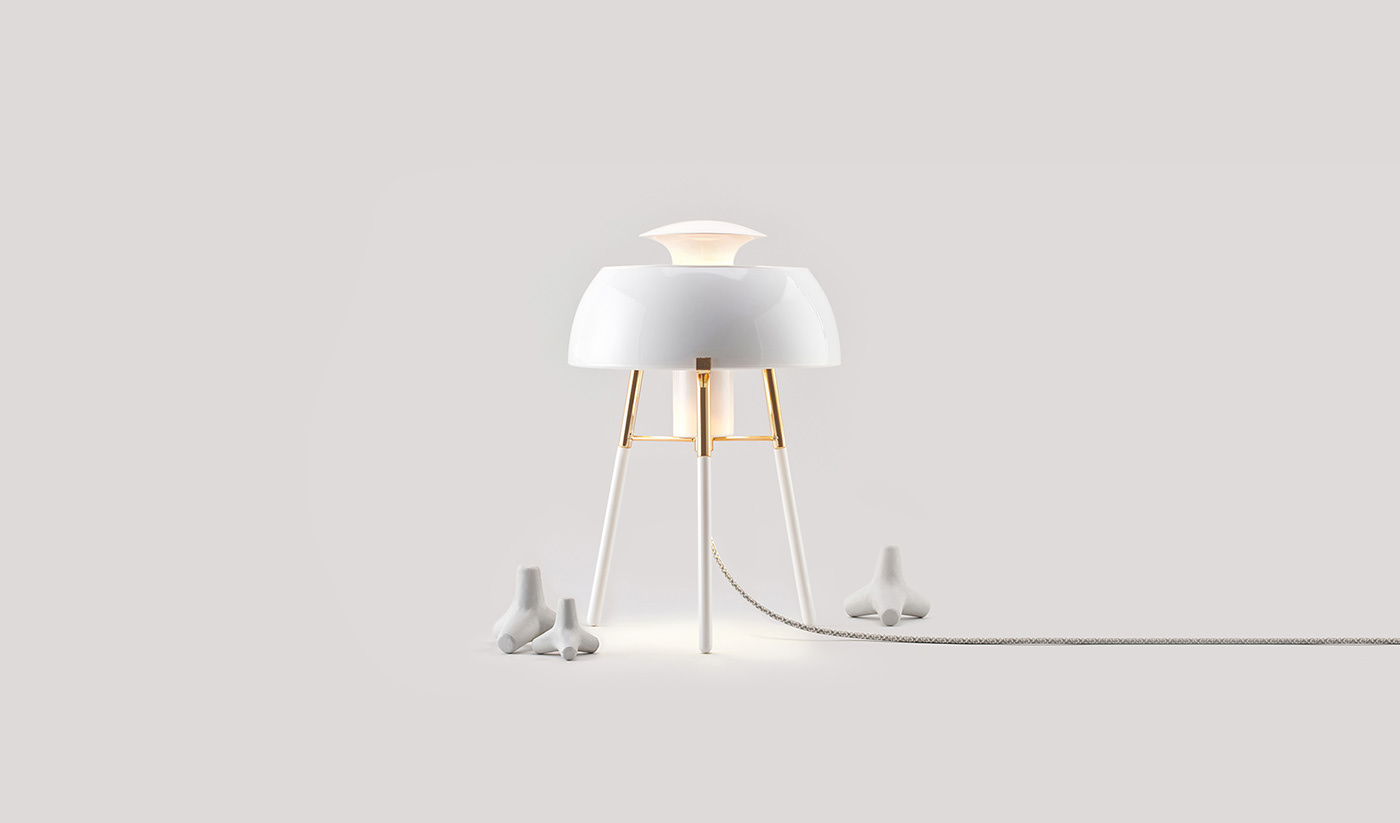
Sketch and Prototyping
등대의 사선 기둥 형태와 돔 지붕을 형상화 할 수 있는 조형을 나타내기 위한 과정을 거쳤다. 스케치 컨펌 이후 3D 모델링을 통해 형태를 구체화 시켰다. 또한 스케일감 및 구조를 확정시키기 위한 프로토타이핑을 진행했다.
It went through a process to represent the shape of a diagonal column of a lighthouse and a dome roof. After confirming the sketch, the shape was concreted through 3D modeling. In addition, prototyping was carried out to confirm the scale and structure.


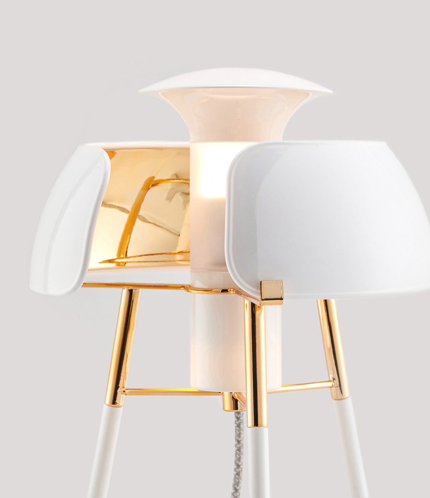
Making Process_1
제품을 잡아주는 중심 파트는, 강도가 중요하므로 스테인레스로 제작을 진행하였다. 중앙부와 조명 갓 부분은 시보리로 진행하고지 하였지만, 제작상의 리스크가 존재하였다. 테두리의 디테일을 추가함과 동시에 3d 프린팅으로 제작하였다.
The part located in the center of the product was made of stainless steel because strength was important. The lighting part and the lampshade part were intended to be processed by spinning, but there has a production risk. and I wanted to make the edges more detailed too, so i proceeded with 3D printing.
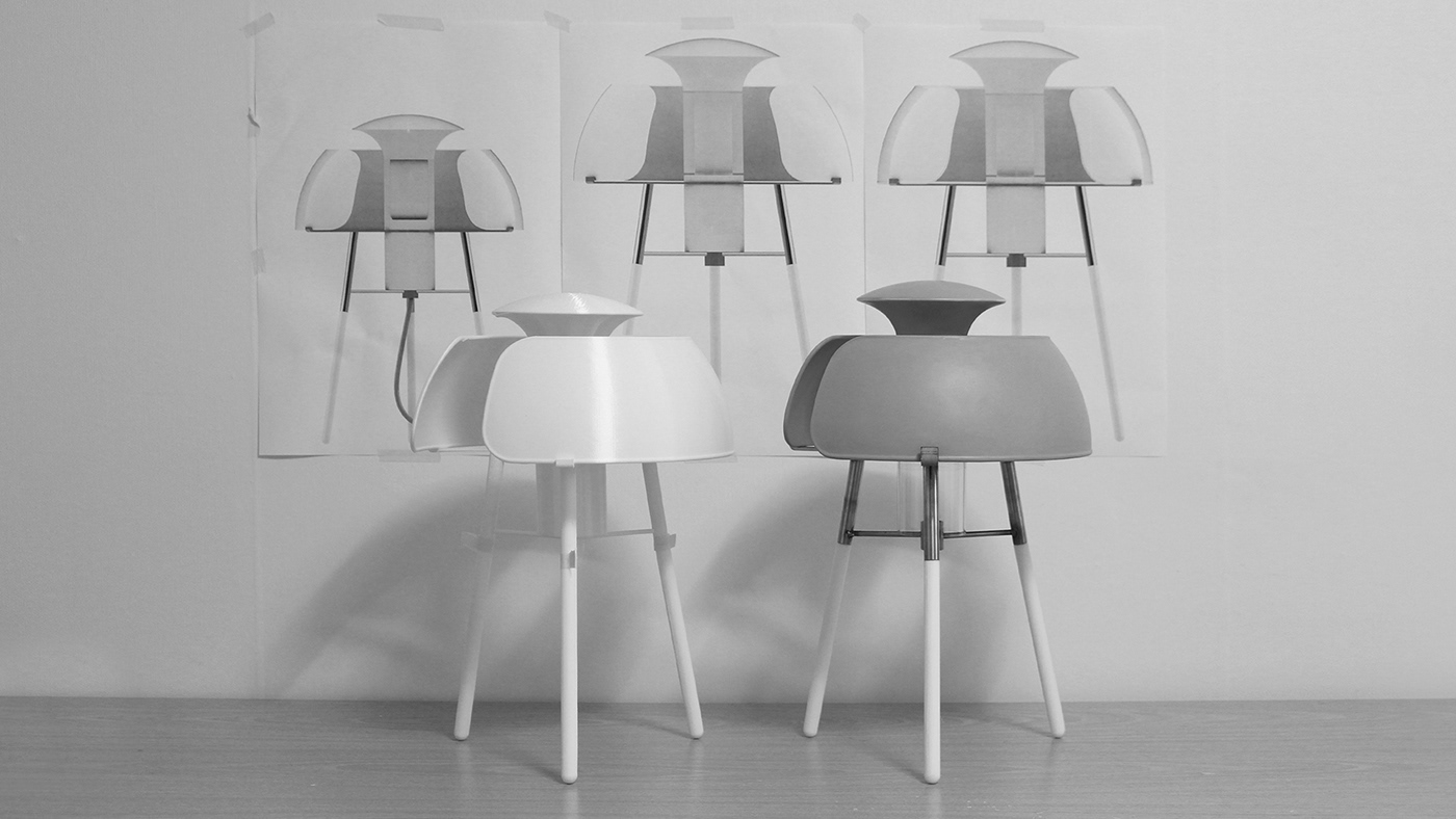
Interim Form Check
1:1 사이즈의 2D 스케일 이미지와 프로토타입 모형, 제작된 제품 형태를 나란히 두고 형태를 확인하는 과정을 거쳤다. 도색 전 수정사항에 대한 마지막 보완을 위한 과정이었다.
I went through a process of checking 2D scale images, prototype model, and manufactured product type side by side. It was a process to supplement the last form of the correction before coloring.
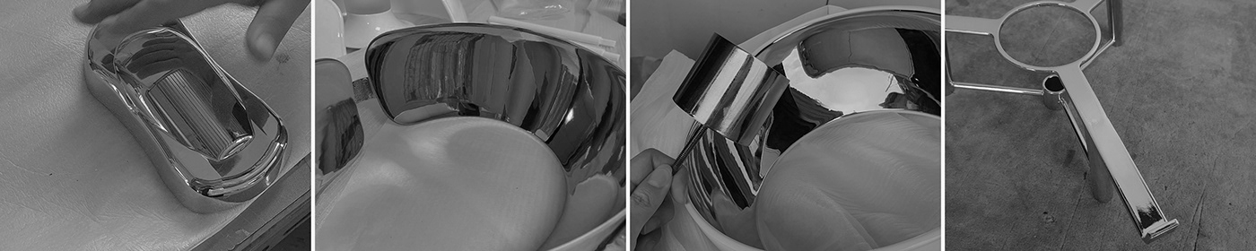
Making Process_2
제작 의도에 맞추기 위해서는 금속 소재인 스테인레스와 플라스틱 출력물을 같은 색상으로 표현해야 했다. 컨셉을 잘 표현하기 위해서는 메탈릭 컬러보다는 크롬 컬러가 알맞다고 생각했다. 두 소재 모두 도색이 가능한 방법을 찾다가 '진공증착' 과정을 통해 골드 색상을 구현했다.
Stainless metal materials and plastic output had to be expressed in the same color. To express the concept well, I thought chrome color was more suitable than metallic color. Both materials have gold colors through vacuum evaporation process that can be color coated.