Mindjoy is an adaptive learning program based in South Africa. It began with the realisation that traditional schooling doesn’t work for all children and one-size doesn't fit all learning. Some children are bored with the pace, others struggle and need more time, sometimes life throws huge curve balls like at home, or sometimes it’s just hard to pay attention in a large classroom. Mindjoy is working to make learning effective so all children can learn what they need to flourish later in life.
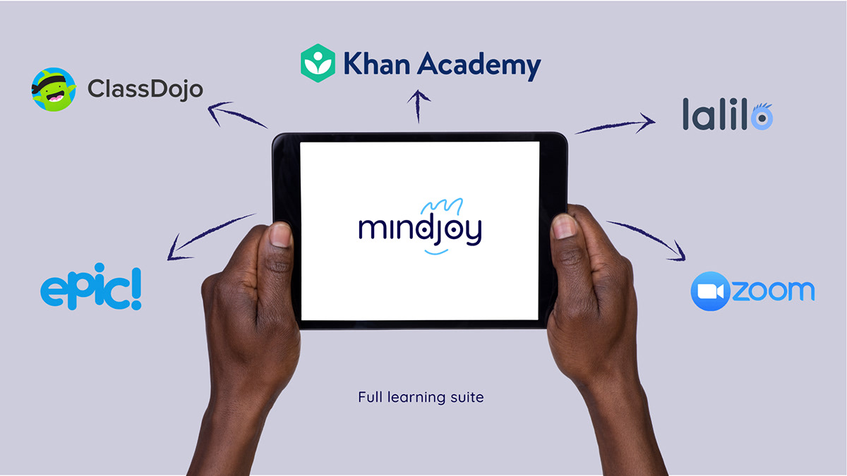
Mindjoy turned to TED to develop a visual direction that could grow with students along their learning journey.

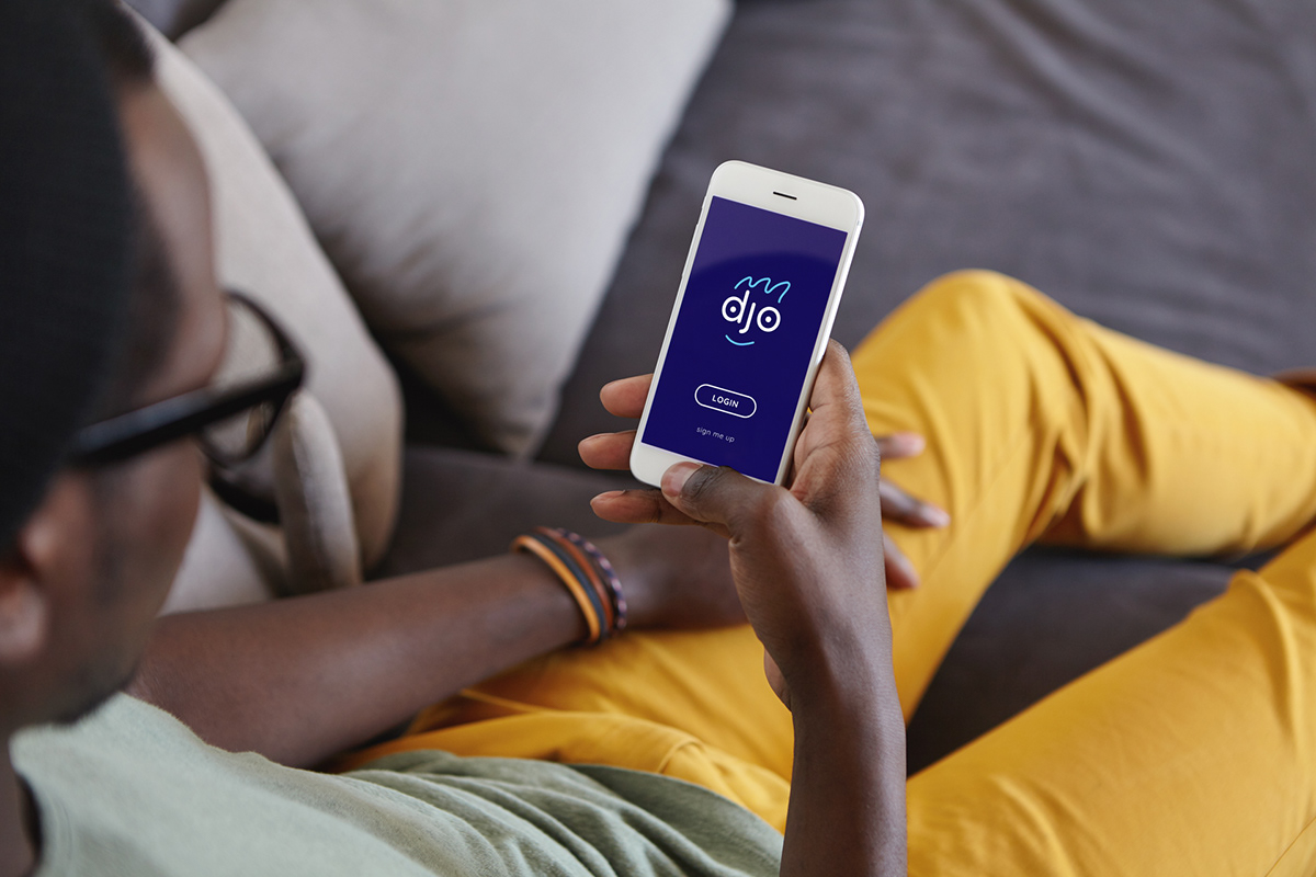
The new identity done by Tiger Eels Design focusses on the brands look and feel being synonyms to its name. The visual identity revolves around the joyful face of Mindjoy. The face is made using the dots from the letters 'i' and 'j'. There are two squiggles for the mouth and hair to contain the basic shape of the face.


The face expands into a further customised kit of childlike characters each being drawn from different illustration mediums that can be found in the Mindjoy classrooms.

The different faces resemble the unique individuals that make up the Mindjoy classrooms. This is one of the ways the company expresses its warm welcoming spirit.

The students at Mindjoy are encouraged to use their imagination when learning.