


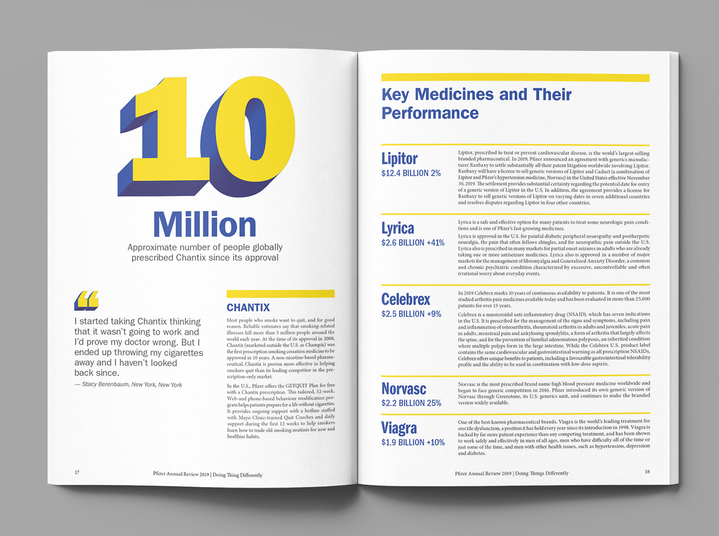
Pfizer Annual Review 2019
Self initiated project redesigning an old Pfizer Annual Report. The concept is based around Pfizer challenging the idea that an organization cannot be large and entrepreneurial/innovative at the
same time.
same time.
My solution was to use a bright yellow to reflect innovative and entrepreneurial thinking/bright ideas and to use big bold 3D typography to represent the large corporate nature of the company. The 'N' takes on this treatment on the front cover due to it's role in the Myers Briggs personality type indicator as a representative of people who tend to be more innovative and entrepreneurial.
