Guatemala Alumínio
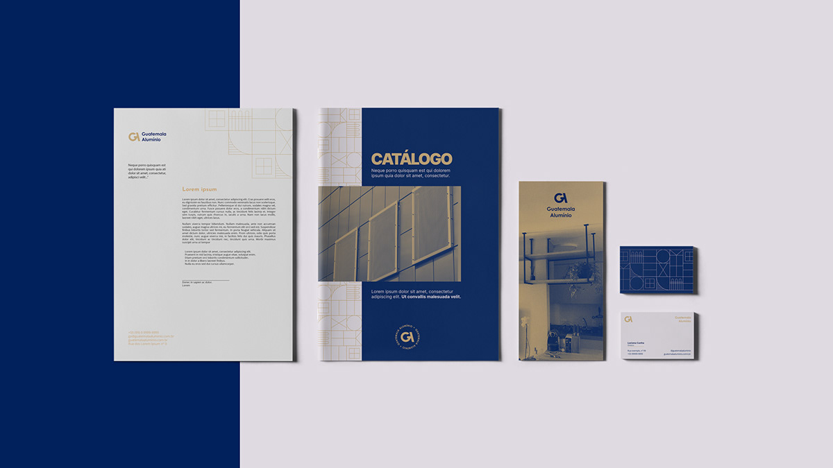
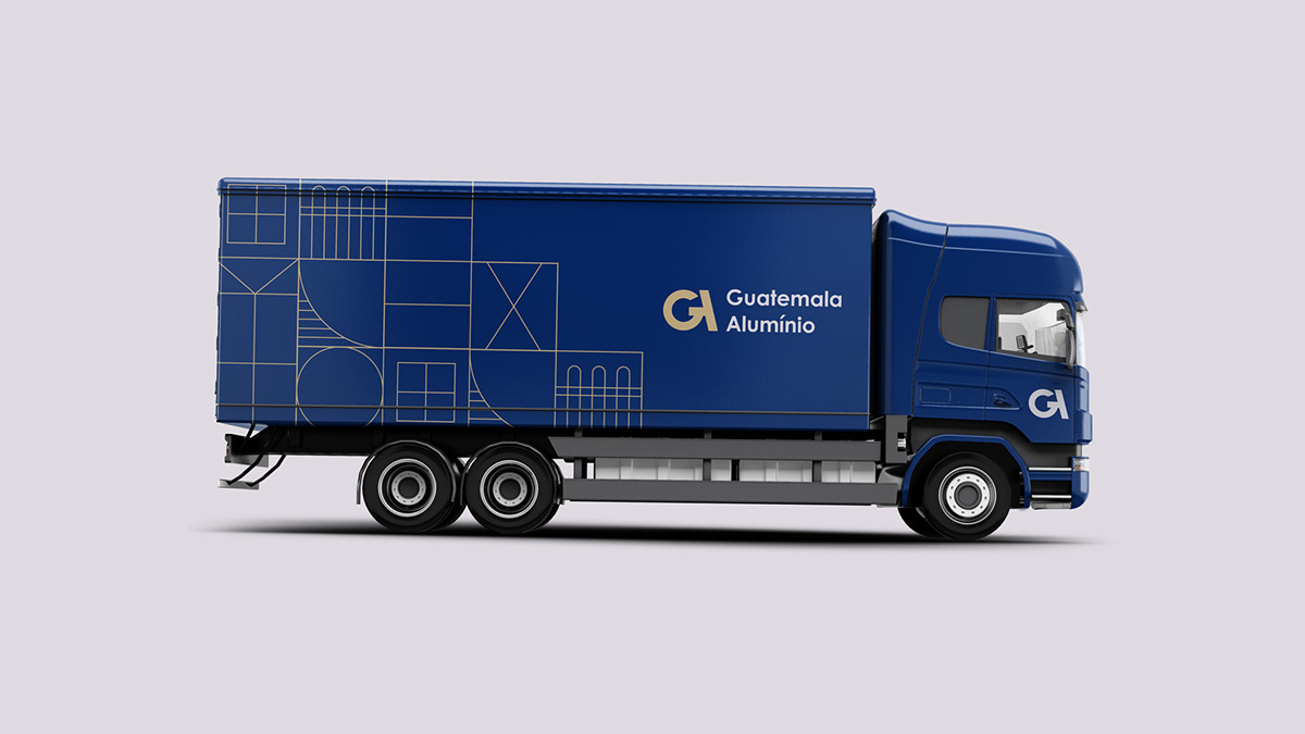
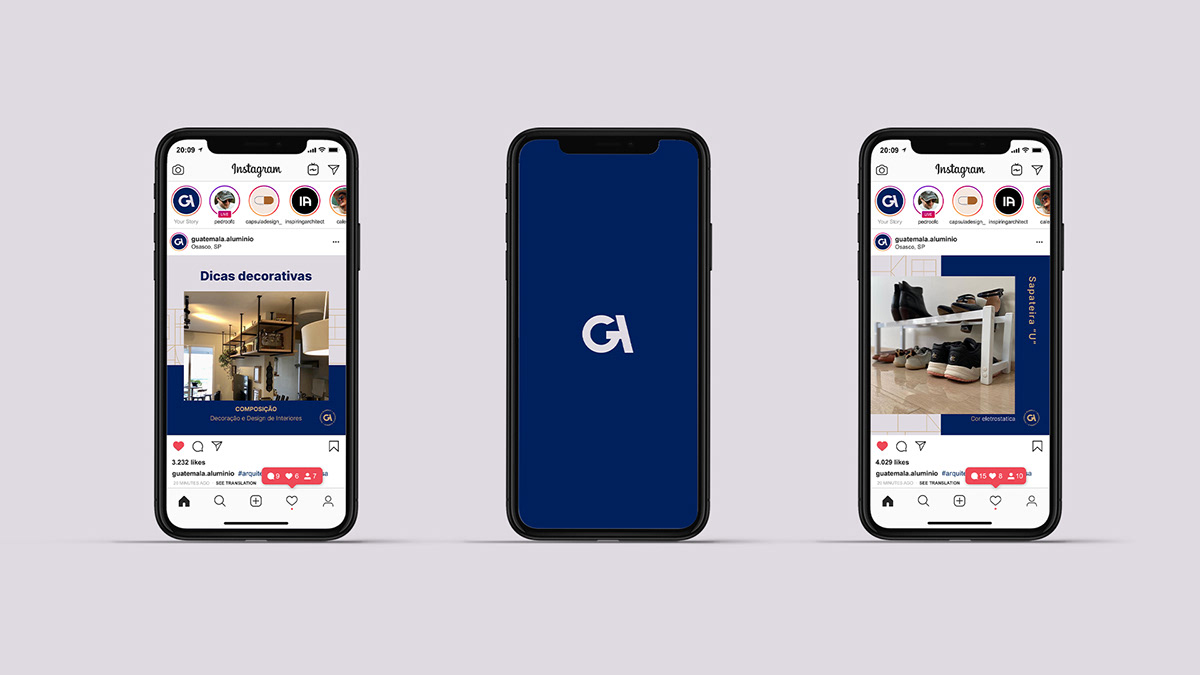
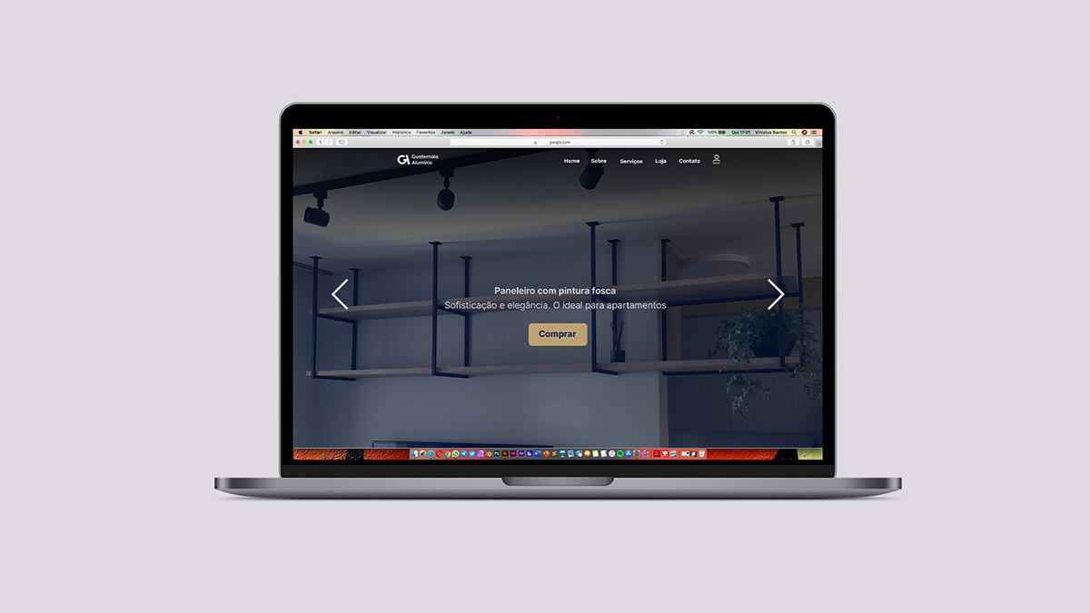
É uma empresa com mais de 30 anos de experiência no mercado e que por onde passa, deixa registrado seu legado e elegância. Uma empresa que está ajustando seu foco para o ramo de produtos de interiores e que sentiu a necessidade de um novo design e um novo posicionamento, assim abrindo as portas para as vendas online, seja por meio de redes sociais ou por e-commerce.
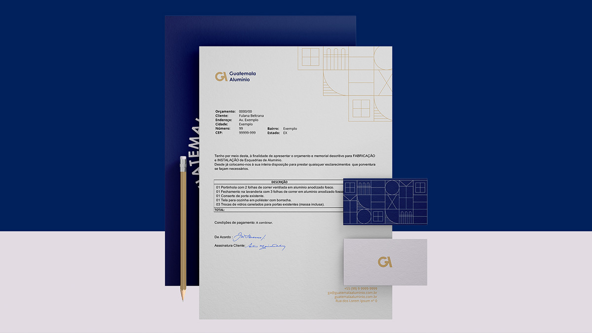
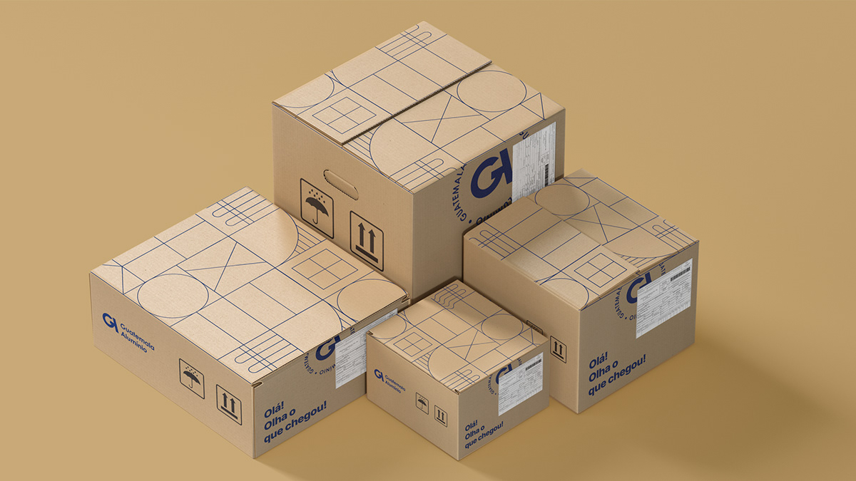
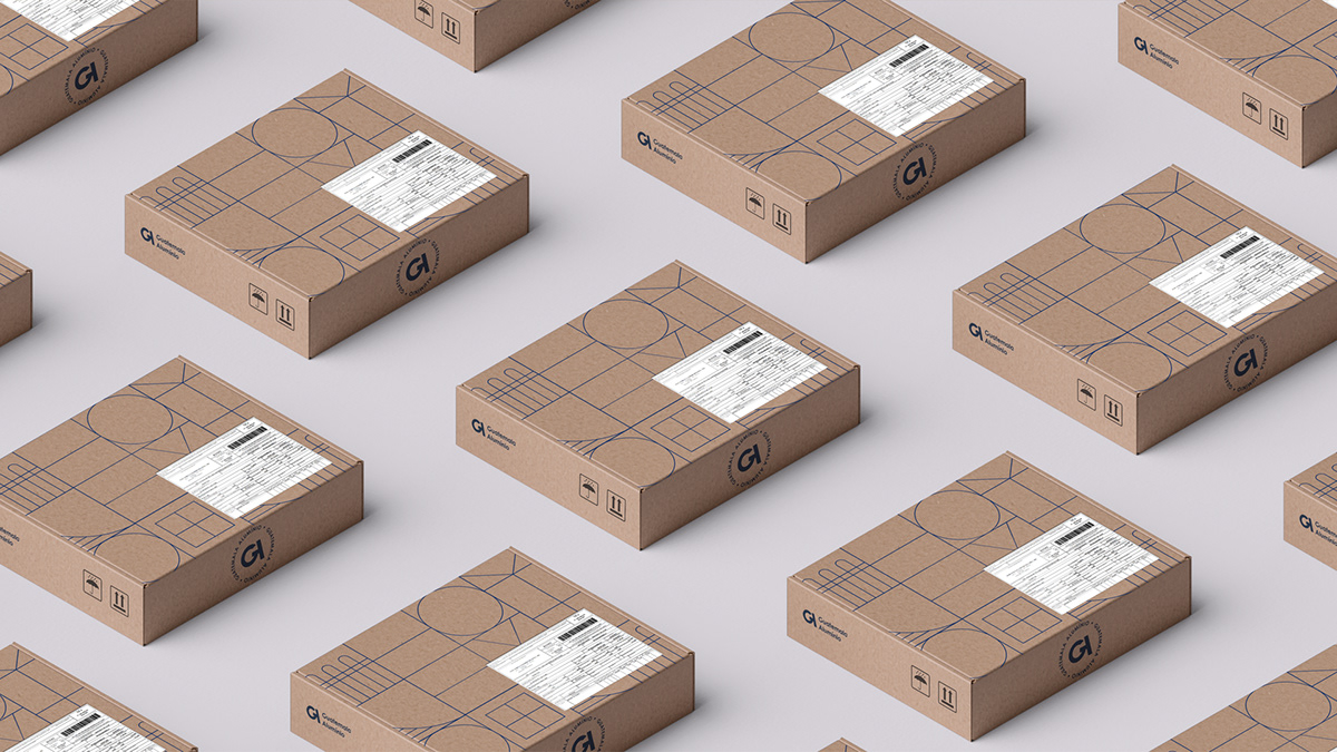
Uma marca que busca sua reestruturação com qualidade em seus produtos e satisfazendo seus clientes desde o primeiro contato até a instalação. Levando acesso ao público desde suporte para celulares até a cobertura de vidros.
-
It is a company with more than 30 years of experience in the market and that wherever it goes, it registers its legacy and elegance. A company that is adjusting its focus to the interiors business and that felt the need for a new design and a new positioning, thus opening the doors for online sales, either through social networks or through e-commerce.
A brand that seeks its restructuring with quality in its products and satisfying its customers from the first contact until the installation. Bringing public access from cell phone holder to glass cover.
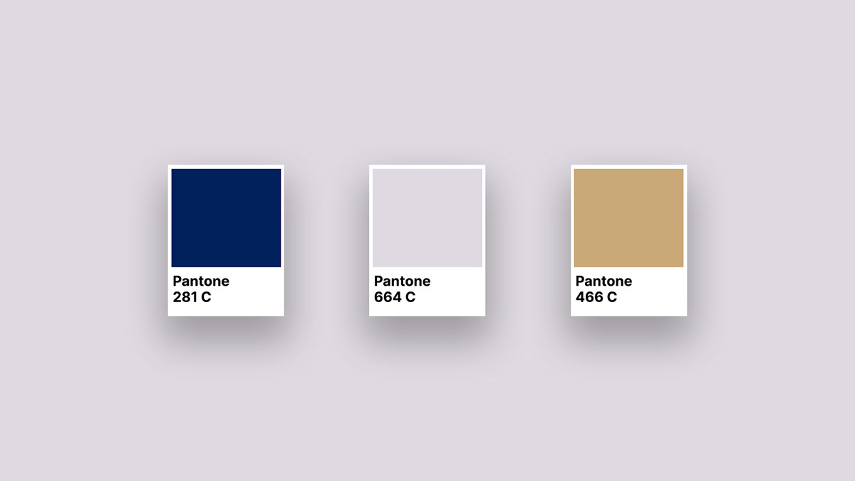
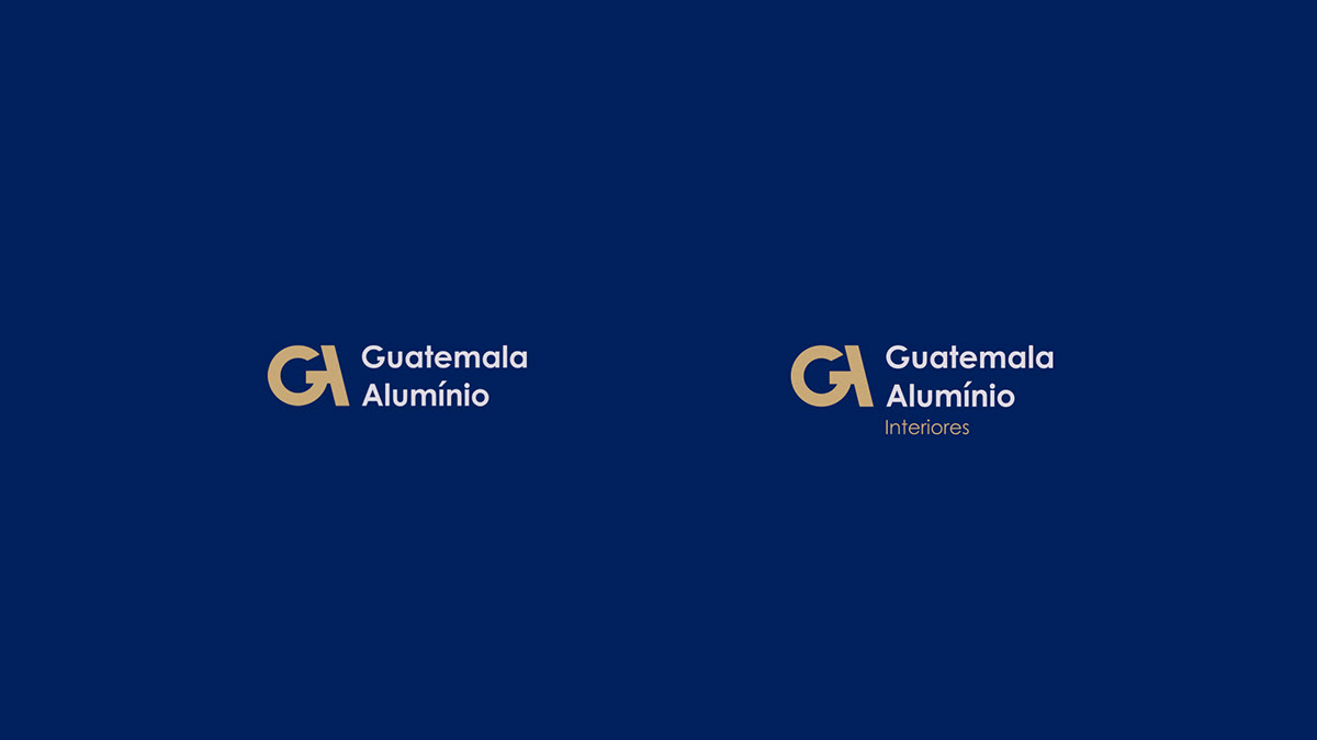
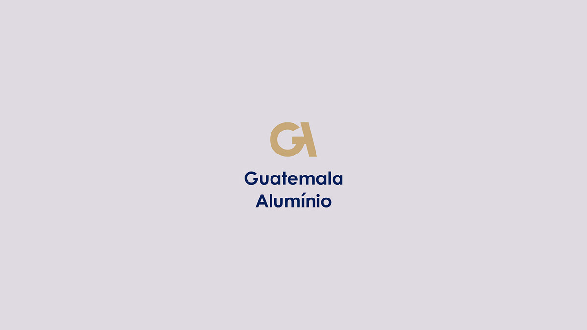
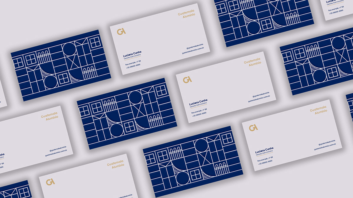
Foi utilizada uma técnica chamada "monograma" para a construção do símbolo. Técnica antiga e clássica para reforçar o conceito tradicional da empresa. Onde essa técnica se baseia na sobreposição ou combinação de duas ou mais letras ou outros elementos gráficos para formar um símbolo.
Essa ideia de combinação e agrupamento foi pensada no conceito de união, por se tratar de uma empresa familiar, onde a família é um elo de união entre todos. Elo que se expande aos consumidores de seus produtos desde o inicio da compra até a instalação, logo, foi construído um monograma de forma minimalista com a junção das letras "G" e "A", que também são as iniciais da empresa, para trazer elegância para a empresa.
-
A technique called "monogram" was used to construct the symbol. Ancient and classic technique to reinforce the traditional concept of the company. Where this technique is based on the overlap or combination of two or more letters or other graphic elements to form a symbol.
This idea of combination and grouping was thought of in the concept of unity, as it is a family business, where the family is a link between all. Link that expands to consumers of its products from the beginning of the purchase until the installation, therefore, a monogram was created in a minimalist way with the combination of the letters "G" and "A", which are also the initials of the company, to bring elegance for the company.
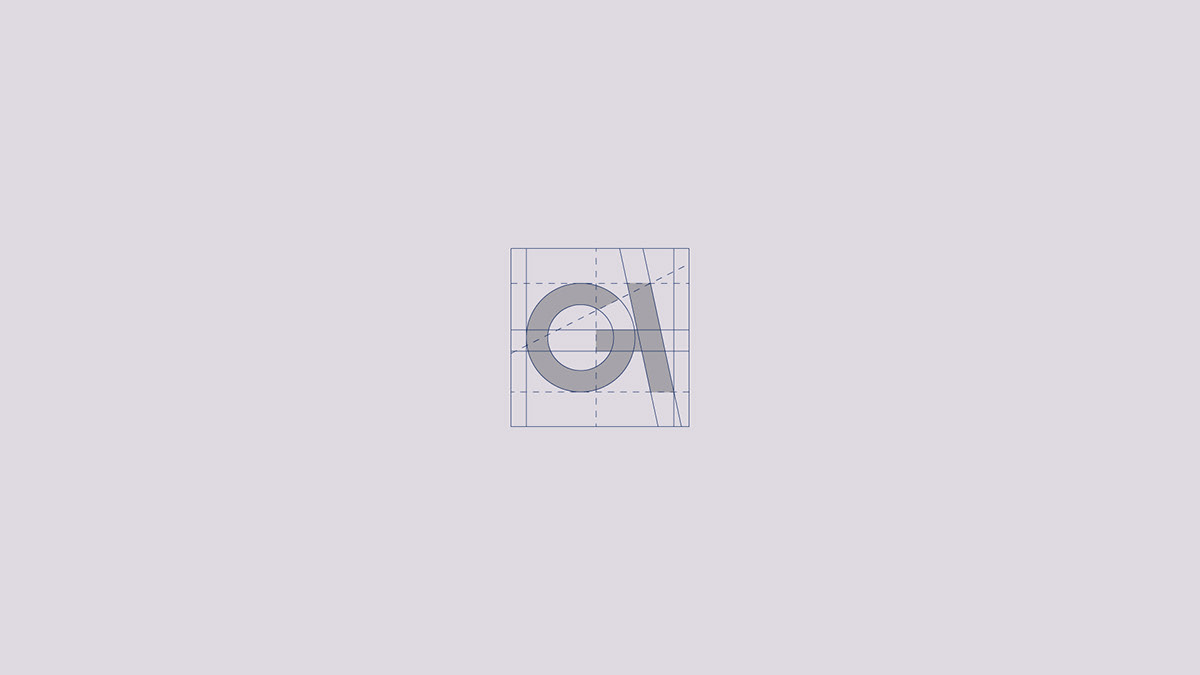
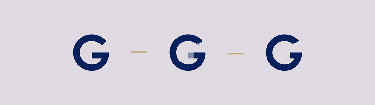
Para criar mais harmonia e exclusividade para a marca, foi feita uma alteração na letra "G" para que pudesse remeter a mesma letra desenhada no símbolo.
-
To create more harmony and exclusivity for the brand, a change was made to the letter "G" so that it could refer to the same letter drawn on the symbol.