WordPress Content
Management Plugin
Management Plugin
Client Project
Tasks: Component Design, Visual Design, Development
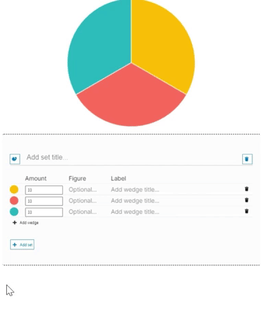
Contracted to build a CMS that could allow the creation of single page documents focus around data, I recommend WordPress as a system to be built on top of that would fit into the budget without compromising the projects requirements. The project is built as a WordPress plugin using ReactJS and involves use of the ChartJS API and OpenLayers API to display pie charts and interactive maps.
This project is currently in progress and the below interactions and designs are not finalised.
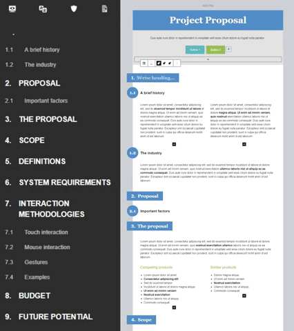
The plugin developed adds 12 custom content modules (Gutenberg blocks) to WordPress' existing visual interface. It also restyles the page to suit the required format - which includes headings and subheadings that are dynamically populated into an ever present navigation bar, print-friendly, and mobile friendly layouts.
An important aspect of the project is the ability for non-designers to rapidly populate documents without being slowly down by design choices (while also preventing them from making poor design choices). This, while also allowing flexibility in colours and fonts.
To achieve this, each document is given 1 primary, 1 secondary, and 5 supporting colours that can be defined differently per document. Each blocks colour usage is then limited to those colours plus 8 automatically generated variations of the primary and secondary colours.


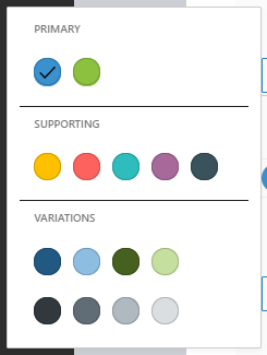
As seen below, this allows structure while building the document, but also allows easily changing the colours of all blocks en masse at any point.
This technique is also applied to the fonts in the document. Editors are provided an ability to change between predefined font sets only. How these sets are applied to each block is hard coded into the block. This allows flexibility for the user while simplifying and guiding their design choices.
Both colours and fonts are defined in the root of the document using CSS vars. This allows changes to easily be communicated to each Gutenberg block without requiring the block code to look up values in the back-end.


As each heading and subheading block is created and edited, a debounced javascript function notes the changes and auto populates the navigation bar and bullet numbering.
While WordPress runs ReactJS in their Gutenberg editor, the public facing side of the documents are static html. This means that while the blocks are monitor for changes in the editor, once the document is published, the navigation contents becomes statically populated.
A number of components requiring detailed settings were broken down into sets and subsets. This allowed settings to be more consistent across different blocks (icons, bar chart, pie chart, etc.) and allowed the settings to be very versatile while limiting complexity.
Icon block

A map block was developed which uses the OpenLayers API to provide a tailorable map to the user editing the document. This enables them to frame the map and choose which countries are visible, but for the public viewing the published document, the image is static.
This approach was designed to allow the client to use customised map based images without requiring the use of design tools. While also ensuring that use of the maps remained consistent with the documents design style.
Map Block

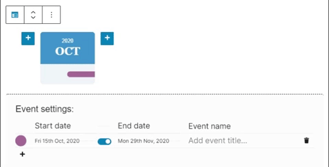
The calendar block was designed to support showing events cleanly stretched out in a horizontal line so that end users can easily understand the relative time differences. At the same time, nodes showing single months, groups of months, or even years were designed encourage the readers understanding of the important parts of any timeline.
Calendar Block

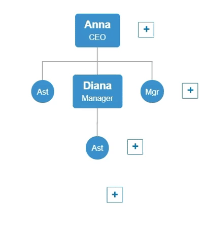
Similar careful design was implemented in the flowchart block, which allows the editing user to visualise nodes as large, small, or a mixture of the two. As well as flowcharts that are interactive for the end user or not-interactive. All this functionality is carefully managed and limited at times to ensure that the flowcharts behaviour is always expected and understandable for the end user.
For the editing user, this was a difficult set of options to balance correctly. Allowing them to choose from settings sometimes but not at other times, depending on the mode chosen, while ensuring the interface intuitively helps them understand why.
Flowchart Block


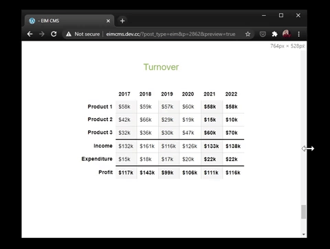
While implement the table block, an editing user may create a large complex table that requires scrolling even on a desktop. In order to enable the data to provide the best possible experience for mobile users, a system of priority rows and columns was design.
The editing user can designate certain rows or columns as most important, and then specify how they should be displayed when the screen becomes to small.
Below, you can see the priority rows and columns identify by a blue phone icon. The the device or window size becomes to small to show the full table, the priority cells are reorganised into meaningful small tables based on the display options. A "View full table" button is also shown so that no functionality is lost, or if not priority cells are defined, simply a "View table" button.
Table Block

Group by Columns or Group by Rows