Van Ijssel Yogurt Box
Van Ijssel Drink Yogurt is a yogurt brand established in the Netherlands. Van Ijssel Yogurt- A taste of nature- uses milk from Jersey cows on Dutch pastures, providing the world’s best quality of milk. The products are processed in Germany, home to world-renowned factories, where cleanliness is culturally ingrained.
Client: Van Ijssel
Type: Package Design
Design: Tammie Kang
Design: Tammie Kang
Year: 2019
Info/
Van Ijssel Yogurt expands its sales in 2019. In order to import to the Chinese market, the package needs a redesign. For the Chinese New Year, Van Ijssel wishes to redesign their old package which according to print wise they were limited to Monoprint. There were challenges in the process which is colour print. Based on the experience of the PM, Colours doesn't seem nice when it has high saturation on their standard package material. At the same time, we need to be as eye-catching as other products.
Van Ijssel Yogurt expands its sales in 2019. In order to import to the Chinese market, the package needs a redesign. For the Chinese New Year, Van Ijssel wishes to redesign their old package which according to print wise they were limited to Monoprint. There were challenges in the process which is colour print. Based on the experience of the PM, Colours doesn't seem nice when it has high saturation on their standard package material. At the same time, we need to be as eye-catching as other products.


Concept/
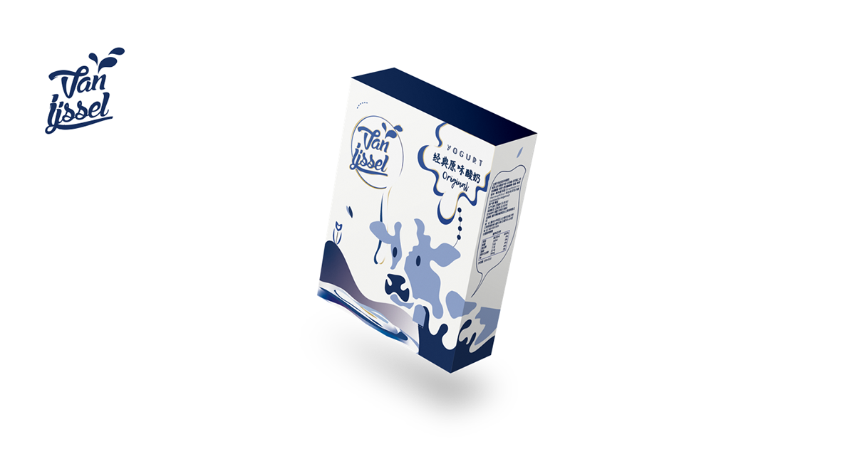
The package will be presented in a crowded market shelf together with other products, to be able to adapt to the situation, the package ordering is possible to extend the image of this package. The first image is important in this situation to shows its milk product related.
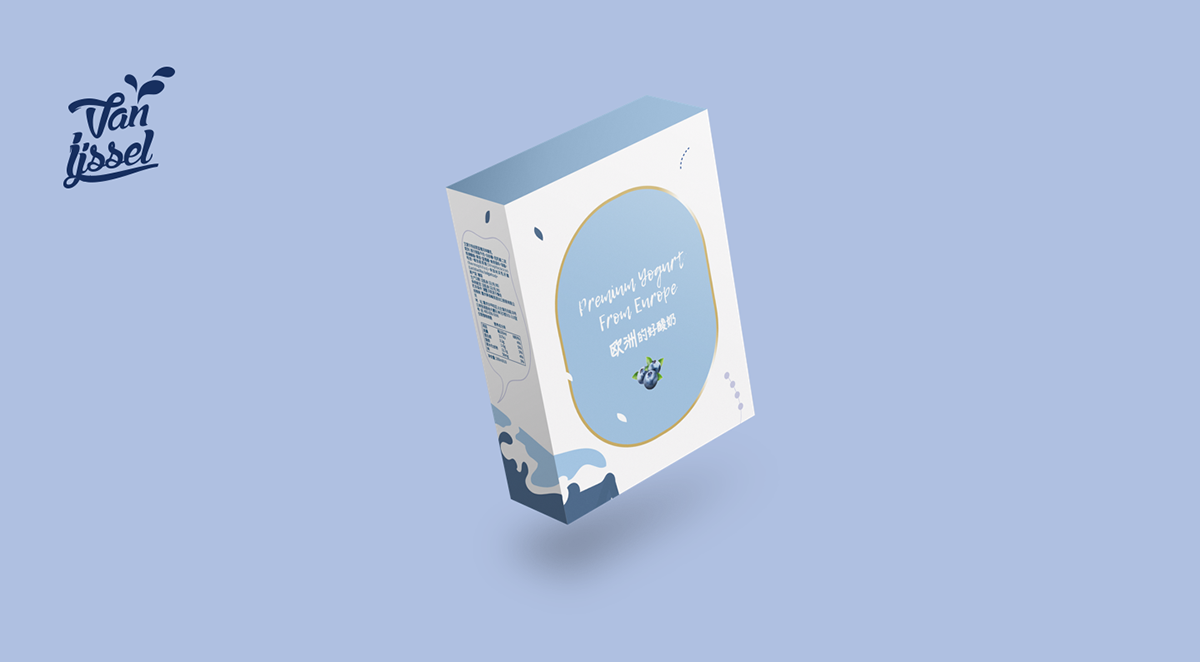
Like most food product, it is always hard to tell the whole story, we decide to focus on milk and foreign brand images. I used handwriting fonts to present handmade and close to the natural image of the brand.
The main design and flavoured yogurt have similar visual. The colour combination of those flavours differentiate the original flavour and blueberry.


