


Pacific Logistics Group - Connecting Asia and the World
In the new ‘belt and road’ economy PLG is the expert on Asia with a presence across the region, connecting Asia and the world and managing the flow of logistics seamlessly across borders. A strong positioning and identity supports PLG’s strategy to become the leading multimodal logistics player in the region and a mobilising force in Asia’s growth.
In the new ‘belt and road’ economy PLG is the expert on Asia with a presence across the region, connecting Asia and the world and managing the flow of logistics seamlessly across borders. A strong positioning and identity supports PLG’s strategy to become the leading multimodal logistics player in the region and a mobilising force in Asia’s growth.


PLG Wordmark
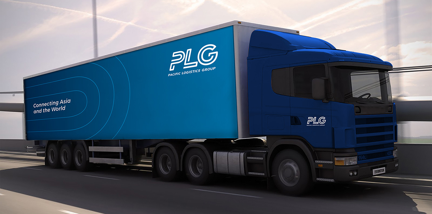
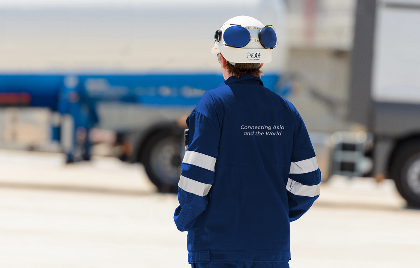
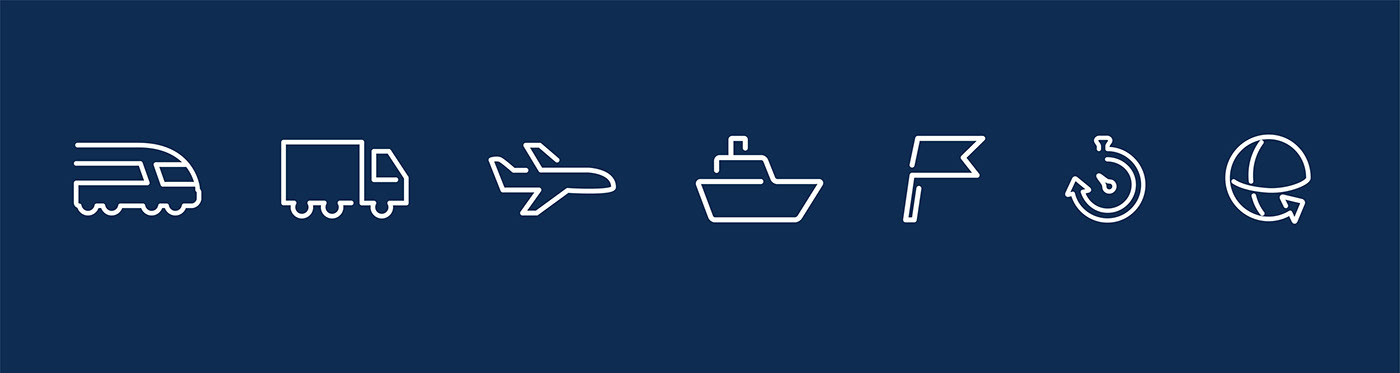
The PLG identity is a wordmark formed with a single line for each individual letter, representing the seamless cross-border collaborations and connections that PLG delivers through its multimodal solutions – land, air and sea. The colour blue sustains the familiarity customers have with the previous brand identity, while the gradient symbolises PLG’s agility and dynamism.


Project Outcome
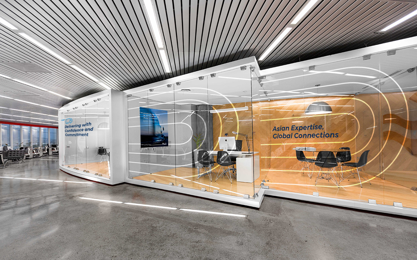
With the new brand strategy and design recommendations, PLG has gone on to launch their new brand with their headquarters building in Singapore, and continues to establish themselves as a technology and innovation leader in the space of Integrated logistics.
Disclaimer: © DIA Brand Consultant Pte Ltd, Project done during employment at DIA Brand Consultants Pte Ltd, Singapore
Thank You
Click here to view the full project on my website


