清友明心 KIYOTOMO
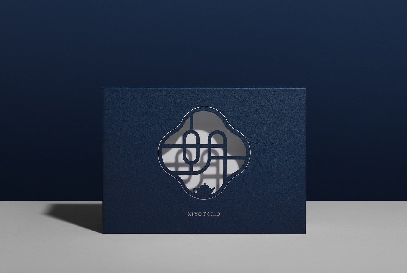
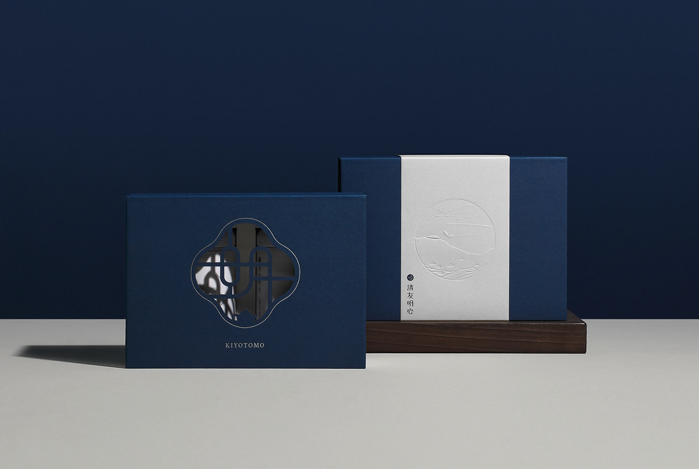
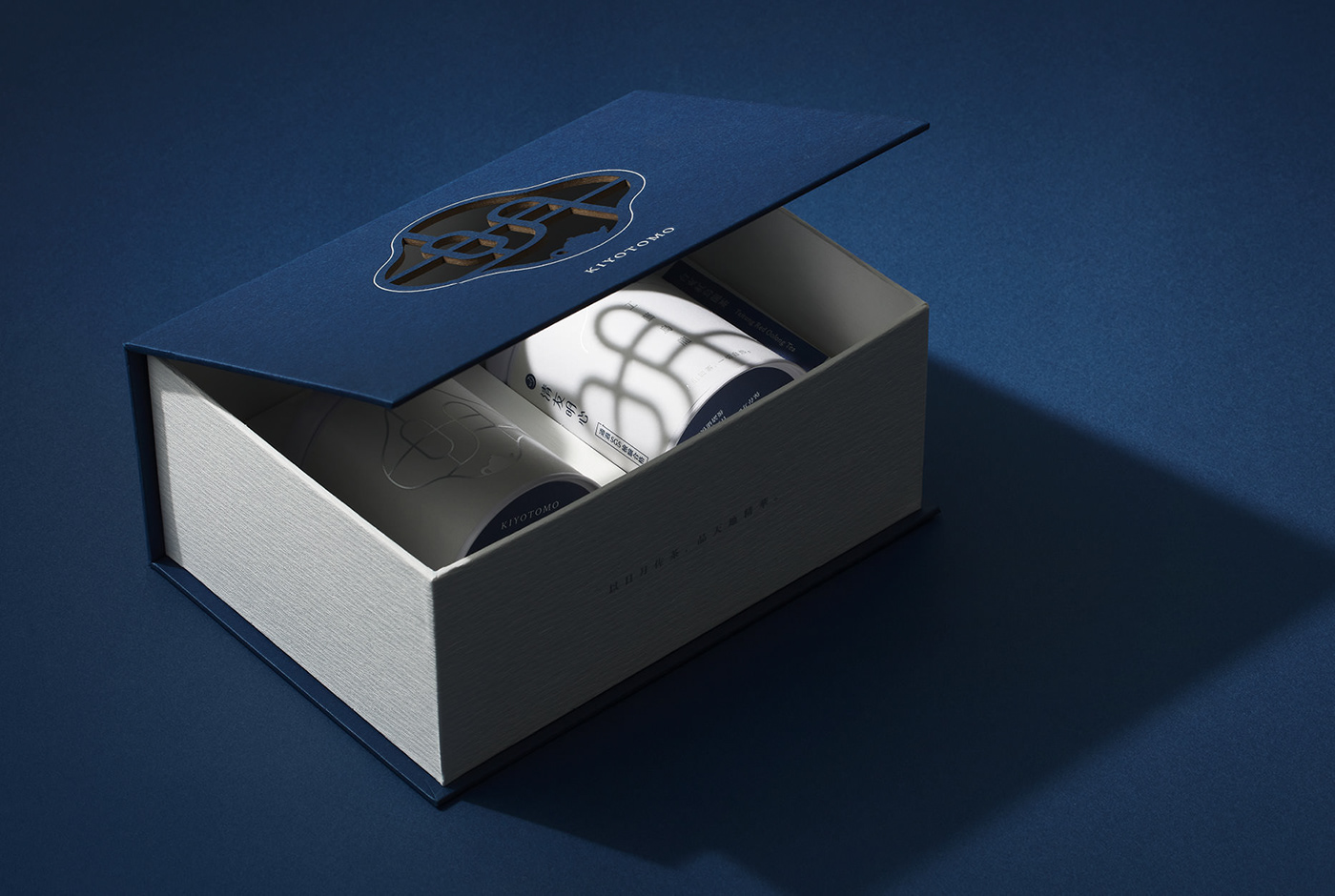
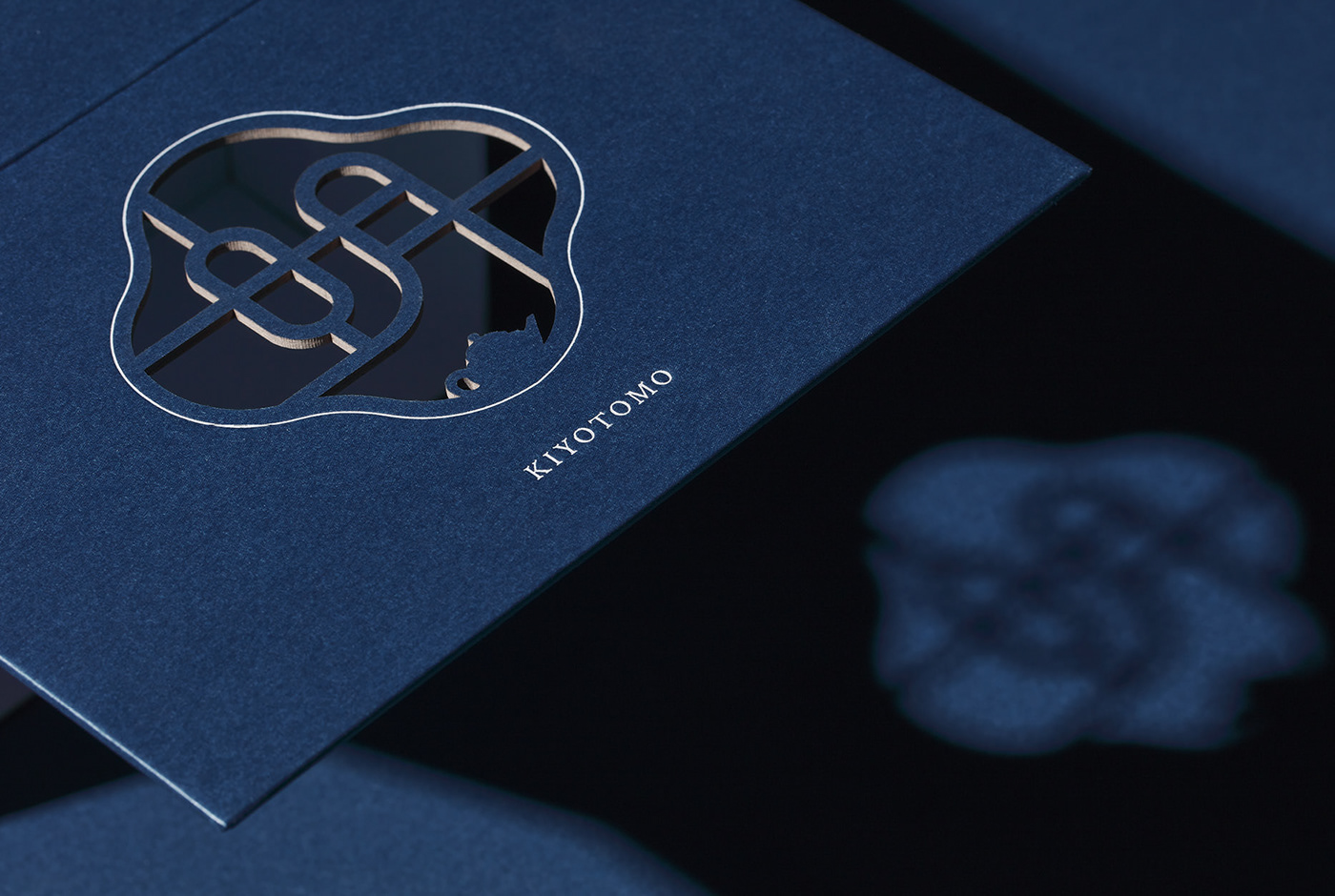
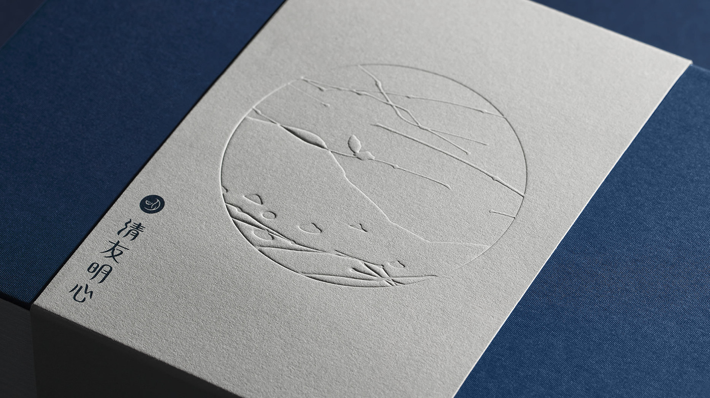
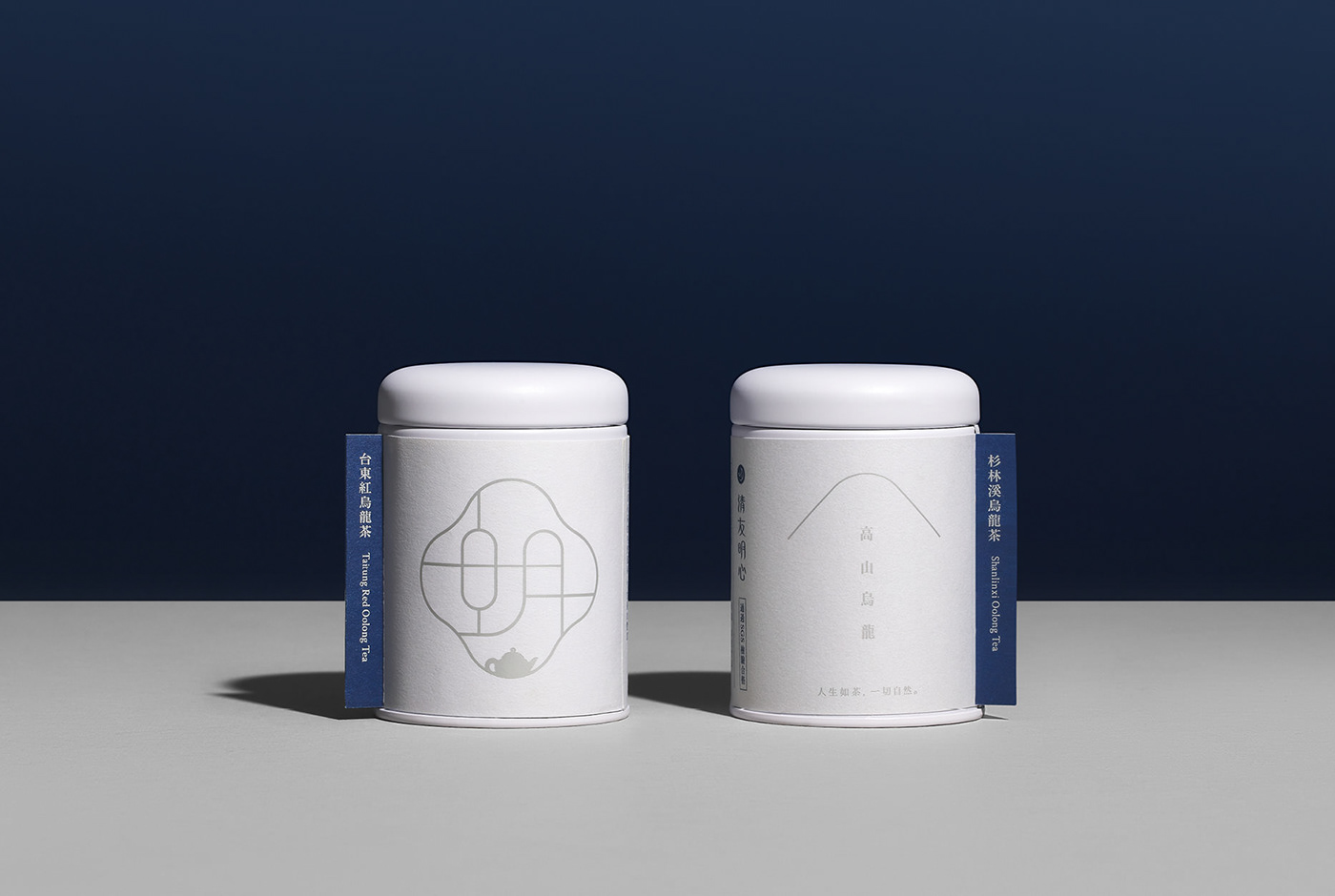
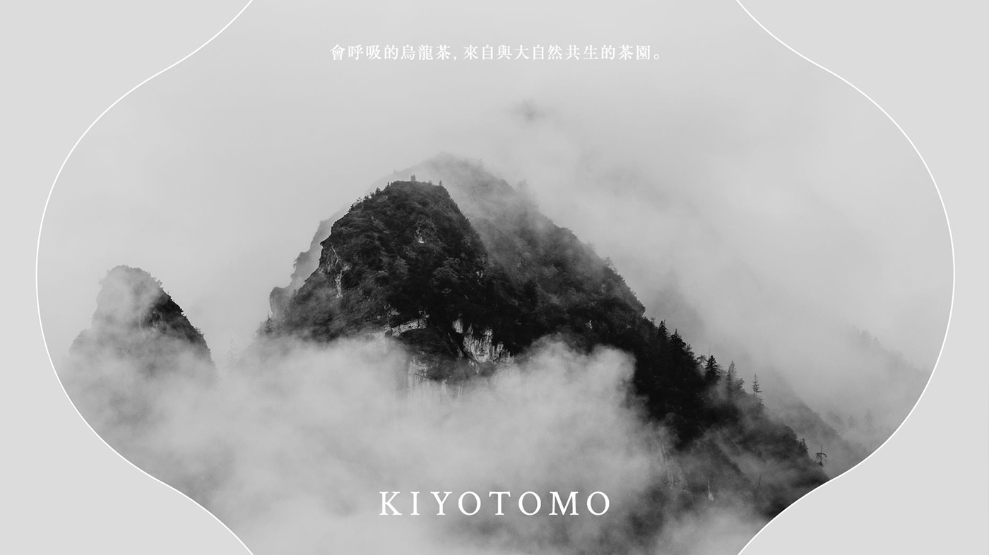
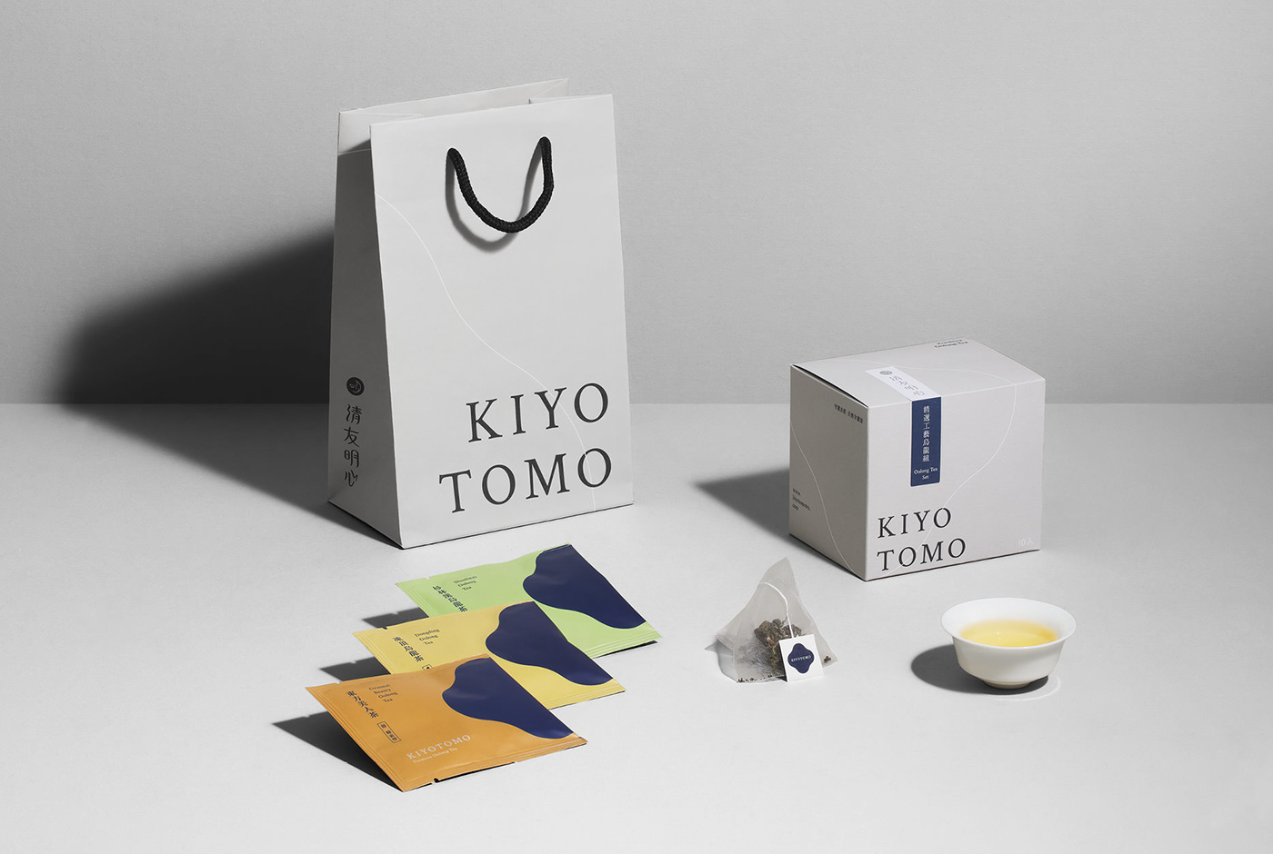
清友明心是精研於台灣烏龍茶的茶品牌,致力於讓人們感受天然烏龍茶的原味與飲茶文化。茶葉包裝以品牌「明」字(明:為日與月之結合,明亮之意)與花形窗框為視覺主軸,延伸至各設計物的細節之中,運用打凹、燙銀與雷雕的加工,透過光線的照映與穿透,營造彷彿在窗邊沏茶的景象。色彩上以深藍色搭配淺灰色,呈現整體沈穩與寧靜的品牌氛圍。依據不同茶品的發酵程度設定不同深淺的代表色,製成品項標籤貼於茶盒上,具有辨識品項與封裝的雙重功能。
KIYOTOMO is a brand specializing in Taiwan Oolong tea and dedicated to promoting tea culture and the natural taste of oolong tea in Taiwan. We combine the brand's Chinese character "明" and flower-shaped window tracery as the main identity for all extended packaging designs. "明" in Chinese is a character combination of sun and moon, representing brightness. To visualize this concept, we use debossing, silver stamping, and laser cutting for the light that can shine through the "明" tracery, creating a picture like brewing a decent cup of tea by the window. In coloring, we choose indigo blue and silver grey to build an ambiance of calmness and serenity. The colors of sealing stickers are designed by color shades according to different degrees of tea fermentation.








Credit:
Client:KIYOTOMO
Project Director:Chi Yao Tang
Design Manager:Hsiang Chia Wu
Brand Planner:Chia Ling Tsai
Art Director:Chun Yao Huang
Designers:Yi Wang、Hsin Hui Chen
Print : 易加印刷
Photography: Kent / Matter Image
