Refreshing the brand of Messiah University
Once the Messiah University logo was established, my design team and I delved into refreshing the visual brand. This brand refresh signals to our audience that we see ourselves in a new way but are still well connected to what made Messiah University the unique higher education institution that it is. (To see examples of Messiah's brand prior to 2020, feel free to peruse the rest of my Behance portfolio.)
Where did we begin? Research. Beginning with a competitor analysis, our design team discussed what would make us stand out amidst our primary competitor institutions. Then in focus groups with current and prospective students, we learned that our prospective students resonated with our tagline – see anew – as well as our identity line – Sharpening Intellect. Deepening Christian Faith. Inspiring Action. – and our stained glass metaphor. However, they consistently didn't see the stained glass design element as stained glass. It looked like "snake or dragon scales," "tiles," or "just a pattern." The vibrancy of our student body that we talk about in our marketing materials, on tours and in personal conversations wasn't apparent in our muted color palette. So our design team set out on our mission to rethink our established brand look and feel to more clearly represent our ideals, vibrant student body and strengthen the connection of our brand statements to our visuals.
With a solid design schedule with planned meetings with senior administration, check points with the visual identity subcommittee that I chaired and the full marketing and communications team, our team created 3 distinct design directions. In the end, this was pared down and refined to the elements you see below. It truly was a collaborative process. These elements were refined by all of us at different stages of the process. This was about an 8 month process.
The presentation below encompasses these elements that we focused on:
• The stained glass element
• A vibrant color palette
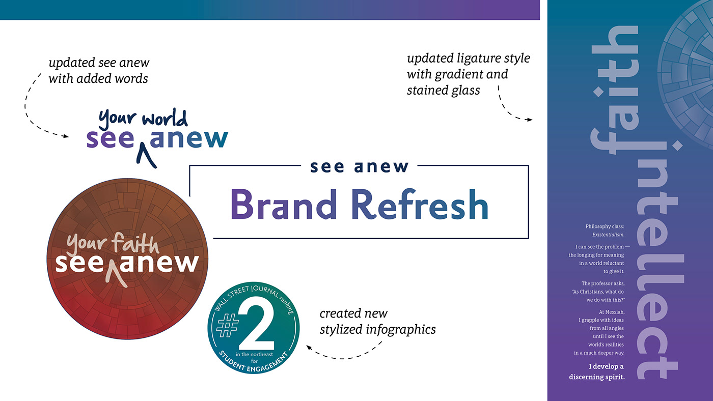
• Refining the ligatures –the fused words– seen throughout our marketing projects
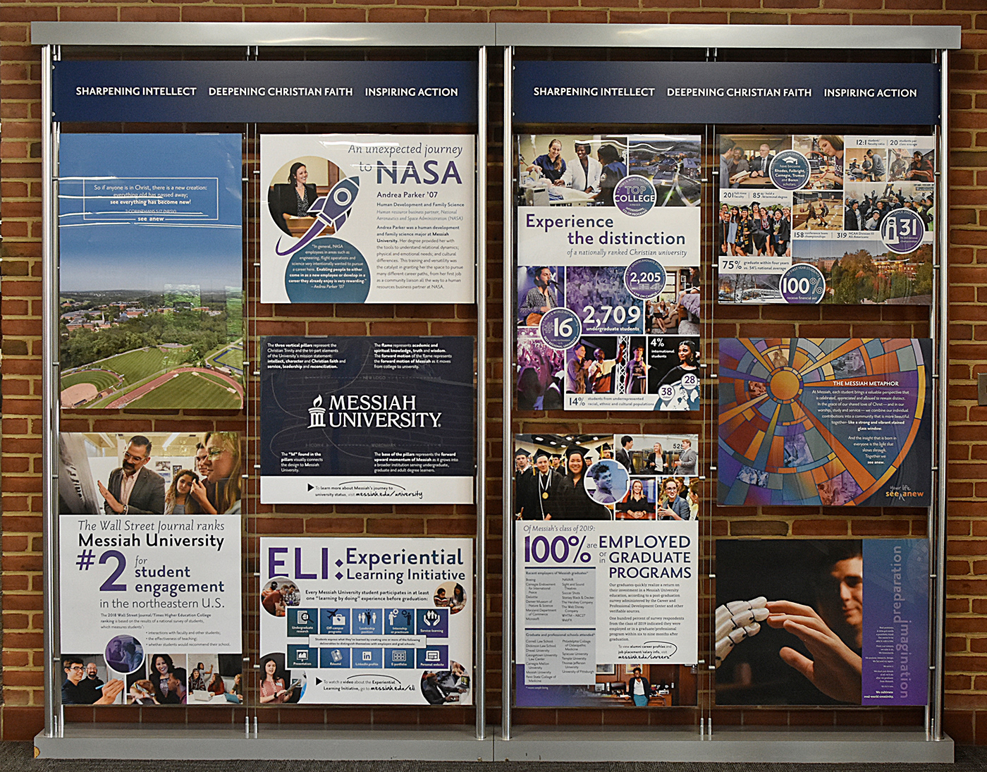
• Creating a consistent style for infographics
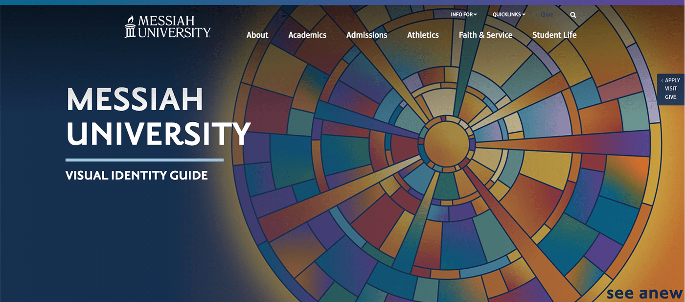
The stained glass and color palette
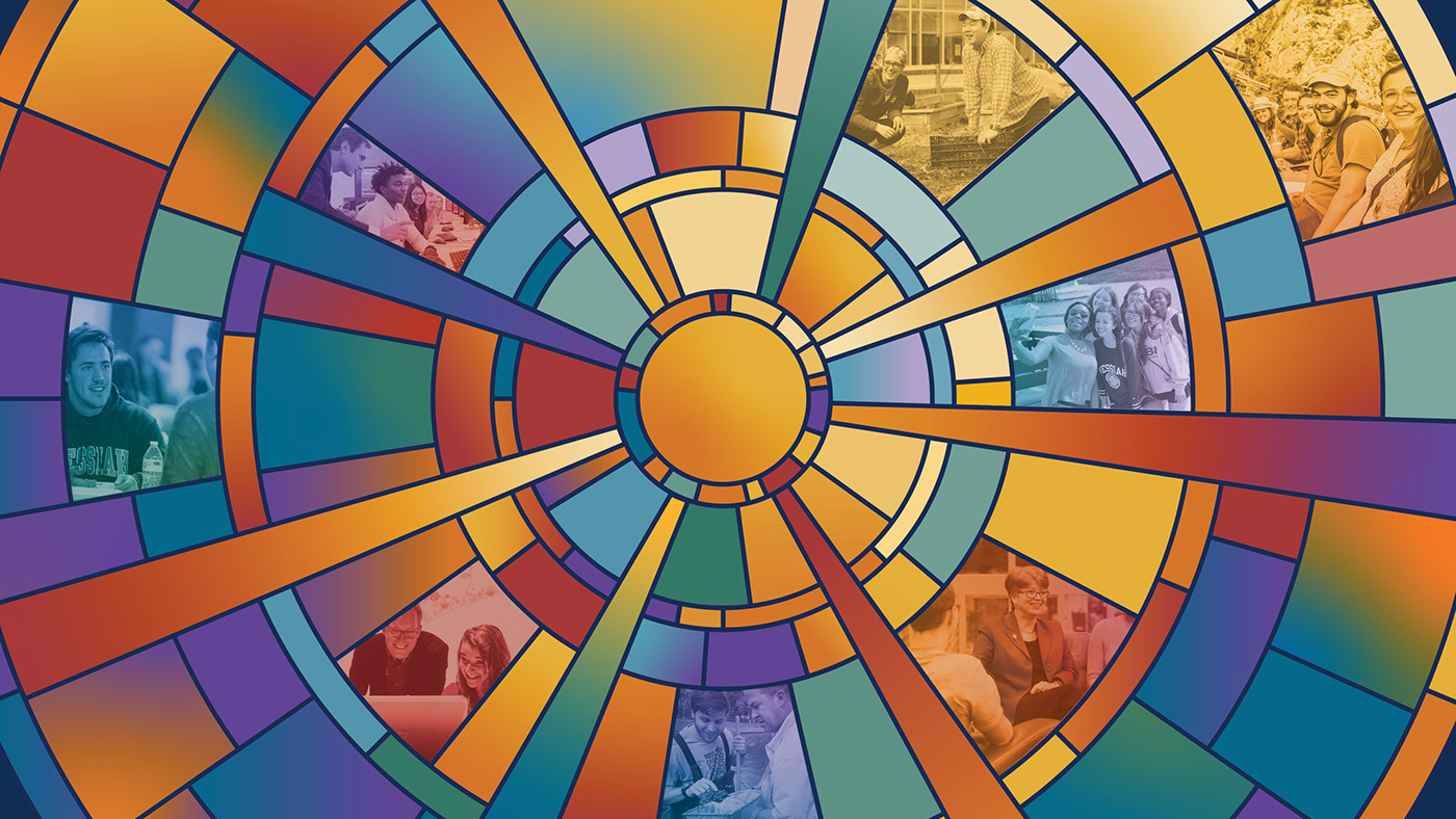
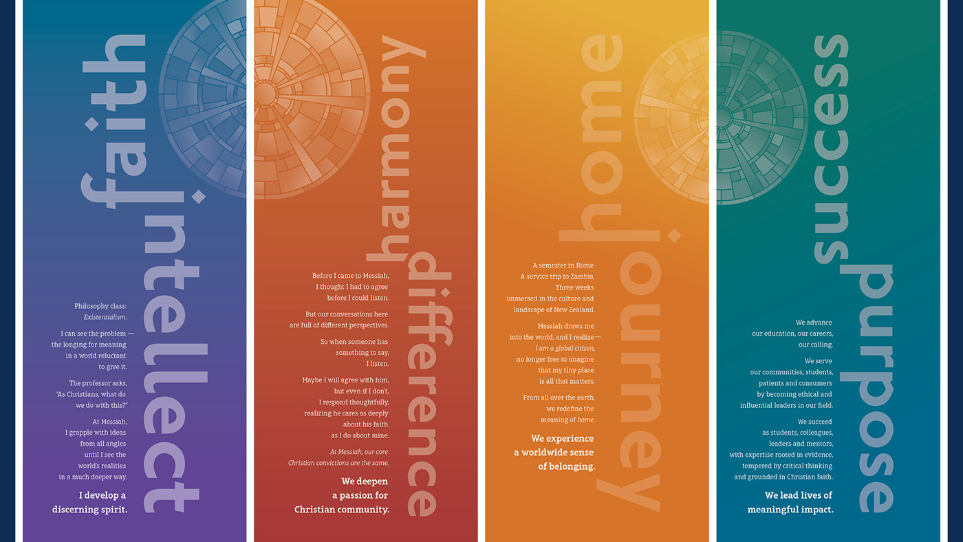
The stained glass that you see associated with Messiah University in our marketing symbolizes the imagery we use to describe why "see anew" is an appropriate metaphor for our unique Christian educational community.
Each student brings a rich perspective that is celebrated, appreciated and allowed to remain distinct at Messiah. In the grace of our shared love of Christ and in our worship, study and service, we meld our separate contributions into a community that resembles a strong and vibrant stained glass window.
And the insight that is born in everyone is the light that shines through. Together we see anew.
In order to more closely represent the vibrant student body, we brightened the color palette and added some specific gradients that represent the melding of ideas and community connections. Sometimes the gradients are used to more simply represent the stained glass when the more broad and specific stained glass design element is too complicated for the project.
The brand refresh at Messiah University won a 2021 GDUSA In-House design award.

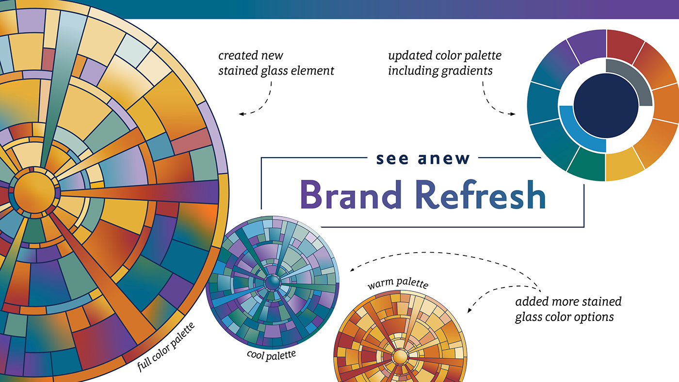
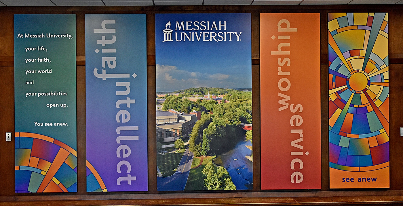
The stained glass metaphor in use

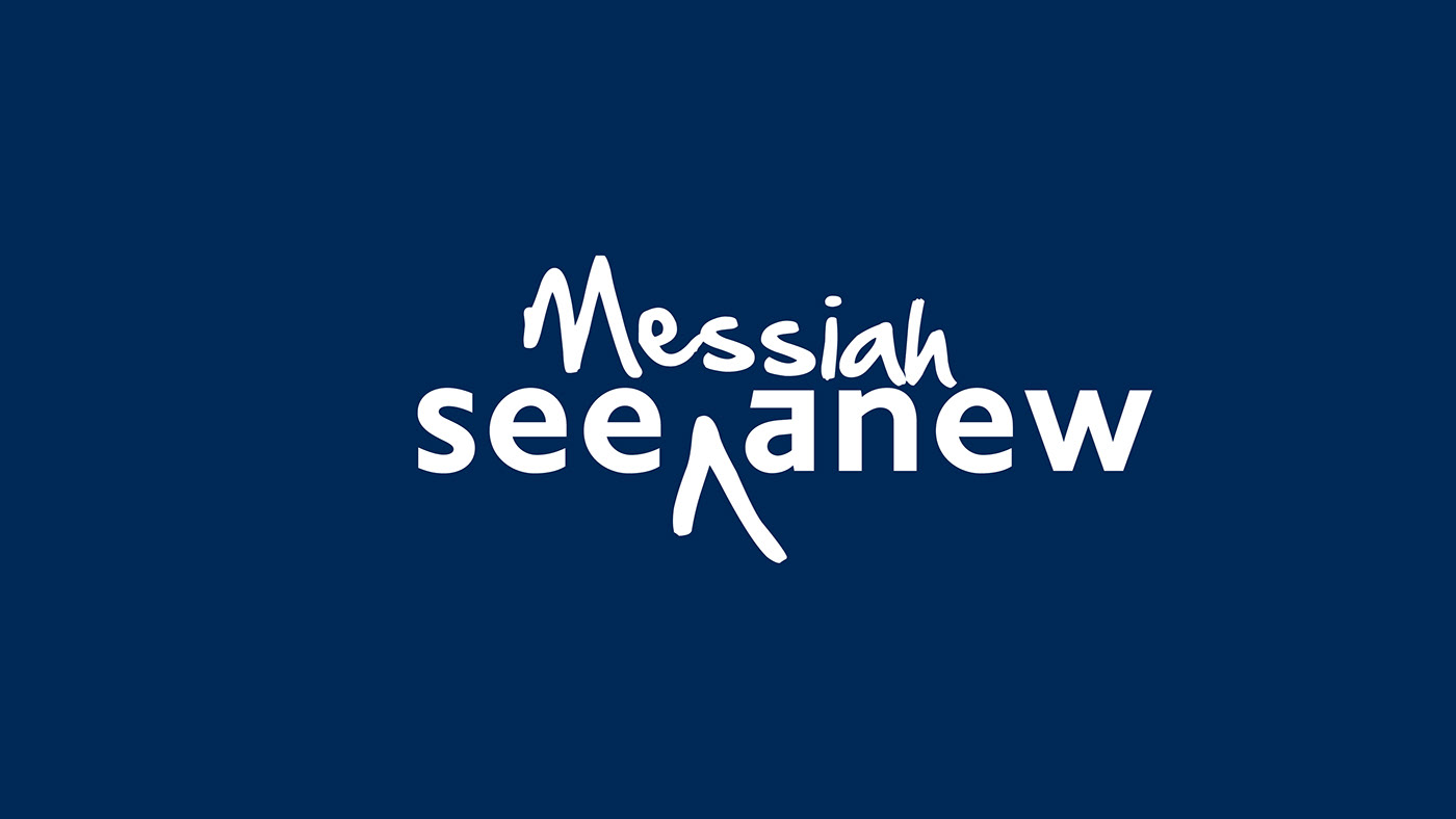
see anew tagline
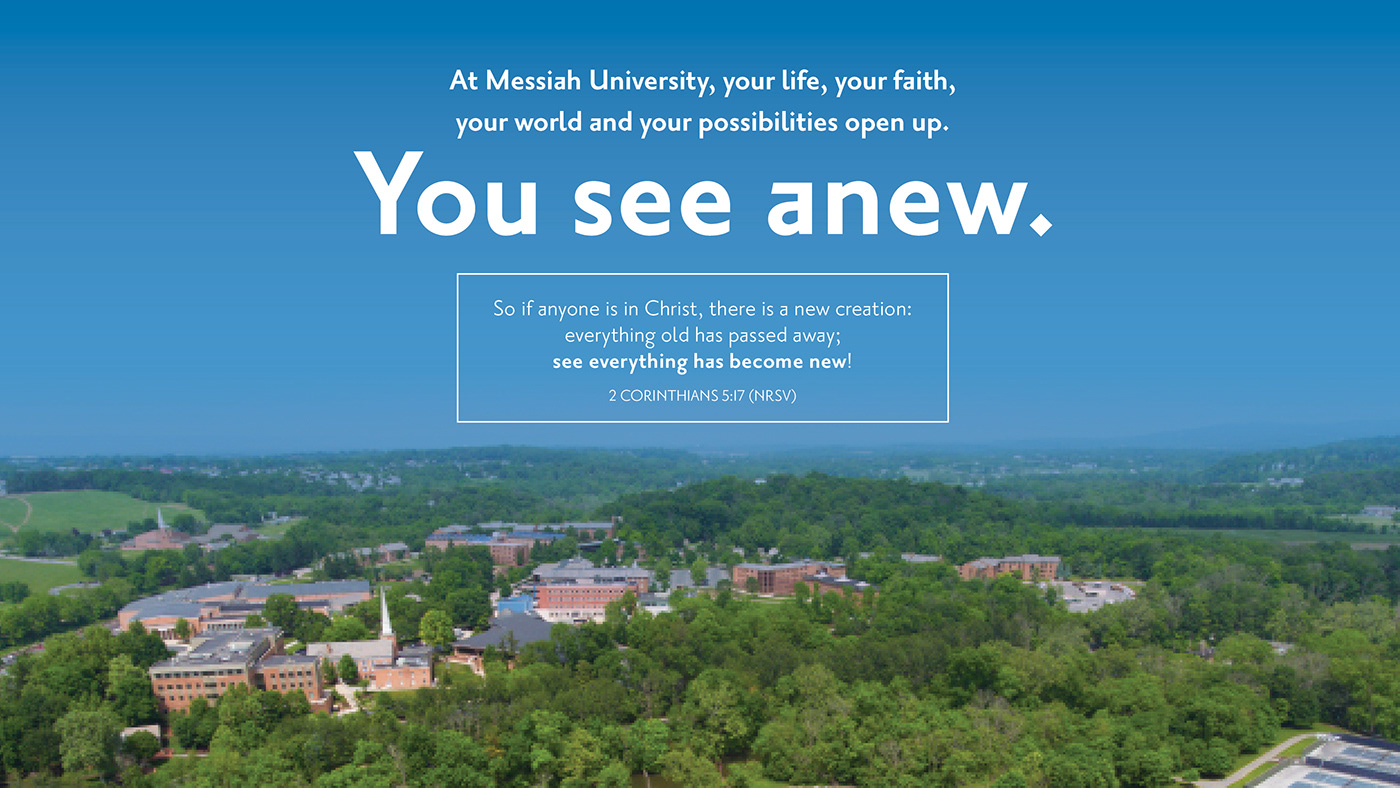
When we are asked at Messiah University about the meaning of our tagline “see anew,” we’re eager to share that: At Messiah University, your life, your faith, your world and your possibilities open up. You see anew.
The heart of “see anew” is the concept of transformation and reconciliation. Our alumni consistently tell us that their experience at Messiah was transforming—that it helped them see themselves, their faith, their career and the world in exciting new ways.
We learned from our prospective students that this resonates with them more when it is used with descriptive words. Whenever possible, we combine see anew with ways students can personally see anew at Messiah like: your world, your faith and your future. To strengthen the connection to Messiah, the personal words are often in Messiah blue or white.

Ligatures
You’ll often notice in Messiah’s communications the use of two different words “fused” together. We refer to these as “ligatures” and they symbolize Messiah’s ability to help students reconcile seemingly different ideals in new and interesting ways. Messiah University uses ligatures to help visually communicate its institutional values and to help students explore if Messiah’s values will be a good fit for their own.
The redesign of these brought in the gradients to visually strengthen the change from one word to the other, connect the stained glass imagery and more closely connect the tone poems that describe the meaning behind the ligatures.
The updated brand in use
2020-21 Undergraduate Admissions marketing magazine
Site marketing


Visual identity website
The visual identity website gives a light overview of our brand and offers our on-campus clients some downloadable tools to help create consistency in telling Messiah's story.
messiah.edu/visualidentity
messiah.edu/visualidentity
Visual identity and brand manual
As we reworked the design of our marketing pieces, I refined and wrote the guidelines that govern the uses of our graphic elements, logos and styles. Click on the image below to see the full manual.
This project represents a small sampling of the projects connected to the brand refresh. Follow along with the brand journey as many projects will be added as they are created.