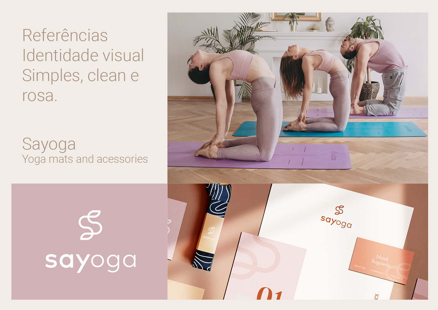
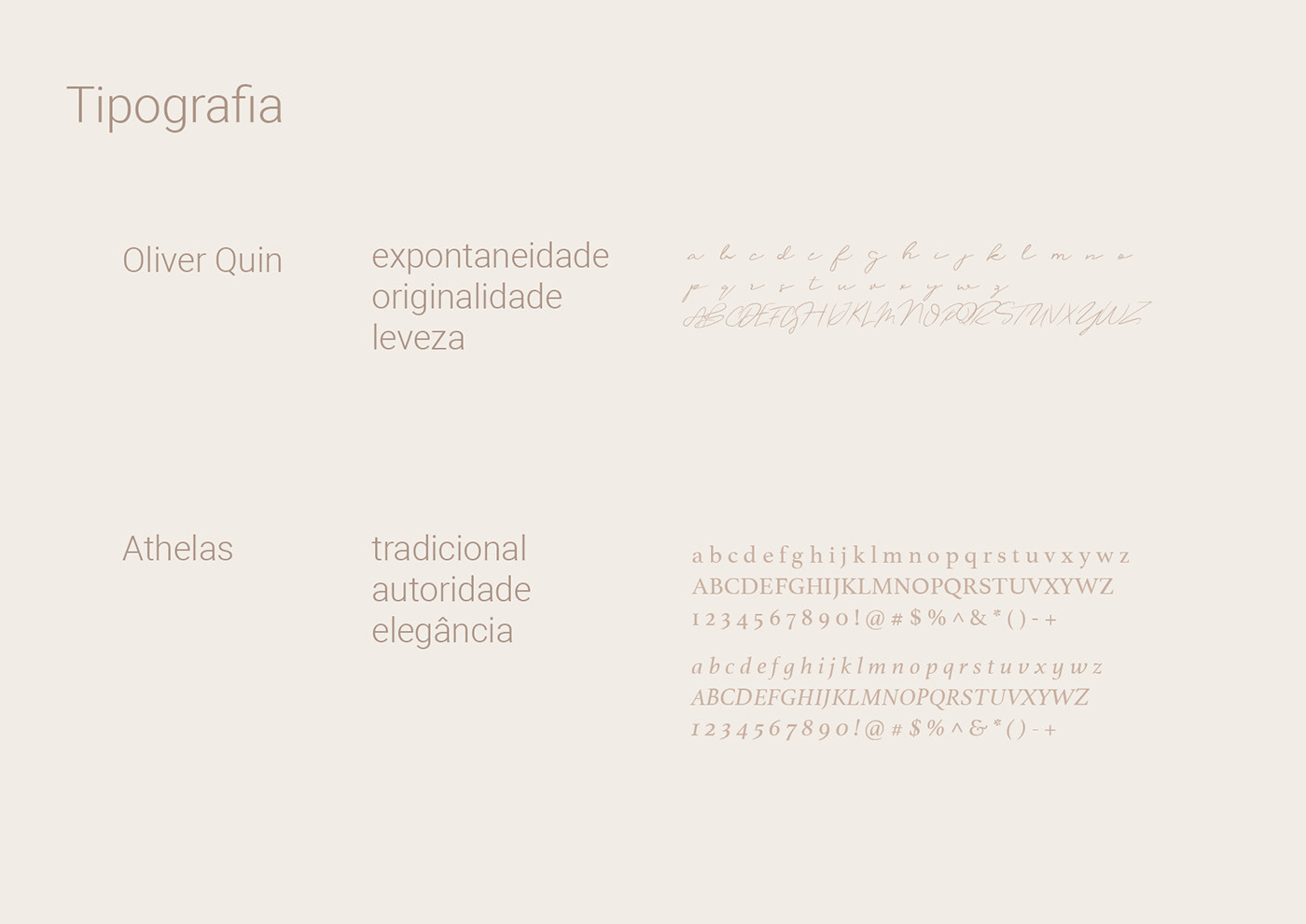
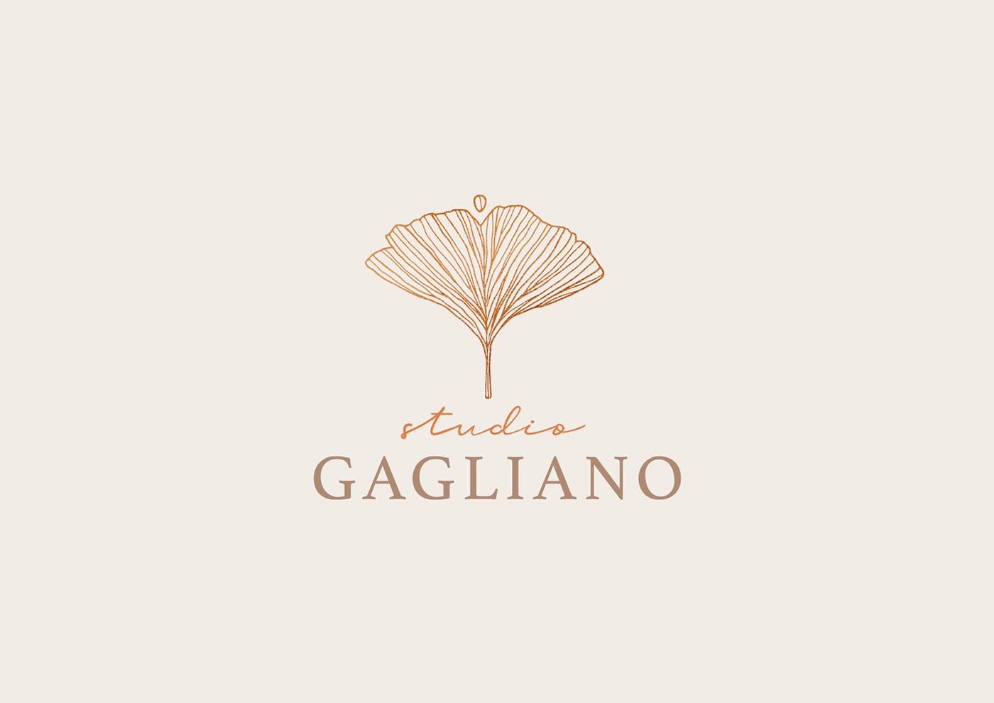
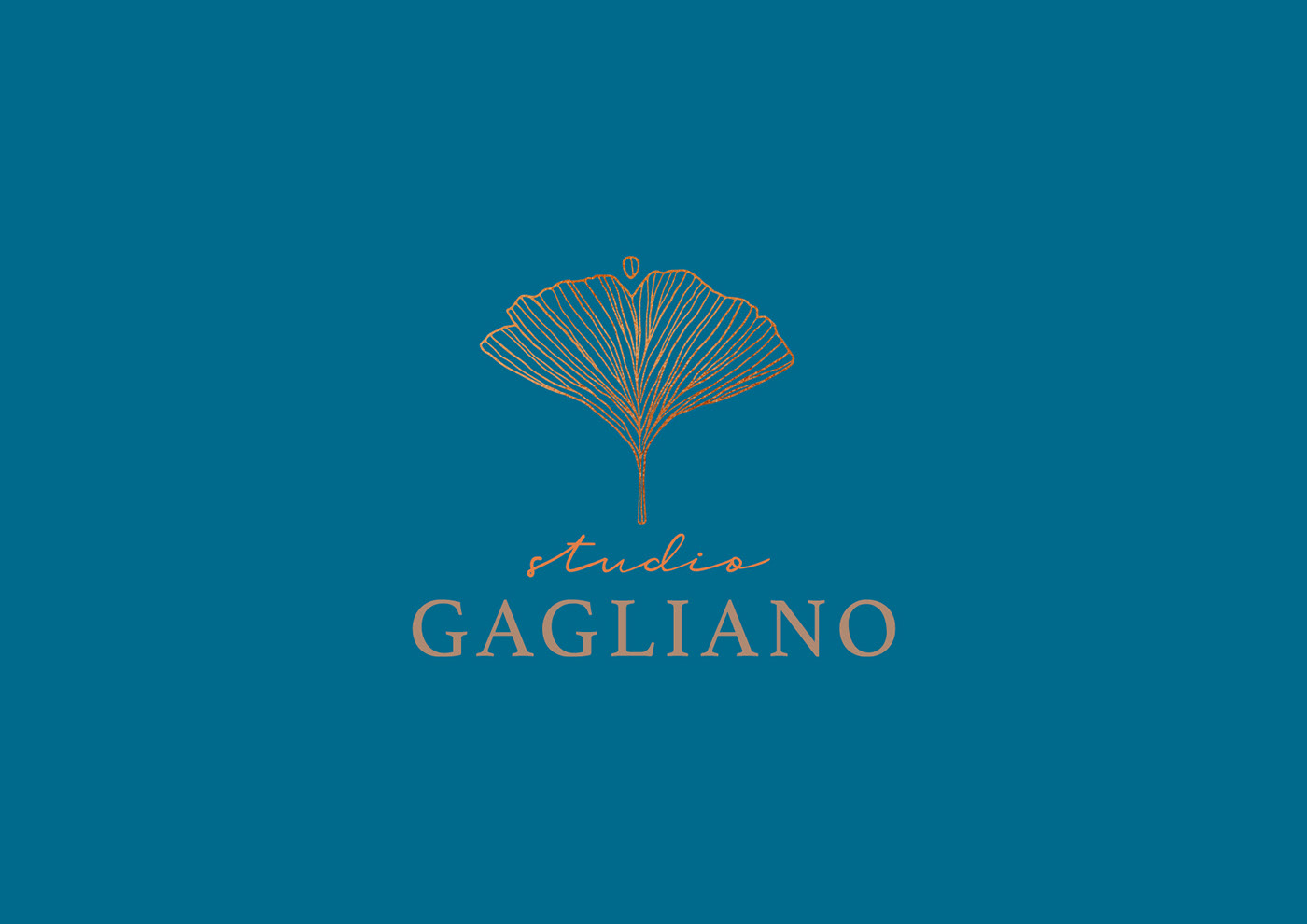
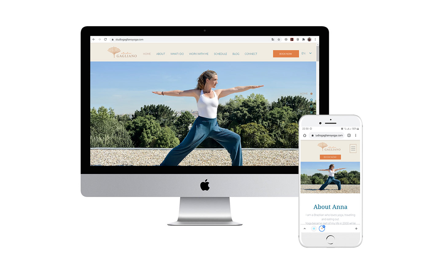
A construção do logotipo do estúdio de yoga de Anna Gagliano começou a partir da folha de gingko biloba. A árvore, considerada um fóssil vivo, existe há mais de 200 milhões de anos e também é um símbolo de paz e longevidade, tendo sobrevivido às explosões atômicas no Japão. Suas folhas têm sido frequentemente utilizadas no combate aos radicais livres e como auxiliar na oxigenação do cérebro, sendo benéficas para a saúde e, portanto, associadas ao descritivo ‘Yoga para restaurar, renovar e rejuvenescer’. O formato da folha também remete a uma pessoa de braços abertos, comunicando positividade. O detalhe do corte reforça seu atendimento individual e exclusivo. Para esse projeto, além da identidade visual, também desenvolvemos o website do estúdio em parceria com a fotógrafa Natacha Guevara.
The construction of AnnaGagliano's yoga studio logo started from the gingko biloba leaf. The tree, considered a living fossil, exists for more than 200 million years, and is also a symbol of peace and longevity, having survived the atomic explosions in Japan. Its leaves have been frequently used to combat free radicals and as an aid to brain oxygenation, being beneficial to health and, therefore, associated to the studio description ‘Yoga to restore, renew and rejuvenate’. The shape of the leaf also refers to a person with open arms, communicating positivity. The detail of the cut reinforces her individual and exclusive service. For this project, besides tha visual identity, we also did the studio website in partnership with the photographer Natacha Guevara.⠀