
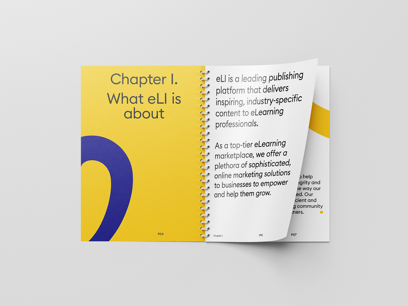
What eLearning Industry is about
eLearning Industry is the leading online platform that serves professionals and businesses by providing inspiring, industry-specific content and high-end marketing tools and resources. In other words, eLI provides the best collection of eLearning articles, eLearning concepts, eLearning software, and eLearning resources in the United States.

Approach
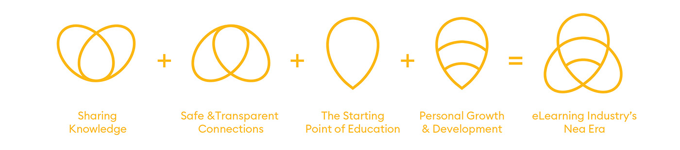
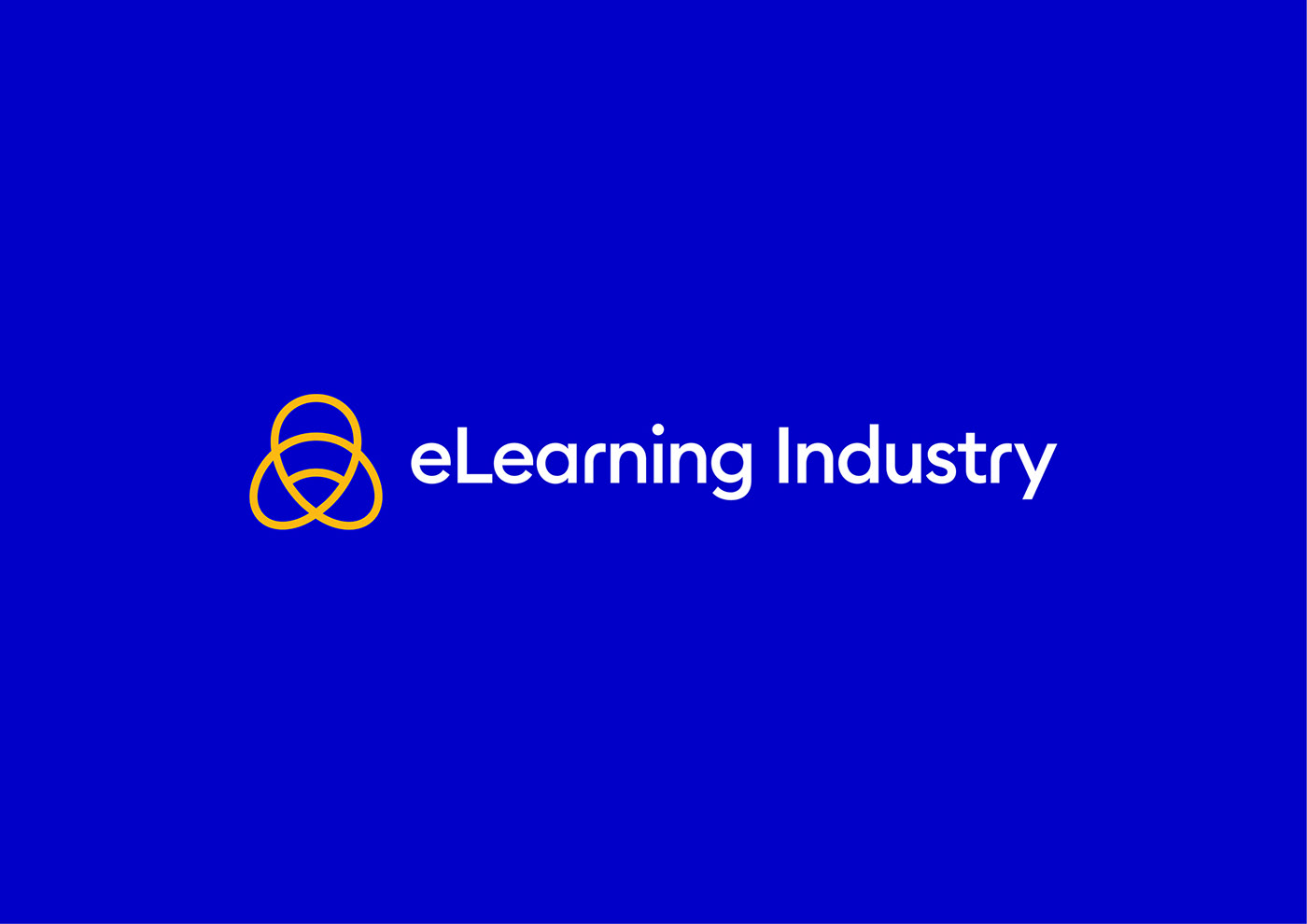
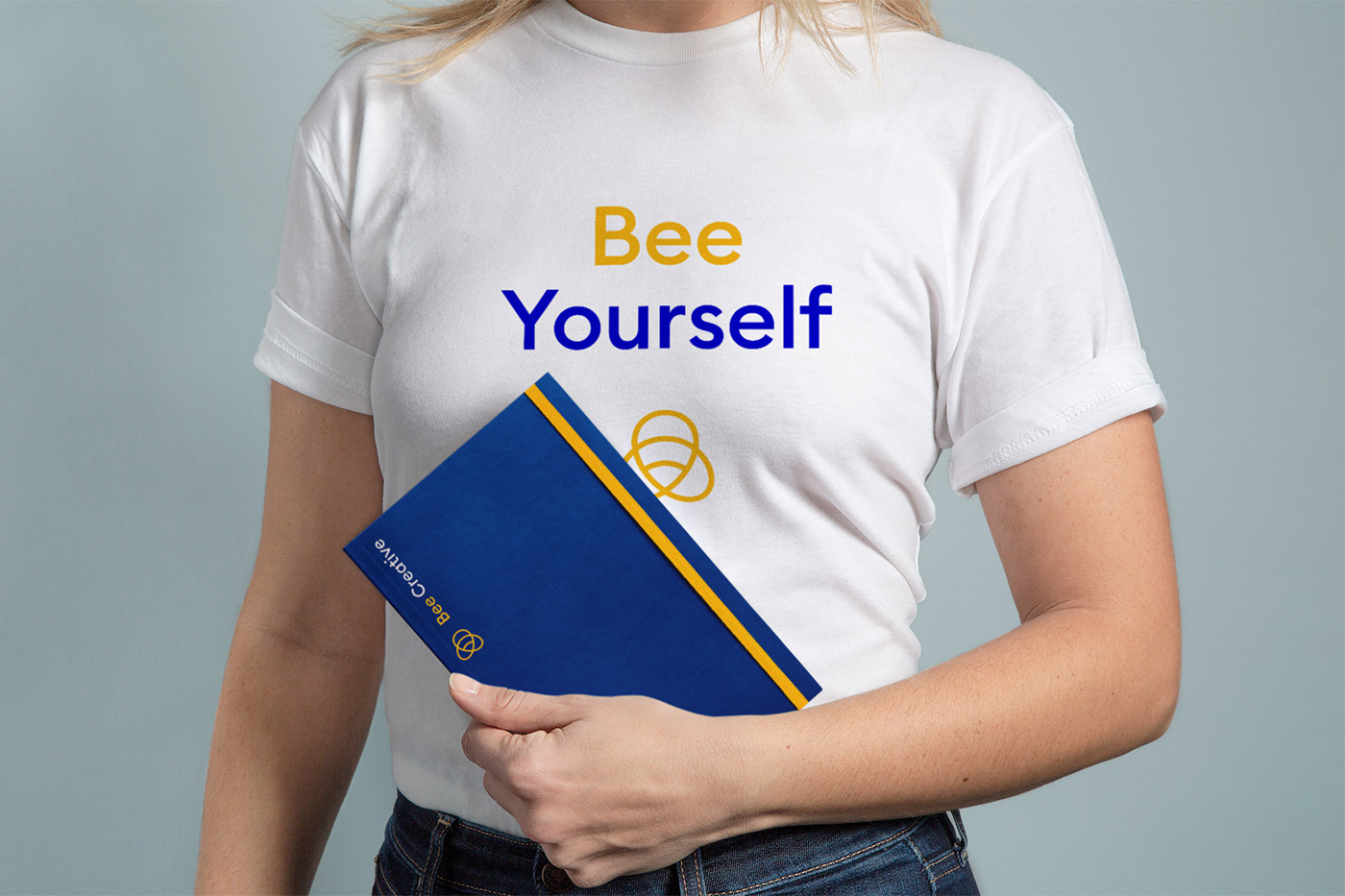
We purposefully moved away from the seemingly rigid and conservative “Tree of Knowledge” logo and translated the brand’s pillars: Community, Teamwork, Responsibility, Progress and Productivity into Melissa the Bee, a symbol that reveals wisdom, strength and harmony, an encouragement to open communications and a unified community.


The challenge
Almost 10 years since its founding, eLI came to AG Design Agency for help establishing a fresh brand experience that would reflect the company’s growing global presence and unique position in the market. Going a step further, we challenged ourselves to create a motivating and inspiring visual system that would set new standards for an industry often seen as dull and impersonal.


The Solution
Even though eLI is a multi touch-point brand serving a diverse range of audiences mainly from the US, India, the United Kingdom and Canada, we took a fresh look at what they all have in common and decided on the strategic approach of a “jaunty yet wise” brand that embodies one common principle: the continuous desire to learn, grow and improve.
With a distinct and extensive set of brand tools, eLI is re-positioned as a powerful category leader, aptly equipped to take on new challenges and able to connect with distinctly different audience segments in a meaningful way.


The elements of the brand identity system. Everything starts here.
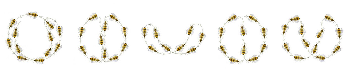
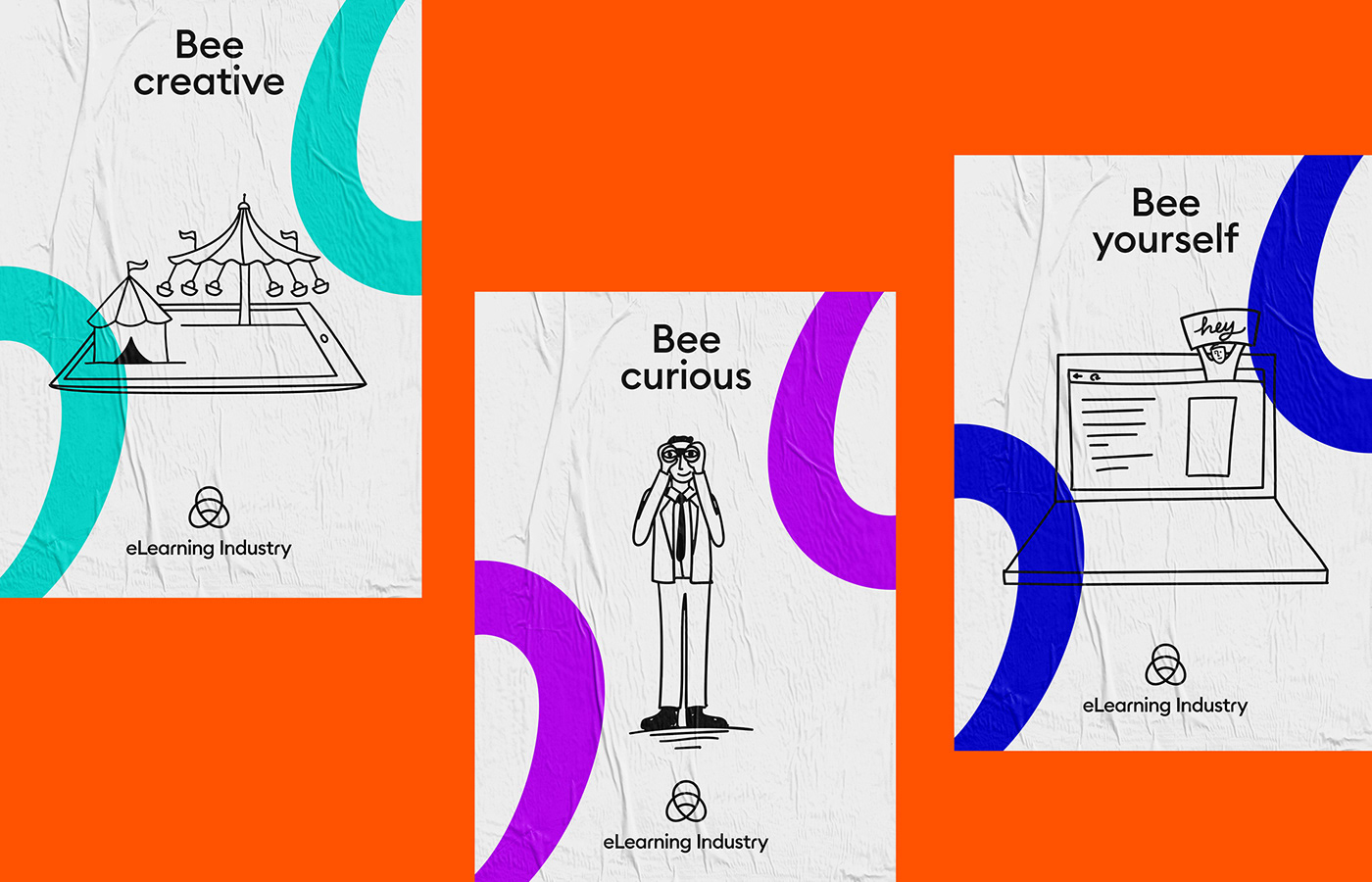
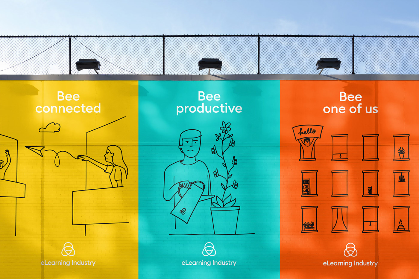
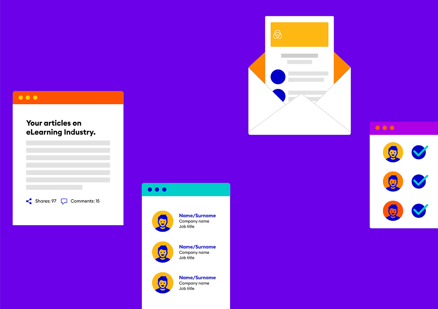
The brand’s expressive character is further highlighted by a complementary graphic system inspired by the wonderful ‘dance language’ of the honey bees and a series of allegorical illustrations that represent different personalities or work habits within our audience. In addition, we designed more a large set of pictos that maximize brand recognition throughout the platform and allow eLI to communicate various messages in a simple, effective and friendly way.

Iconography & Typography.
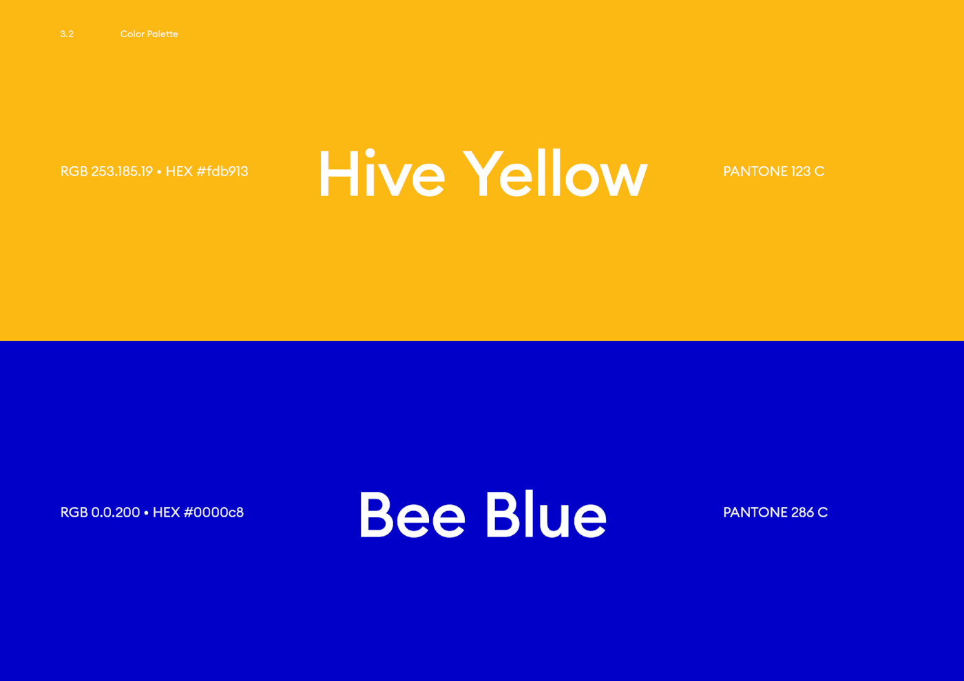
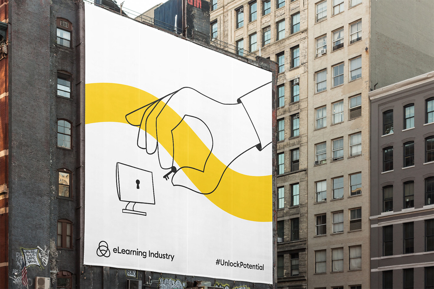
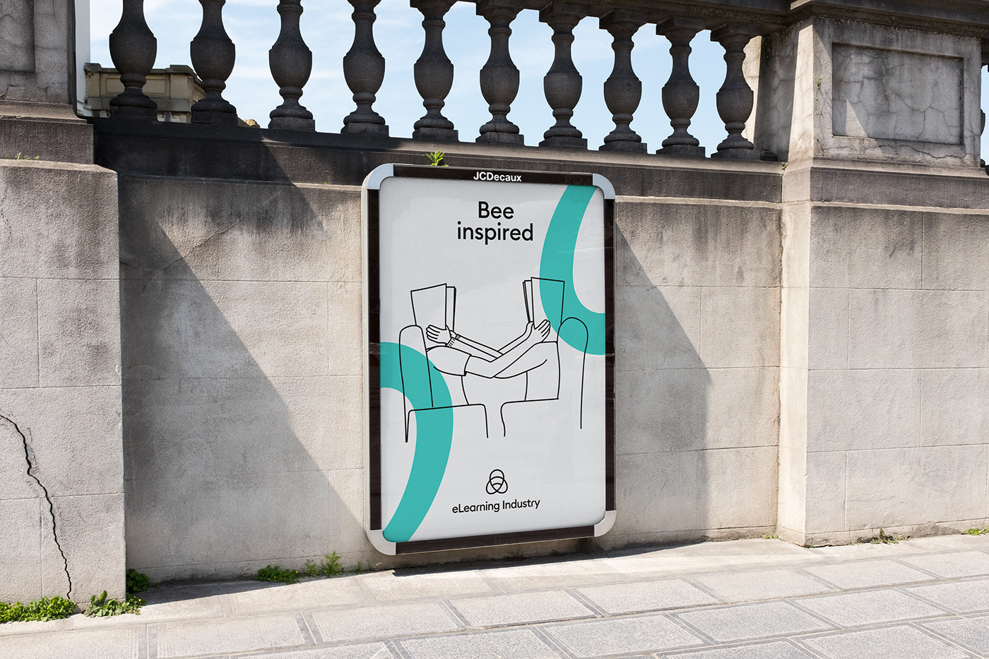
Icons were designed to communicate quickly and effectively different kinds of messages. They aim to be bold, friendly & expressive. Each one of those is colored in Hive Yellow & Bee Blue lines.
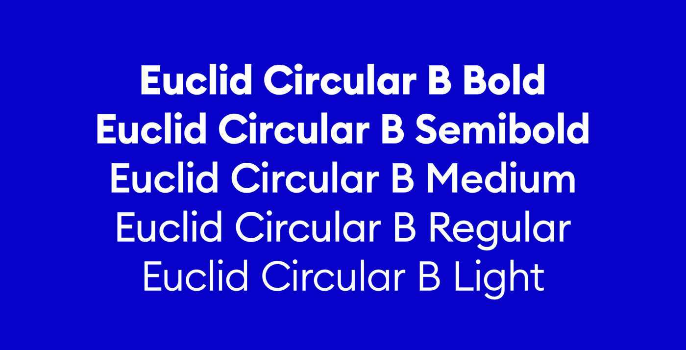
Our font family is designed to look great in any context. Its name is Euclid Circular B. Euclid Circular B is a key element in our brand. It works to maintain consistency, create clarity and provide equity to the brand as a global leader in e-learning industry.


Illustration
The company’s mission is truly understanding, educating and connecting with people. This is why we created a playful and imaginative feel by illustrating each and every one of our eLearners. Different characteristics, different looks, uniqueness.


Tone of Voice
The company’sTone of voice express our brand’s essence, signaling what we stand for. Friendly and confident, expressive and bold. A sharing community, this is who we are. mission is truly understanding, educating and connecting with people. This is why we created a playful and imaginative feel by illustrating each and every one of our eLearners. Different characteristics, different looks, uniqueness.


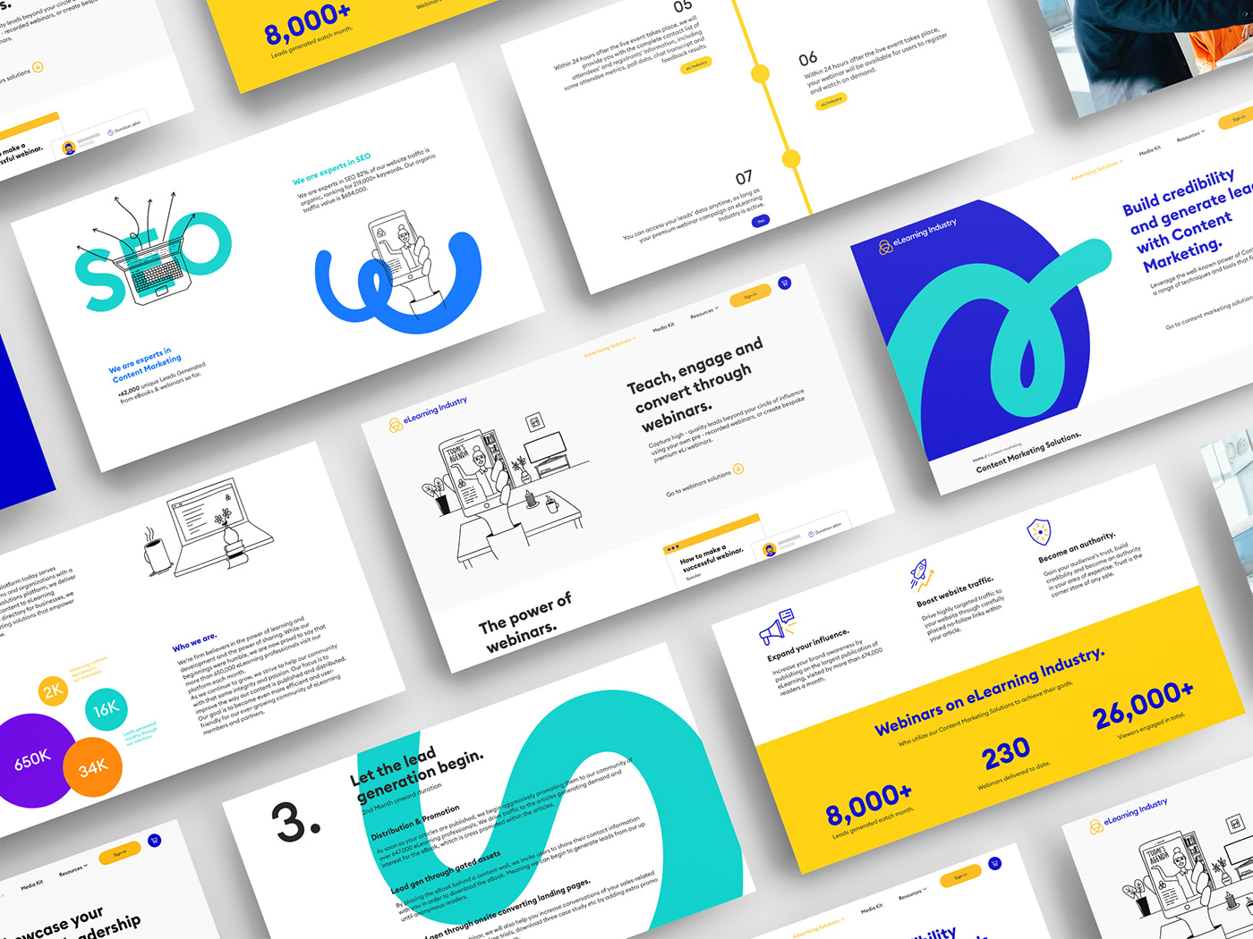
The website
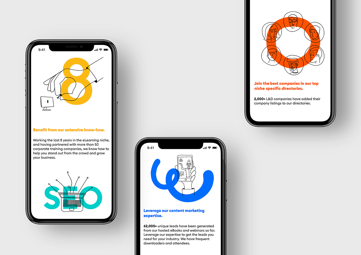
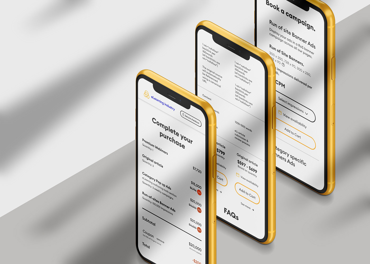
We worked closely with eLI's UX team to create a rich user-journey around the digital marketing solutions provided for top Industry leaders such as Abode, Docebo and others.
Are you looking for the right marketing solution for your eLearning brand?


Art Direction: Anna Trympali, Yiannis Petris, Illustration: Panos Nikolakakis, UI: Kiki Tyrekidou,
Code: eLearning Industry, Copy: Olympia Aivazi, Animation: Senone
–––––
See more: AG's projects on Branding

