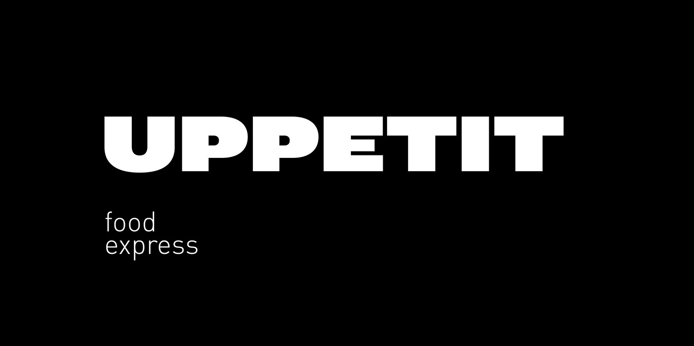
Uppetit
—
Client
Chain of shops
Ready-made food
Services
Naming
Positioning
Strategy
Form style
Exterior and interior
Comfort food in a modern format
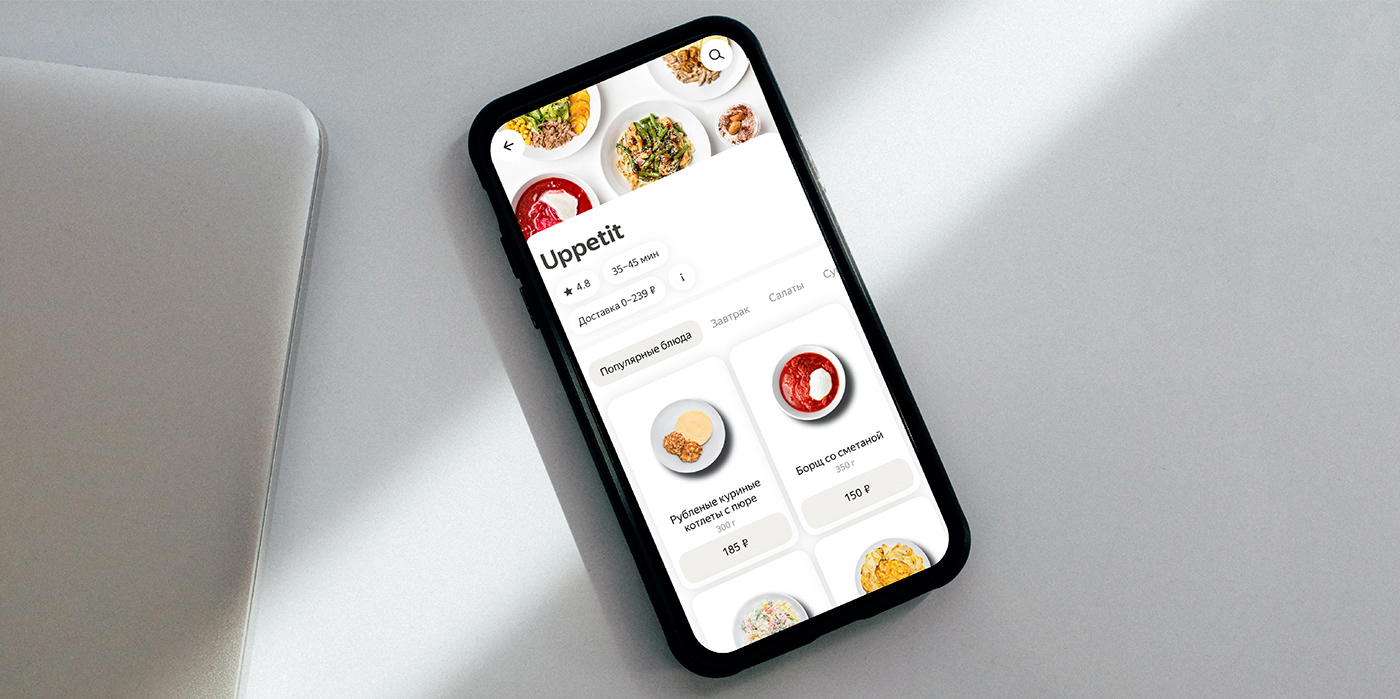
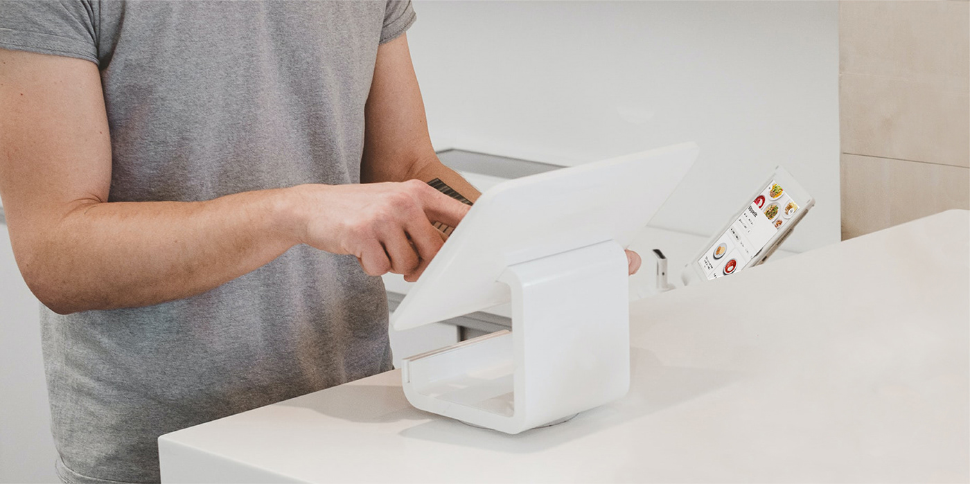
Task Ready-made and comfort food in a new format at the crosswords of a bakery, a cafe, a delicatessen and a shop. The peculiarity of the establishment is the customer self-service using the scan&go system. Our task was to develop a new brand of a high-tech shop-cafe with simple and straightforward everyday food.

Market and competitors
1. Distrust of food in retail due to the lack of transparency in the cooking process as well as the storage duration.
2. Competitors work in only two segments: healthy food or delicious food. Nobody talks about comfort and simplicity.
3. Customers are becoming more rational when choosing a place.
Consumers
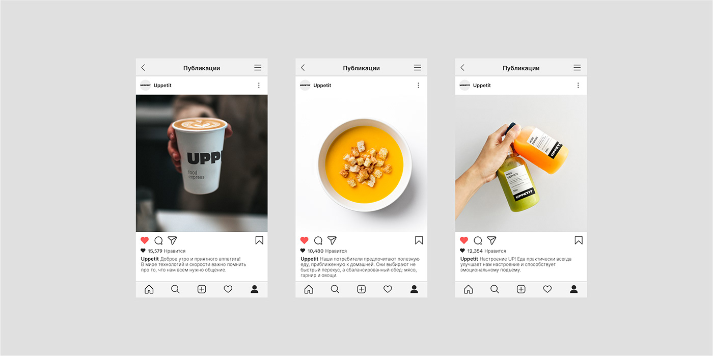
The core of our target audience is people who value their time and resources. They work a lot, so it is important for them to eat comfort food and don't think about it until the next meal. They don’t like experimenting as it is easier for them to go to a familiar place where they can quickly make a choice. Our consumers prefer healthy food that is close to homemade meals. They wouldn’t grab a quick snack, but a balanced lunch including meat, side dishes and vegetables.
Positioning
Food by your rules The conclusions on analytics and brand audit formed the basis for developing the concept of a hearty and simple meal at an affordable price. It was important for us to talk about how manufacturability is tastier and able to convey the feeling that the consumers themselves control their purchases and time for lunch.
Naming
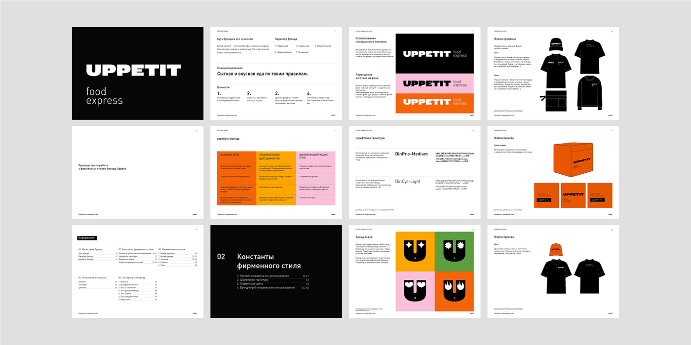
We worked in three semantic fields: satiety, simplicity and manufacturability. The name Uppetit is a laconic reflection on the brand positioning. It reinterprets the word “appetite” while making it unique as it emphasises the fact that food almost always improves our mood and contributes to emotional uplift.
Form style
In the world of technology and speed, it is important to remember that we all need communication.
Brand character
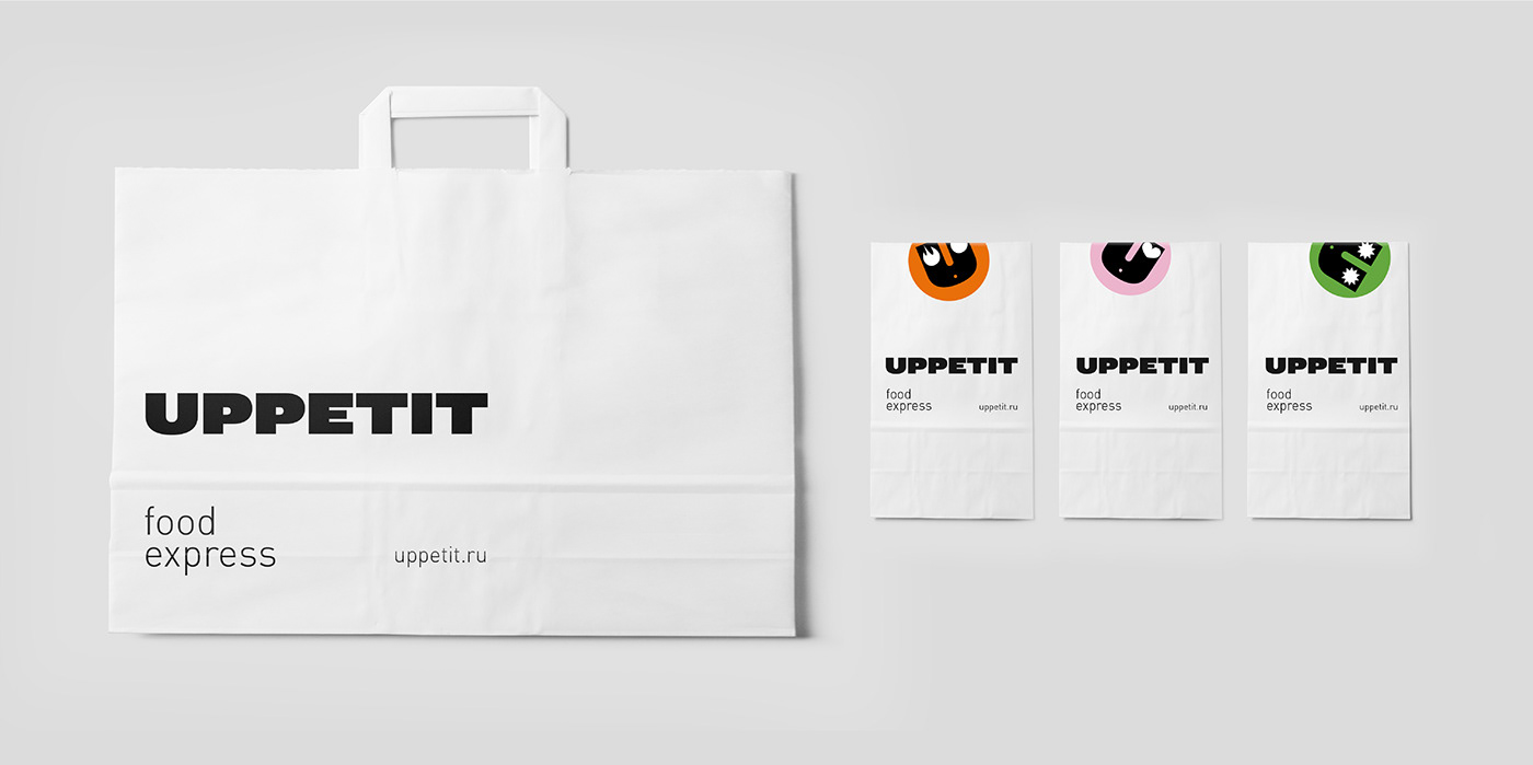
In the corporate style, we put the emphasis on the sensations, the brand character, so that the brand image turned out to be alive and emotional. This is how a character named U (for Uppetit) emanated. The hero can be happy, sad, surprised as well as full of laughter. The character sets the general mood for the entire project. It turns out to be useful to feature him in animations and stickers when it comes to the product branding.
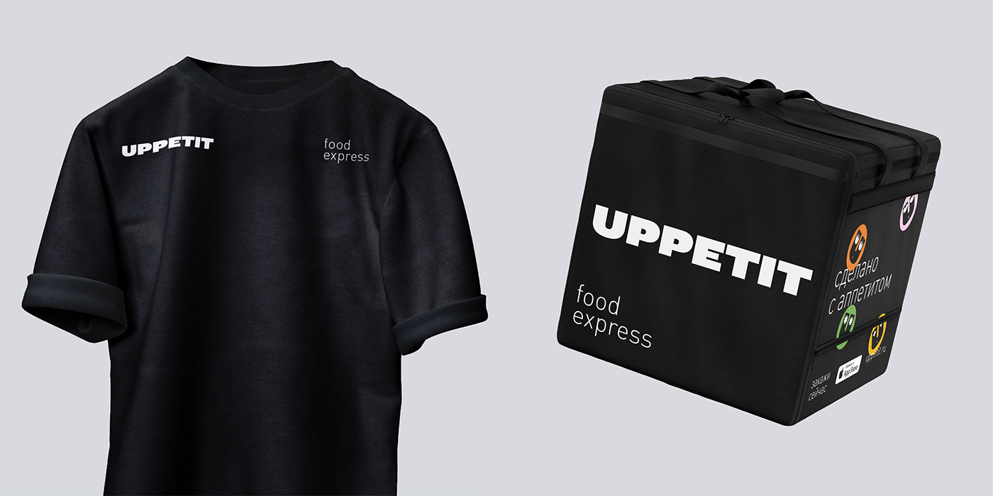
The form
We have developed a number of corporate identity media. In the form, the emphasis was on simplicity, versatility and functionality. We came up with black T-shirts for assistants working in the main room and a cooler bag for couriers.
Packaging
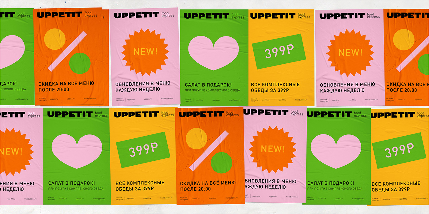
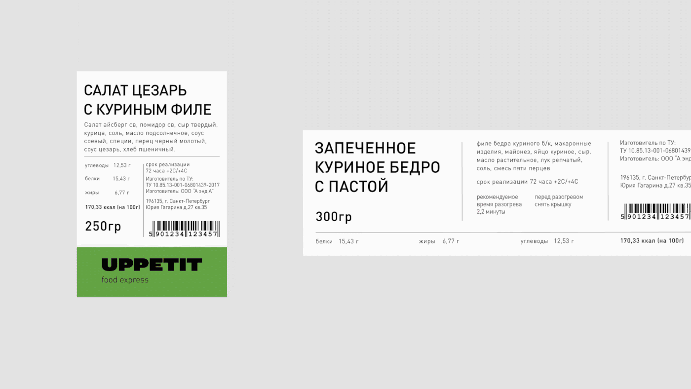
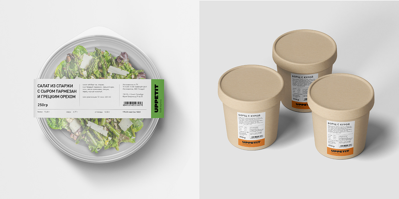
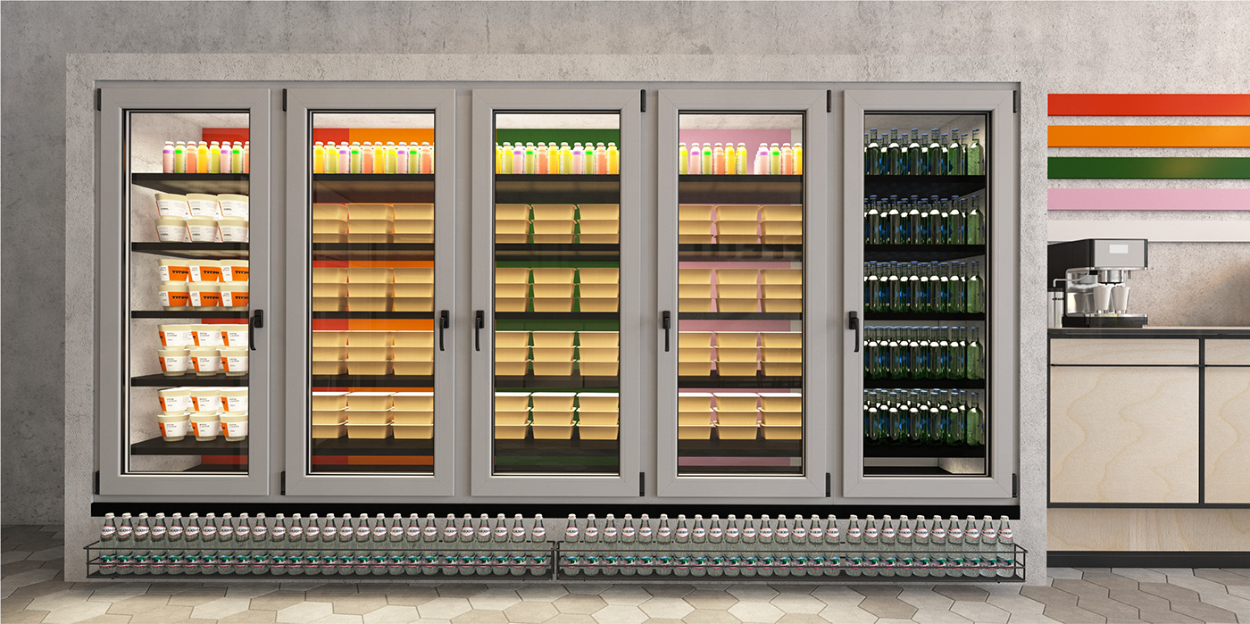
We focused on lively, tasty and mouth-watering colours including hues of green, orange, yellow and pink. The branded palette has a navigational role. It is easier for the consumer to navigate among the assortments: green stands for salads, orange for soups, yellow for the main menu and pink for desserts.
A standard label for the main dishes has been developed to reduce production costs. Paper cups and bags are completely sealed with a white background and feature stickers with the brand character to enhance the awareness of the brand.
POS materials
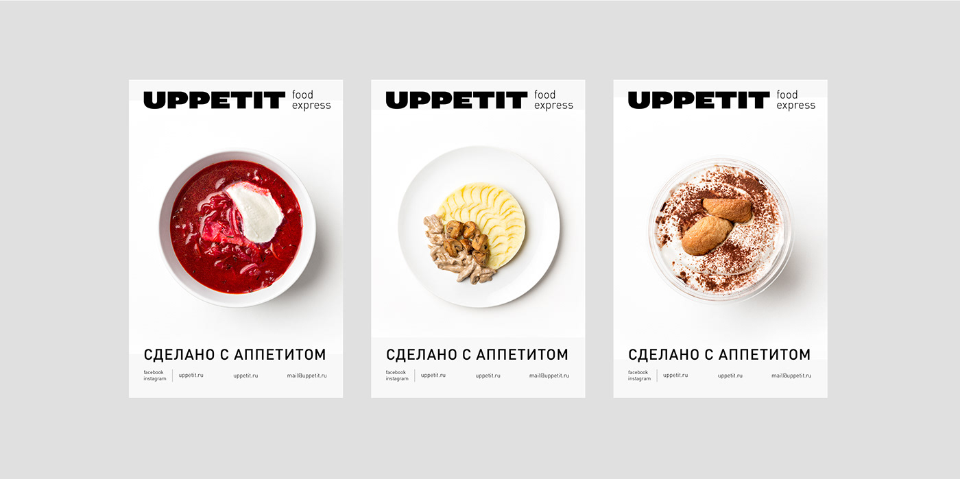
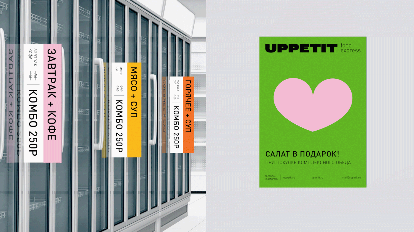
With in the framework of the project, POS materials were also considered: posters, price tags and stoppers. They help the consumer quickly navigate the shop and choose great deals. The posters feature photos of the products against a clean white background in order to emphasise the simplicity and clarity of the ingredients. Promotions attract the consumers’ attention due to the use of bright corporate colours and graphics.
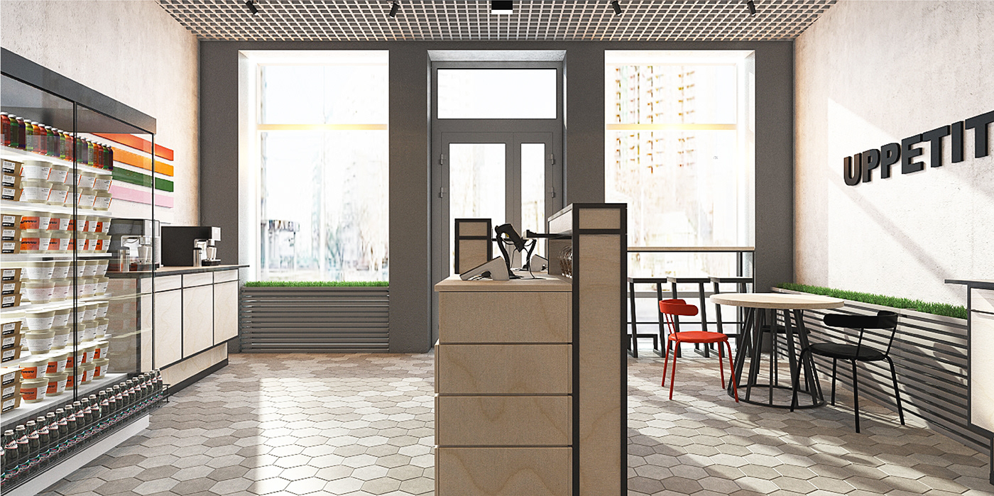
Interior
An interior designer participated in the development of the project. We offered a series of solutions when it came to the room design with drinks, chafing dishes, snacks, fridges as well as a fresh zone. The visual solution looks minimalistic and has a European feel. The interior features light wood and hues of grey that echoe technology. The clean windows provide natural light. Thanks to them, the shop is clearly visible from the street. An exclusive colour palette is used to create the assortment range. The branding of the fridges is one of the important stages since they take up most of the room space. The equipment is light grey. Thanks to the use of colours, it is convenient for customers to navigate the fresh zone.
Brand book
For the correct positioning of the brand in the market, we have developed a set of rules. The first part of the brand book describes the firm’s values and philosophy according to which the go-to-market strategy is built. The second one is a guide on how to use the corporate identity.
Results
1. Prepared the brand for market launch and flagship shop opening
2. Developed a POS material system for the management of customer interests
3. Created an adaptable design system for various retail spaces