

Amplified Opera
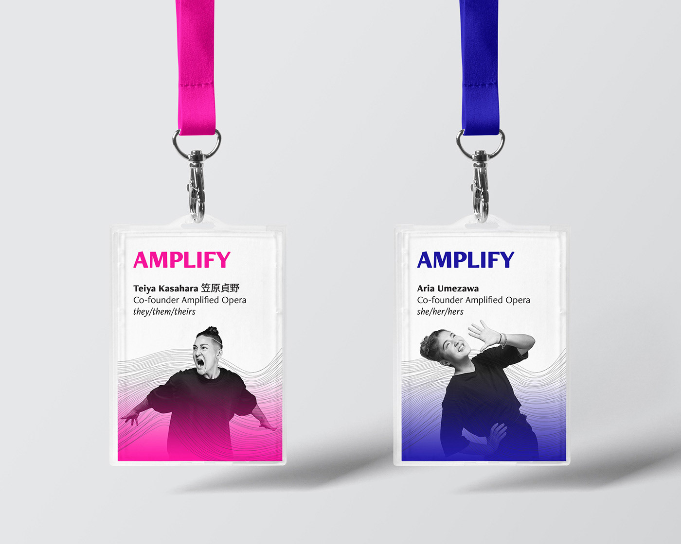
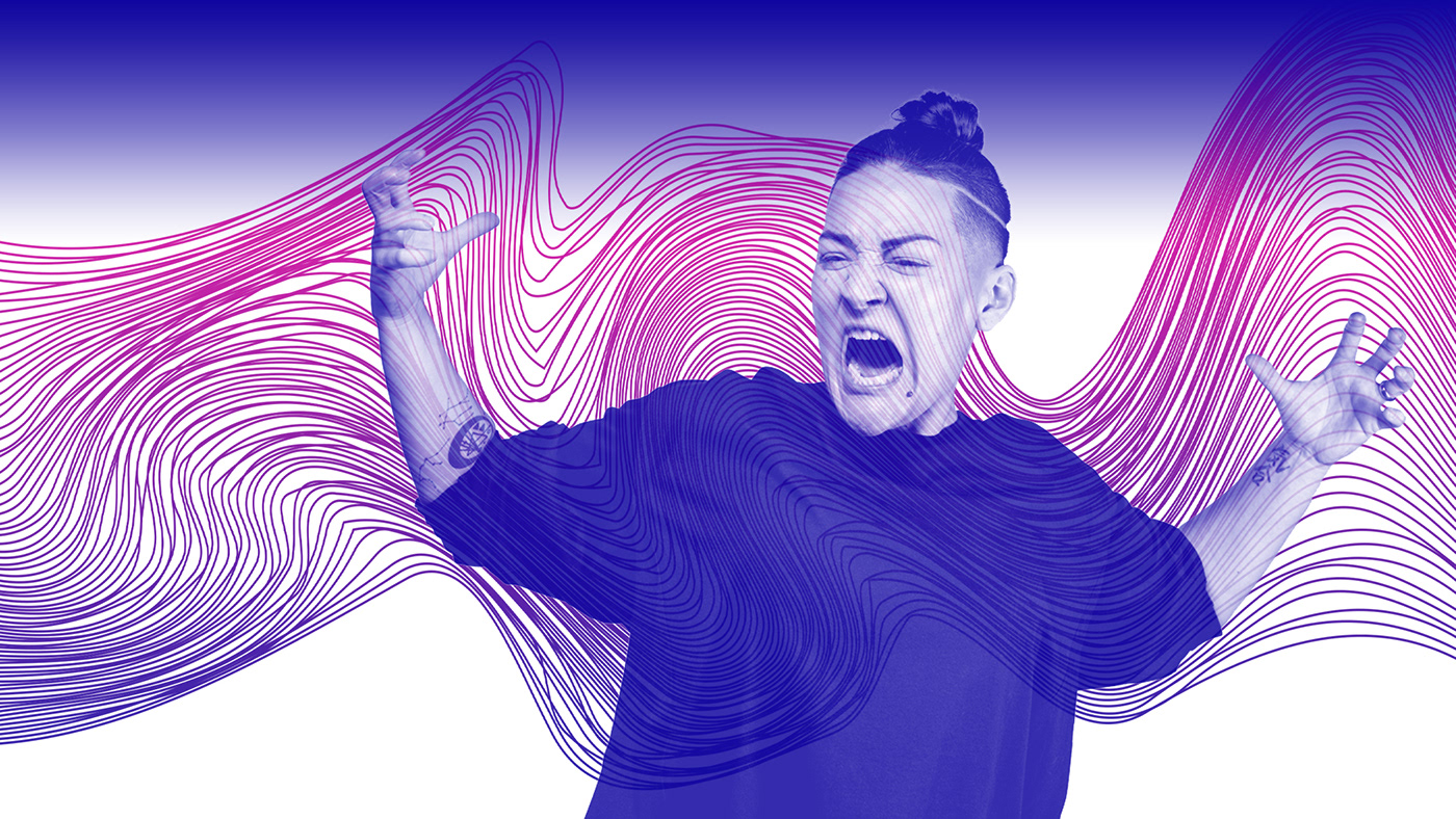
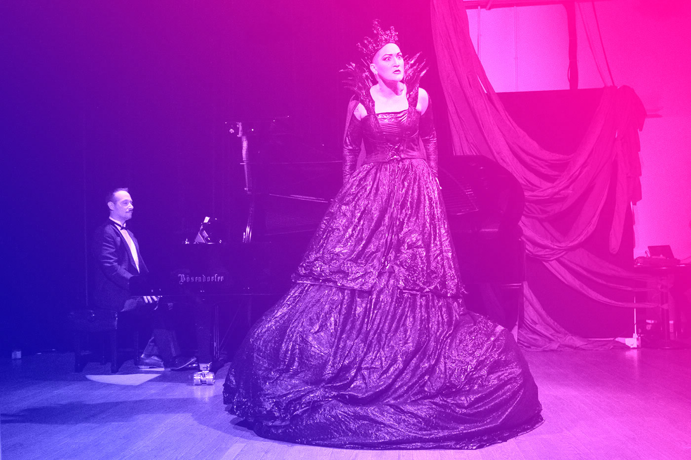
Acme was commissioned to design a visual identity for Amplified Opera—Formed by two Toronto-based opera artists, this new opera/theatre company is focused on providing artists from equity-seeking groups a platform to tell their stories on their own terms.
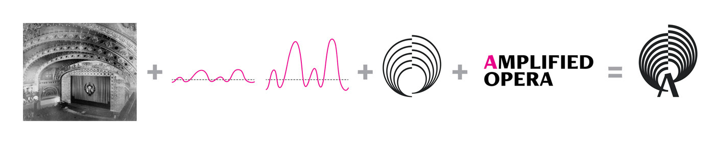
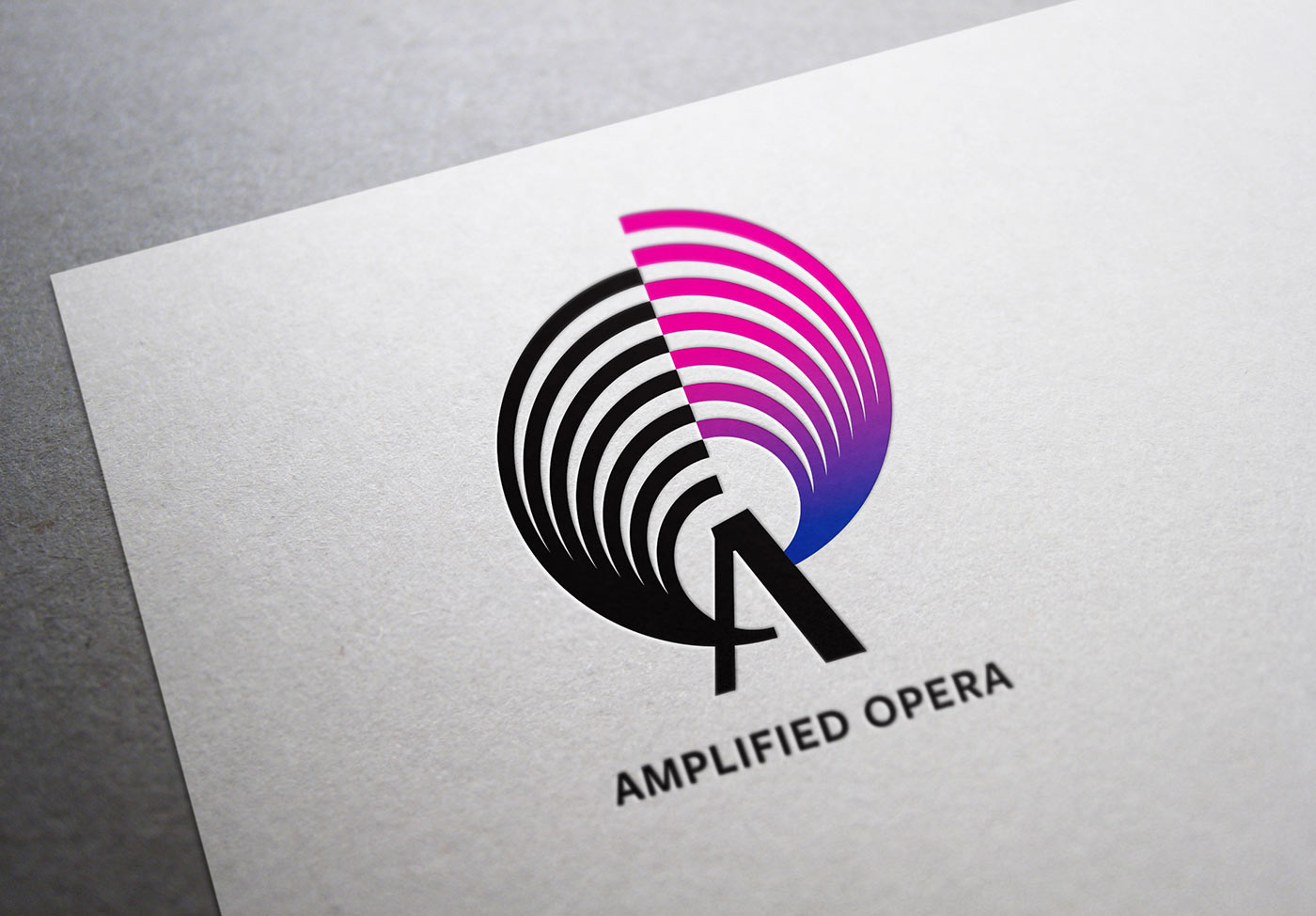
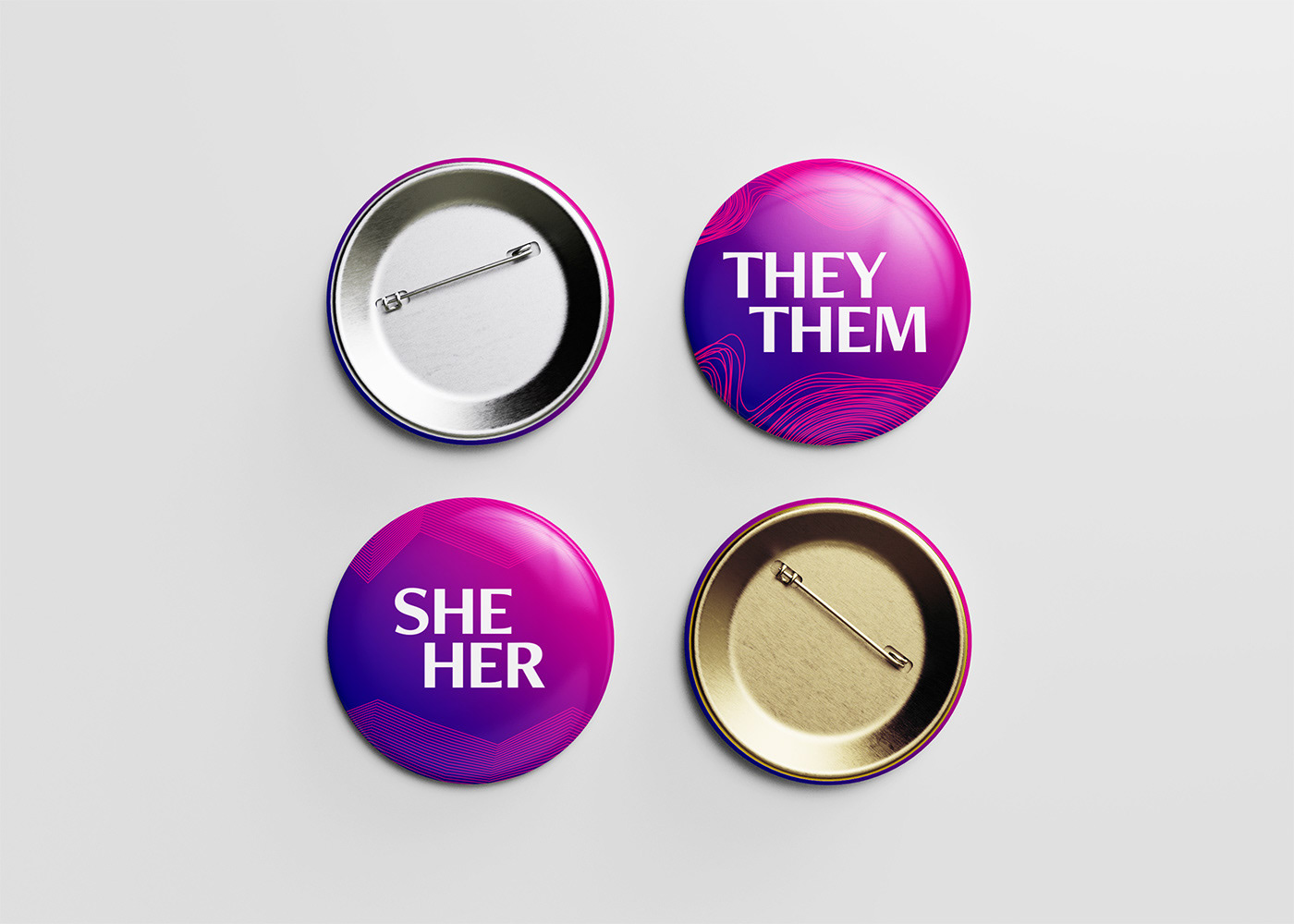
The Amplified Opera logo references a proscenium arch, a geometric diagram of waveform amplification, and the “O” letterform in “Opera” to arrive at a series of radiating concentric circles—this base figure is divided and elevated (amplified) signifying both a break with the past and the amplification of diverse voices that challenge the status quo.
Additional credits:
Photography: Michael Barker
Hair and Make-up: Deux Beauté, Olyvia Little, Amy Harper
Performance Photography: Tanja Tiziana
Proscenium arch photo: Library of Congress, Prints & Photographs Division, ILL,16-CHIG, 39-89
Photography: Michael Barker
Hair and Make-up: Deux Beauté, Olyvia Little, Amy Harper
Performance Photography: Tanja Tiziana
Proscenium arch photo: Library of Congress, Prints & Photographs Division, ILL,16-CHIG, 39-89