

TPE-HUN Public Transportation Aesthetics Project
北花線回遊號 - 台灣公運美學計畫

「 歷經5個月,北花線創造3個第一 」
第一次 交通部X經濟部跨部合作
第一次 公運服務路線新品牌
第一次 公運產業設計導入大整合
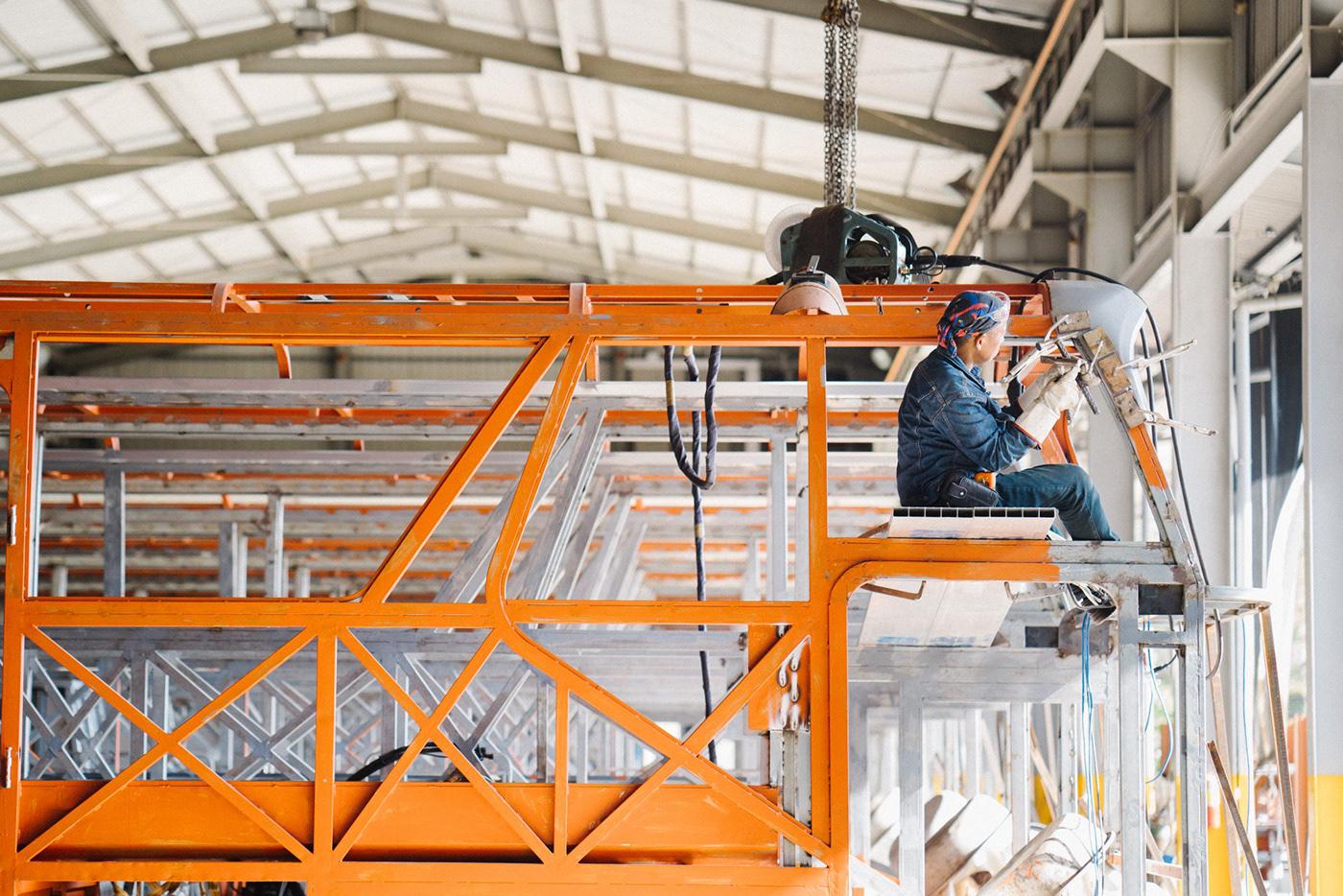
「北花線-回遊號」公運美學品牌計畫由經濟部與交通部跨部合作並與台灣設計研究院(TDRI)聯手將設計導入公路運輸服務,
並配合2020年1月6日蘇花改開放全線通車,由公路總局授權首都、臺北與統聯3家客運業者行駛「台北-花蓮」全新路線。
MOEA and MOTC introduce design to public transportation. New routes (TPE-HUN Public Transportation) via Suhua Highway were
launched by three service providers on January 6, 2020. - TDRI led the two professional design teams for the execution,
targeting branding, bus exterior design, information design, and interior optimization.


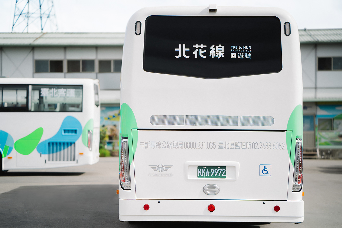
此計畫發掘花蓮在地元素,以自然水色與鵝卵石為品牌視覺,透過8顆相連的石頭象徵蘇花改全線貫通的8個隧道,打造全新形象;
並以鵝卵石概念改造具人體工學的寬敞座椅與可調式造型頭枕,提升長途車程的舒適度;內裝透過色彩、材質整合,減少異材質使用、
淡化材質紋理、簡化線條大原則進行「減法設計」,車體更大膽以白、藍色系呼應。 資訊指標也在法規原則下重新盤點,透過視覺計畫
檢視必要性;全方面從品牌路線、車體外觀、內裝優化等項目逐一著手,引領公路運輸產業的整合共創,優化大眾搭乘公運的服務體驗,
徹底顛覆過去公運巴士的刻板印象,打造最美的移動風景,宣告台灣「公運美學」誕生!
Through subtraction strategy, co-creation is facilitated to improve public transit experience. Achievement of design realization:
Local Elements|Pebbles of Hualien’s famous Chih Sing Lake are used for the main visual.
8 pebbles symbolize the eight tunnels along the way. Green (mountain) and blue (sea) are used to create a new image.
Subtraction Design| Avoiding heterogenous materials, lightening textures, and simplifying lines;
white and blue interior presents a consistent look and pressure-free space, allowing people to enjoy the beautiful sceneries outside.
Human Factors| Ergonomic chairs and pebble-shaped adjustable headrest enhance comfort. Highlight of the project is the design of the headrest. .
Information Redesigned| Reexamining regulations and utilizing subtraction design to redesign signage system.
Colors are used for different levels of urgency. Bilingual signs create friendly experience.


在現有法規規範之下以減法原則導入資訊設計,去除非必要與重複內容,打破過去混雜著標楷體、黑體、圓體等字型,
將斗大的紅色警語轉換為俐落白色顯示,並選用文鼎晶熙黑體。文鼎晶熙黑體為台灣設計製造,擁有識別性、易讀性
與設計簡潔的精神,最重要的是在高速移動時保持視覺清晰,完全符合減法美學的設計原則。透過色彩計畫與指標
系統優化,用設計還給乘車者一個舒適乾淨的視覺感受。


具體效益上,創造台北花蓮雙城高度關注與支持,吸引國內外超過50家媒體採訪報導與近100篇電視、網路及紙媒露出;
每日營運最高服務5,000人次,並獲得9成以上乘客表示滿意,成功運用口碑行銷,促進觀光效益。
Track records & features
With public interest and support, the project attracted over 50 domestic and overseas media, achieving 100 TV, online, and print media exposures. Highest daily ridership reached 5,000; over 60% of passengers learned about the services via social media, followed by friends and families.
With public interest and support, the project attracted over 50 domestic and overseas media, achieving 100 TV, online, and print media exposures. Highest daily ridership reached 5,000; over 60% of passengers learned about the services via social media, followed by friends and families.
Over 90% expressed satisfaction. Successful WOM marketing generates tourism benefits.


「 全新路線 全新車體 即將啟程 」
花蓮得天獨厚由「水」打造而成,豐富生態與壯闊地景遠近馳名
視覺特別以七星潭的石頭注入新活水共創全新的形象語言
也象徵貫穿蘇花改奮力打通的八個隧道呼應這條24小時往來台北-花蓮的路線通車
期盼「北花線-回遊號」這台不只去玩、不只回家的巴士
不間斷帶給遊子及旅客一段平安的旅程
七彩圓潤、簡單的造型呼應減法哲學打造的車體計畫
透過嶄新的設計觀點提升臺灣公運美學
在此邀請大家一起來搭乘臺灣最「水」的巴士!
Logotype. Boyu Chien
Creative Director. Pu Chen
Art Director. HsienHsun Huang
Graphic Designer. Boyu Chien, YunChian Ye
Animator. HaoYen Chuang, KuoWei Chang
Animator. HaoYen Chuang, KuoWei Chang
Film Director. Pu Chen
Photographer. YuCheng Li, Audi Shu, Terry Liu, Jason
Industrial Designer. U10 Inc.
Photographer. YuCheng Li, Audi Shu, Terry Liu, Jason
Industrial Designer. U10 Inc.
Project Executive. TDRI
Client. MOEA & MOTC (R.O.C.)
Coachwork. TongYing & SanKuen (Body Co.,Ltd.)
Project. 247 Visualart


