


Introduction - Vela, water sport weather forecast
Vela, my first UX project, is a weather forecast responsive application. It is intended for recreational water sport lovers who spend their time on the Adriatic Sea in Croatia.
I worked as the UX & UI designer, and researcher. The project, based on user-centered design framework, was part of a Career Foundry course. I collaborated with a tutor and mentor receiving valuable feedback.

Solution screens for creating an account and setting units and alerts
Problem
I wanted to design an app for weather forecast for Adriatic Sea because Croatia is a major tourist destination with great potential to explore water sports. There are currently no simple, well designed forecast apps specifically promoting Croatia and its recreational water sport potential.
The app needs to present forecast in an easy to understand way and should target enthusiasts ages 21-55 who desire to check forecast for 2-3 minutes before or during their water sport. This UX case study is about steps that I took to propose a solution.

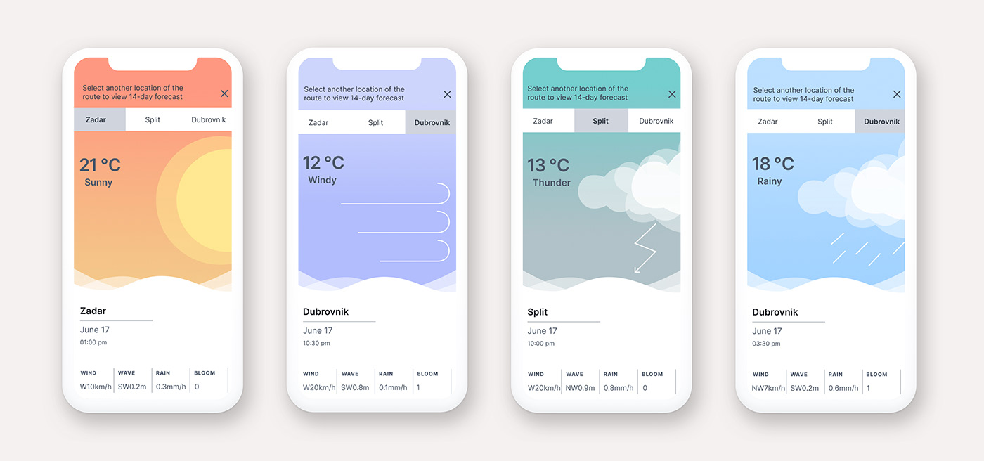
Solution for day and night hours forecast
Competitor Analysis
I searched for apps that users would likely use if they wanted to engage in a water sport. The best known are Windfinder and Windy.
Analysis of Winfinder site uncovered the abundance of complex animated forecasts that do not cater to recreational water sport lovers. Windy is another weather app with complex forecast maps that are difficult to interpret.

Competitor analysis - Winfinder Swot profile

Competitor analysis - Windy Swot profile
User Research
In order to understand my user’s needs, behaviours and frustrations, I interviewed four representative users. Their responses, gathered in affinity mapping, showed that complex forecast data cause frustrations.

Affinity mapping from user research
Based on user research two distinct personas emerged, Lucia and Helmut. They helped me to create a reliable and realistic representation of Vela’s key audience.

Helmut user persona
User Journeys helped me to understand my persona's thoughts, emotions and opportunities when interacting with Vela.

Helmut's user journey
Furthermore, research findings helped me to create a site map with the list of Vela's features from the point of view of user personas and journeys.

Ideation stage
Ideation of Vela started with initial thinking about the navigation throughout the whole app.

Ideation of homepage: Second low fidelity wireframe employed full screen map to better use mobile screen real estate. Bottom navigation was moved to the top to make space for directions of key features. Grayscale high-fidelity prototype shows all the elements under the hamburger menu clearing up the clutter. At this stage clickable prototype of Vela was created and usability testing was conducted.

Usability Testing
I conducted usability testing with 6 representative participants. I tested how participants interacted with the prototype while creating an account, changing forecast units, setting alerts, checking forecast and creating a route. Testing uncovered what felt natural to users and what did not.
One issue with usability testing showed that users wanted to simplify the process of accessing forecast for a location. Problem and solution reasoning are described below.

Participants and more issues uncovered during usability testing can be found here:
Usability test plan and usability test script can be found here:
After usability testing was completed, I have made the necessary changes to five crucial issues and applied the UI to finalize the mockups.

After finalizing Vela homepage in color, I conducted a preference test on Usability Hub to ask users if they prefer two separate buttons or side navigation. 21 participants were tested and 67% of participants preferred the buttons. Reasons for choosing buttons were: they felt more clickable, the separation is clearer, more readable, organised, logical and reveals more of the map. The final home page reflected this preference.

Iterations of my route feature: Initial pencil and paper low fidelity sketches of my route feature with the progression to mid fidelity.

Iterations of my route feature: From mid fidelity I progressed to high fidelity iterations in grayscale and gradually added color. Buttons were not positioned here as in the rest of the app, so they were stacked on top of each other to be uniform with the rest of Vela.

Iterations of my route feature: There was not enough color difference between save route and add location buttons. In order to make them distinguishable, more color contrast was added, aligned with Vela's color style guide.
Save route and add location buttons needed to be made uniform with the rest of Vela's buttons, so their size was adjusted.

Iterations of forecast screens of my route feature: Low and mid fidelity solution showed a struggle to fit lots of weather data onto a small mobile screen.

High fidelity solution added knob navigation for time, arrow navigation for days and tab navigation for locations.

Conclusion
Here is the walkthrough of the key feature of Vela - my route. It enables the users to check forecast for 2-3 minutes and it is simple enough so users don't get frustrated.
What I learned and future direction
When tempted to make changes based on single feedback, I had to remind myself that Vela will be used by many different people and that I should consider input from several users and designers.
If time and resources were not crucial, more issues could have been fixed after the usability testing. However, time and resources usually are limited, so it is important to discern what needs to be fixed and what does not.
During user interviews, all the participants mentioned they would like to have a more graphical at a glance representation of a forecast for a quick glance before they engage in their sport. A possible future direction is outlined below.
A possible future direction for Vela


