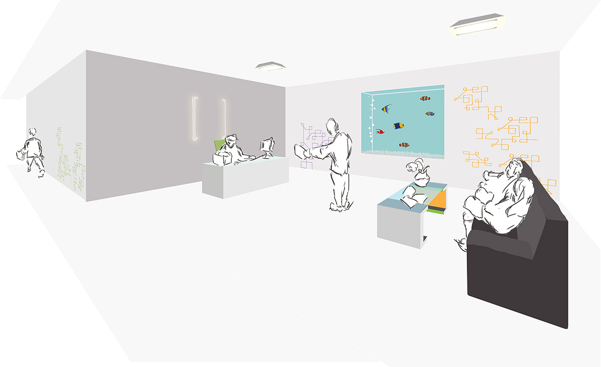
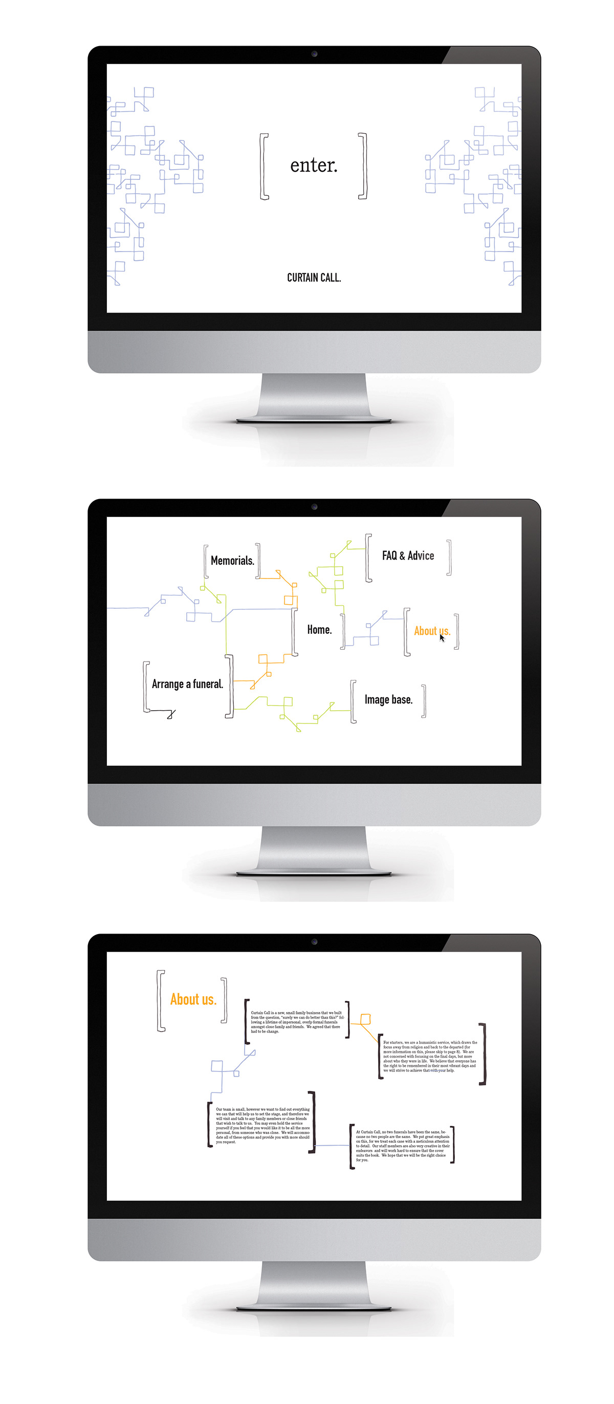
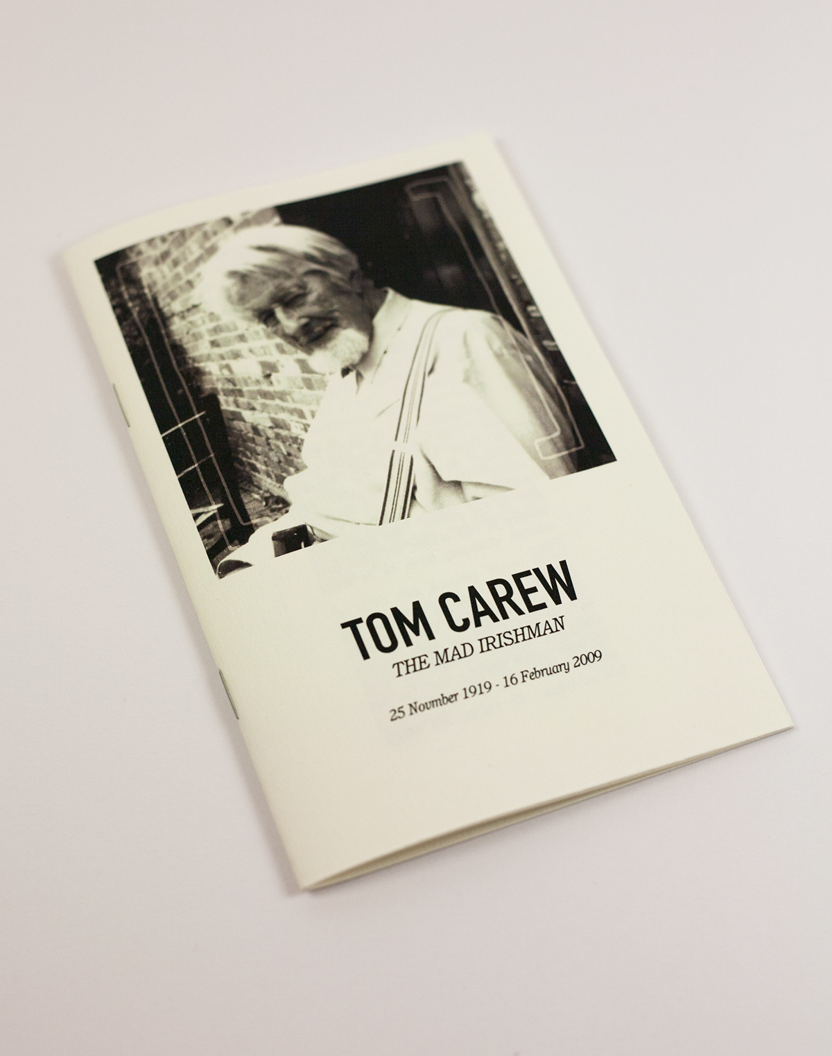
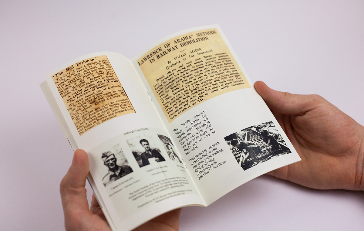
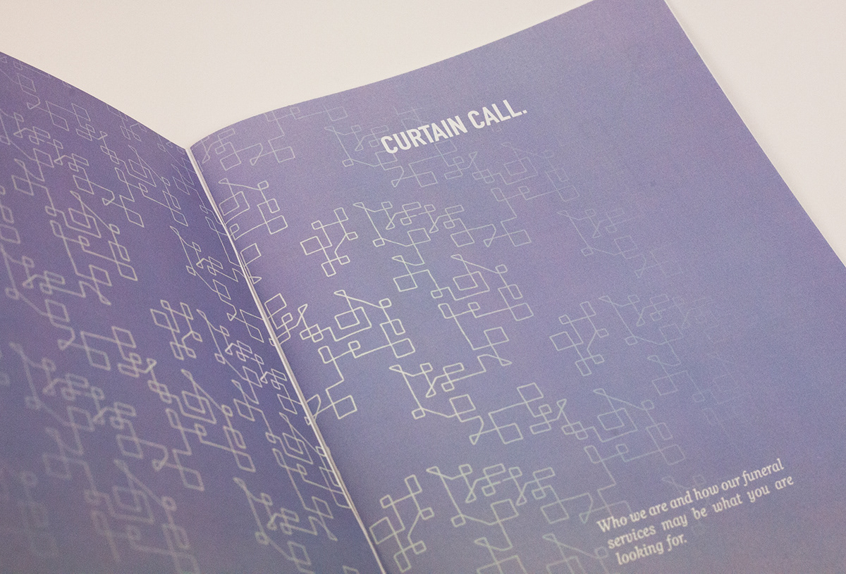
Curtain Call: A Humanistic Funeral Home
Branding
Brief:
Create the visual identity for something uninteresting. In a random selection, I was allocated a funeral home!
Interpretation:
A funeral home. This was a bit morbid but not deterring. Funeral homes are perceived to be drab establishments, which means that there was lots of room for improvement. The way I interpreted this was to brand a humanistic funeral home. My idea in the name references a show, calling back the performers for one final bow once the curtain has been drawn. I wanted to respond with a hail of colour so chose this orange, purple and green, all differently relating to life in some way. A person's funeral, in my eyes, should encompass their life incredibly harmoniously with who they were and so I tried to used the idea of empty brackets as a form of blank slate, there to be filled by their personalities and their lives.