
The Preservatory
Brand Identity | Package Design
The Preservatory creates its artisanal small-batch preserves with simple craftsmanship, using only the ripest ingredients, mostly grown on the family farm in Langley, BC. Our approach was to use carefully curated illustrations and elegantly refined typography to comprise a brand identity system that balances handcrafted farm quality with the sophisticated nature of The Preservatory’s gourmet products.
Illustration//Andrew Plewes
The Preservatory, Langley BC Canada

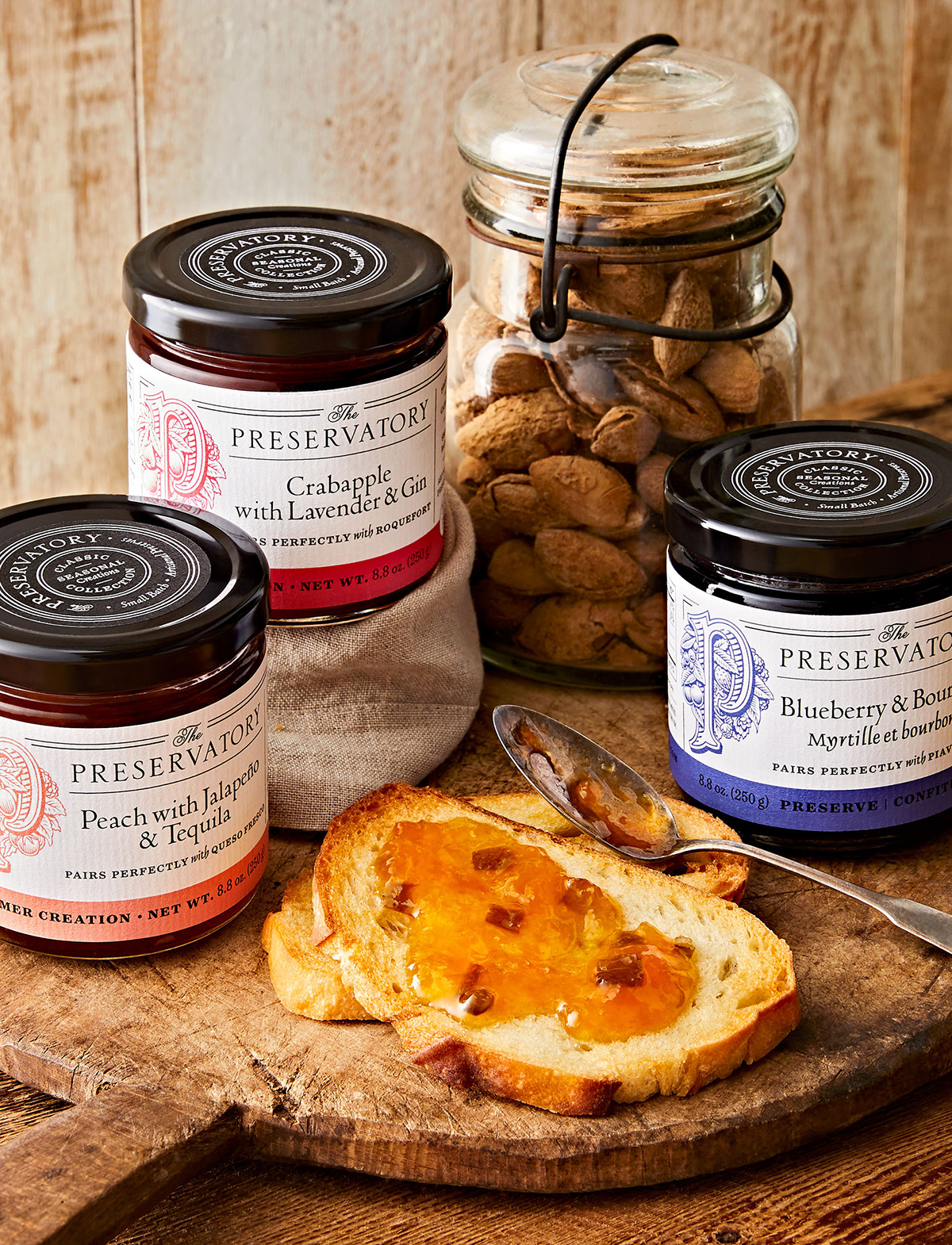


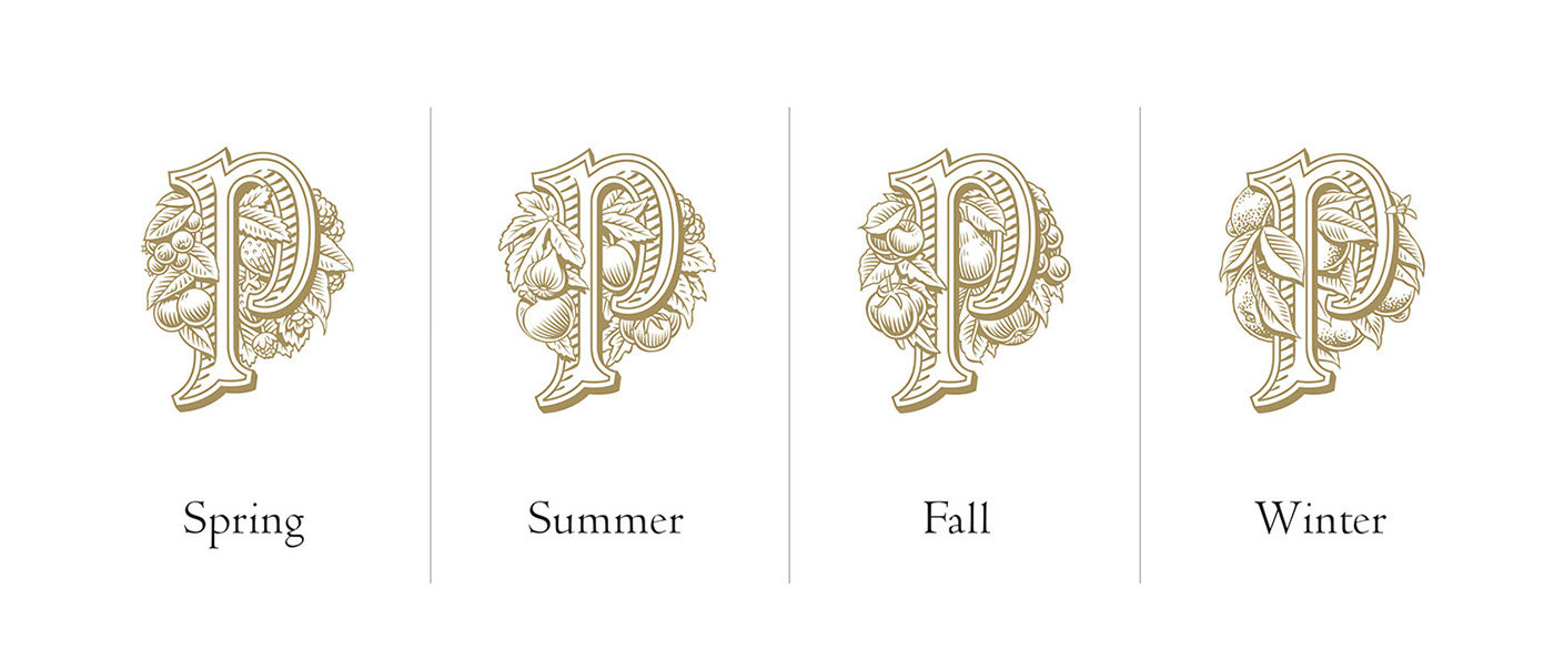
We designed the packaging to be versatile so that it works across different seasonal offerings and sizes, covering over 35+ distinct flavours and preserve types. A family of identity lockups distinguish between the seasons by incorporating varying fruit illustrations that feel lush, premium and delicious.


Portfolio Photography//Maya Visnyei Prop Styling//Catherine Doherty

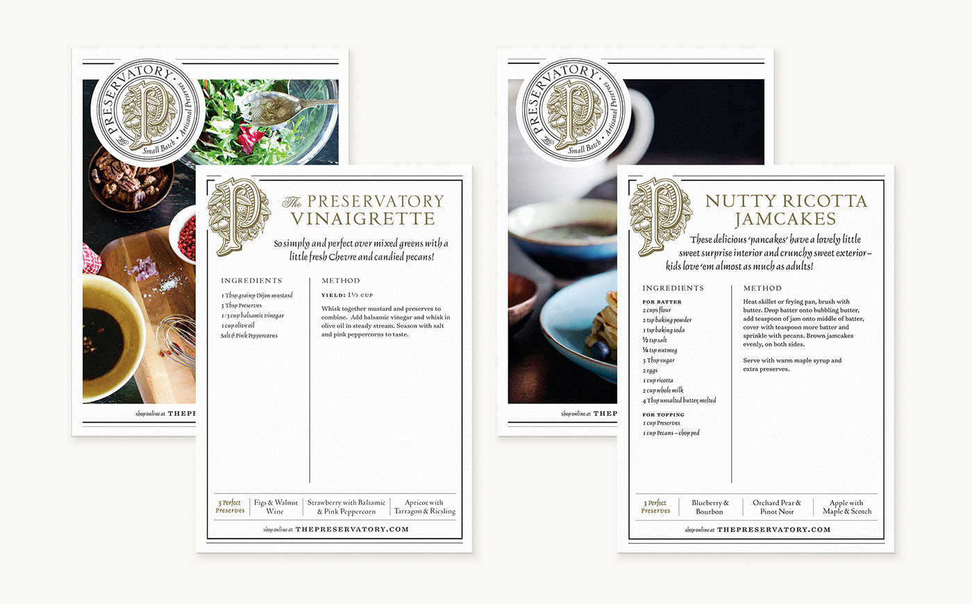

The Preservatory Cook Book Published by appetite by Random House, 2017
Book Design//Terri Mimmo
Book Design//Terri Mimmo
View more work at ChadRobertsDesign.ca


