Our project was to create a set of 4 covers and 2 double page spreads that were to be a part of a new magazine called 'Creative Arts'. The covers had to look a part of a set but also be quite different to each other. The only set cover themes were the launch issue, and a typography issue.
The first task was to create the masthead for the magazine.
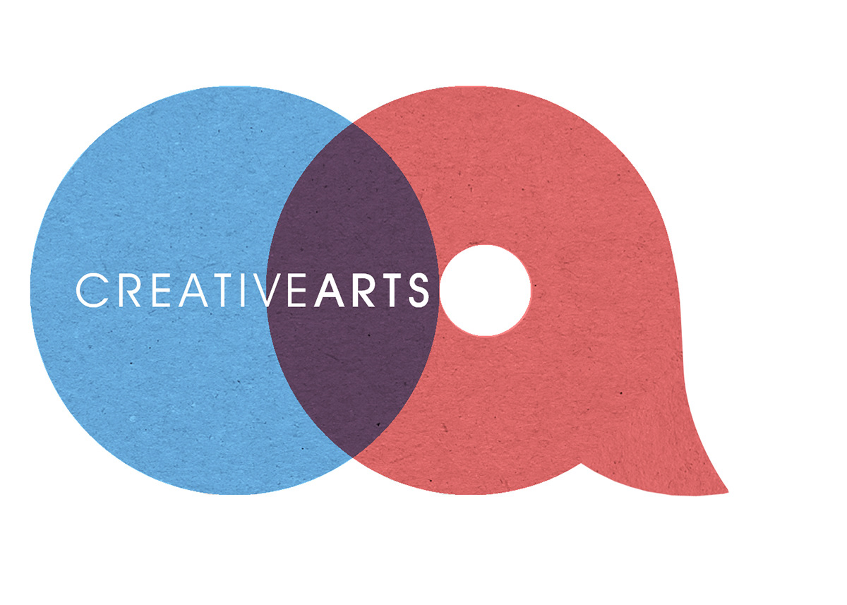
This is my masthead. I designed it to be quite versatile, as the two colours can be changed to fit to the style of the cover, which shows cohesion throughout the designs. I experimented with ways that the letters C and A could work together and came up with this approach. Two circles overlapping each other create a simplistic lowercase version of c and a accordingly. I added a flick to the a to make it more obvious was it was supposed to be. The overlapping a created the c shape. I wrote 'Creative Arts' in the middle to finish off the masthead.
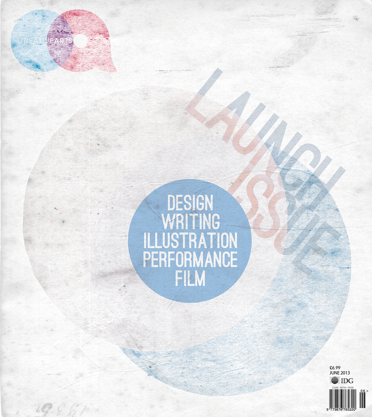
The launch cover was the first one that I designed. I wanted it to be very simple, and not overloaded with information, so I decided to just keep it to showcasing the tag line of the magazine (something that is required on each cover) I enclosed the tag line within a circle, something that is consistent throughout the covers.
In the background are two overlapping circles which is something that happens in the masthead. The masthead is also changed slightly here to correspond with the style of the cover which is slightly grungey.
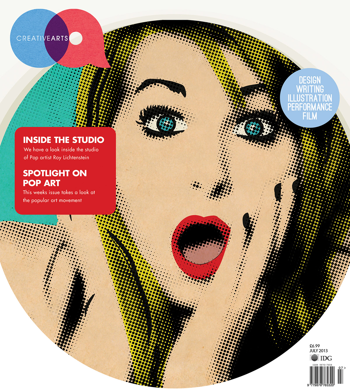
The second cover was supposed to be quite colourful and 'in your face' sort of, I wanted it to jump out to people. The image is from DeviantArt (not sure who from, if this is you, sorry - it was only a uni project) and I transformed it into a pop art style image. Again the tag line is on the cover enclosed in the circle, only in a different place this time.
This magazine's main image is also constrained within a circle, to tie in with the masthead also.

Third cover was the mandatory Typography issue. Again, various aspects tie this cover in with all the others. Pattern in the background was created by myself in Illustrator by using the 3d tool and repeating the effects.

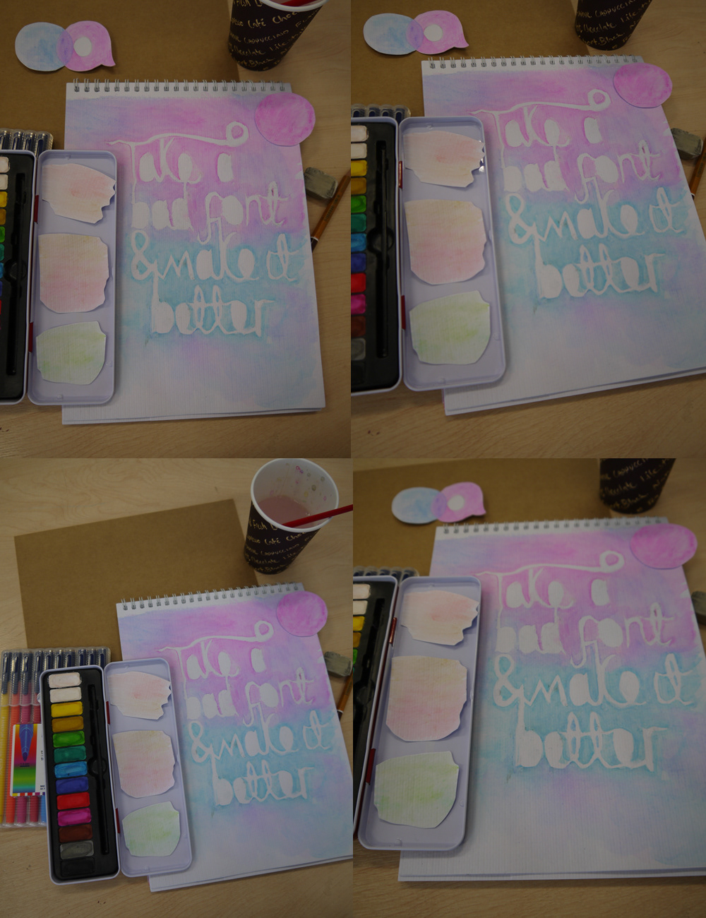
Fourth cover is a watercolour issue. The sketchpad with the text on in the background was done by myself, basically covering the paper with the text that I had cut out and stuck down lightly, then painted over the top and took off the text paper, leaving me with this effect. I set out the image on a desk and placed around it various items such as the watercolour tray, a pencil, an eraser, and cup of water. I cut out a separate circle and placed it in the corner of the photo so I could add the tagline within it later in Photoshop.