About
Alancell, a company specialized in cell phone repairs and sales, has been operating in the Comodoro-MT market for exactly 6 years. Throughout this period, it has solidified with its resulting growth, due to merit acquired through its efficiency and professionalism in the services provided to its customers.
In search of a differentiator, Alancell opted to invest in professional and consistent visual identity so as to be able to externalize its professionalism, seriousness, modernity and also its incessant search for technologies and improvements to better serve its customers.
Challenge
The idea was to create something minimalist, objective and that could convey the concept of innovation and technology.
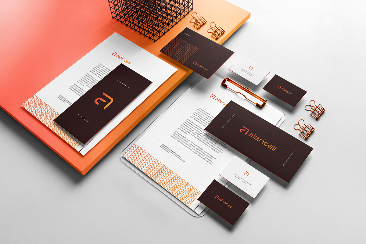
The typography with stylized letters and soft curves comes to transmit and talk even more about the idea of technology and innovation.
The colors orange and yellow come to transmit and provoke enthusiasm, joy, creativity and encouragement. Orange is the color that stimulates new ideas and is associated with innovation; Yellow is the color that represents the value, as it resembled gold and is also associated with energy. The brown comes to contrast with the orange and yellow that conveys confidence, maturity, quality and reliability.
The icon was made through the silhouette of a smartphone that is the predominant product of the company. Through this feature, I arrived at the initial of the name Alan, where later the idea of merging the letter c of cell had come up, thus creating something unique, objective, minimalist and genuine.