Wink Lashes. Packaging Design
Year: 2021
Client: Wink Lashes
Role: Illustration, Packing Design, Art Direction
Tools: Adobe Illustrator, Adobe Photoshop
Awards: Gold A'Design Award
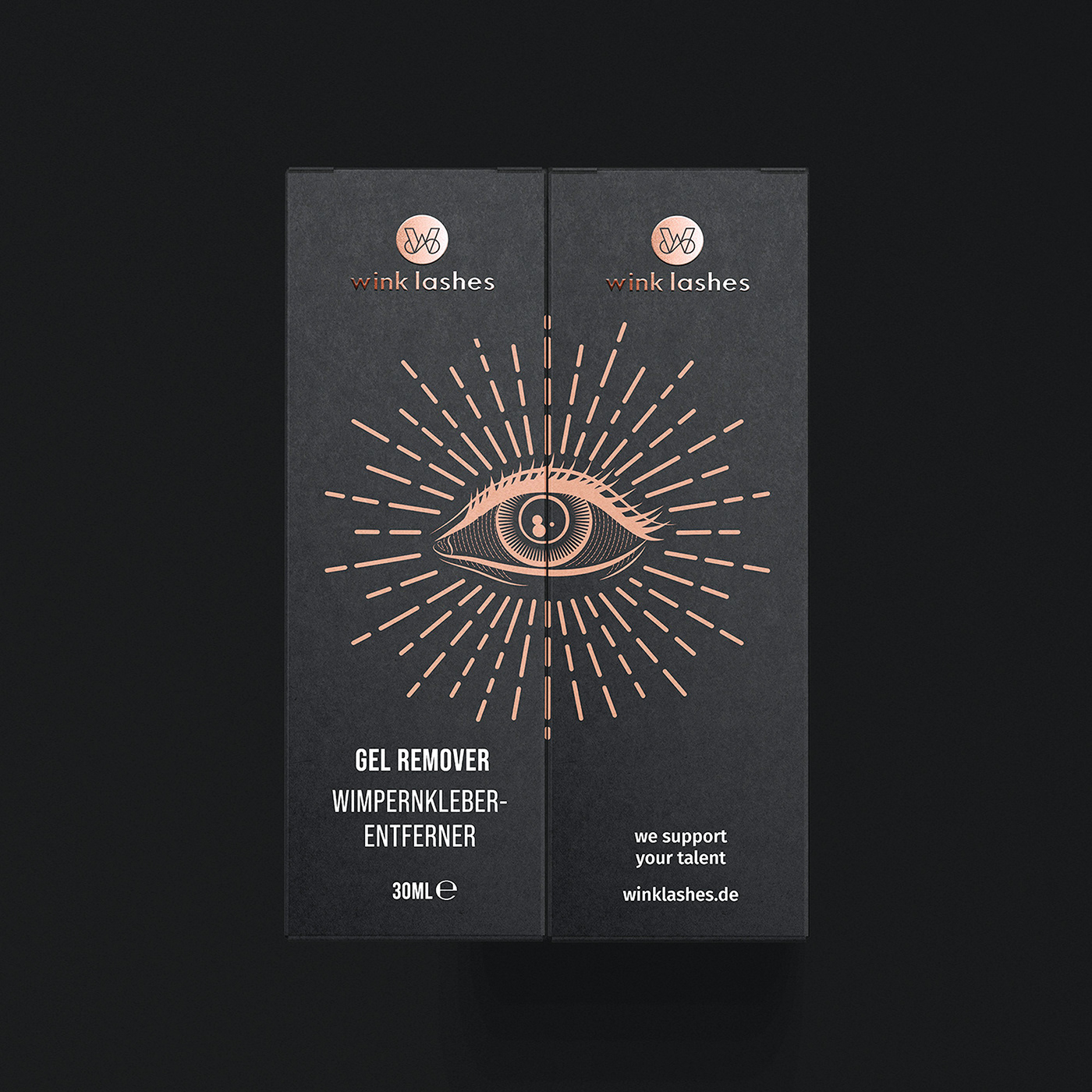
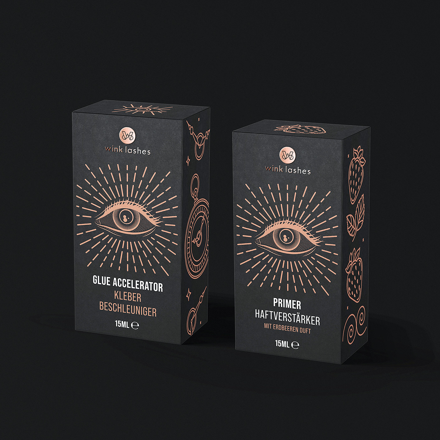
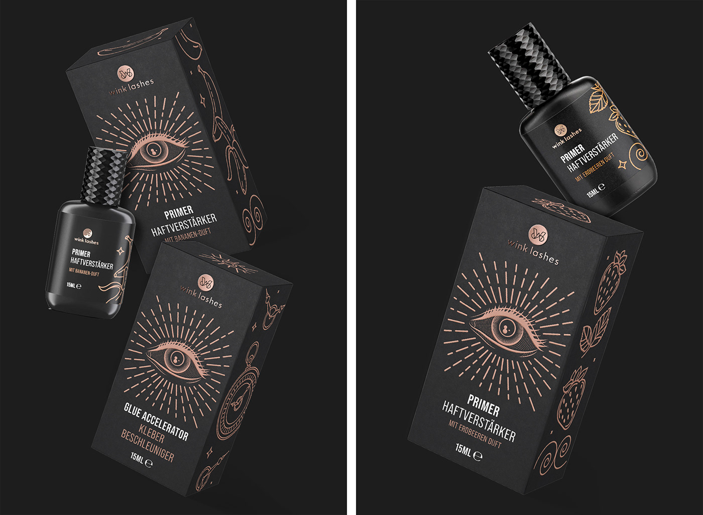
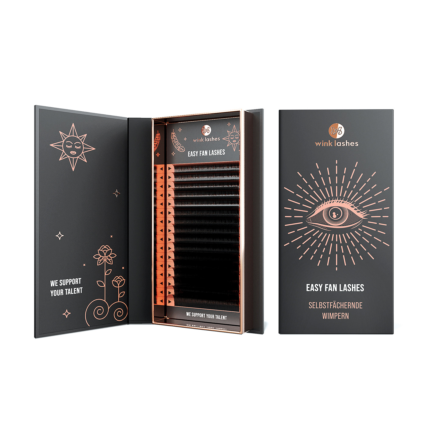
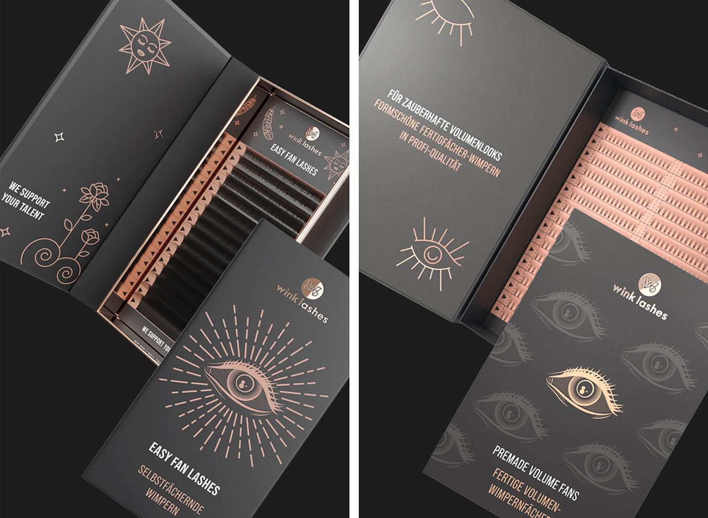
Wink Lashes is a German brand that specializes in high quality and professional artificial eyelash extension products.
The main idea behind the packaging design comes from the desire to "add some magic". Thus, an attractive design was chosen that is supported by symbols that tell about the purpose and benefits of the product. The main graphic symbol that creates a single recognizable style is the "Eye". The image of the stylized "Eye" immediately conveys the direction of the product - eyelash extension and at the same time adds a sense of mystery and magic. The rest of the symbols involved in packaging design are developed for a specific product and are convenient as a tool for differentiation.

Basic Design Colors: dark graphite, dark coral and white emphasize the graphic elements favorably, add elegance to the packaging design and emphasize the confidence in the brand.
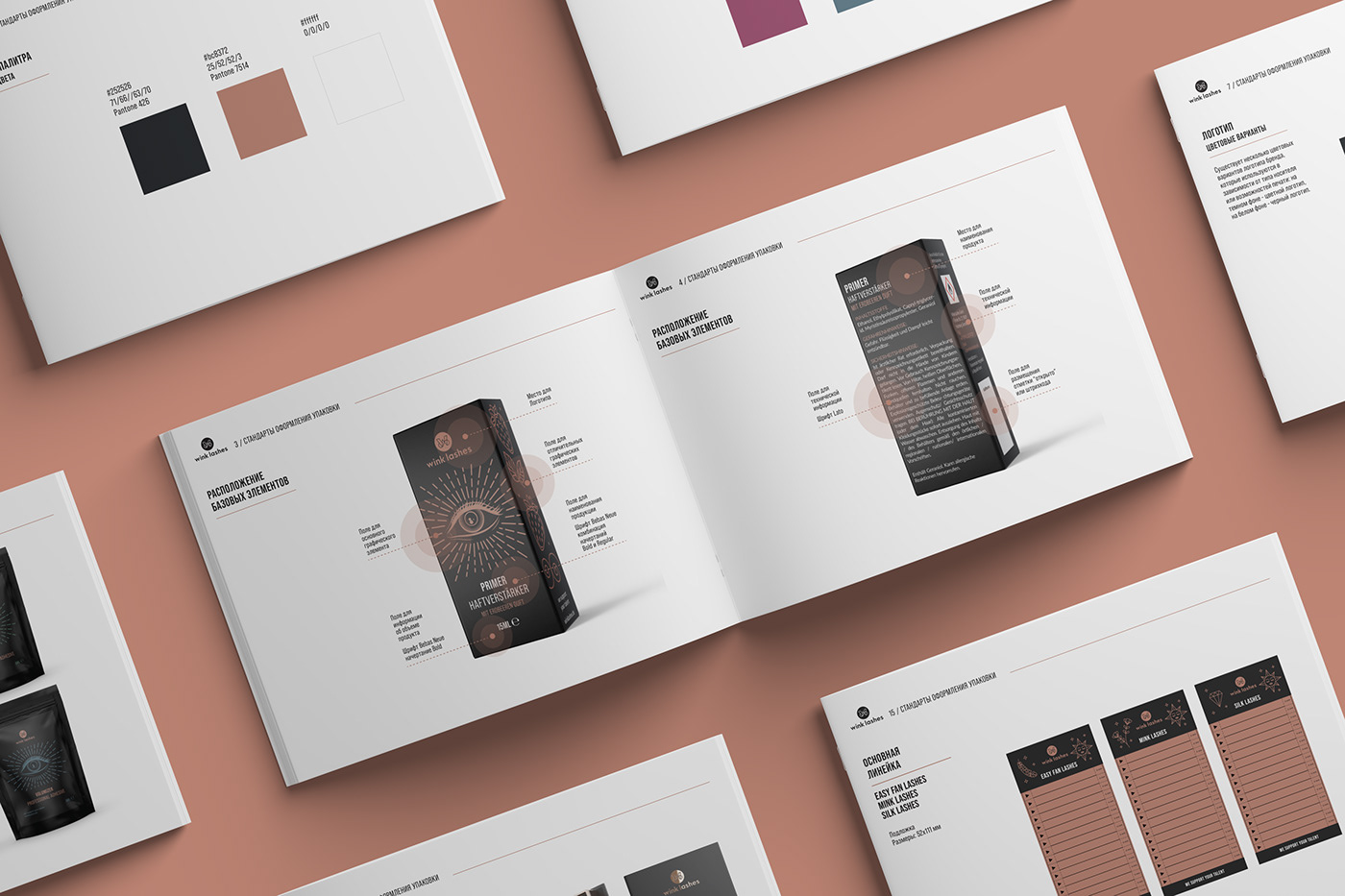
Graphic style elements are a kind of graphic markers that help to increase consumer awareness of a product, and also solve the problem of unifying visual solutions.
Some graphic elements can be used on various types of branded surfaces, as well as image, information and advertising media. This allows the entire visual strategy of the brand to be consolidated and ensure its ubiquitous presence.