Celebrating our 10th anniversary marks the evolution of success.
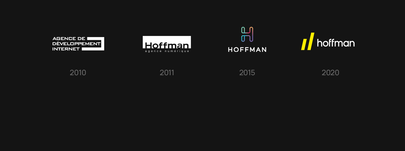
For our 10th anniversary, we’re redesigning our entire brand identity with new positioning and new art direction more in line with the evolution of Agence Hoffman.
We get up every morning and strive for excellence. Day after day, we go further to meet our clients’ marketing needs, whether it’s deploying a website, testing its performance, transforming its visual identity, integrating applications or reviewing its content architecture. Driven by the desire to innovate, we reflect, create, and develop. We measure our performance and start over. Step by step, we work with our clients until their objectives are achieved. From one achievement to the next, we build something powerful together.
//
Fêter ses 10 ans, c'est pas anodin dans la vie d'une agence.
Pour son 10ème anniversaire, l'Agence Hoffman décide de re-concevoir son identité de marque au complet. Nouveau positionnement et nouvelle direction artistique plus en phase avec l'évolution de l'agence.
Parce que chez Hoffman, on se lève le matin et on vise l’excellence. Jour après jour, on dépasse nos limites pour répondre aux besoins marketing de nos clients, qu’il s’agisse de déployer un site web, de tester sa performance, de transformer son identité visuelle, d’intégrer des applications ou d’en revoir l’architecture des contenus. Guidés par le désir d’innover, on réfléchit, on crée, on développe. On mesure nos performances et on recommence. Pas à pas, on accompagne nos clients jusqu'à transformer leurs objectifs en réalité. D’une réalisation à l’autre, on construit quelque chose de beau ensemble.
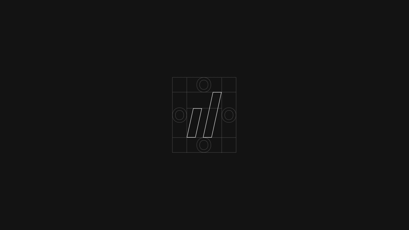
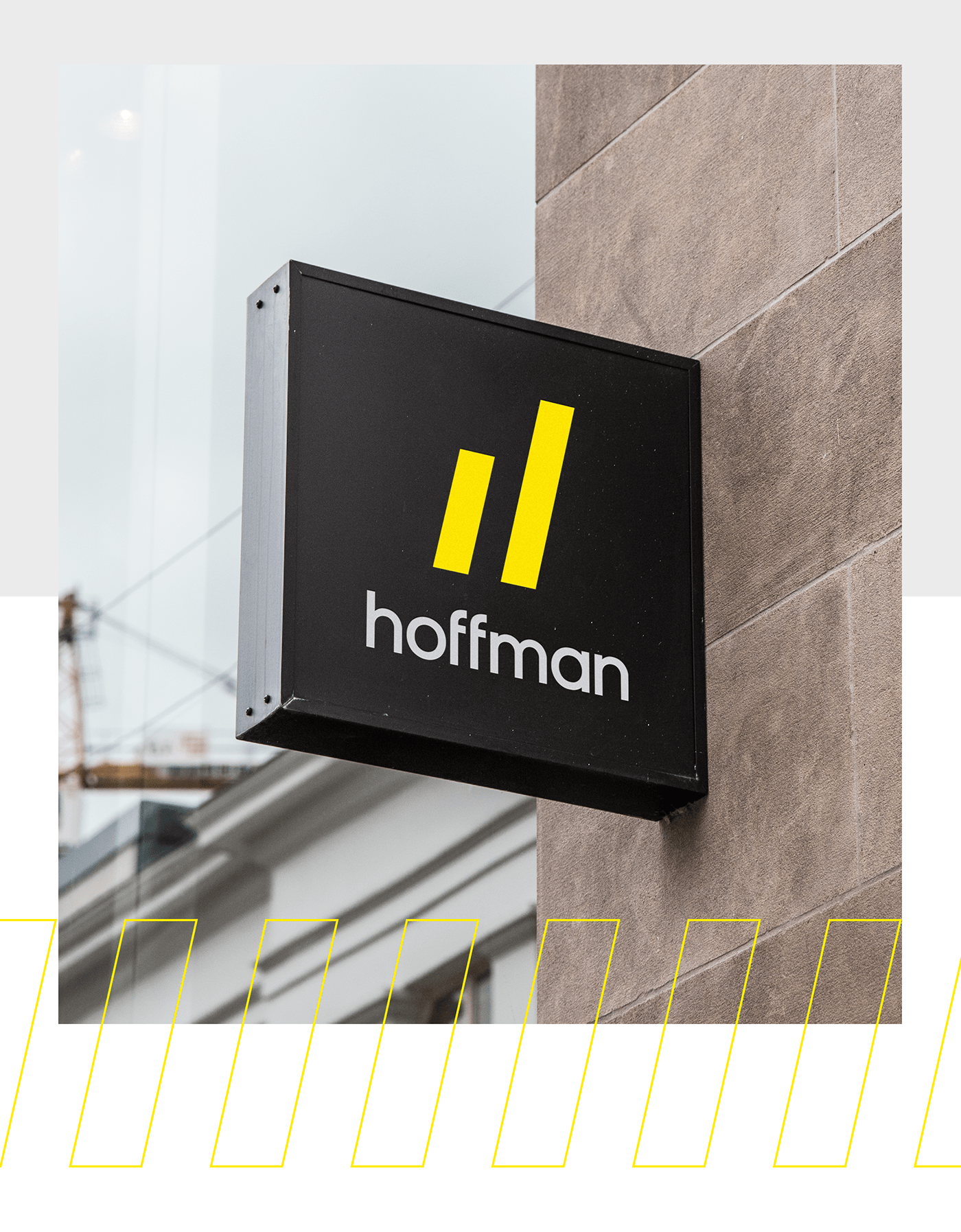
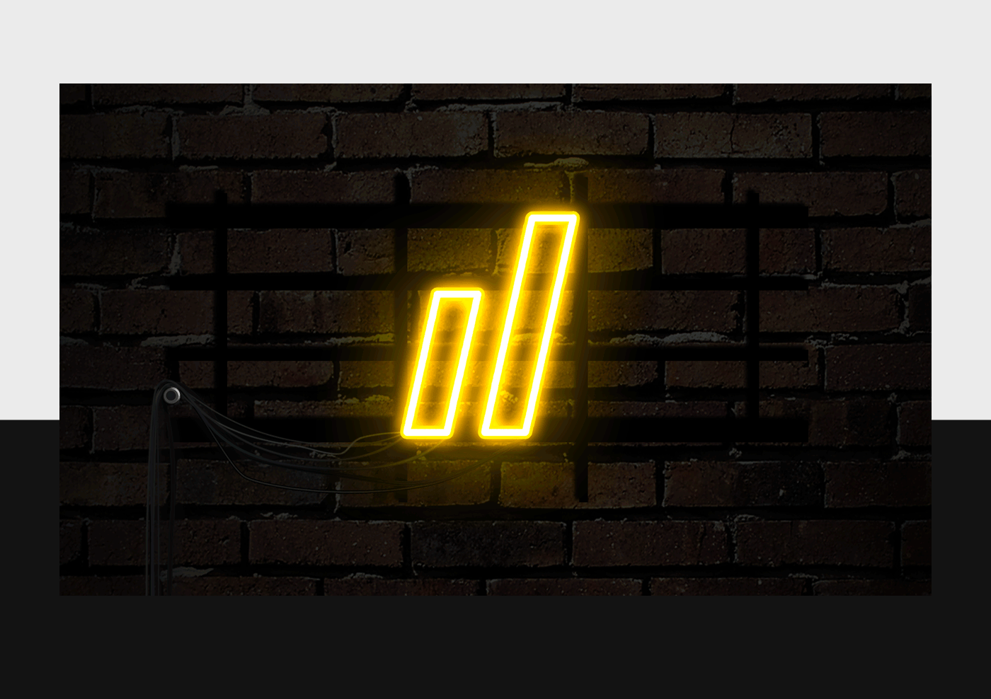
The logo’s double slash is inspired by the Hoffman H, remaining abstract and minimalist. It uses the graphic code of histograms, the ascent effect between the two lines reflects the notion of accelerated growth generated by Hoffman, whether on the client or the team side. Lastly, the logo’s slant boosts this sense of acceleration and innovation, and symbolizes that Hoffman is always moving forward.
The custom-designed sans serif typography is round, stable and attractive to balance the logo’s dynamism. It evokes the stability of the agency, which is celebrating its 10th anniversary, as much as the family spirit that reigns here.
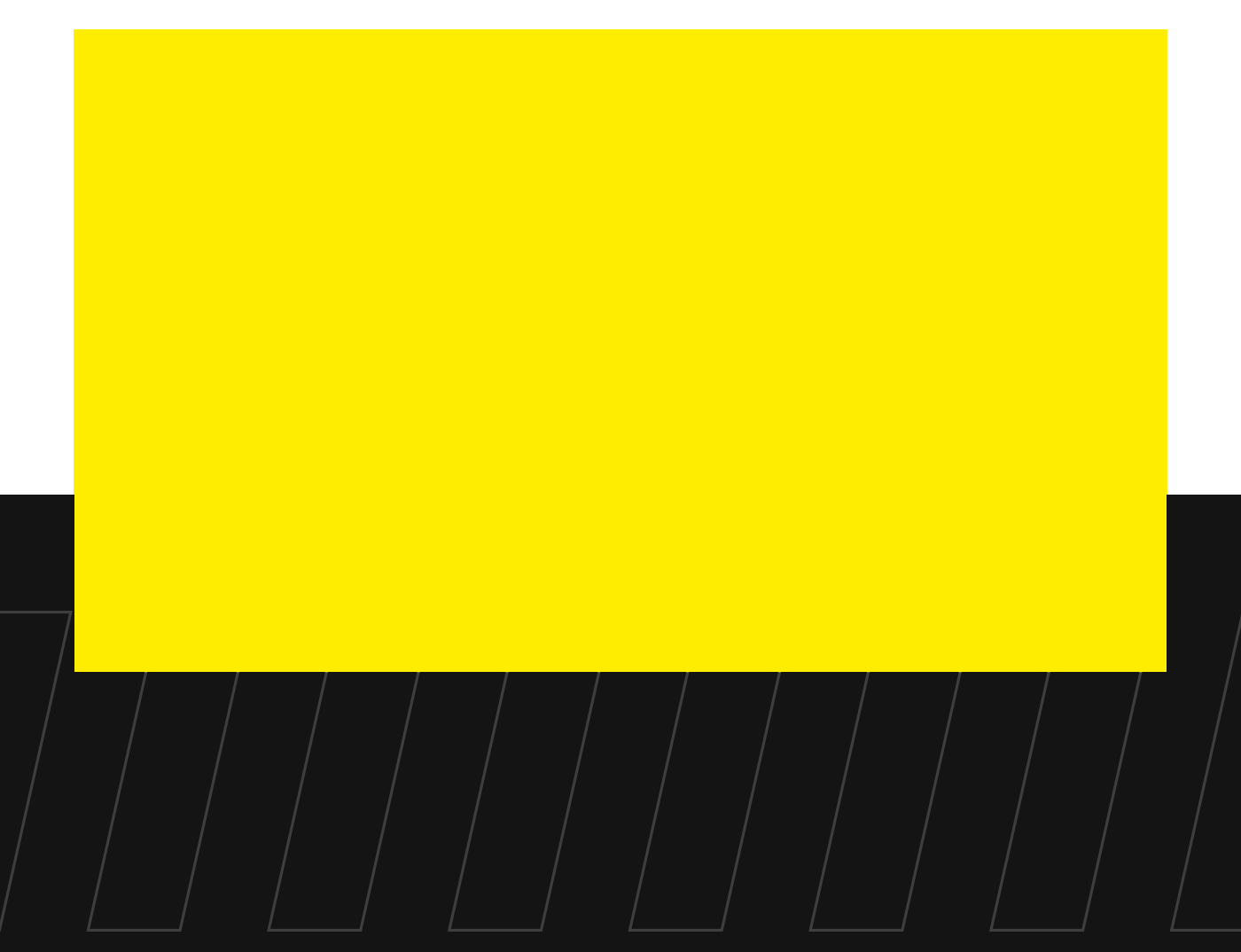
Chromatically, we are reinvigorating our identity by completely replacing the old palette. The choice of yellow as the main colour has been considered for a long time. It evokes freshness, dynamism and power. It stimulates mental processes, the nervous system and communication. Along with the black, an elegant and prestigious colour, it attracts attention and stands out with visual impact.
//
Le double slash du monogramme s’inspire au H de Hoffman tout en restant très minimaliste et abstrait. Il reprend le code graphique des histogrammes, l’effet d’ascension entre les deux fûts appuie la notion de croissance et l'accélération générée par Hoffman, que ce soit côté client ou côté équipe. Enfin, l’inclinaison du monogramme augmente ce sentiment d’accélération, d’innovation, et symbolise l’idée qu’Hoffman est tournée vers l’avant.
La typographie sans serif, créée sur mesure, est ronde, stable et avenante afin de balancer le dynamisme du monogramme. Elle évoque autant la stabilité de l’agence qui fête ses 10 ans, que l’esprit familial qui y règne.
D’un point de vue chromatique, nous ravivons l’identité en changeant complètement l’ancienne palette. Le choix du jaune comme couleur principale a été longuement réfléchit. Il évoque fraîcheur, dynamisme et puissance. Il stimule les processus mentaux, le système nerveux et la communication. Associé au noir, couleur d’élégance et de prestige, il attire l’attention et se démarque par son impact visuel.
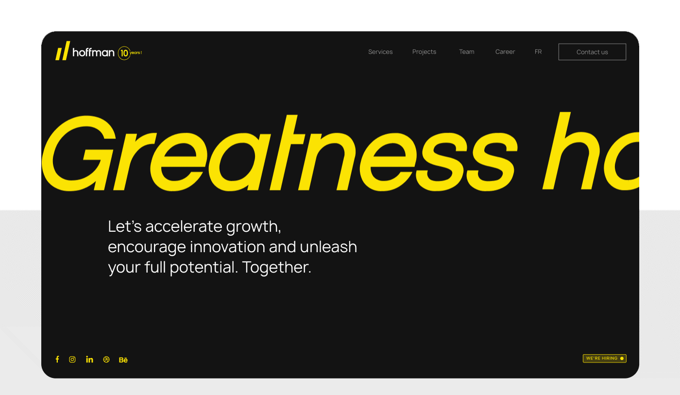
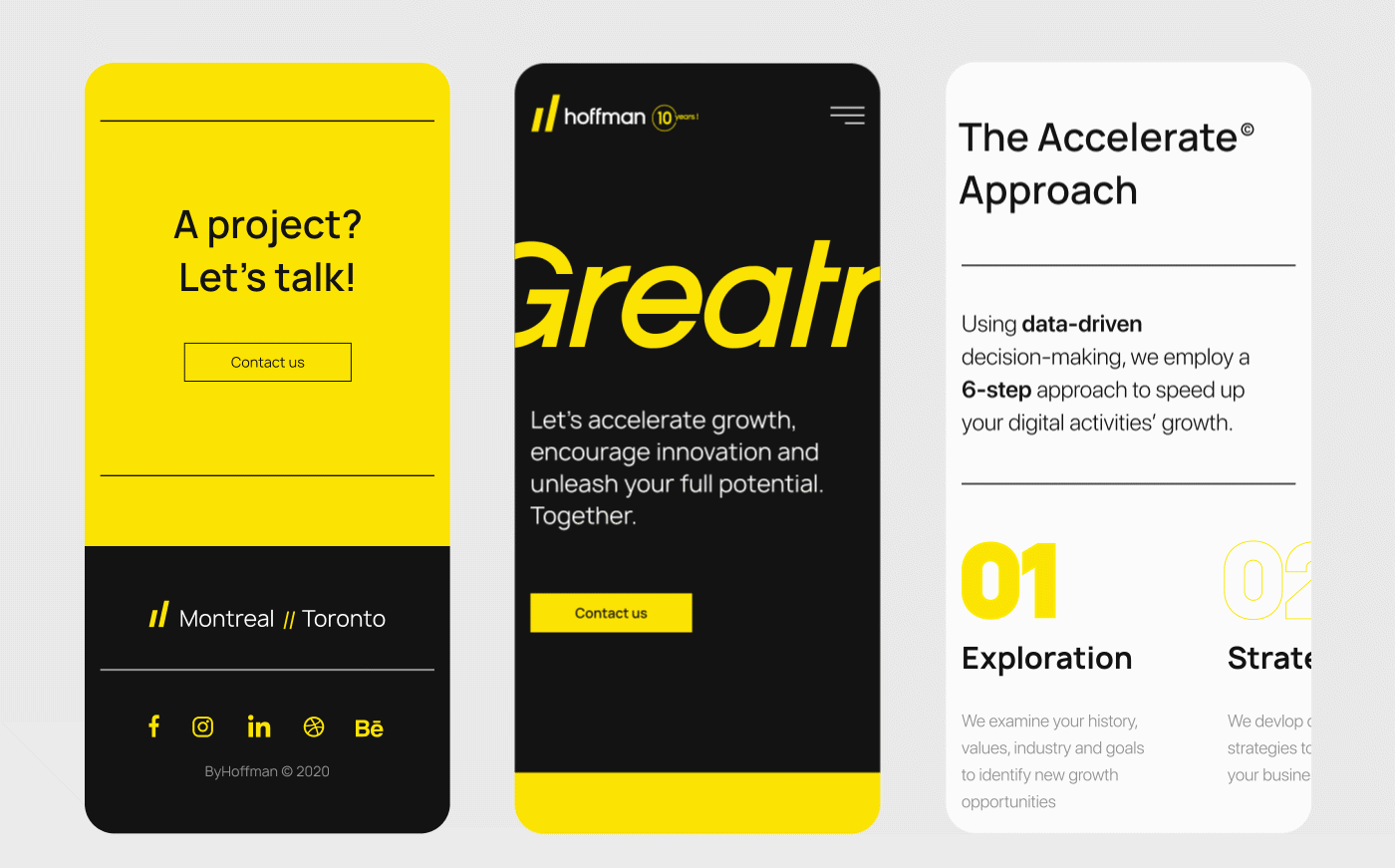
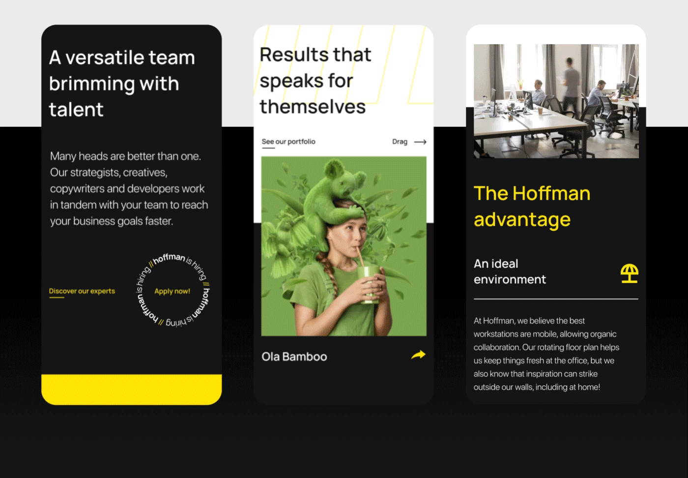
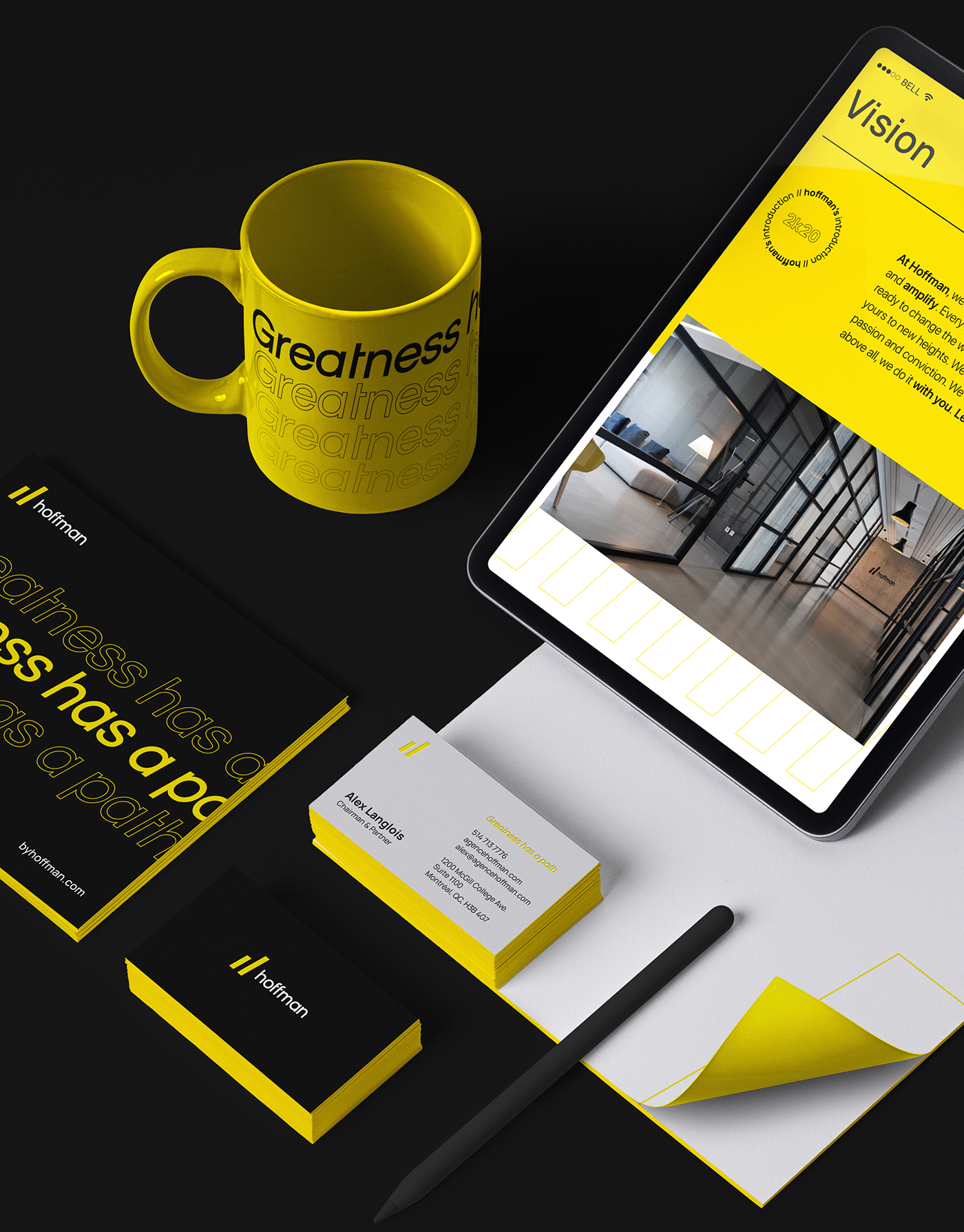
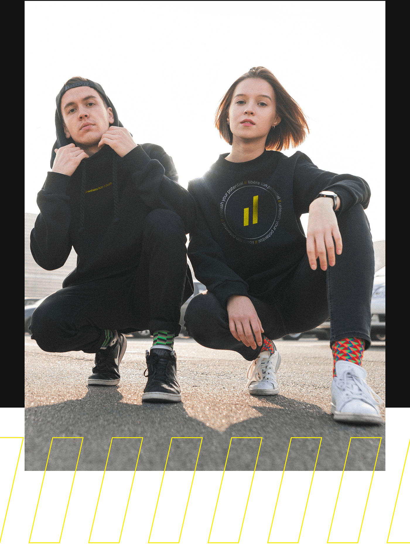
We have created a strong identity, designed to be simultaneously flexible, modern and organized. The logo is designed in different formats to be easily applied on all materials and in all media.
Lastly, our brand extends to both print and digital design, which helps us create effective 360-degree communications.
//
Nous avons créé une identité forte, conçue pour être flexible, moderne et organisée en même temps. Le logo se décline sous différents formats afin d'être facilement appliqué sur tous les supports et médias.
Enfin, notre brand s'étend à la fois à la conception imprimée et numérique, ce qui permet à l'agence d'être efficace dans sa communication à 360 degrés.