I T ' S S H O W T I M E
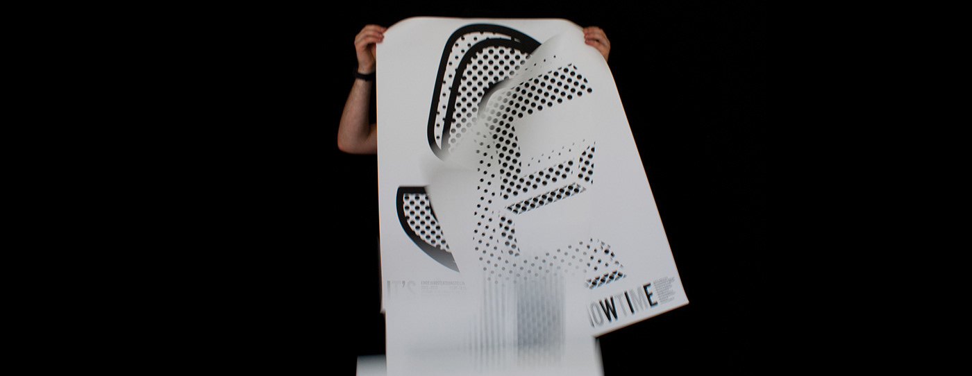
For the end-year exposition of my university we were tasked to create a typographic poster that had one letter per poster. Together with the other students, it would become a chain of posters, each unique in a string of clashing fonts, colours and styles. My approach and personal challenge was to create a poster that is monotone and sober, yet quirky. Not shouty, yet standing out from the other posters created by my fellow students.
I thus ended up combining a 3D-style as seen in the works of Escher, yet in a Lichtenstein-esque pop-art style.


THANKS FOR WATCHING!

