
ABOUT THE PROJECT:
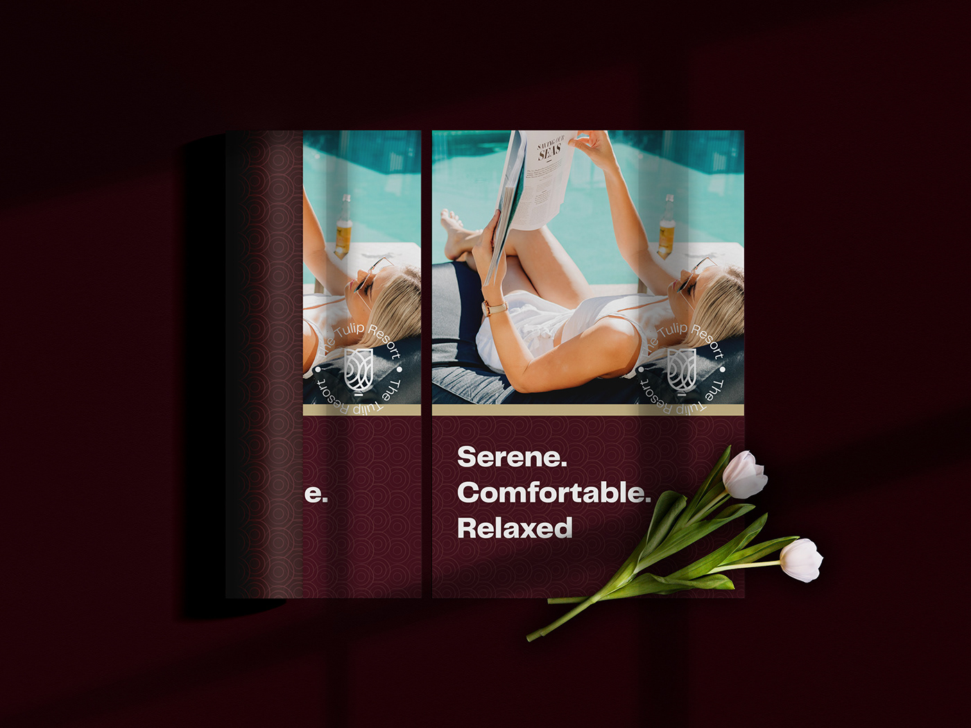
The Tulip resort is a project bourne out of a need to redefine the regular resort experience and create a more luxurious and comforting adventure for all those who want to escape the madness of the outside world and fall in love with the thrills of relaxation all over again.
WHY TULIP?
The Tulip is an all time classic, luxurious by nature, friendly and symbolic in many cultures.
The most known meaning of tulips is perfect and deep love. As tulips are a classic flower that has been loved by many for centuries they have been attached with the meaning of love. They’re ideal to give to someone who you have a deep, unconditional love for, whether it’s your partner, children, parents or siblings. (According to Bloom&Wild, Full Article Here).
THE LOGO:
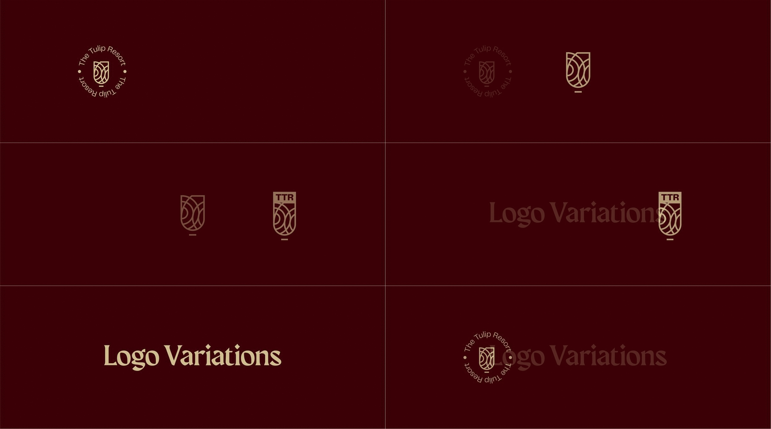
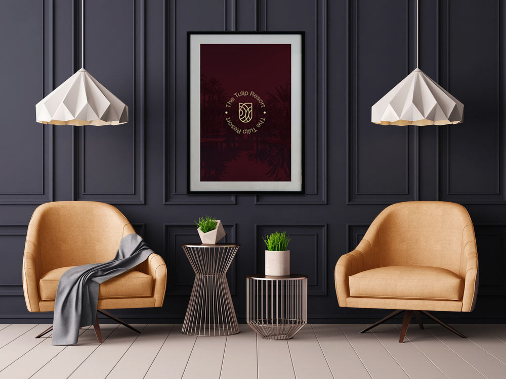
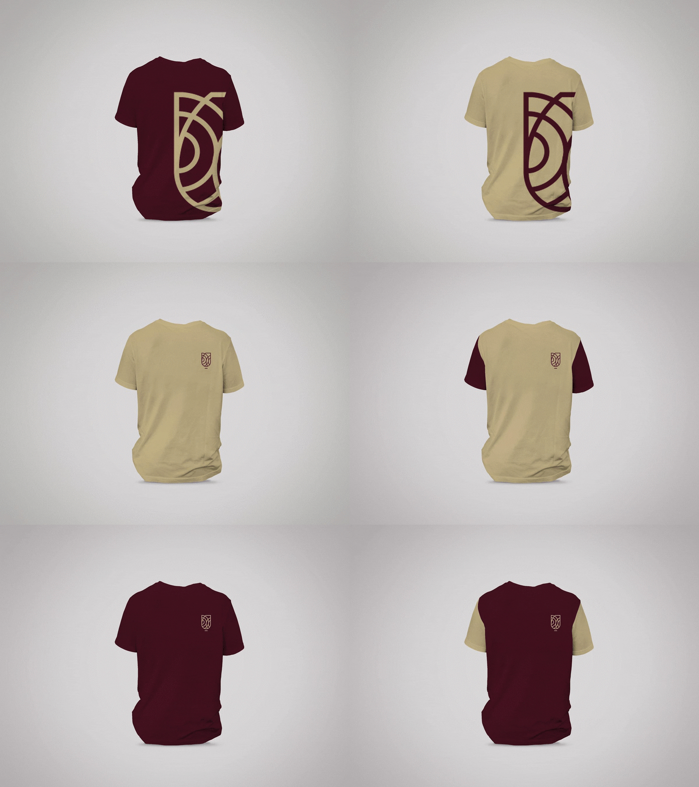
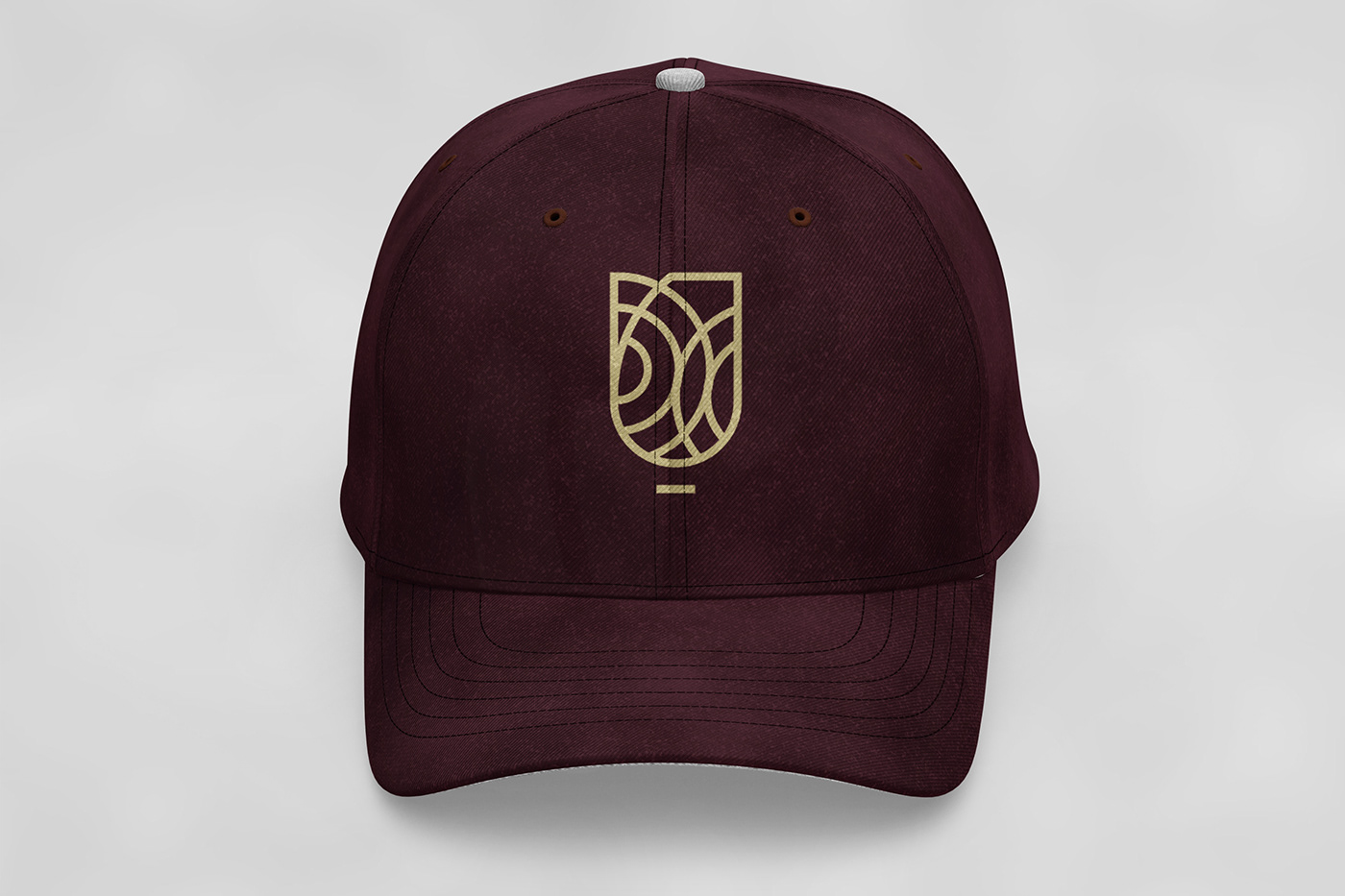
The logo was created by combining reoccurring circles in the fibanocci sequence otherwise known as the golden ratio to create a custom-made and well balanced representation of a Tulip.

















THANKS FOR VISITING!
CREDITS:
Special Thanks to: Obereke Tijesuni, Alexander Adetayo, Olutola Taiye, Bolarinwa Nifemi and Obayagbona Paul Kelly for your support and critique throughout the duration of this project.
DISCLAIMER:
I don't out-rightly own any of the mockups or images used throughout this project.
Images : www.unsplash.com & www.pexels.com
Mockups: www.unblast.com
Keep up with my Social Media
Want me to work on your next project? Lets Talk!


