


Ohalo | Visual Identity
EN
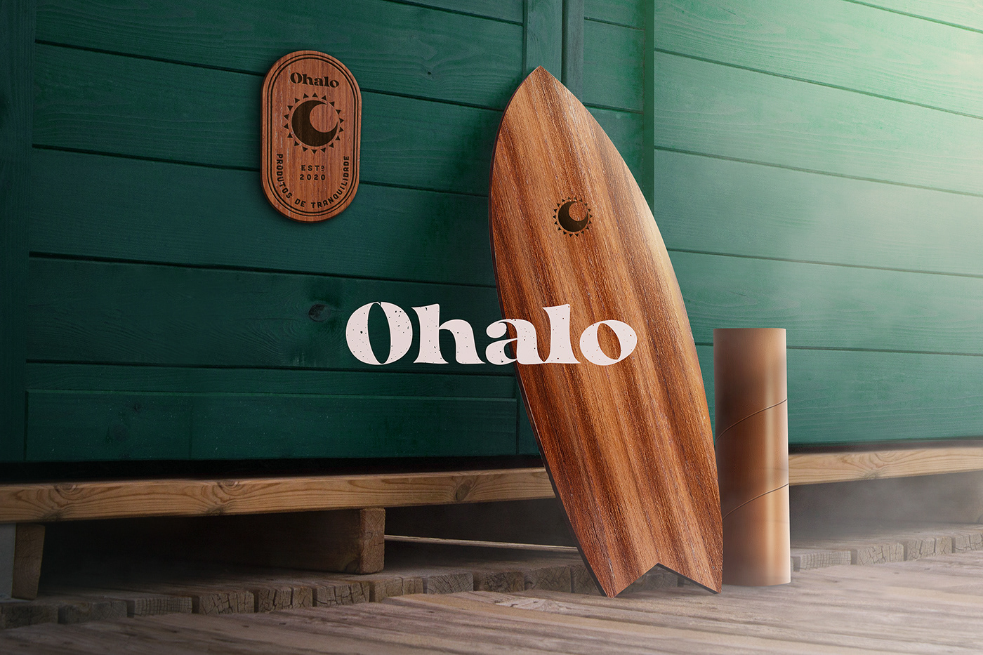
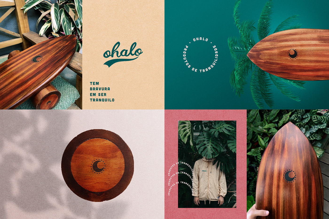
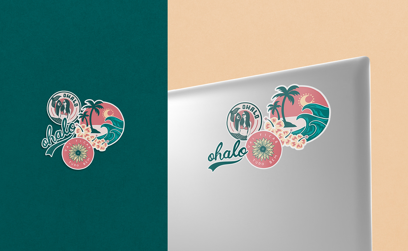
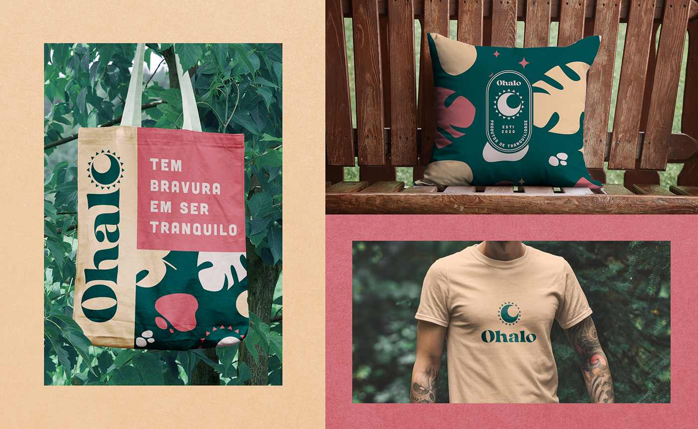
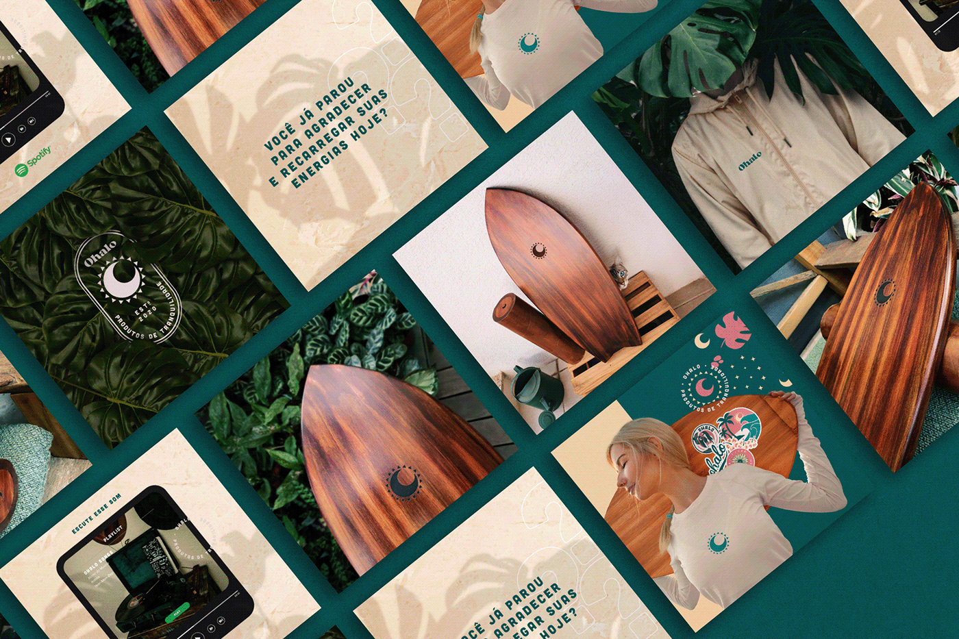
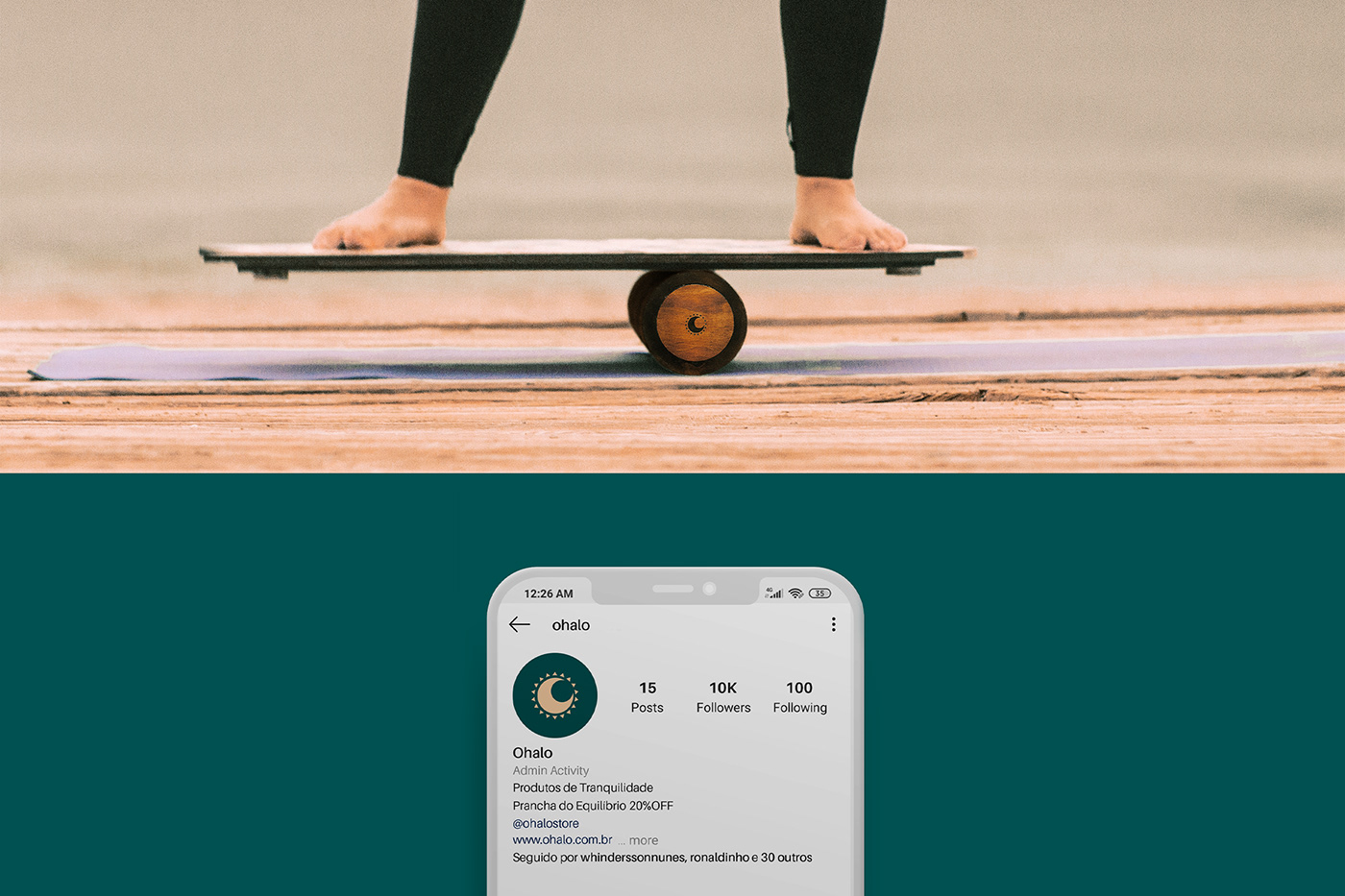
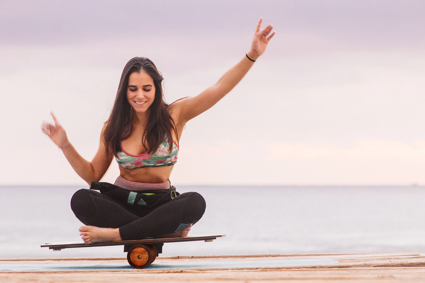
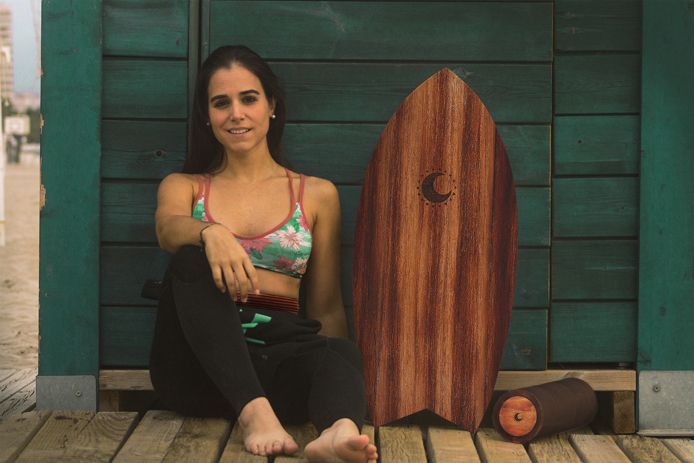
Ohalo is a brand of tranquility products, handmade and wood. Initially located in Porto Alegre. Its first and main product is the balance board. However, brand planning with launches that explore other categories, such as accessories for coffee and music.
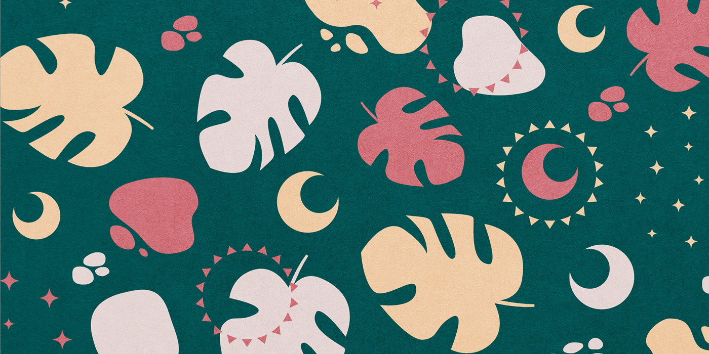
The main attributes of the brand are balance and rusticity. With uncomplicated and welcoming products, which preserve textures and natural aspects of the materials used to produce them.
PT-BR
Ohalo é uma marca de produtos de tranquilidade, feitos à mão e em madeira. Com atuação inicial local, em Porto Alegre. Seu primeiro e principal produto é a prancha de equilíbrio. Contudo, o planejamento da marca conta com lançamentos que irão explorar outras categorias, como assessórios para café e música.
Os principais atributos da marca são o equilíbrio e a rusticidade. Com produtos descomplicados e acolhedores, que preservam texturas e aspectos naturais dos materiais utilizados para produzi-los.
Naming
The name is composed by the junction of the letter "O" which bears a circular shape and evokes several etymological meanings: that of the Phoenician history, which was represented by an eye; chemistry, which represents oxygen; and Portuguese, which functions as an article or pronoun. Then added to the word "Halo", a natural circular phenomenon that forms a ring of light around the sun or moon.
PT-BR
O nome é composto pela junção da letra "O" que carrega uma forma circular e evoca diversos significados etimológicos: o da história fenícia, que era representado por um olho; da química, que representa o oxigênio; e do português, que funciona como artigo ou pronome. Juntada então à palavra "Halo", um fenômeno natural circular que forma um anel de luz ao redor do sol ou lua.
Brand Voice
Ohalo's proposal is to bring lightness and tranquility to people's day, enabling experiences that permeate both physical and mental health.
The brand's speech brings with it a conscious and honest gratitude, without hyperbole. Ohalo believes that the balance of body and mind is the way for positive changes to happen.
PT-BR
A proposta da Ohalo é trazer leveza e tranquilidade para o dia das pessoas, possibilitando experiências que permeiam tanto a saúde física quanto a mental.
O discurso da marca traz consigo uma gratidão consciente e honesta, sem hipérboles. A Ohalo acredita que o equilíbrio de corpo e mente são o caminho para que mudanças positivas possam acontecer.
Curiosities
Halo is a ring of light that surrounds a celestial body, sun or moon, a natural phenomenon that appears when light is reflected and refracted by millions of ice crystals, at an angle of 22º in the atmosphere, and can be divided into colors by account of the dispersion, colors very close to the rainbow.
PT-BR
Halo é um anel de luz que rodeia um corpo celeste, sol ou lua, um fenômeno natural que aparece quando a luz é refletida e refratada por milhões de cristais de gelo, num ângulo de 22º na atmosfera, e pode dividir-se em cores por conta da dispersão, cores muito próximas ao do arco íris.
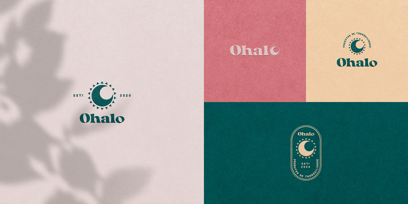
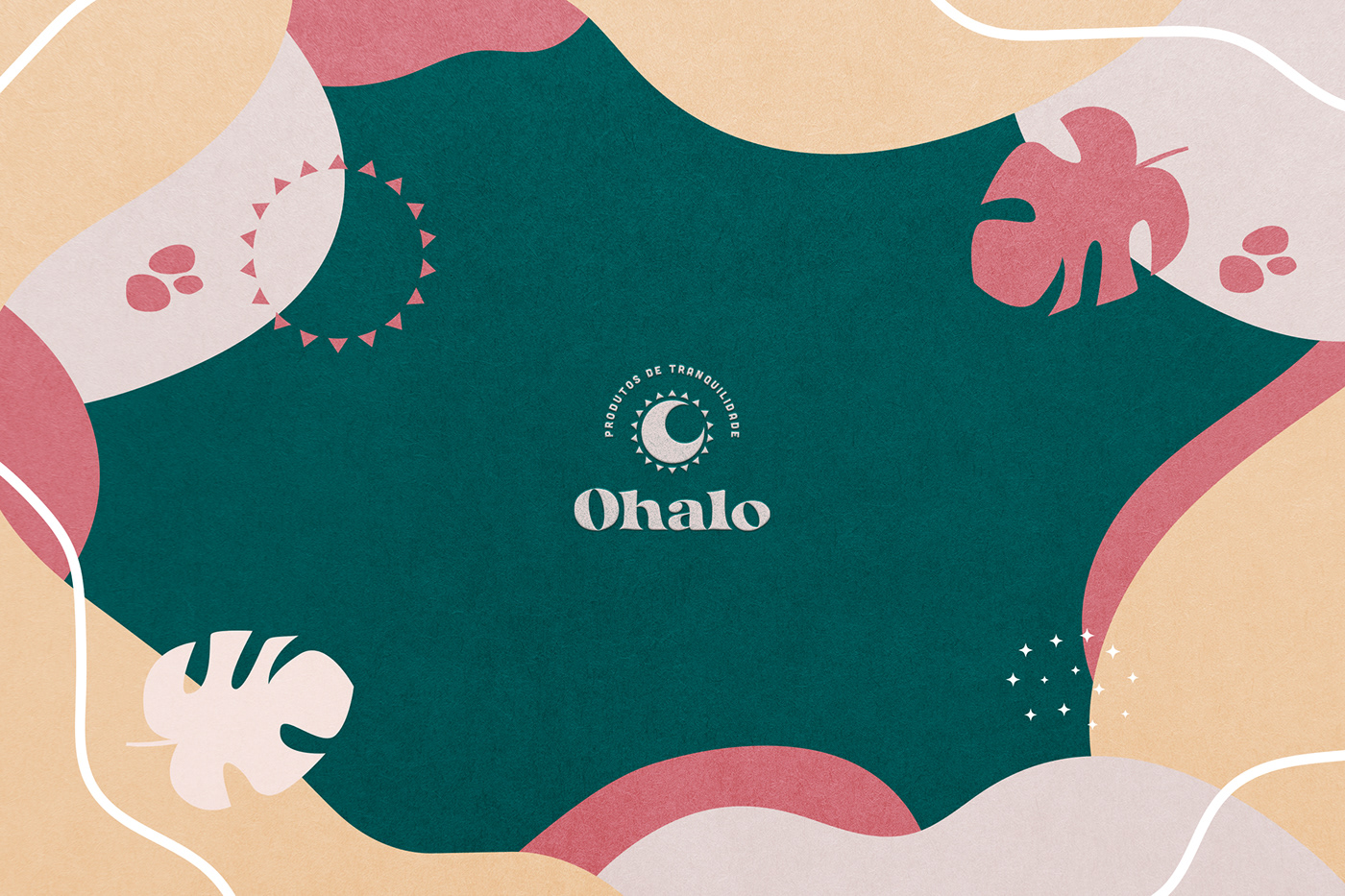
Symbol
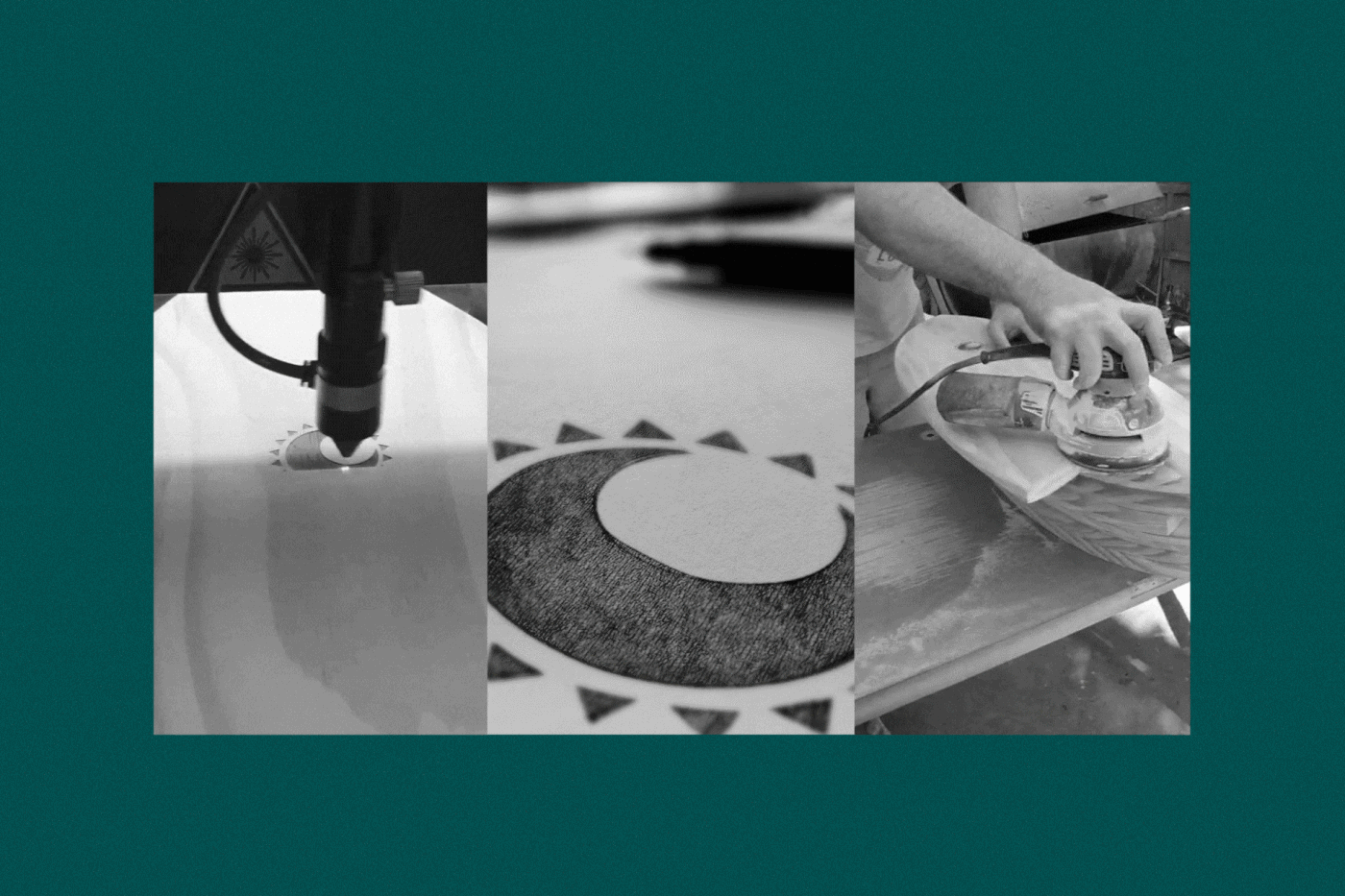
The symbol was created from the junction of the sun and the moon to represent the balance making contrasts: light and dark; cold and hot; ying and yang; perfect contrasts. The circles were made with a golden ratio and the angle between them is 22º according to the angle of the crystals for the appearance of the phenomenon. As it is a handmade product and there is also a variation of colors from the angle of the crystals, some optical adjustments were also made in the composition of the symbol to bring the concept "made by hand".
PT-BR
O símbolo foi criado a partir da junção do sol e da lua para representar o equilíbrio fazendo contraposições: claro e escuro; frio e quente; ying e yang; contrastes perfeitos. Os círculos foram feitos com proporção áurea e o ângulo entre eles é de 22º conforme o ângulo dos cristais para o aparecimento do fenômeno. Como é um produto feito à mão e existe também uma variação de cores a partir do ângulo dos cristais, foram feitos alguns ajustes óticos na composição do símbolo para trazer o conceito "hand-made".
Branding/Naming: William Lucatelli
Designer/Art Direction: Jonathan Santos


© ALL RIGHTS RESERVED | AVINCER STUDIO & ROMES BRANDING


