exeQfit - Fitness for Executives
I met the president of the Georgia Haitian-American Chamber of Commerce Saurel Quettan when I qualified to be a BEL Initiative Fellow in July 2019. That fellowship, a program of the chamber, remains a highlight in my entrepreneurial career and getting the opportunity to rebrand the BEL Initiative program in late 2019 was an honor.
After Saurel had witnessed my process first hand, he reached out to me to work on a personal brand identity project for what was, at the time, his unnamed consulting firm.
One of the first aphorisms I learned in medical school is that "good history taking will lead you to a good diagnostic 80% of the time. Well in marketing what I discovered is: "Great brand strategy leads to great brand execution". That is why I always start my process with defining and establishing it. Once the strategy phase is done thoroughly and properly, I find that the concept and construction of the logo itself, color choice and tone all comes naturally.
After weeks of regular hours on the phone learning about his process and using strategic tools to define the brand positioning (who the brand talks to and how; what place it holds on the market in the consumer's mind etc), we settled on the name exeQfit. After we made sure that name passed all the business naming tests (legally ownable, domain availability etc), I could finally use my trusty pencil and pad to work on the logo.
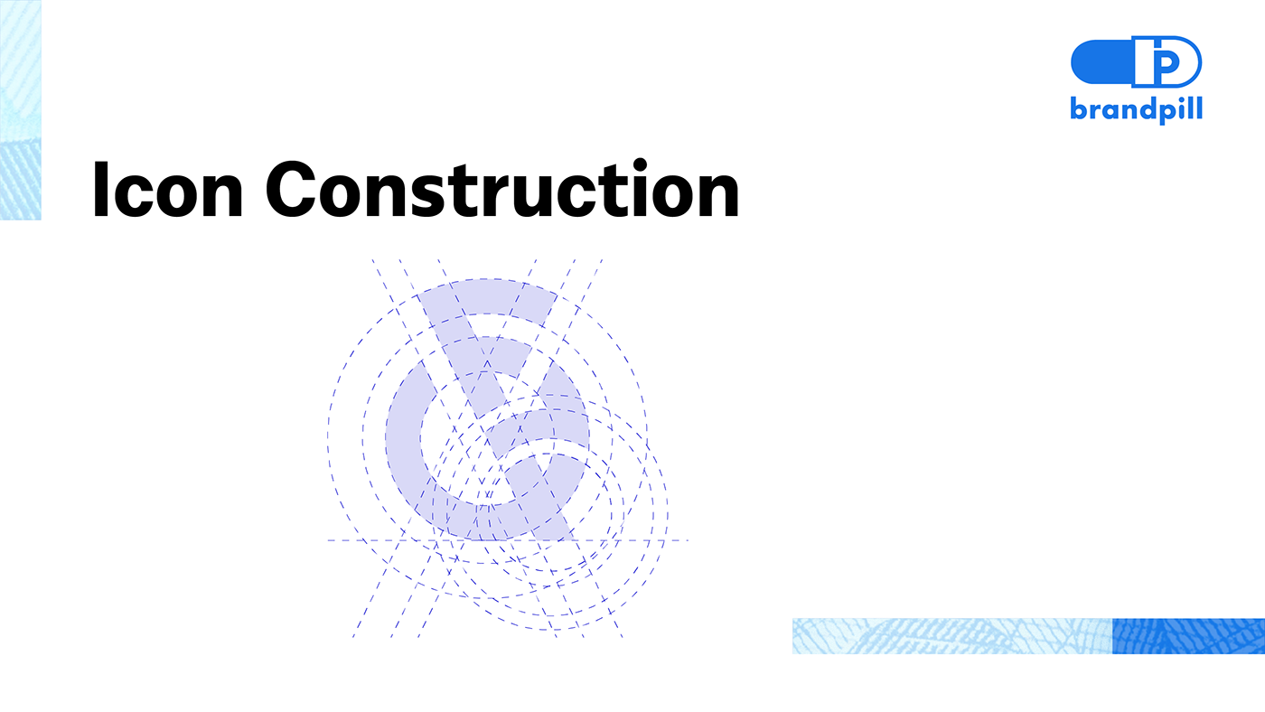
The kettle bell was chosen as the brand symbol. Being a training tool that focuses on compound movements it captures perfectly the challenges but also the compound gains and fitness that is the value proposition of exeQfit.
The icon construction was done by hand, scanned and reconstructed using a grid system in Adobe Illustrator. The bell and base of the kettle bell gave themselves flawlessly to create the Q while the handle formed the F. The construction also subtly features an uppercase E, a lowercase e and an x as a mnemonic. The wordmark uses slight variations of a sans serif typeface to create harmony with the main icon.
The logo passes the tests for effectiveness with flying colors. Its uniqueness and clean geometric construction commands immediate attention and response. It also checks the boxes for meaning and memorability with sound and appropriate surface and deep propositions. It's adaptable in size to the various digital real estates and also lends itself to the physical applications of merchandise and promotional products. Similar to its kettle bell inspiration, the exeQfit logo weighs heavy. And because it of its versatility, it has what it takes to go beyond looking good on screens and do some heavy lifting in the real world.