

[PT]
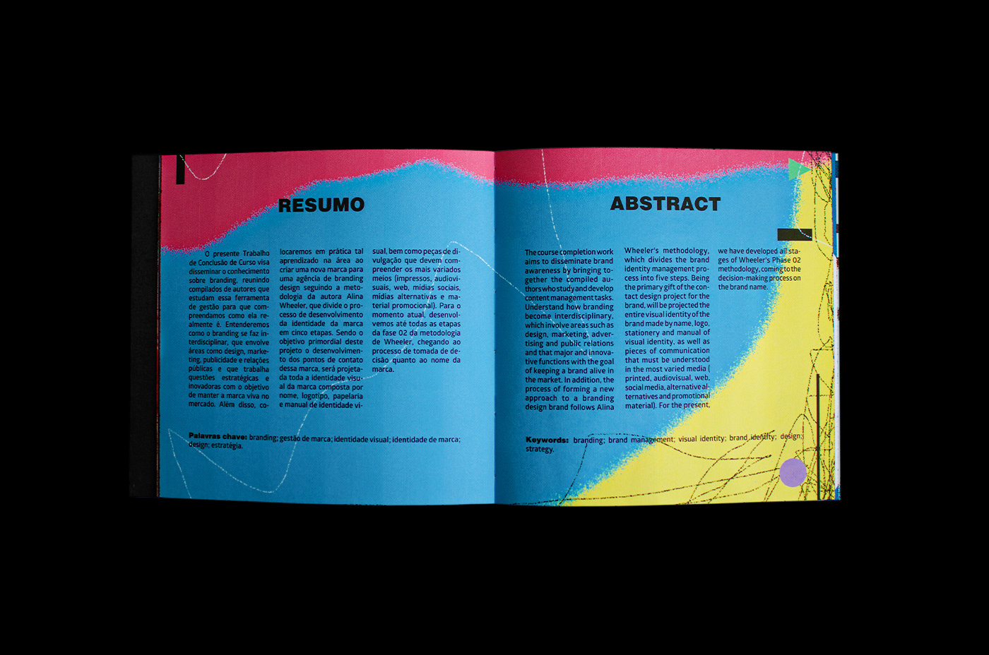
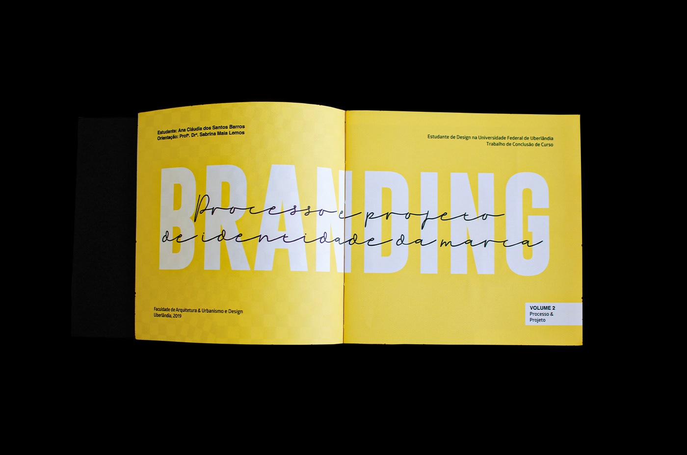
Trabalho de conclusão de curso apresentado ao curso de design da Universidade Federal de Uberlândia finalizado em 2019, que visa disseminar o conhecimento sobre branding, reunindo compilados de autores que estudam essa ferramenta de gestão para que compreendamos como ela realmente é. Entendemos como o branding se faz interdisciplinar, envolvendo áreas como design, marketing, publicidade e relações públicas e que trabalha questões estratégicas e inovadoras a fim de manter a marca viva no mercado. Além disso, colocamos em prática o aprendizado teórico ao criar uma nova marca para uma agência de branding design seguindo a metodologia de Alina Wheeler, que divide o processo de desenvolvimento da identidade da marca em cinco etapas. O objetivo primordial deste TCC está em projetar toda a identidade da marca. Discutimos cada passo do processo e, por isso, quem ler este livro vai se sentir parte do projeto e compreenderá a complexidade de criar uma marca desde sua essência até sua divulgação.
[EN]
Course conclusion paper presented to the design course at the Federal University of Uberlândia, completed in 2019, which aims to disseminate knowledge about branding, gathering compiled from authors who study this management tool so that we understand what it really is. We understand how branding becomes interdisciplinary, involving areas such as design, marketing, advertising and public relations and that works on strategic and innovative issues in order to keep the brand alive in the market. In addition, we put theoretical learning into practice when creating a new brand for a branding design agency following the methodology of Alina Wheeler, who divides the process of developing the brand identity into five stages. The primary objective of this TCC is to project the entire brand identity. We discuss each step of the process and, therefore, whoever reads this book will feel part of the project and will understand the complexity of creating a brand from its essence to its dissemination.


[PT]
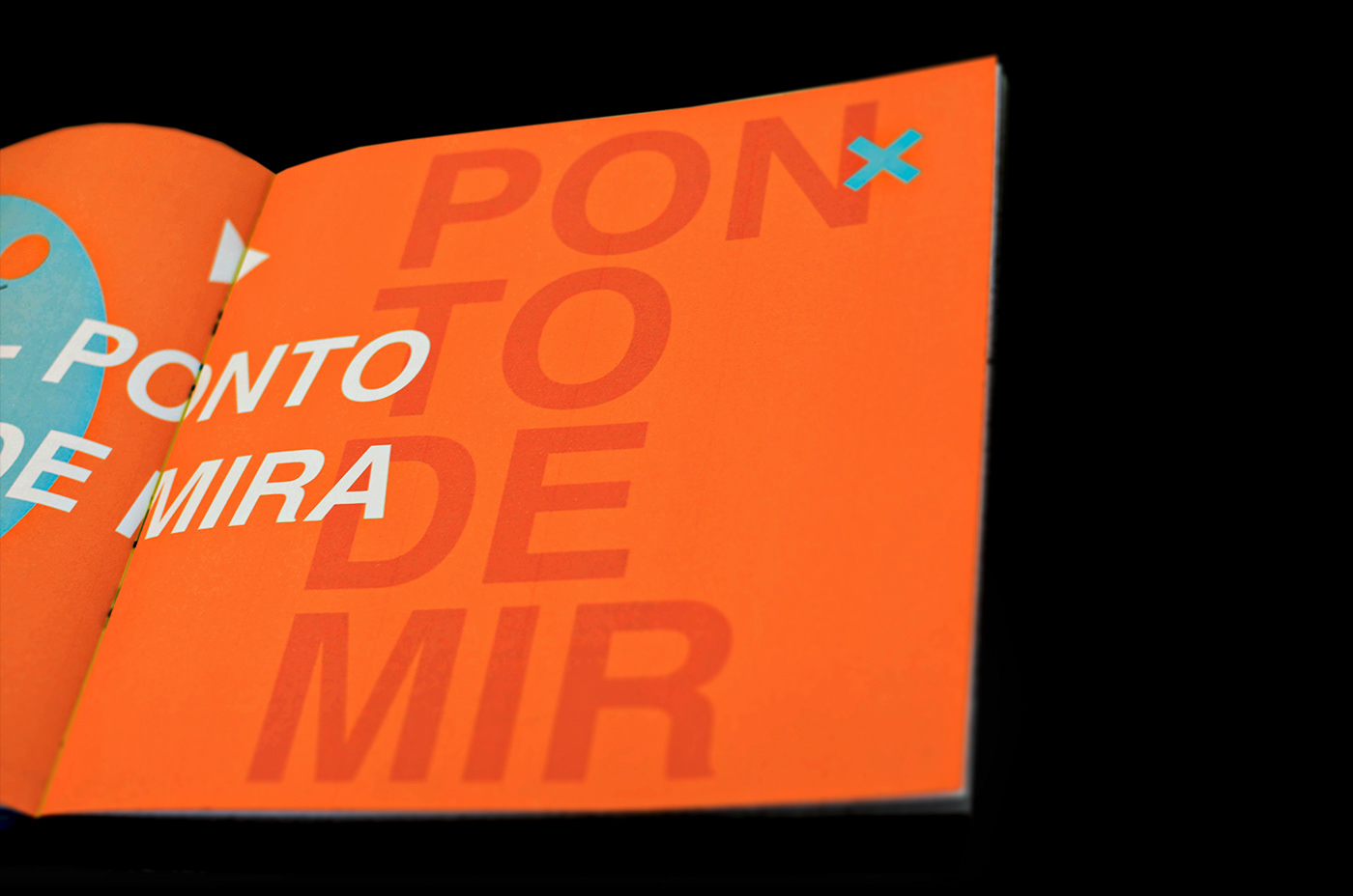
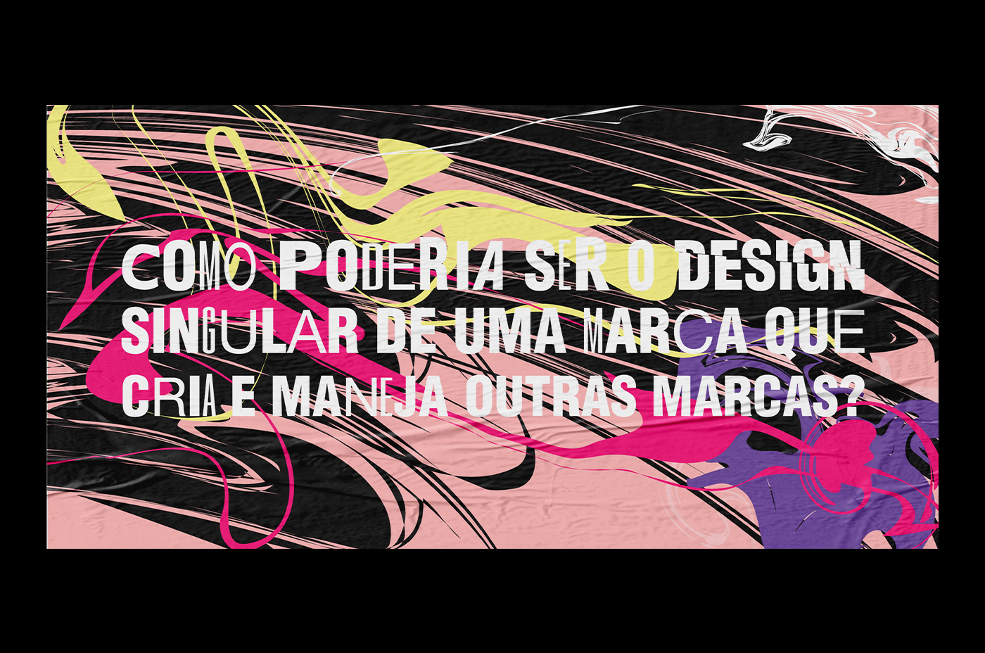
Como poderia ser o design singular de
uma marca que cria e maneja outras marcas?
[EN]
How could it be the unique design of a
brand that creates and manages other brands?


[PT]
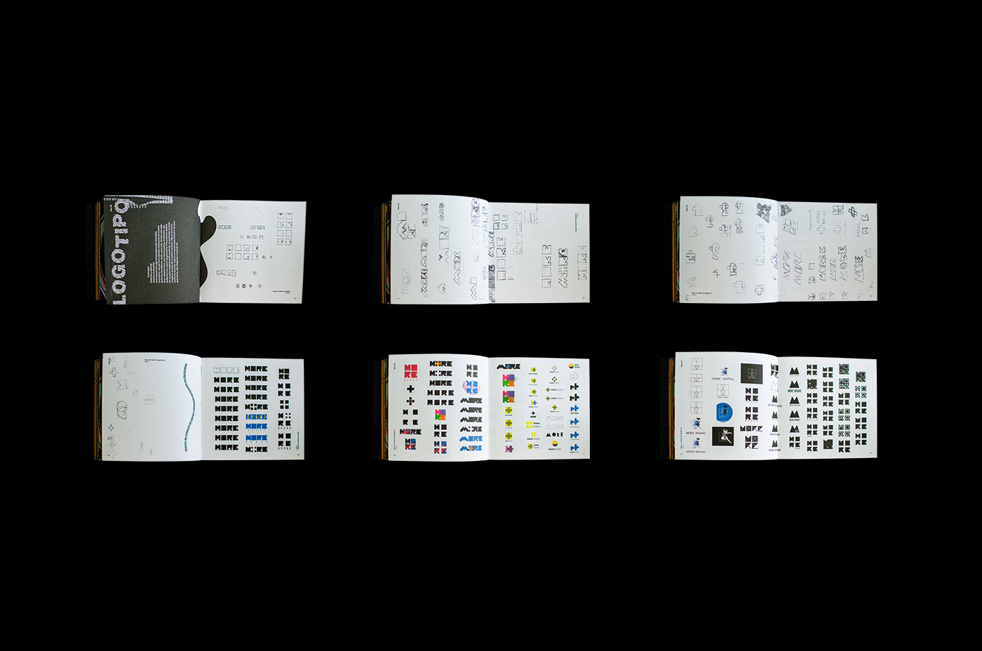
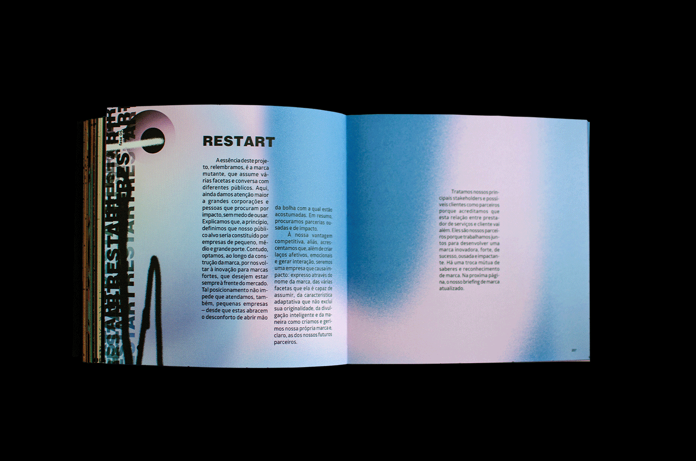
Ao desenvolver o processo de naming esbarrei em algumas dificuldades que me impediram de concluir o projeto a tempo na primeira etapa do TCC. Então, apresentei à banca três propostas - julguei que nenhuma delas seria viável para a agência em questão - e apontei os motivos, a meu ver, de não serem bons nomes. A edição aqui apresentada foi a versão final do projeto. Mantive o que poderia ser chamado de erro (nas páginas acima). Nas seguintes, eis o meu restart. Dei alguns passos atrás para encontrar o problema, voltei ao início do processo de naming e o refiz.
[EN]
In developing the naming process I ran into some difficulties that prevented me from completing the project on time in the first stage of the TCC. So, I submitted three proposals to the board - I thought none of them would be viable for the agency in question - and I pointed out the reasons, in my view, for not being good names. The edition presented here was the final version of the project. I kept what could be called an error (on the pages above). In the following, here's my restart. I took a few steps back to find the problem, went back to the beginning of the naming process and redid it.


[PT]
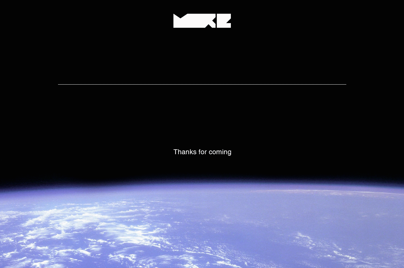
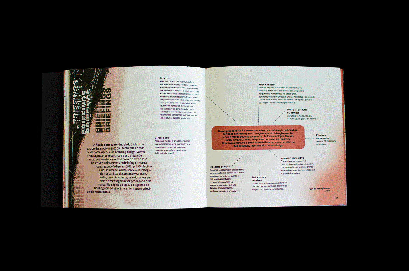
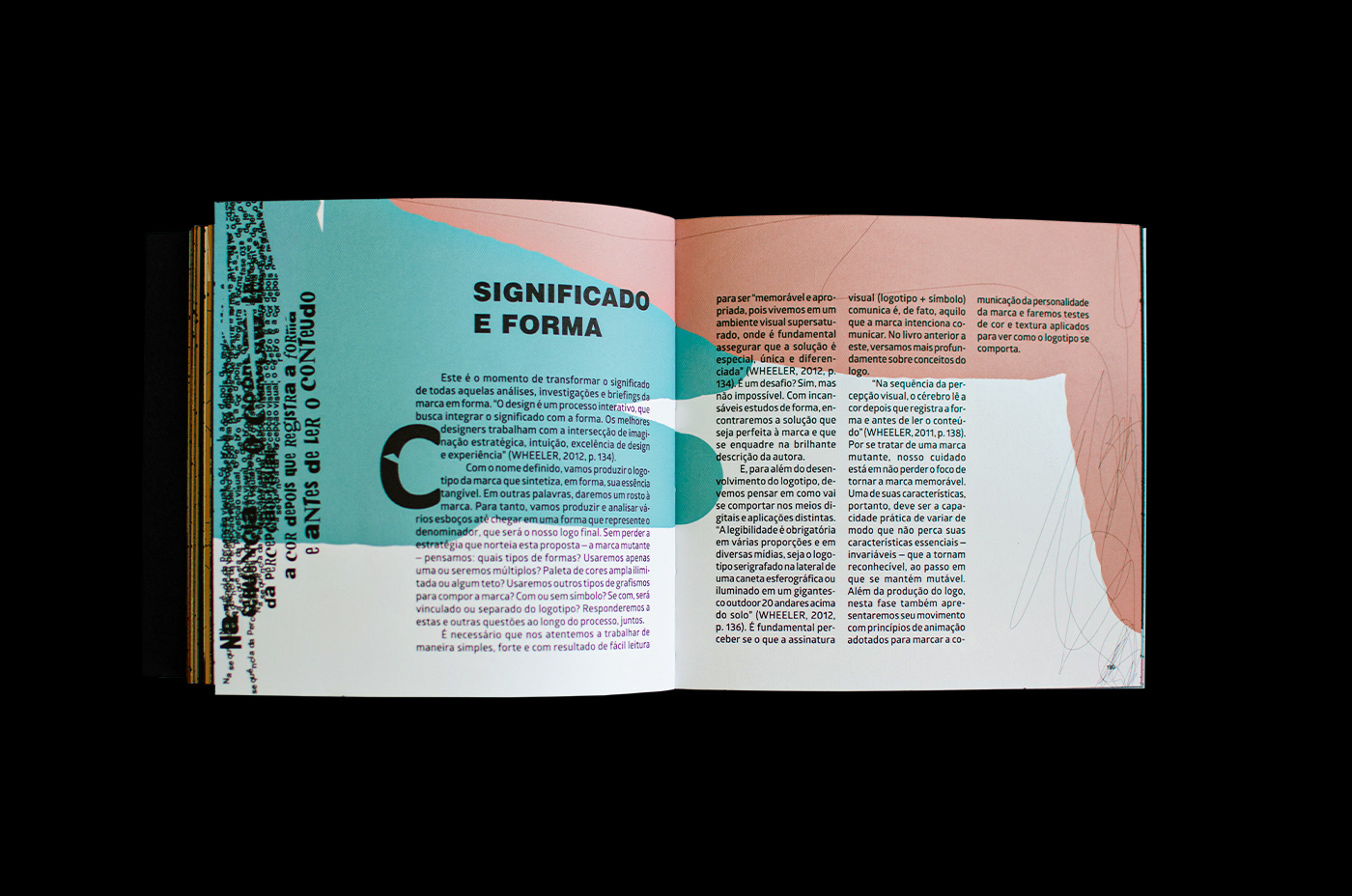
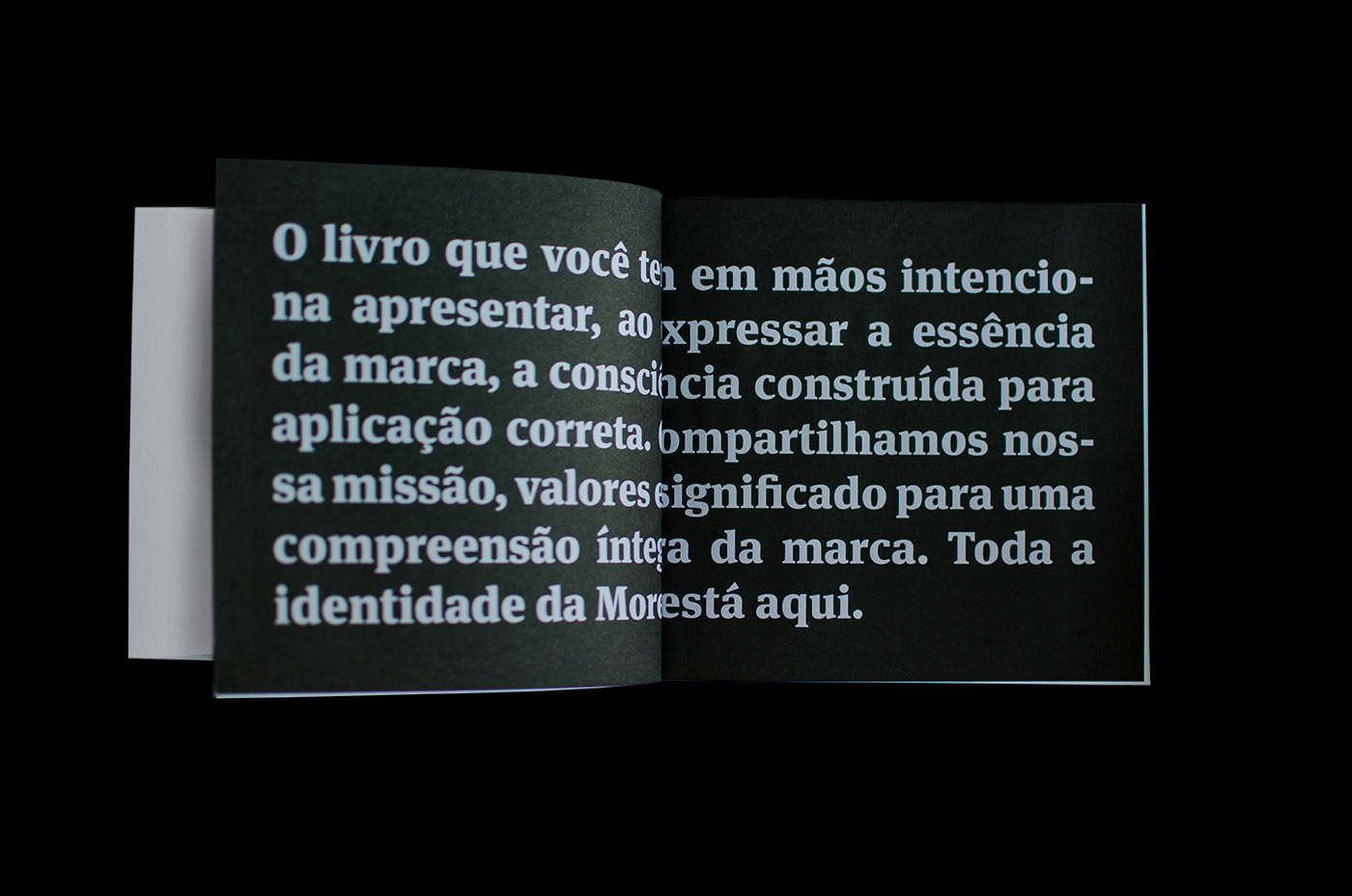
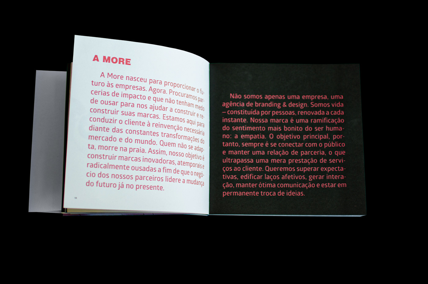
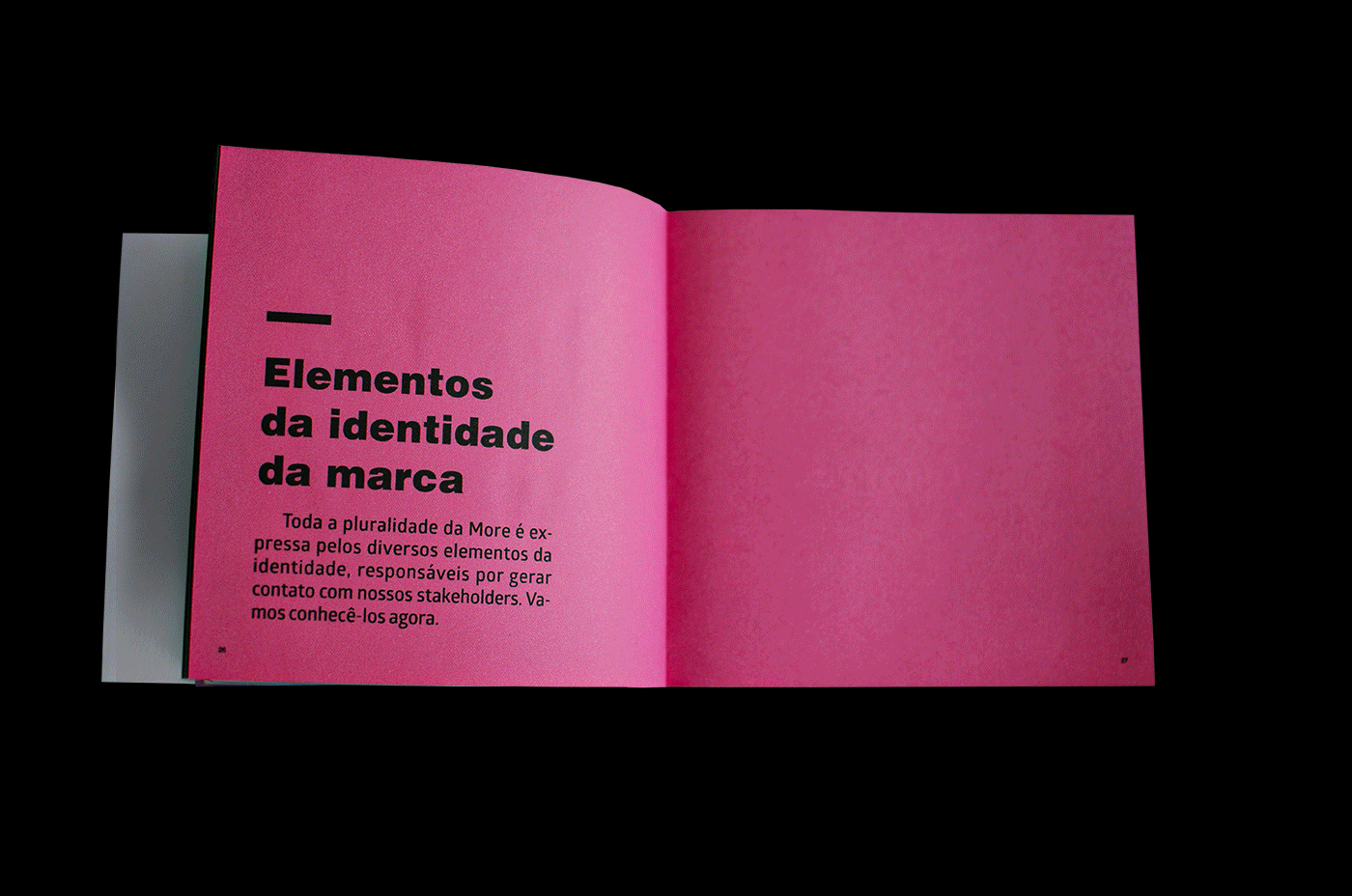
Depois da trajetória exposta até aqui, é chegado o momento de apresentar o livro de identidade da marca, produto final do TCC.
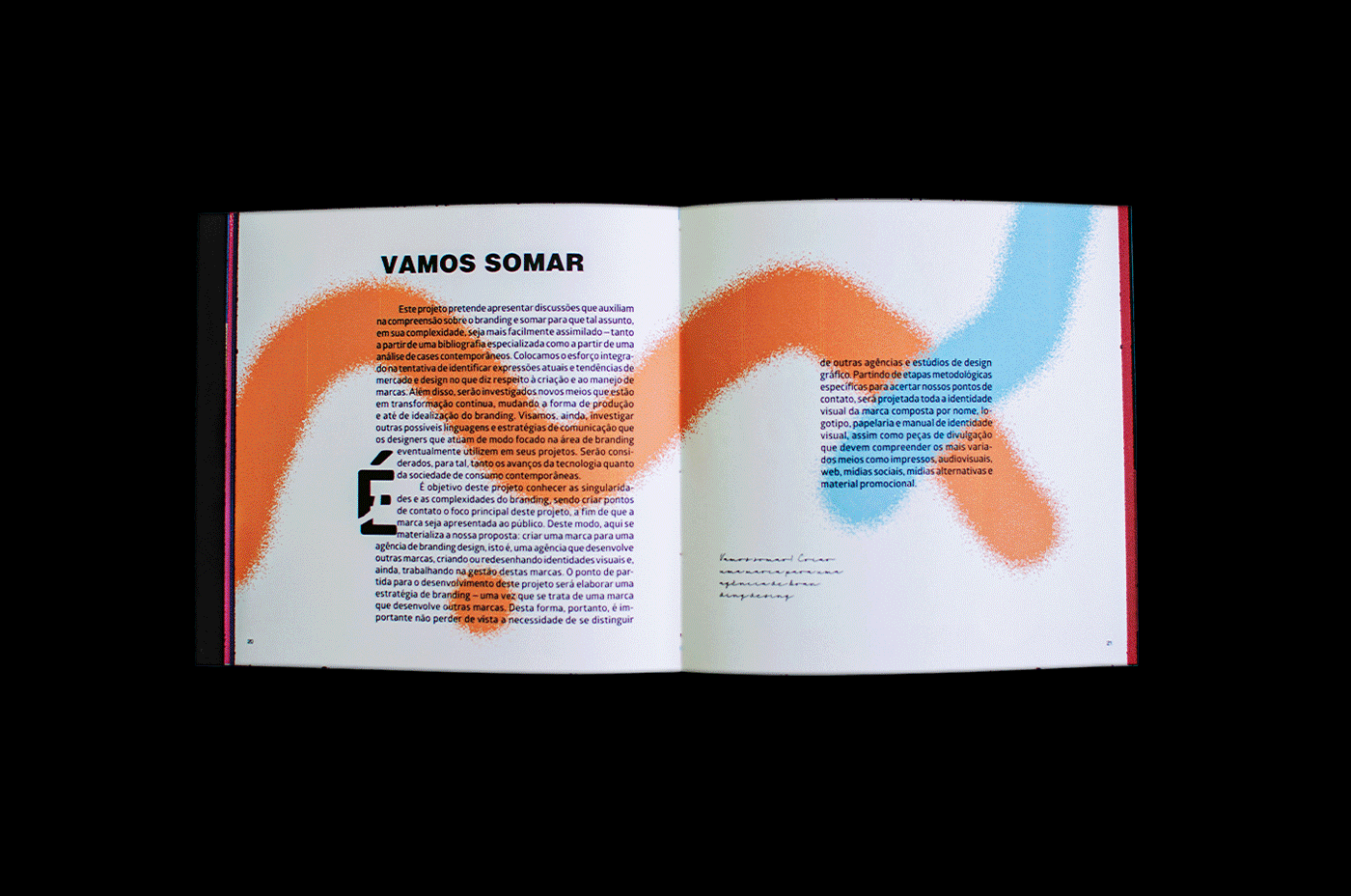
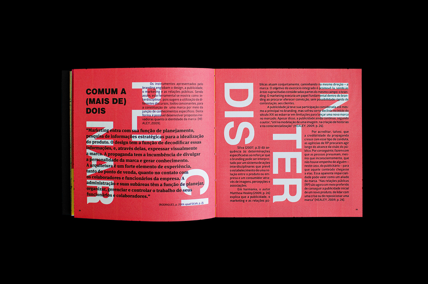
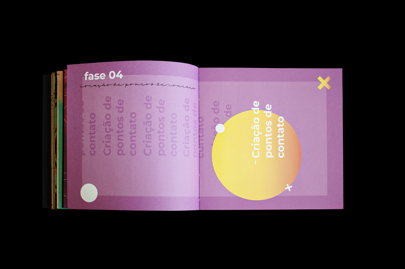
A finalidade fundamental de um livro deste tipo é construir a consciência da marca. Nele, evidenciam-se missão, visão e valores da marca proposta, além de todo o processo referente à produção dos pontos de contato e como eles podem ser usados com seus padrões e diretrizes, bem como as mídias serão desenvolvidas e quais os melhores materiais a serem utilizados em cada caso.
Quem usar ou reproduzir a marca MORE vai precisar dessas instruções para não errar ao fazer aplicações.
[EN]
After the trajectory exposed so far, it is time to present the brand identity book, the final product of the TCC.
The fundamental purpose of such a book is to build brand awareness. It shows the mission, vision and values of the proposed brand, as well as the entire process related to the production of the contact points and how they can be used with their standards and guidelines, as well as the media to be developed and which are the best materials to use. be used in each case.
Whoever uses or reproduces the MORE brand will need these instructions so as not to make mistakes when making applications.


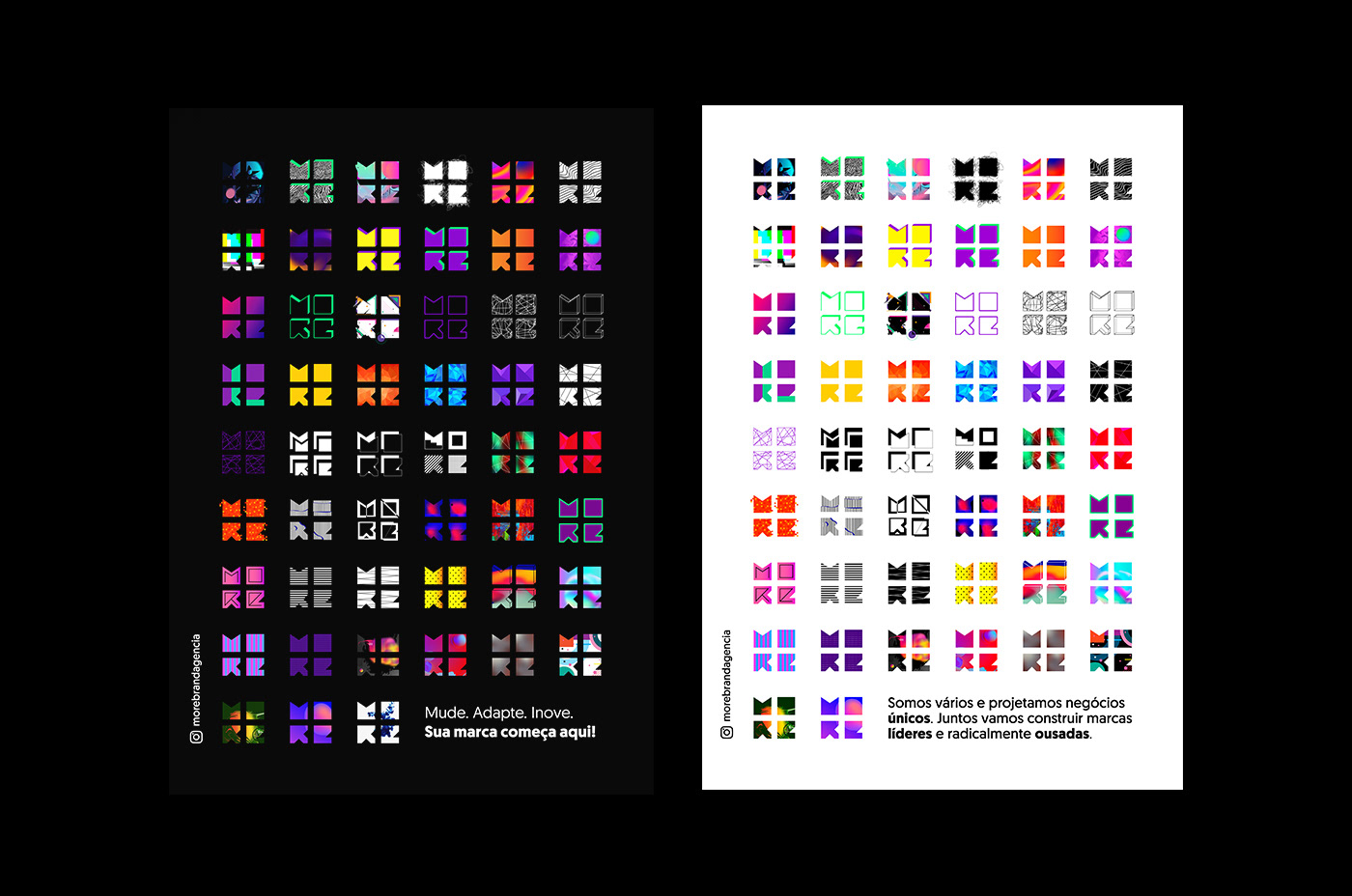
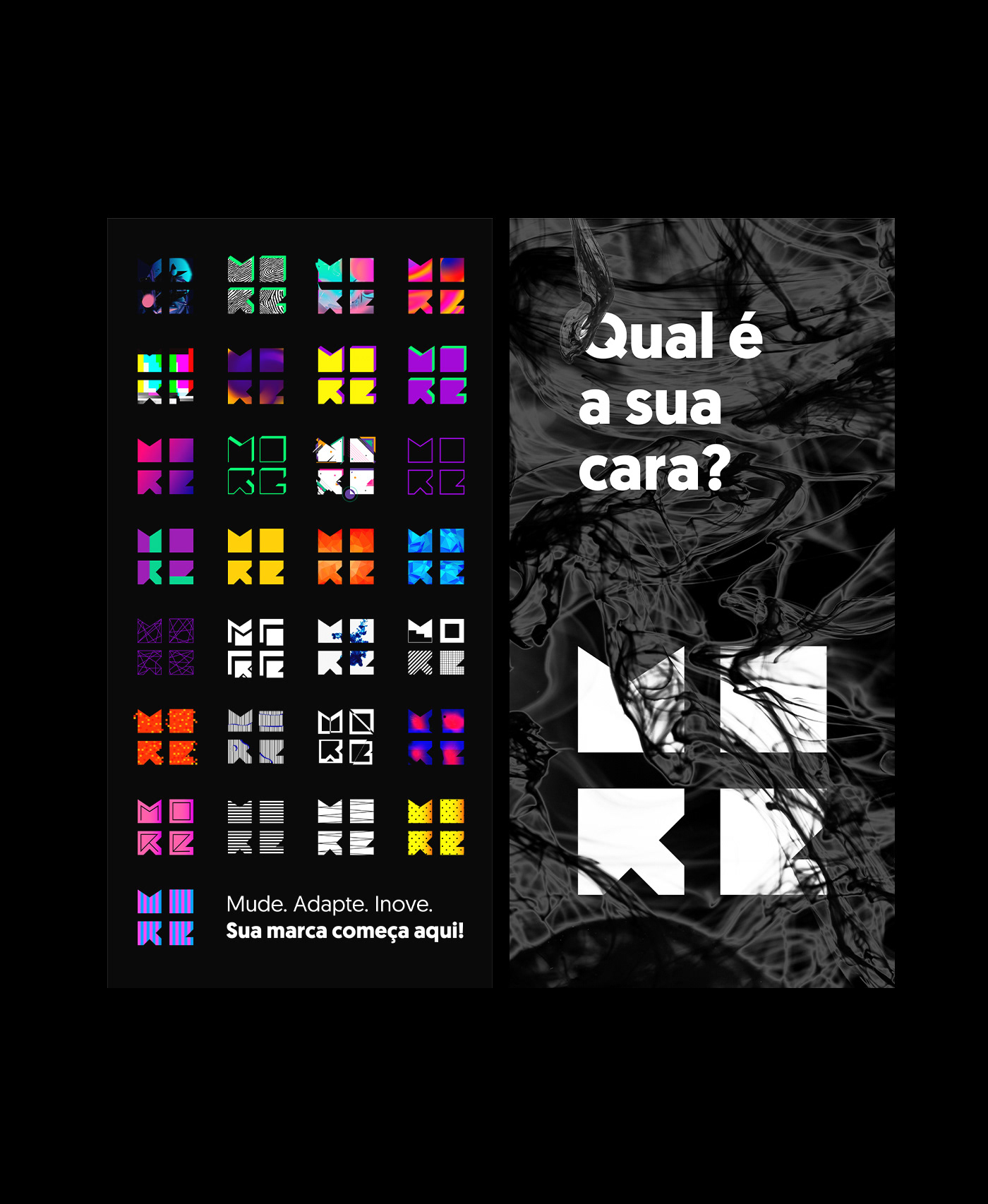
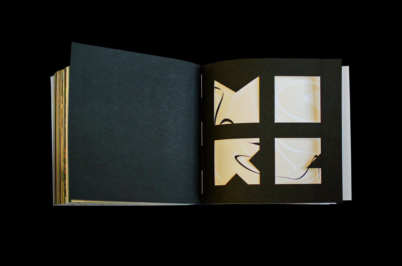
[PT]
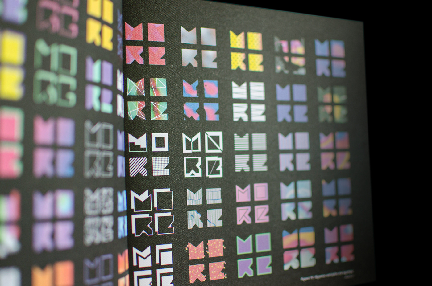
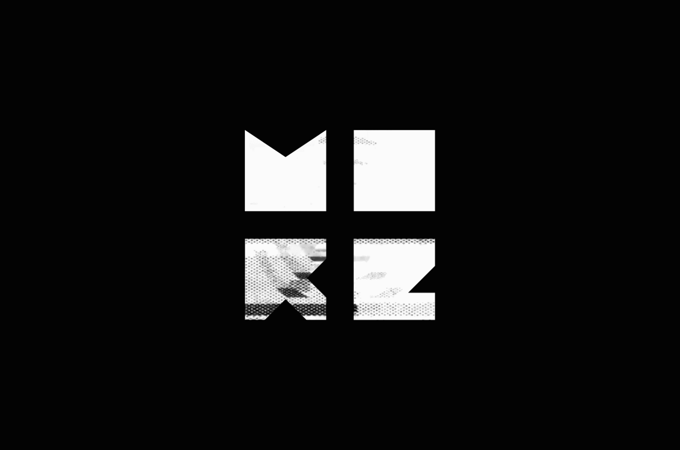
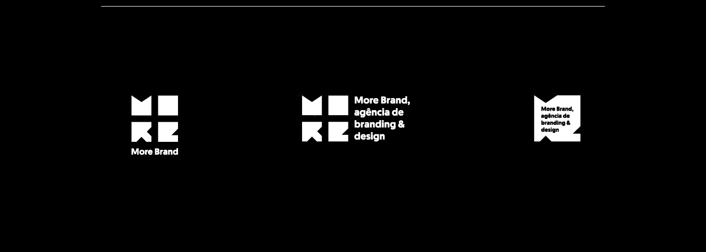
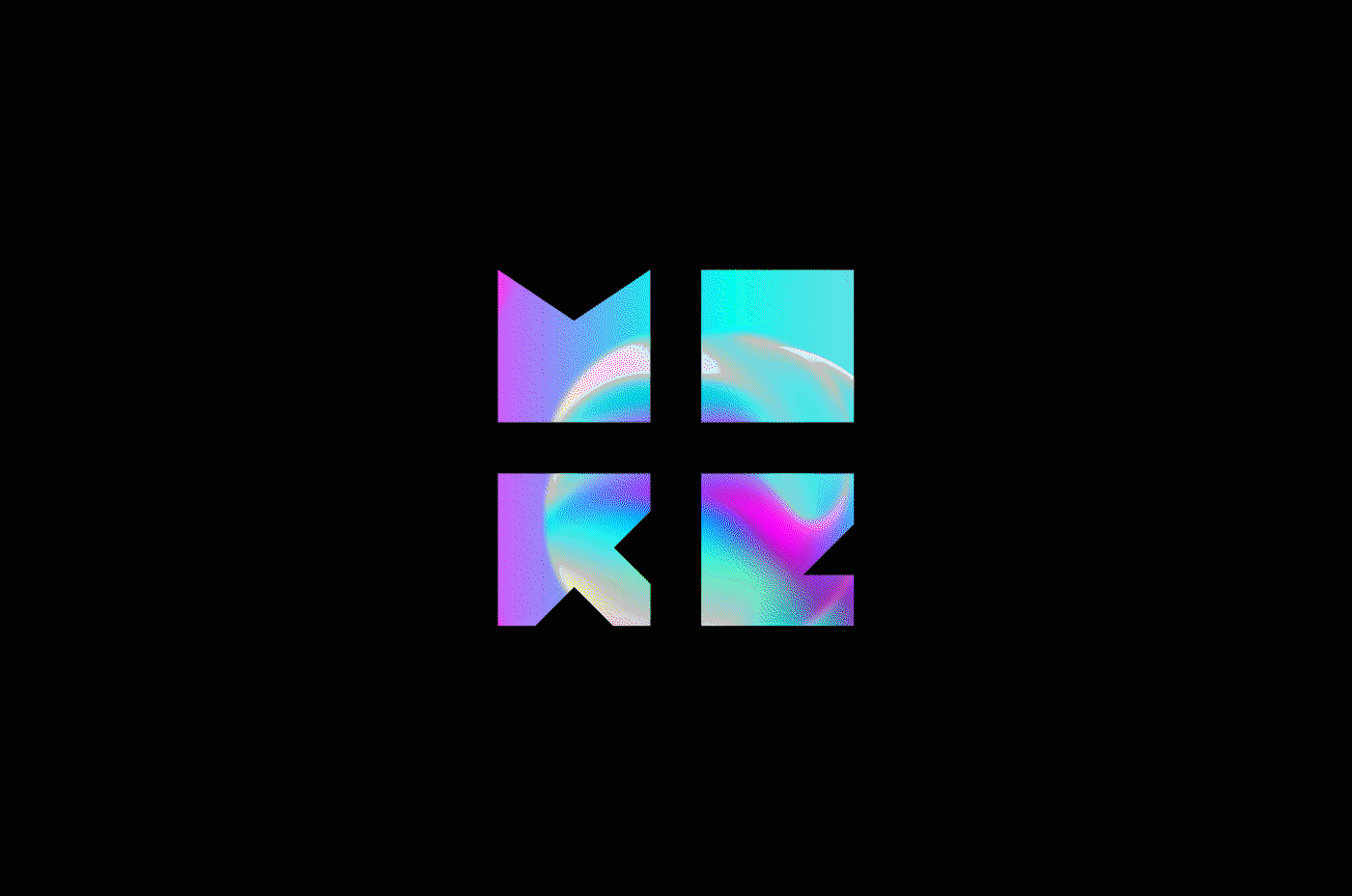
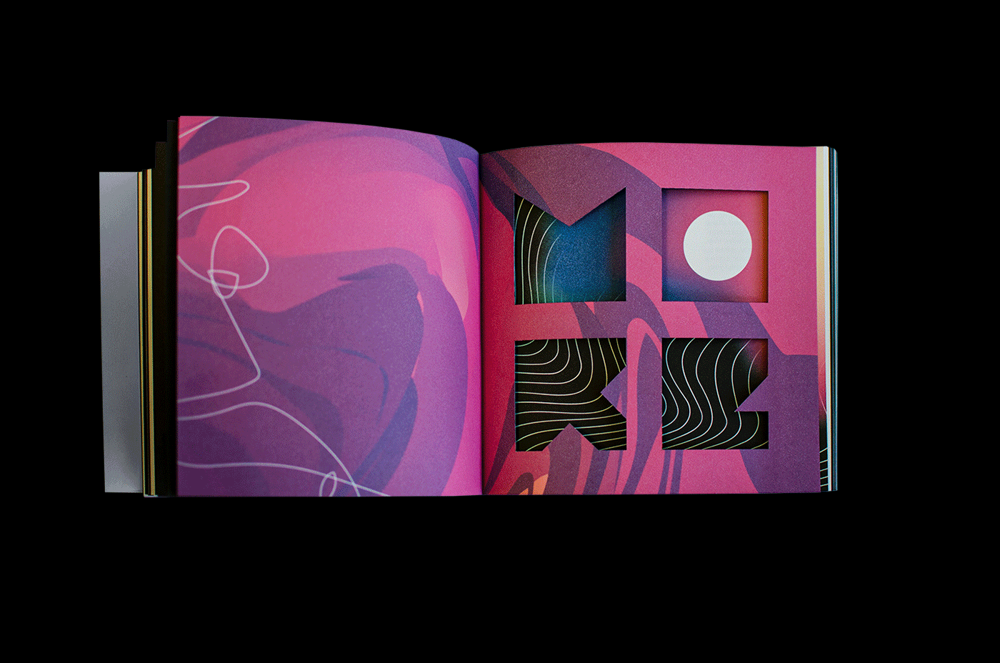
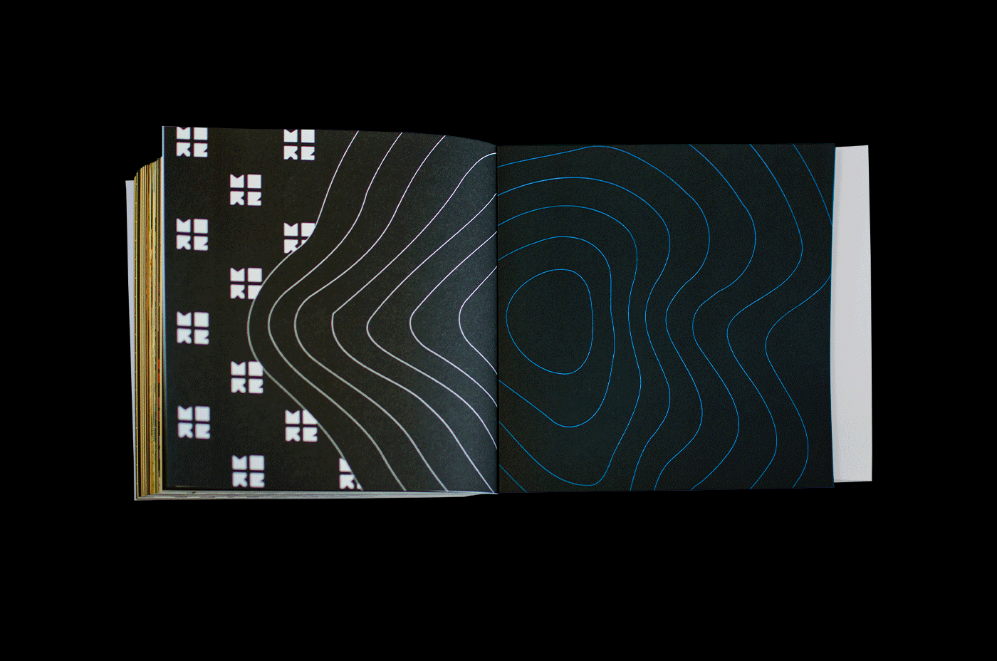
Desenvolvido com base na geometria quadrada e nos princípios de Gestalt, o
símbolo tipográfico permite uma leitura facilitada e reconhecimento imediato do símbolo “+”, criado por uma ilusão de ótica causada por um curto espaço entre das partes do símbolo “MORE”.
símbolo tipográfico permite uma leitura facilitada e reconhecimento imediato do símbolo “+”, criado por uma ilusão de ótica causada por um curto espaço entre das partes do símbolo “MORE”.
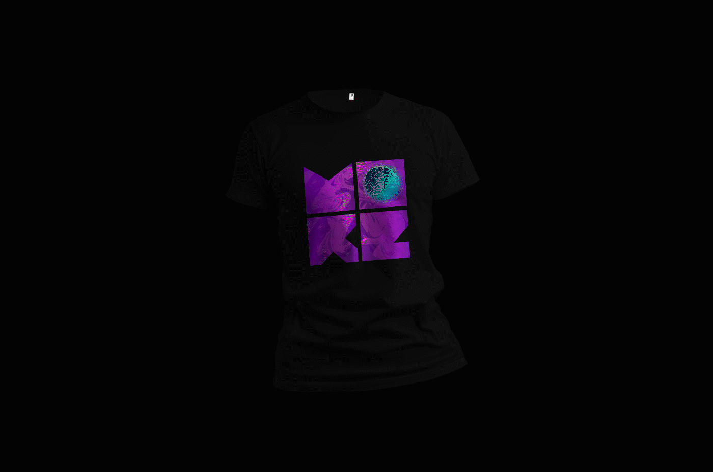
Vivo e mutante, ele assume várias perspectivas e facetas, sendo capaz de conversar com públicos diversos. A composição simples garante infinitas variações e viabiliza a identificação do símbolo a partir de sua forma.
A tipografia usada para o logotipo “More Brand” gera um contraste e adquire força em sua assinatura visual.
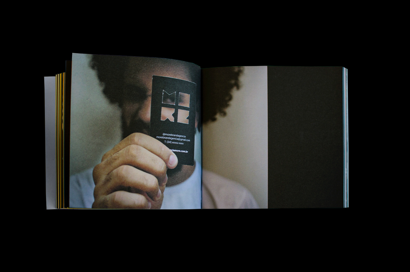
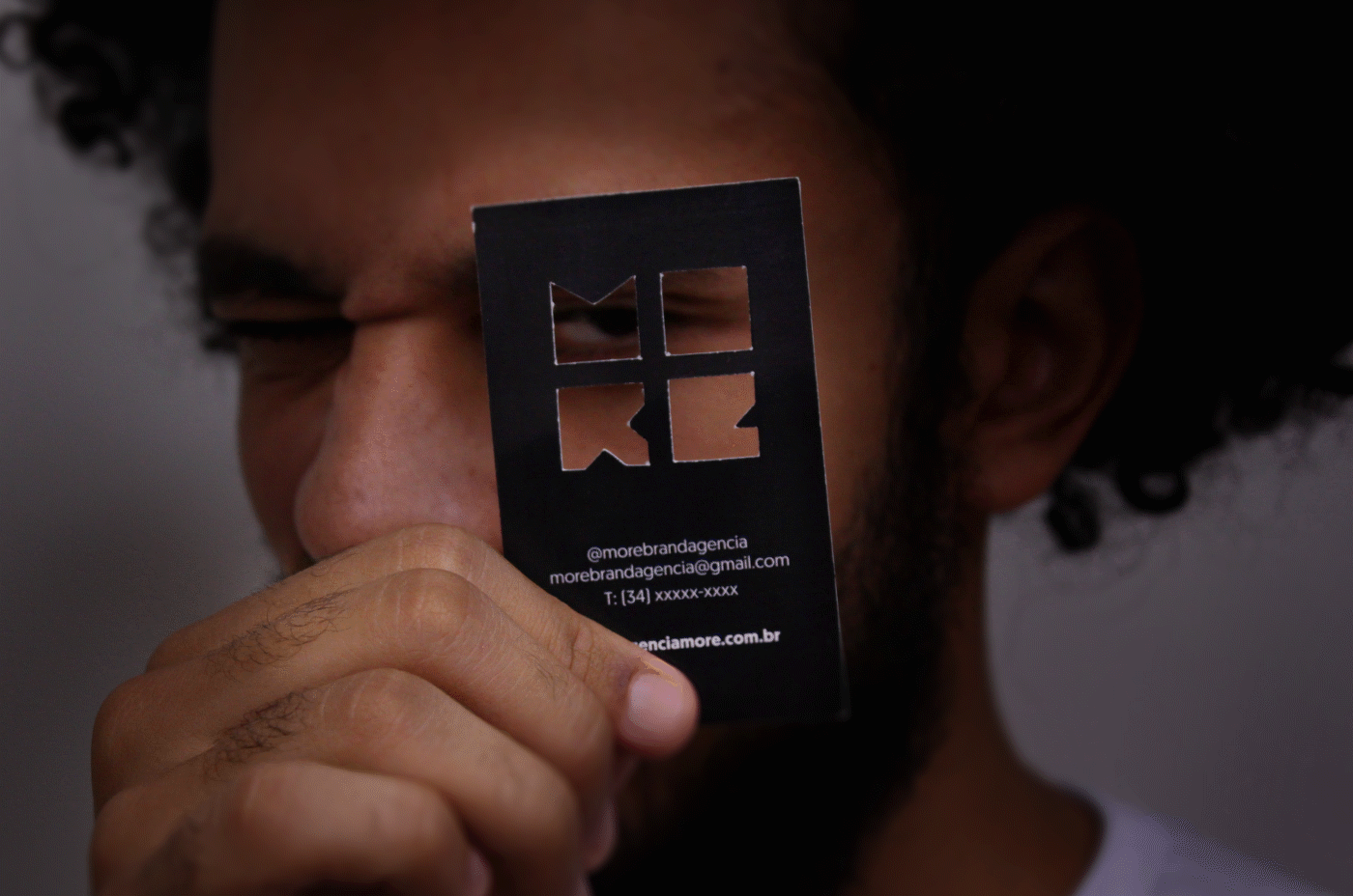
No símbolo, inúmeras cores são possíveis, texturas, presença ou ausência de sombra,
vazados, com imagens de preenchimento ou externas, enfim. A natureza desta assinatura visual é ser plural.
vazados, com imagens de preenchimento ou externas, enfim. A natureza desta assinatura visual é ser plural.
[EN]
Developed based on square geometry and Gestalt principles, thetypographic symbol allows easy reading and immediate recognition of the “+” symbol, created by an optical illusion caused by a short space between the parts of the “MORE” symbol.
Alive and mutant, he assumes several perspectives and facets, being able to talk to different audiences. The simple composition guarantees infinite variations and makes it possible to identify the symbol from its shape.
The typography used for the “More Brand” logo creates a contrast and gains strength in its visual signature.
In the symbol, countless colors are possible, textures, presence or absence of shadow,leaked, filled or external images, anyway. The nature of this visual signature is to be plural.

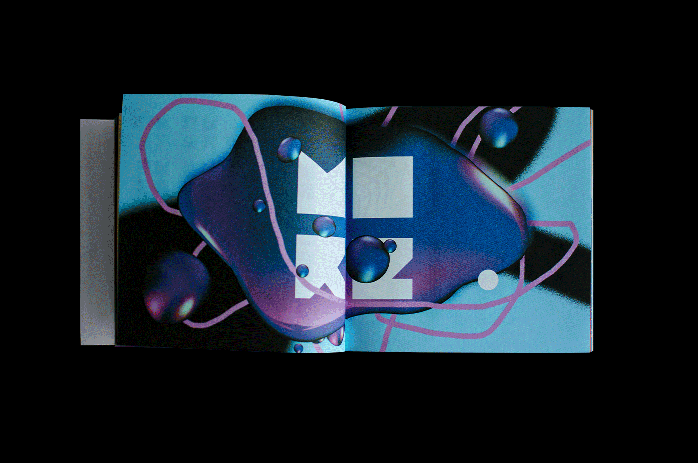
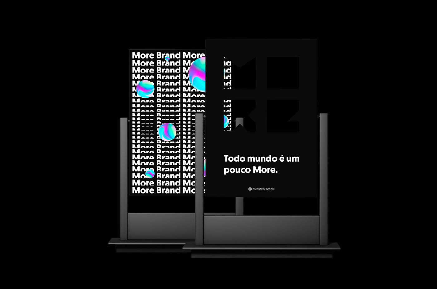
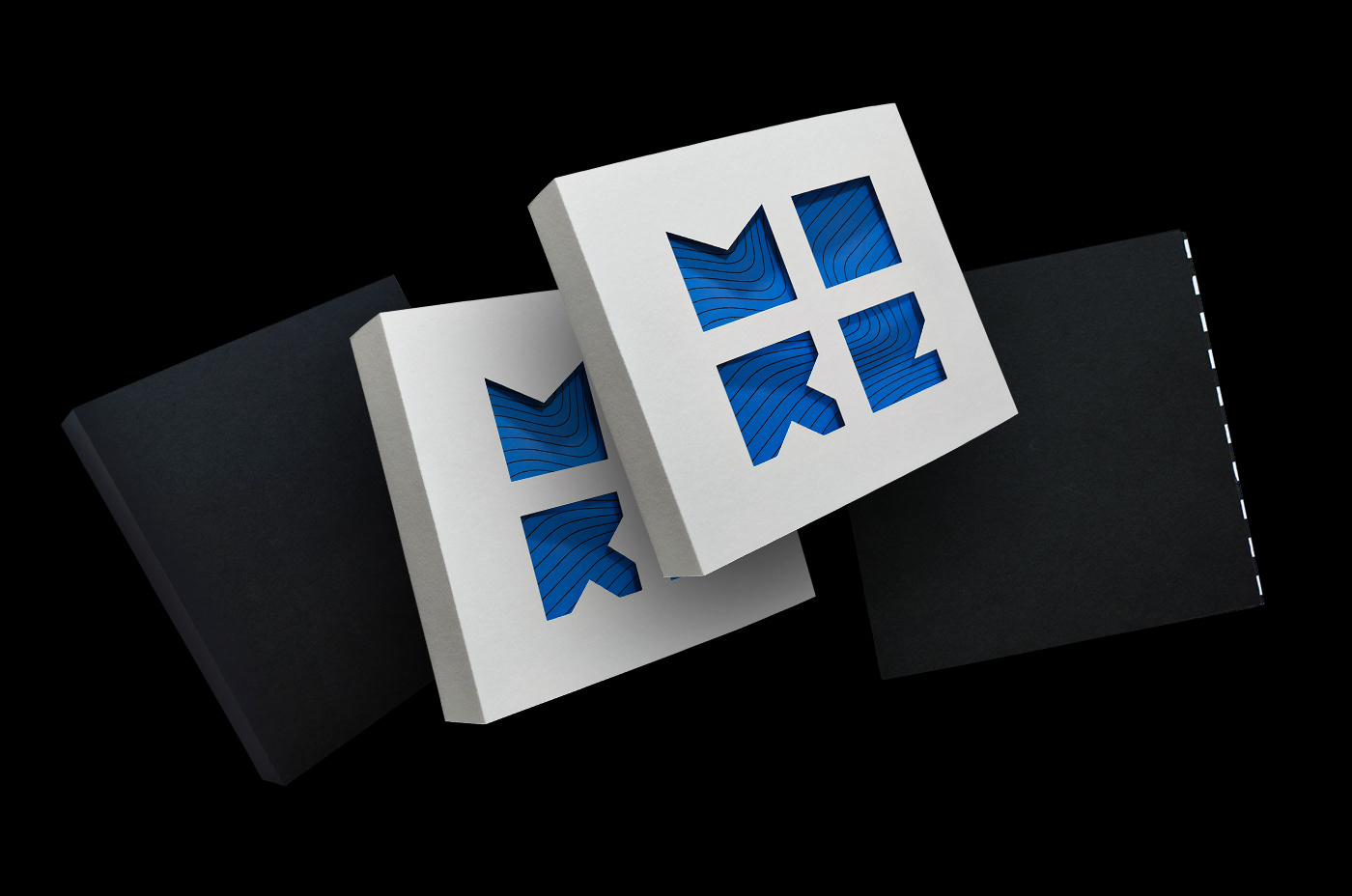
[PT]
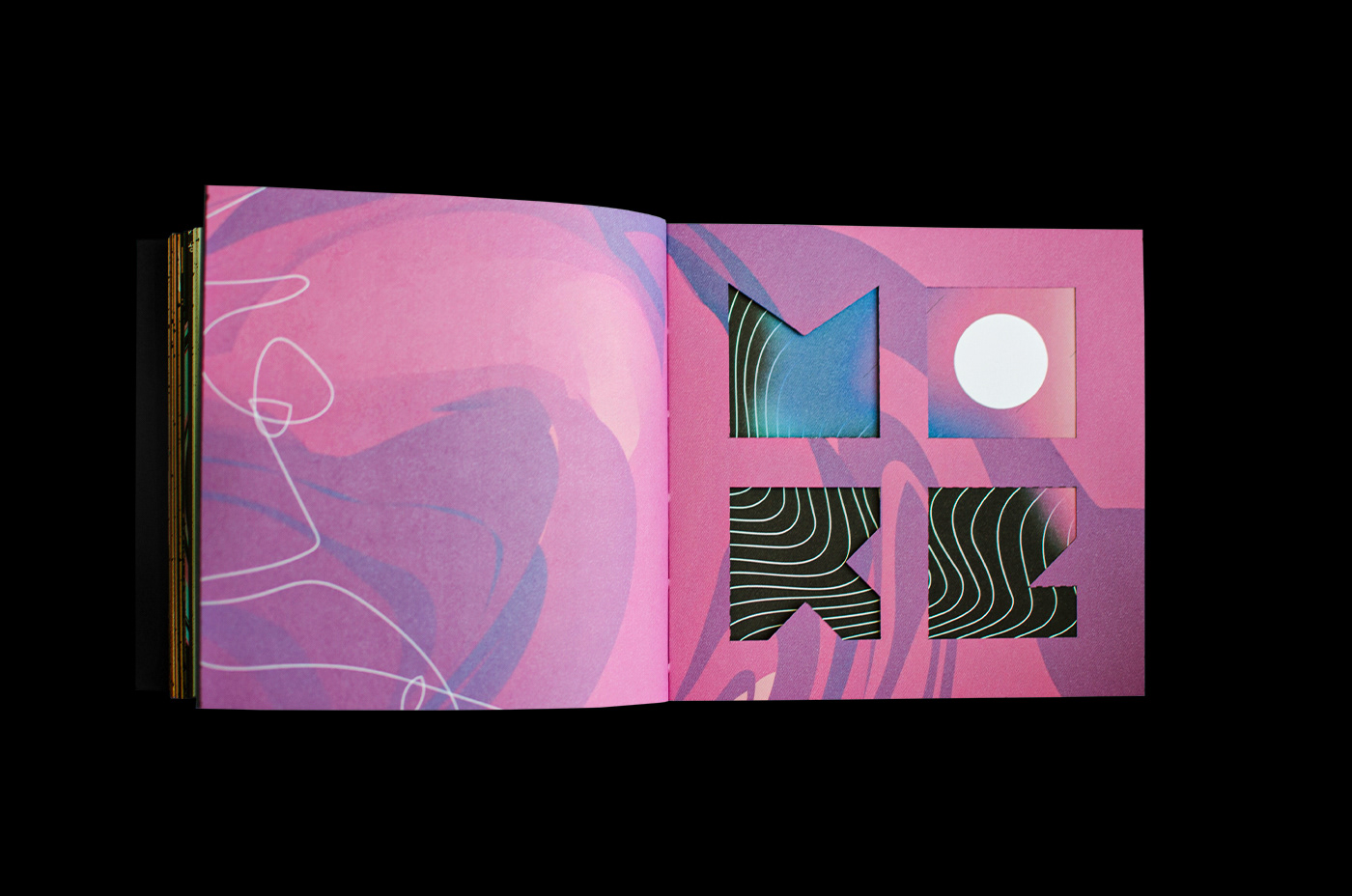
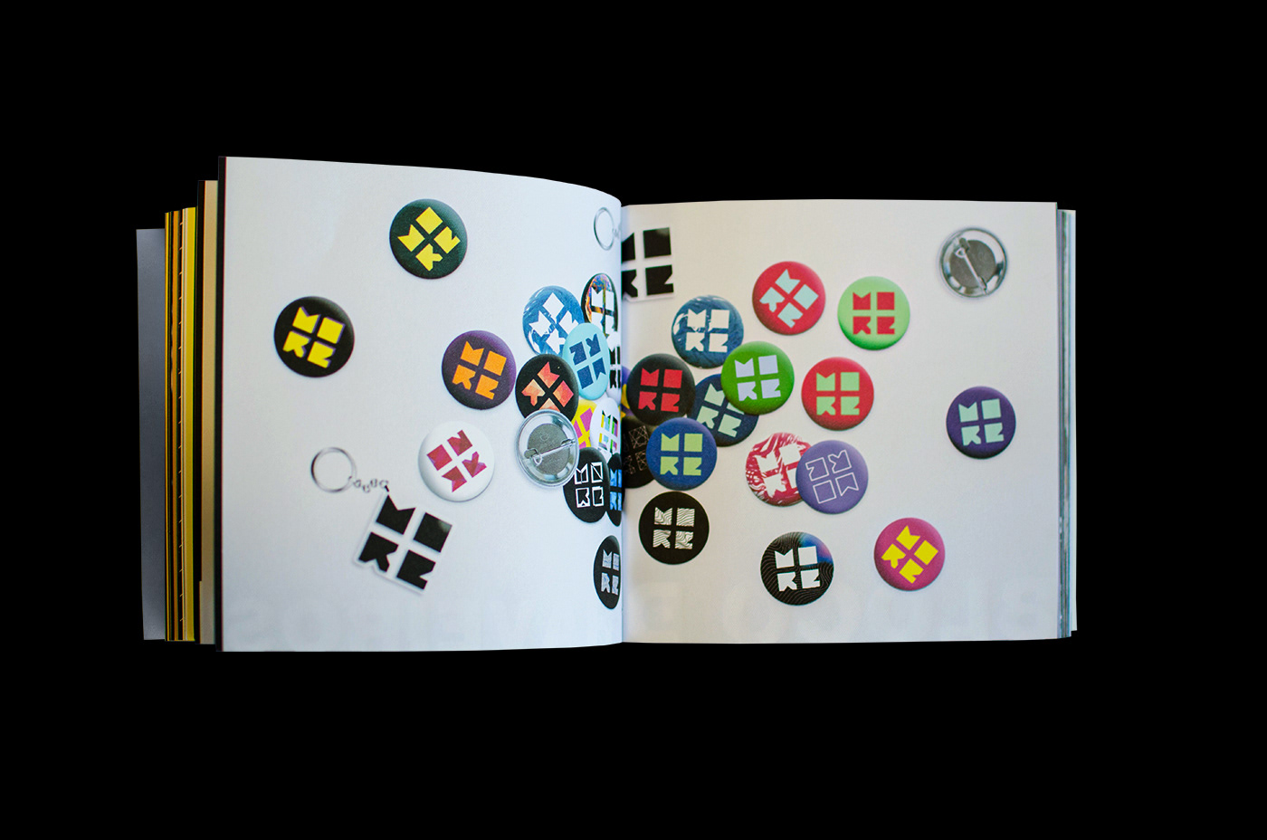
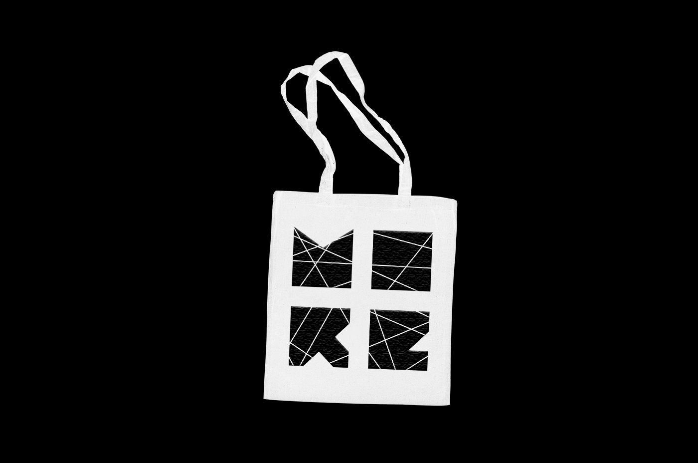
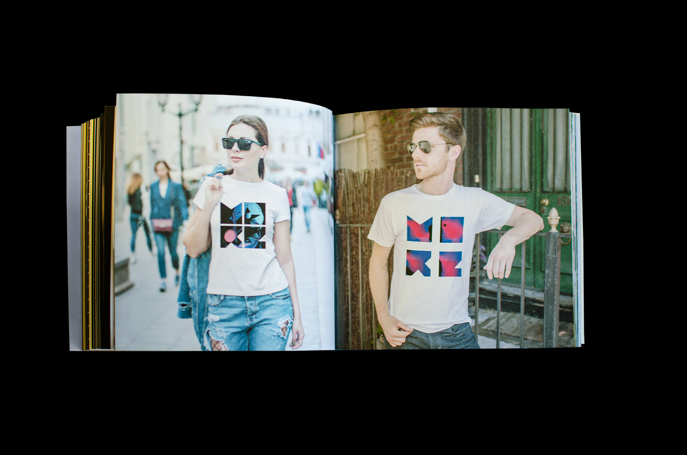
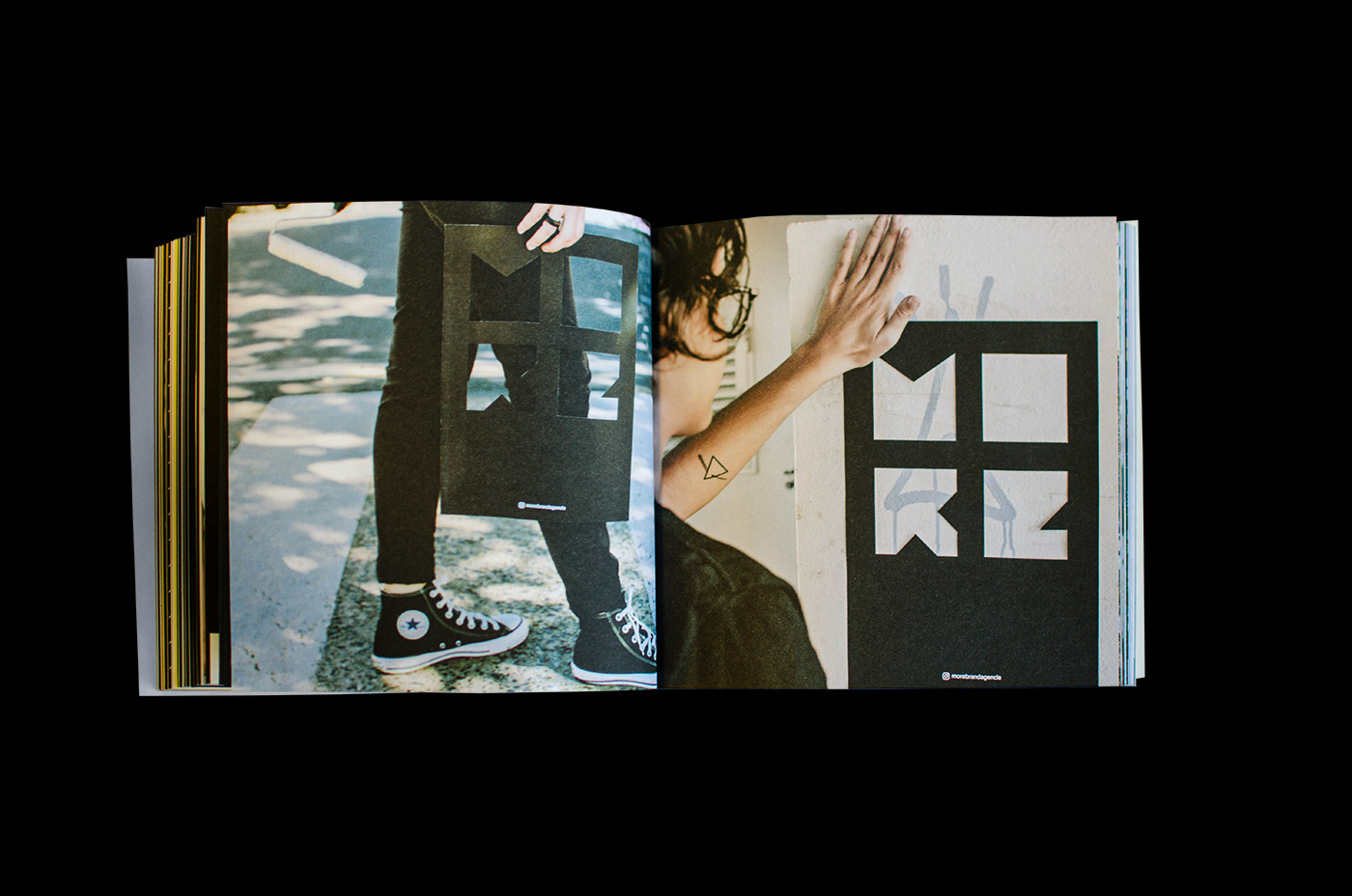
Essas sãos as versões da assinatura visual que podem ter sua facetas compostas por imagens, cores, texturas, grafismos, gradientes, vídeos, gifs etc.
[EN]
These are the versions of the visual signature that can have their facets composed of images, colors, textures, graphics, gradients, videos, gifs etc.


[PT]
Com tantas mutações possíveis, nossa assinatura visual reflete a pluralidade de qualquer contexto. Por meio da capacidade de interação, a marca se torna específica para cada pessoa sem deixar de ser múltipla. Ou seja, se por um lado a More é particular e íntima, por outro, é justamente ao ser tão característica a cada individualidade que preserva sua heterogeneidade e pluralidade estruturais.
[EN]
With so many possible mutations, our visual signature reflects the plurality of any context. Through the ability to interact, the brand becomes specific to each person while still being multiple. In other words, if on the one hand More is private and intimate, on the other, it is precisely because it is so characteristic of each individuality that it preserves its structural heterogeneity and plurality.


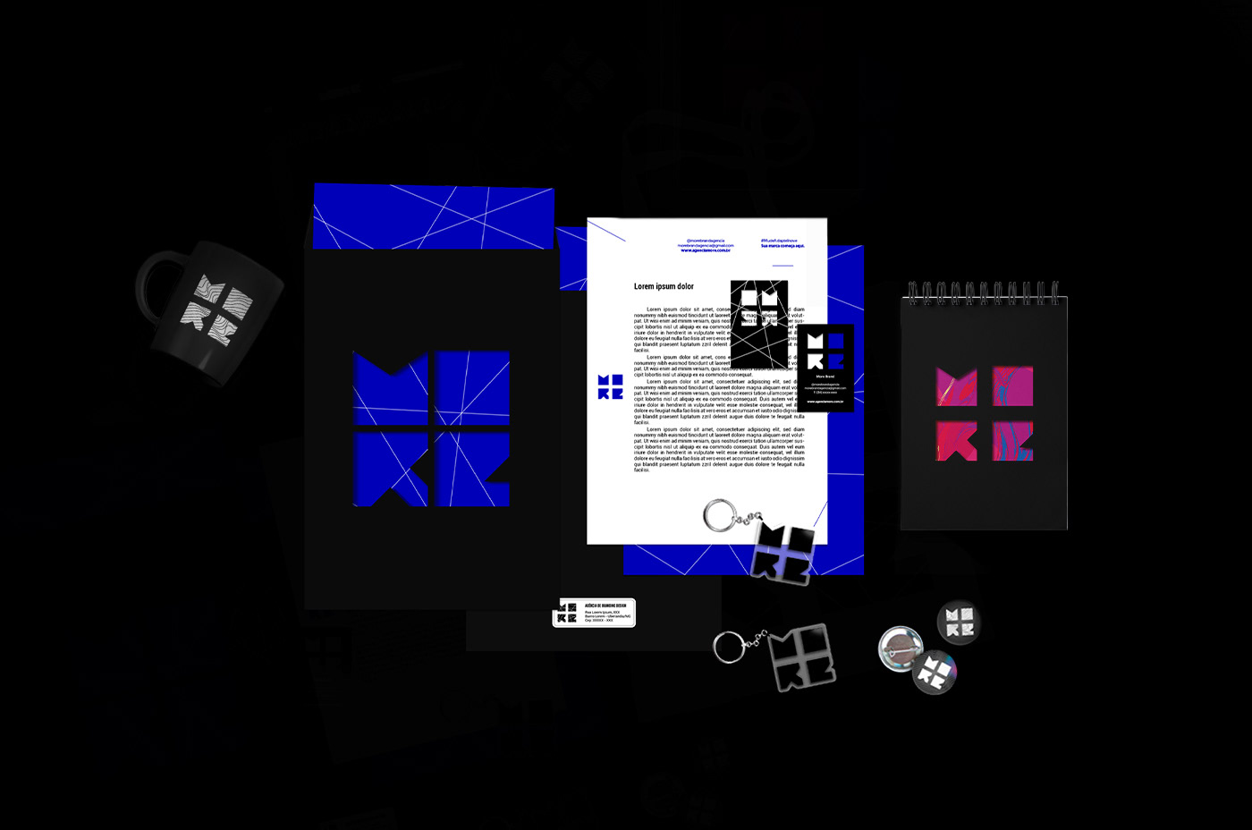

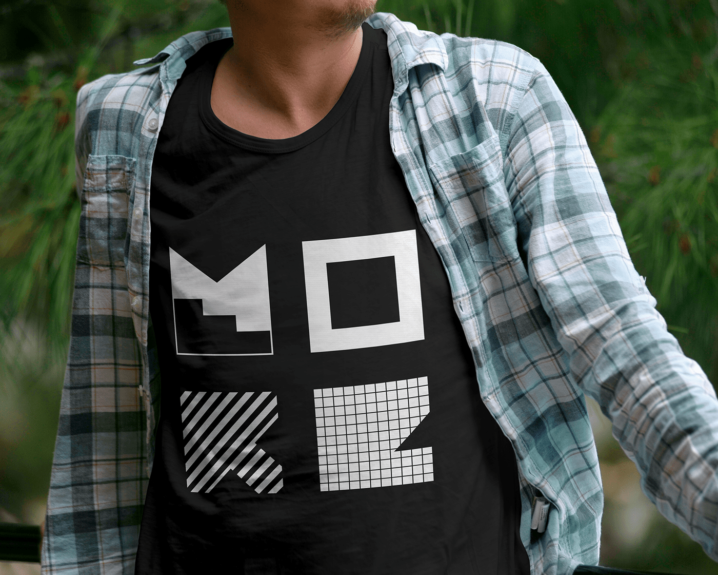
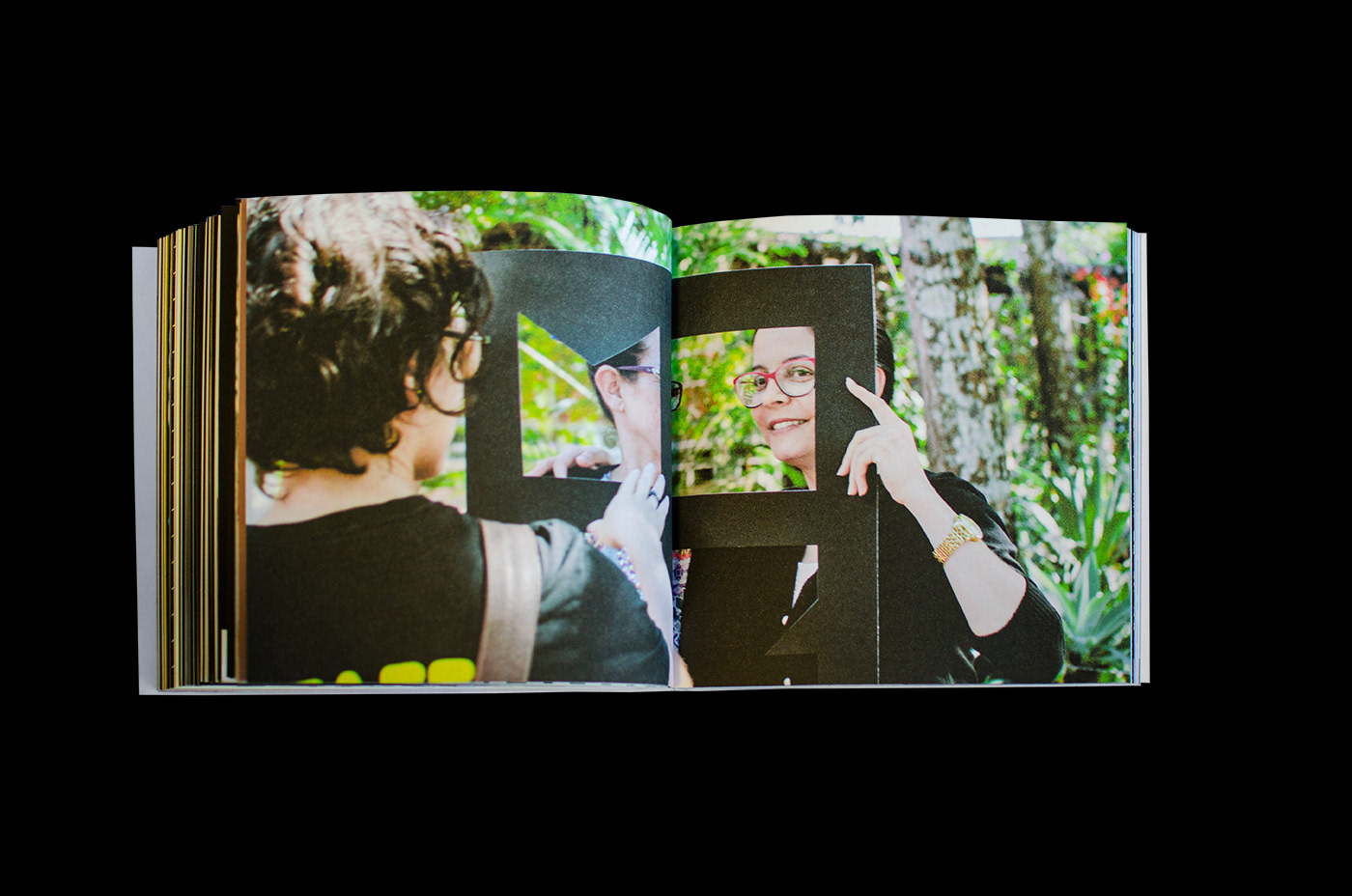
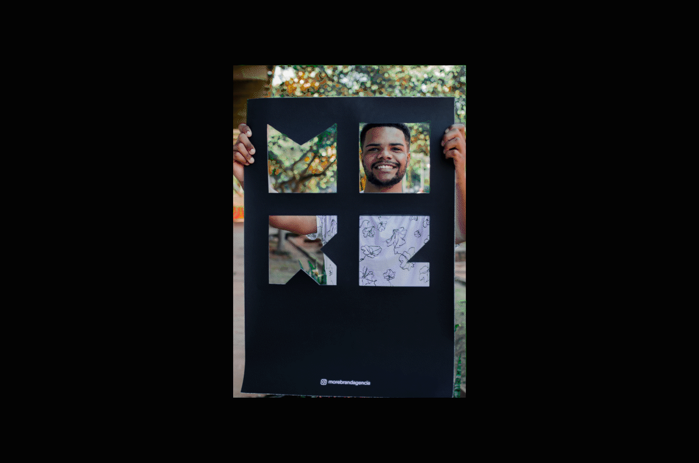
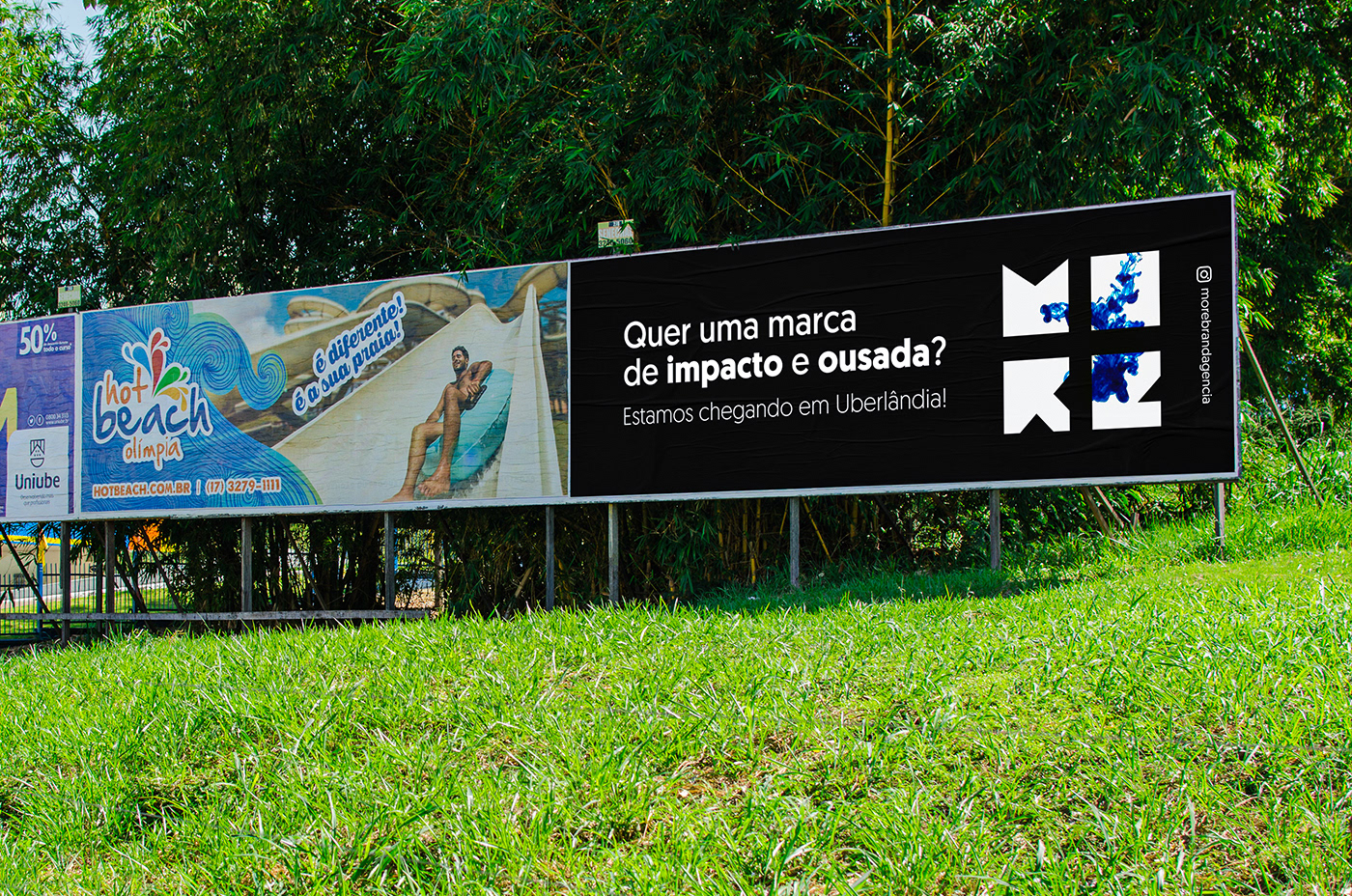
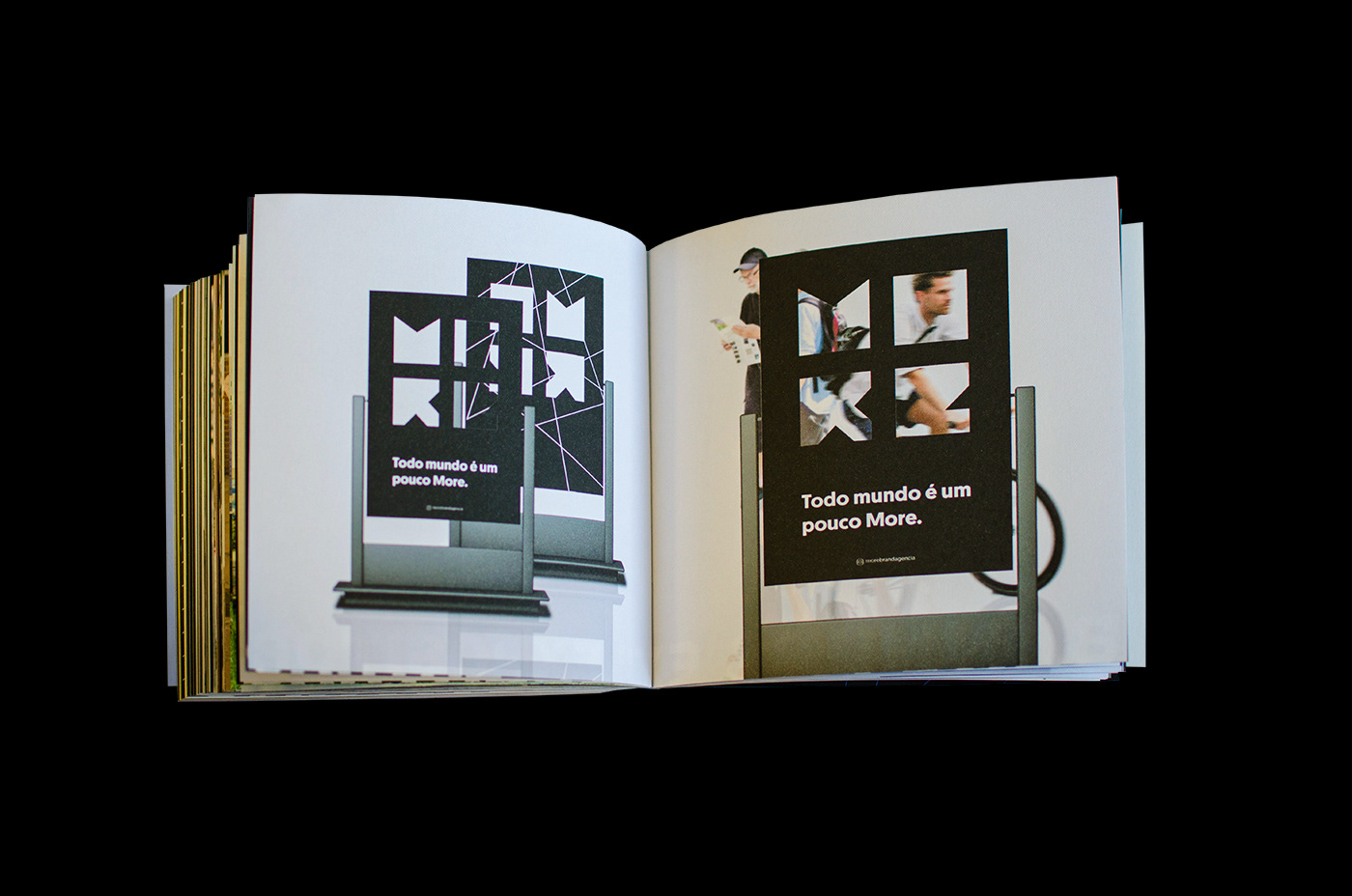
[PT]
Nosso material de divulgação é focado em mostrar sempre o símbolo da marca para mantê-lo fixo na cabeça das pessoas. Vale ressaltar que trata-se da inauguração, o momento inicial de divulgação. Trabalhamos com fundos neutros e os símbolos e logotipo em destaque. A interação com o ambiente, como um todo, prova simplicidade e capacidade de atrair as pessoas, o que permite a texturas, lugares, cores, formas e a
pessoas que integrem nossa história, nossa identidade, contribuindo para que a More seja de fato singular e, ao mesmo tempo, múltipla.
pessoas que integrem nossa história, nossa identidade, contribuindo para que a More seja de fato singular e, ao mesmo tempo, múltipla.
[EN]
Our promotional material is focused on always showing the brand symbol to keep it fixed on people's heads. It is worth mentioning that this is the inauguration, the initial moment of disclosure. We work with neutral backgrounds and the symbols and logo highlighted. Interaction with the environment as a whole proves simplicity and the ability to attract people, which allows for textures, places, colors, shapes andpeople who integrate our history, our identity, contributing so that More is in fact singular and, at the same time, multiple.


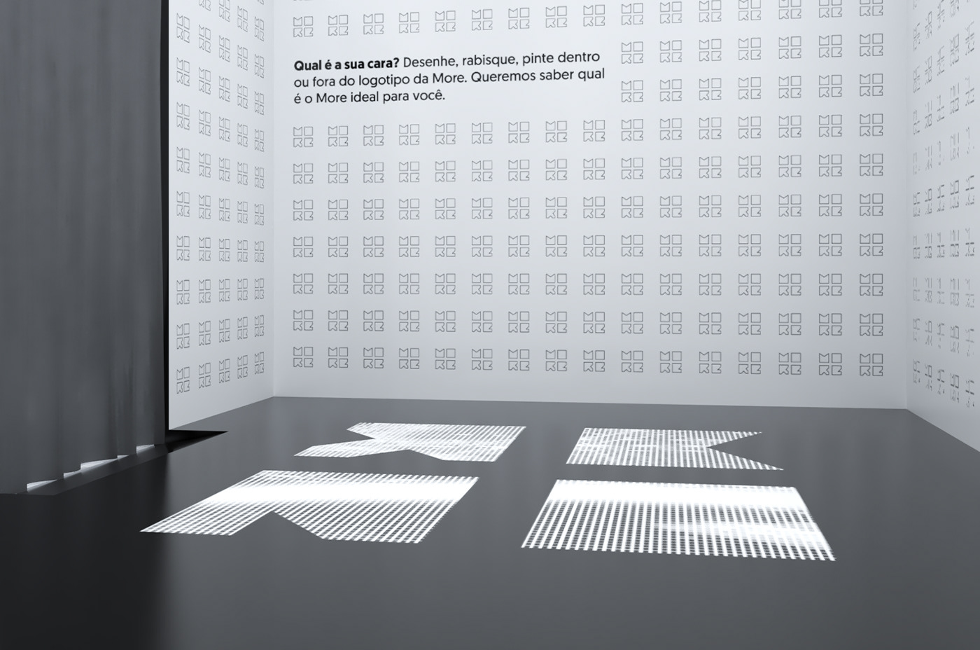
[PT]
O estande foi desenvolvido para o lançamento da marca com a finalidade de gerar interação da marca com o público para que ele a conheça.
Inspirado na caixa preta e no mistério em torno de sua pluralidade, é formado por placas de madeira com laminação lacada fosca, externamente na cor preta, as paredes internas são adesivadas com papel branco e vários símbolos da More, sem preenchimento, para que as pessoas possam personalizá-los do jeito que quiserem. O teto também é laminado em branco com seis luminárias embutidas. O piso é de madeira revestido por adesivos do símbolo laminado.
Suas dimensões totalizam 9m² com pé direito de 3m. A porta é tampada por uma cortina
de plástico preto fosco. A parte externa conta com um balcão de atendimento que tem nichos para alocar os brindes e uma arara para as camisetas. Também na parte externa ficam os banners, na entrada do estande.
de plástico preto fosco. A parte externa conta com um balcão de atendimento que tem nichos para alocar os brindes e uma arara para as camisetas. Também na parte externa ficam os banners, na entrada do estande.
[EN]
The stand was developed for the launch of the brand with the purpose of generating interaction of the brand with the public so that it gets to know it.
Inspired by the black box and the mystery surrounding its plurality, it is formed by wooden boards with a matte lacquered lamination, externally in black, the internal walls are adhesive with white paper and various More symbols, without filling, so that people can customize them however they want. The ceiling is also laminated in white with six built-in lamps. The floor is made of wood covered with laminated symbol stickers.
Its dimensions total 9m² with a ceiling height of 3m. The door is covered by a curtainmatte black plastic. The outside has a service desk that has niches to allocate the gifts and a rack for the T-shirts. Also on the outside are banners, at the entrance to the stand.


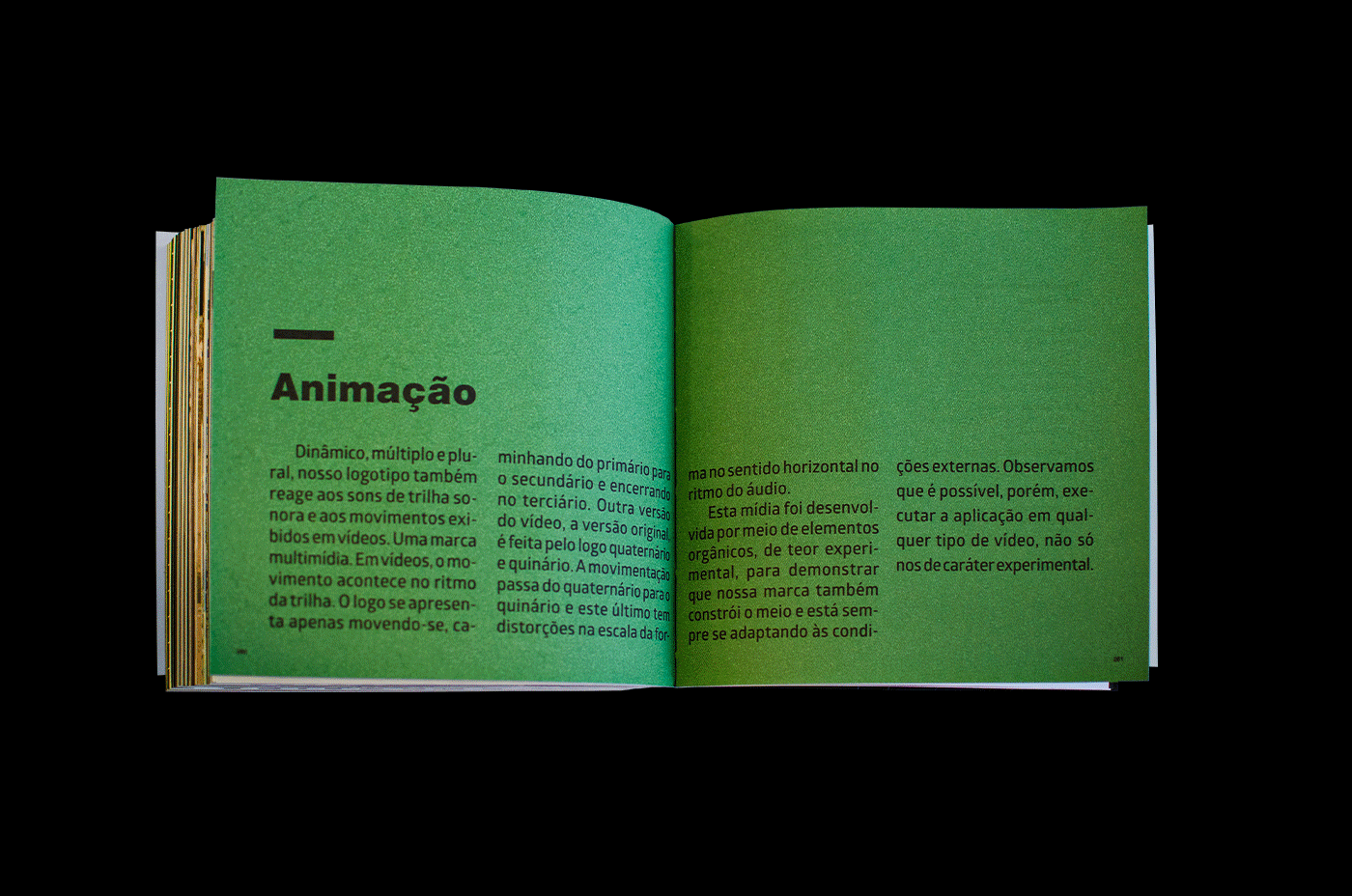
[PT]
Nosso símbolo também reage aos sons de trilha sonora e aos movimentos exibidos em vídeos. Uma marca multimídia.
A mídia a seguir foi desenvolvida por meio de elementos orgânicos, de teor experimental,
para demonstrar que nossa marca também constrói o meio e está sempre se adaptando às condições externas. Observamos que é possível, porém, executar a aplicação em qualquer tipo de vídeo, não só nos de caráter experimental.
para demonstrar que nossa marca também constrói o meio e está sempre se adaptando às condições externas. Observamos que é possível, porém, executar a aplicação em qualquer tipo de vídeo, não só nos de caráter experimental.
[EN]
Our symbol also reacts to soundtrack sounds and movements shown in videos.
A multimedia brand.
The following media was developed using organic elements, with experimental content, to demonstrate that our brand also builds the environment and is always adapting to external conditions. We note that it is possible, however, to run the application in any type of video, not just experimental ones.


[PT]
Este projeto surgiu da ideia – à época, imatura – de desenvolver uma identidade. Nada concreto em mente, não sabíamos direito o que seria. Sabíamos, entretanto, que começaríamos do absoluto zero. Eu e minha orientadora, Sabrina Maia, à conclusão de utilizar o branding como ferramental imprescindível. Jogando possibilidades, finalmente fluiu, em um brainstorming informal, a grande ideia de uma marca mutante e toda a gestão da mesma. Trabalhei com branding, algo que desconhecia até então. Me senti desafiada. Não recuei. Estudei e esmiucei cada detalhe que julguei importante entender para este instrumento tão substancial ao desenvolvimento, redesign, refinamento e gerenciamento de uma marca.
Tive a oportunidade de conhecer autores incríveis e desconstruir falácias repetidas sem o menor embasamento teórico. Para mim, branding não era gestão de marca, apenas a marca. Com os estudos apresentados no Volume 1, descobri que branding é muito mais que isso. Que marca, mesmo tendo muitos sentidos, é a soma dos valores tangíveis e intangíveis de uma organização – e não apenas uma redução ao logotipo. Ele, por sua vez, tem sua importância pois, conforme descrevo no livro, dá rosto à marca a fim de torná-la reconhecível e aproximá-la do público. Juntamente com o nome, isso é apenas o início da construção tangível da marca.
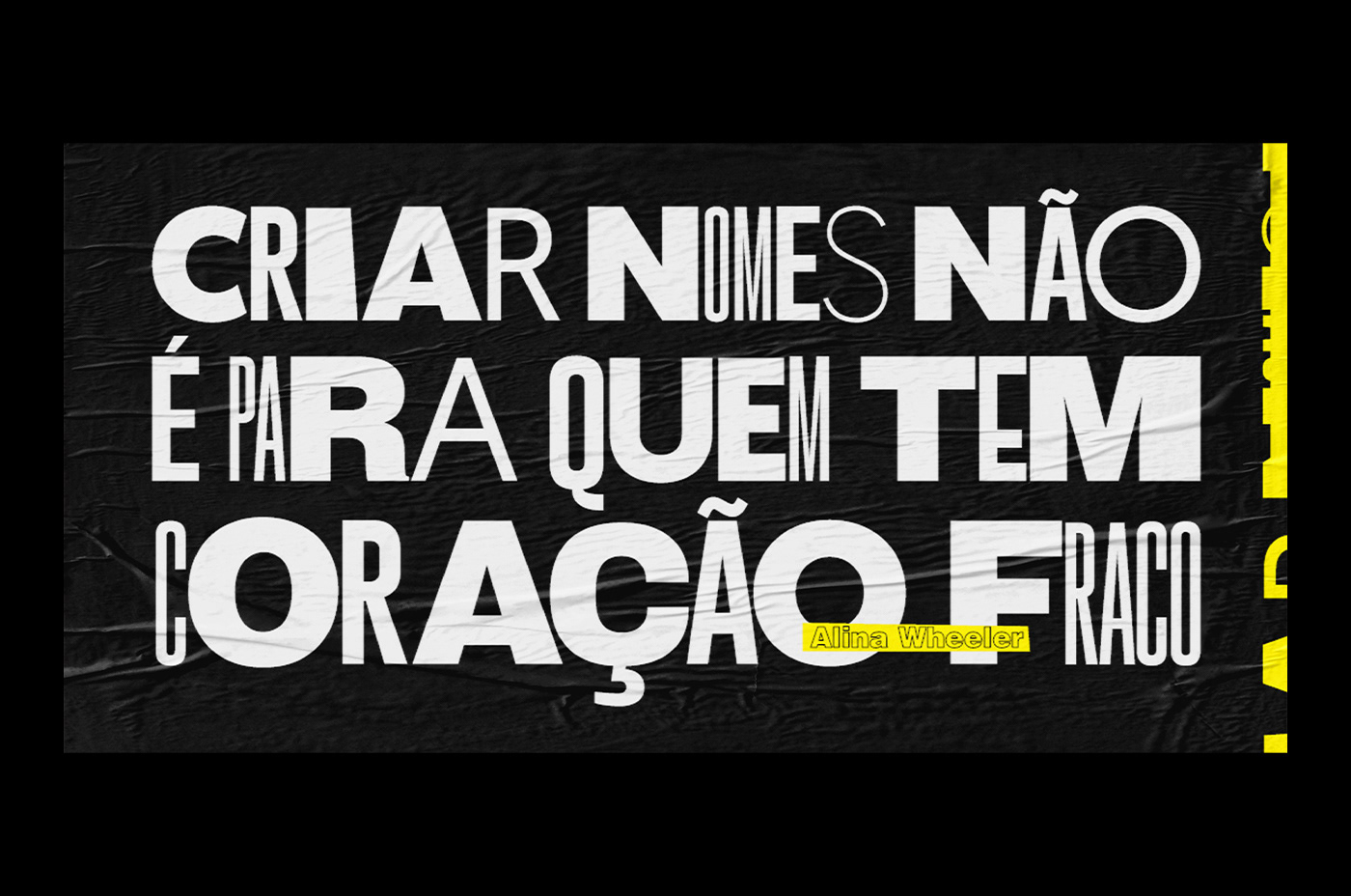
Falando nele, permitam-me um desabafo: ô coisa difícil é criar um nome! No livro mostro quão necessário é ter cuidado ao desenvolvê-lo, pois é o que resume a essência da marca e, a partir dele, cria-se um rosto, o logo. Imagina se sai algo errado? A estratégia pode não ser tão boa quanto poderia. Mas não se permita desanimar caso não acerte de início. Errar faz parte do processo. São testes, fazer e refazer até chegar a algo que represente, de fato, a marca em criação. E, neste caso, vale muito a pena. Além do aprendizado que só os erros concedem aos insistentes, ninguém quer correr o risco de ter uma marca fracassada no mercado, certo?
Depois de passar pela tribulação do mar tempestuoso, chegamos, enfim, ao parque de diversões. Criar os pontos de contato da marca foi uma delícia. Expusemos o passo a passo completo, detalhado, e produzimos juntos a identidade. Partimos de uma ideia imatura e conseguimos concluir um projeto especial de branding, no qual o desafio foi desenvolver uma marca mutante a uma agência de branding design. Trabalhar o conceito de marca mutante também foi outro desafio. Como conceber algo simultaneamente único, flexível, original, múltiplo e reconhecível? Demonstramos neste projeto que é possível.
Finalizamos o projeto com êxito e deixamos registrado no livro até mesmo o que deu errado. Aliás, os erros são uma excelente base comparativa para não perder de vista o ponto que permitiu a completude do processo e o desenvolvimento de cada etapa do projeto proposto. Se você tem uma ideia, ainda que não tenha muito sentido, não a descarte. Bem lapidada, ela pode se tornar algo grandioso.
[EN]
This project arose from the idea - at the time, immature - to develop an identity. Nothing concrete in mind, we didn't really know what it would be. We knew, however, that we would start from absolute zero. Me and my advisor, Sabrina Maia, to the conclusion of using branding as an essential tool. Playing possibilities, the great idea of a mutant brand and all its management finally flowed, in an informal brainstorming. I worked with branding, something I didn't know until then. I felt challenged. I didn't back off. I studied and scrutinized every detail that I thought was important to understand for this instrument so substantial to the development, redesign, refinement and management of a brand.
I had the opportunity to meet incredible authors and deconstruct repeated fallacies without the slightest theoretical basis. For me, branding was not brand management, just the brand. With the studies presented in Volume 1, I discovered that branding is much more than that. What marks, even though it has many meanings, is the sum of an organization's tangible and intangible values - and not just a reduction to the logo. It, in turn, has its importance because, as I describe in the book, it gives face to the brand in order to make it recognizable and bring it closer to the public. Together with the name, this is only the beginning of the tangible construction of the brand.
Speaking of which, allow me to vent: the hard thing is to create a name! In the book I show how necessary it is to be careful when developing it, as it is what sums up the essence of the brand and, from it, a face, the logo, is created. Imagine if something goes wrong? The strategy may not be as good as it could be. But don't let yourself get discouraged if you don't get it right at first. Making mistakes is part of the process. They are tests, doing and redoing until you reach something that actually represents the brand being created. And in this case, it is very worthwhile. In addition to the learning that only mistakes give insistent people, nobody wants to take the risk of having a failed brand in the market, right?
After going through the tribulation of the stormy sea, we finally arrived at the amusement park. Creating the brand touch points was a delight. We exposed the complete, detailed step by step, and produced the identity together. We started from an immature idea and managed to complete a special branding project, in which the challenge was to develop a mutant brand for a branding design agency. Working on the concept of a mutant brand was also another challenge. How to conceive something simultaneously unique, flexible, original, multiple and recognizable? We demonstrate in this project that it is possible.
We completed the project successfully and left in the book even what went wrong. In fact, errors are an excellent comparative basis for not losing sight of the point that allowed the completion of the process and the development of each stage of the proposed project. If you have an idea, even if it doesn't make much sense, don't discard it. Well polished, it can become something great.

Research, Project, Design, + Concept
Ana Cláudia Barros
Teacher Advisor
Photos
Textual Review
[Artisanal production of books made by cumulus.press, with inkjet printing on paper Markatto Concetto Bianco 170g.Hand-stitched core, flexible cover with ColorPlus Greece 180g papers and jacket in colorplus paper with hollow cut made with stylus (blue book with white jacket) and ColorPlus Los Angeles 180g (black books), this last manual spray application to turn black.]